I have just completed my first responsive website, it is five pages, and I must admit it looks pretty much perfect! I have pride, but I also have a fear. There are six tiny dots underneath some of the selector’s statements that display warnings. I have made an image of these warnings, and I am hoping this does not mean there are problems. I looked at another project and their project had these dots too. Is everything okay? What are these warnings indicating? Do you know what I mean by dots?
Those things seem to be basically pointers that there may be slight performance implications with using certain features, but the best way to ensure perfect web page performance is to have no elements or styles at all.
So it’s not saying you have a broken layout or anything. Feel free to show us your code if you’d like suggestions on how to make it more efficient, as there’s usually a leaner way to achieve any layout result.
Oh, ralphm, that would be really nice! The complete site is on GitHub as master. I just set it up for you. May I call this a review, ralphm? Here is the address: https://github.com/Josheir/livingsimplelife
It looks like a nice clean site to me. It’s certainly very responsive, so well done there. If anything (maybe I’m getting old) but the text is way too small for me (font-size: 6px; — ), but that’s easily fixed on desktop by bumping up the text size, although mobile users might have issues.
Bumping up your font size to something reasonable like 100% or 16px does break the layout badly, though, which means you are dealing with some brittle design foundations. Putting overflow: hidden on something like the html element is also a bad idea, as that hides anything that can’t fit on the screen.
One minor suggestion would be to add this to your main nav, so that it’s not stuck to the very top of the screen:
.banner {
  align-items: center;
}
But really, my advice would be to give the CSS a once-over starting with a reasonable font size on the html/body, and then ironing out the consequences of doing that. (Review paddings/margins etc.)
I still stand by my feeling that the dots you first posted about relate to finicky stuff that you need not worry about — especially at this beginning stage.
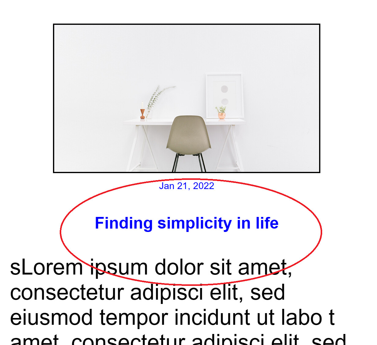
Ah, this was a good find, I hadn’t looked at the site under 27 inches, that’s why it is too small. I have done some analyzing and determined that the heading will need to be the same size or smaller than its text. I could make it bold and / or colored. What do you think about this idea, ralphm?
ralphm, sorry for the late post, I’ve been swamped. The image below will show you what I mean by making the headers smaller than the text. I was wondering what you thought of it, if it looks okay.