Getting Started with React Native

With the ever-increasing popularity of smartphones, developers are looking into solutions for building mobile applications. For developers with a web background, frameworks such as Cordova and Ionic, React Native, NativeScript, and Flutter allow us to create mobile apps with languages we’re already familiar with: HTML, XML, CSS, and JavaScript.
In this guide, we’ll take a closer look at React Native. You’ll learn the absolute basics of getting started with it. Specifically, we’ll cover the following:
- what React Native is
- what Expo is
- how to set up an React Native development environment using Expo
- how to create an app with React Native
Prerequisites
This tutorial assumes that you’re coming from a web development background. The minimum requirement for you to be able to confidently follow this tutorial is to know HTML, CSS, and JavaScript. You should also know how to install software on your operating system and work with the command line. We’ll also be using some ES6 syntax, so it would help if you know basic ES6 syntax as well. Knowledge of React is helpful but not required.
What is React Native?
React Native is a framework for building apps that work on both Android and iOS. It allows you to create real native apps using JavaScript and React. This differs from frameworks like Cordova, where you use HTML to build the UI, which will then just be displayed within the device’s integrated mobile browser (WebView). React Native has built-in components which are compiled to native UI components, while your JavaScript code is executed through a virtual machine. This makes React Native more performant than Cordova.
Another advantage of React Native is its ability to access native device features. There are many plugins which you can use to access native device features, such as the camera and various device sensors. If you’re in need of a platform-specific feature that hasn’t been implemented yet, you can also build your own native modules — although that will require you to have considerable knowledge of the native platform you want to support (Java or Kotlin for Android, and Objective C or Swift for iOS).
If you’re coming here and you’re new to React, you might be wondering what it is. React is a JavaScript library for the Web for building user interfaces. If you’re familiar with MVC, it’s basically the View in MVC. React’s main purpose is to allow developers to build reusable UI components. Examples of these components include buttons, sliders, and cards. React Native took the idea of building reusable UI components and brought it into mobile app development.
What is Expo?
Before coming here, you might have heard of Expo. It’s even mentioned in the official React Native docs, so you might be wondering what it is.
In simple terms, Expo allows you to build React Native apps without the initial headache that comes with setting up your development environment. It only requires you to have Node installed on your machine, and the Expo client app on your device or emulator.
But that’s just how Expo is initially sold. In reality, it’s much more than that. Expo is actually a platform that gives you access to tools, libraries and services for building Android and iOS apps faster with React Native. Expo comes with an SDK which includes most of the APIs you can ask for in a mobile app development platform:
Those are just few of the APIs you get access to out of the box if you start building React Native apps with Expo. Of course, these APIs are available to you as well via native modules if you develop your app using the standard React Native setup.
Plain React Native or Expo?
The real question is which one to pick — plain React Native or Expo? There’s really no right or wrong answer. It all depends on the context and what your needs are. But I guess it’s safe to assume that you’re reading this tutorial because you want to quickly get started with React Native. So I’ll go ahead and recommend that you start out with Expo. It’s fast, simple, and easy to set up. You can dive right into tinkering with React Native code and get a feel of what it has to offer in just a couple of hours.
But as you begin to grasp the different concepts, and as the need for different native features arises, you might find that Expo is kind of limiting. Yes, it has a lot of native features available, but not all the native modules that are available to standard React Native projects are supported.
Note: projects like unimodules are beginning to close the gap between standard React Native projects and Expo projects, as it allows developers to create native modules that work for both React Native and ExpoKit.
Setting Up the React Native Development Environment
To quickly get started with React Native, the recommended method is to set up Expo.
The only prerequisite of setting up Expo is that you need to have Node.js installed in your machine. To do this, you can either head to the official Node download page and grab the relevant binaries for your system, or you can use a version manager, which allows you to install multiple versions of Node and switch between them at will.
Once you have Node.js installed, install the Expo CLI. This is used for creating, serving, packaging, and publishing projects:
npm install -g expo-cli
Next, install Yarn, the preferred package manager for Expo:
npm install -g yarn
That’s really all there is to it! The next step is to download the Expo client App for Android or iOS. Note that this is the only way you can run Expo apps while you’re still in development. When you’re ready to ship the app, you can follow this guide to create standalone binaries for iOS and Android which can be submitted to the Apple App Store and Google Play Store.
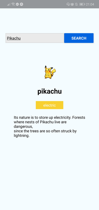
What We’ll Be Building
Now that your development environment is set up, we can look at the app we’re going to create — a Pokémon search app. It will allow the user to type the name of a Pokémon into an input box, before fetching the Pokémon’s details from an external API and displaying them to the user.
Here’s what the finished thing will look like:
As ever, you can find the source code for this in our GitHub repo.
Bootstrapping the App
On your terminal, execute the following command to create a new React Native project using Expo:
expo init RNPokeSearch
Under Managed Workflow, select blank. By default, this will install the dependencies using Yarn.
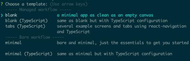
You might be asking what this Managed workflow and Bare workflow is. These are the two types of workflows that Expo supports. With a managed workflow, you only have to deal with JavaScript and Expo manages everything for you. While in Bare workflow, you have full control over the native code. It gives you the same freedom as the React Native CLI, but with the added bonus of Expo’s libraries and services. You can visit this managed vs bare intro page if you want to learn more about workflows in Expo.
Just like in a web environment, you can install libraries to easily implement different kinds of functionality in React Native. Once the project is created, we need to install a couple of dependencies: pokemon and axios. The former is used for verifying if the text entered in the search box is a real Pokémon name, while axios is used to make an HTTP request to the API that we’re using, namely the PokeAPI:
yarn add pokemon axios
React Native Project Directory Structure
Before we proceed to coding, let’s first take a look at the directory structure of a React Native project created with Expo:
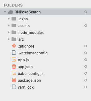
Here’s a breakdown of the most important files and folders that you need to remember:
App.js: the main project file. This is where you’ll start developing your app. Any changes you make to this file will be reflected on the screen.src: acts as the main folder which stores all the source code related to the app itself. Note that this isn’t included in the default project created by Expo CLI. The name of this folder can be anything. Some people useappas well.assets: this is where the app assets such as icons and splash screens are stored.package.json: where the name and versions of the libraries you installed for this project are added.node_modules: where the libraries you installed are stored. Note that this already contains a lot of folders before you installed the two libraries earlier. This is because React Native also has its own dependencies. The same is true for all the other libraries you install.
Don’t mind the rest of the folders and files for now, as we won’t be needing them when just getting started.
Running the App
At this point, you can now run the app by executing the command below. Make sure that you’ve already installed the corresponding Expo client (Android or iOS) for your phone and that it’s connected to the same network as your computer before doing so. If you don’t have an Android or iOS device you can test with, you can use the Android Studio Emulator or the iOS simulator so you can run the app on your machine:
yarn start
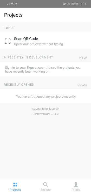
Once it’s running, it will display a QR code:

Open your Expo client app, and in the projects tab click on Scan QR Code. This will open the app on your Android or iOS device. If you have an emulator running, you can either press i to run it on the iOS simulator or a to run it on the Android emulator.
If you’re testing on a real device, shake it so the developer menu will show up.
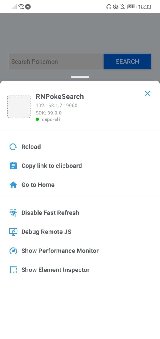
Make sure that Fast Refresh is enabled. This allows you to automatically reload the changes that you make on your components.
Coding the App
Expo has many built-in components which you can use to accomplish what you want. Simply dig through the API documentation and you’ll find information on how to implement what you need. In most cases, you either need a specific UI component or an SDK which works with a service you plan on using. More often than not, here’s what your workflow is going to look like:
- Look for an existing package which implements what you want.
- Install it.
- Link it. This is only necessary if you’re on Expo’s bare workflow and the package you’ve installed has a corresponding native dependency.
- Use it in your project.
Now that you’ve set up your environment and learned a bit about the workflow, we’re ready to start coding the app.
First, let’s scaffold out the files we’ll need. These are src/Main.js, as well as src/components/Pokemon.js. The Main component will hold the code to display the search input and query the API, whereas the Pokemon component will be used to display the returned Pokémon data:
mkdir -p src/components
touch src/Main.js
touch src/components/Pokemon.js
Add some dummy content to both files:
// src/Main.js
import React, { Component } from 'react';

export default class Main extends Component {
  render() {
    return null;
  }
}
// src/components/Pokemon.js
import  React  from  'react';

const  Pokemon  =  ()  =>  null;
Next, replace the contents of the App.js file with the following code:
import React from 'react';
import Main from './src/Main';

function App() {
  return <Main />;
}

export default App;
The first line in the code above code imports React. You need to import this class any time you want create a component.
The second line is where we import the custom Main component. We’ll fill this in later, but for now, know that this is where we’ll put the majority of our code.
After that, we create the component by creating a new function. All this function does is return the Main component.
Lastly, we export the class so that it can be imported and rendered by Expo.
Next, in src/Main.js file and add the following:
// src/Main.js
import React, { Component } from 'react';
import {
  SafeAreaView,
  View,
  Text,
  TextInput,
  Button,
  Alert,
  StyleSheet,
  ActivityIndicator,
} from 'react-native';
The second line imports the components that are built into React Native. Here’s what each one does:
SafeAreaView: for rendering content within the safe area boundaries of a device. This automatically adds a padding that wraps its content so that it won’t be rendered on camera notches and sensor housing area of a device.View: a fundamental UI building block. This is mainly used as a wrapper for all the other components so they’re structured in such a way that you can style them with ease. Think of it as the equivalent of<div>. If you want to use Flexbox, you have to use this component.Text: for displaying text.TextInput: the UI component for inputting text. This text can be plain text, email, password, or a number pad.Button: for showing a platform-specific button. This component looks different based on the platform it runs on. If it’s Android, it uses Material Design. If it’s iOS, it uses Cupertino.Alert: for showing alerts and prompts.ActivityIndicator: for showing a loading animation indicator.StyleSheet: for defining the component styles.
Next, import the libraries we installed earlier:
import axios from 'axios';
import pokemon from 'pokemon';
As well as the custom Pokemon component used for displaying Pokémon data:
import Pokemon from "./components/Pokemon";
Note: if Expo is unable to resolve the Pokemon (or any other) component, try restarting the server.
Because getting the required Pokémon data involves making two API requests, we have to set the API’s base URL as a constant:
const POKE_API_BASE_URL = 'https://pokeapi.co/api/v2';
Next, define the component class and initialize its state:
export default class Main extends Component {
  constructor(props) {
    super(props)

    this.state = {
      isLoading: false, // decides whether to show the activity indicator or not
      searchInput: '', // the currently input text
      name: '', // Pokémon name
      pic: '', // Pokémon image URL
      types: [], // Pokémon types array
      desc: '', // Pokémon description
    };
  }

  render() {
    return null;
  }
}
In the code above, we’re defining the main component of the app. You can do this by defining an ES6 class and having it extend React’s Component class. This is another way of defining a component in React. In the App.js file, we created a functional component. This time we’re creating a class-based component.
The main difference between the two is that functional components are used for presentation purposes only. Functional components have no need to keep their own state because all the data they require is just passed to them via props. On the other hand, class-based components maintain their own state and they’re usually the ones passing data to functional components. Note that this is the traditional way of creating components in React. A more modern approach would be to stick with a functional component and use the state hook to manage the state — though in this tutorial we’re just going to keep things simple and stick with a class-based component.
If you want to learn more about the difference between functional and class-based components, read the tutorial “Functional vs Class-Components in React”.
Going back to the code, we’re initializing the state inside our component. You define it as a plain JavaScript object. Any data that goes into the state should be responsible for changing what’s rendered by the component. In this case, we put in isLoading to control the visibility of the activity indicator and searchInput to keep track of the input value in the search box.
This is an important concept to remember. React Native’s built-in components, and even the custom components you create, accept properties that control the following:
- what’s displayed on the screen (data source)
- how they present it (structure)
- what it looks like (styles)
- what actions to perform when user interacts with it (functions)
We’ll go through those properties in more detail in the next section. For now, know that the values of those properties are usually updated through the state.
The rest of the state values are for the Pokémon data. It’s a good practice to set the initial value with the same type of data you’re expecting to store later on — as this serves as documentation as well.
Structuring and Styling Components
Let’s return to the component class definition. When you extend React’s Component class, you have to define a render() method. This contains the code for returning the component’s UI and it’s made up of the React Native components we imported earlier.
Each component has its own set of props. These are basically attributes that you pass to the component to control a specific aspect of it. In the code below, most of them have the style prop, which is used to modify the styles of a component. You can pass any data type as a prop. For example, the onChangeText prop of the TextInput is a function, while the types prop in the Pokemon is an array of objects. Later on in the Pokemon component, you’ll see how the props will be used.
Replace the render() method in Main.js with the following:
render() {
  const { name, pic, types, desc, searchInput, isLoading } = this.state; // extract the Pokémon data from the state

  return (
    <SafeAreaView style={styles.wrapper}>
      <View style={styles.container}>
        <View style={styles.headContainer}>
          <View style={styles.textInputContainer}>
            <TextInput
              style={styles.textInput}
              onChangeText={(searchInput) => this.setState({ searchInput })}
              value={this.state.searchInput}
              placeholder="Search Pokémon"
            />
          </View>
          <View style={styles.buttonContainer}>
            <Button
              onPress={this.searchPokemon}
              title="Search"
              color="#0064e1"
            />
          </View>
        </View>

        <View style={styles.mainContainer}>
          {isLoading && <ActivityIndicator size="large" color="#0064e1" />}

          {!isLoading && (
            <Pokemon name={name} pic={pic} types={types} desc={desc} />
          )}
        </View>
      </View>
    </SafeAreaView>
  );
}
Breaking down the code above, we first extract the state data:
const { name, pic, types, desc, searchInput, isLoading } = this.state;
Next, we return the component’s UI, which follows this structure:
SafeAreaView.wrapper;
  View.container;
    View.headContainer;
      View.textInputContainer;
        TextInput;
      View.buttonContainer;
        Button;
    View.mainContainer;
      ActivityIndicator;
        Pokemon;
The above structure is optimized for using Flexbox. Go ahead and define the component styles at the bottom of the file:
const styles = StyleSheet.create({
  wrapper: {
    flex: 1,
  },
  container: {
    flex: 1,
    padding: 20,
    backgroundColor: '#F5FCFF',
  },
  headContainer: {
    flex: 1,
    flexDirection: 'row',
    marginTop: 100,
  },
  textInputContainer: {
    flex: 2,
  },
  buttonContainer: {
    flex: 1,
  },
  mainContainer: {
    flex: 9,
  },
  textInput: {
    height: 35,
    marginBottom: 10,
    borderColor: '#ccc',
    borderWidth: 1,
    backgroundColor: '#eaeaea',
    padding: 5,
  },
});
In React Native, you define styles by using StyleSheet.create() and passing in the object that contains your styles. These style definitions are basically JavaScript objects, and they follow the same structure as your usual CSS styles:
element: {
  property: value;
}
The wrapper and container is set to flex: 1, which means it will occupy the entirety of the available space because they have no siblings. React Native defaults to flexDirection: 'column', which means it will lay out the flex items vertically.

In contrast, (flexDirection: 'row') lays out items horizontally.

It’s different for headContainer, because even though it’s set to flex: 1, it has mainContainer as its sibling. This means that headContainer and mainContainer will both share the same space. mainContainer is set to flex: 9 so it will occupy the majority of the available space (around 90%), while headContainer will only occupy about 10%.
Let’s move on to the contents of headContainer. It has textInputContainer and buttonContainer as its children. It’s set to flexDirection: 'row', so that its children will be laid out horizontally. The same principle applies when it comes to space sharing: textInputContainer occupies two thirds of the available horizontal space, while buttonContainer only occupies one third.
The rest of the styles are pretty self explanatory when you have a CSS background. Just remember to omit - and set the following character to uppercase. For example, if you want to set background-color, the React Native equivalent is backgroundColor.
Note: not all CSS properties that are available on the Web are supported in React Native. For example, things like floats or table properties aren’t supported. You can find the list of supported CSS properties in the docs for View and Text components. Someone has also compiled a React Native Styling Cheat Sheet, and there’s a style section in the documentation for a specific React Native component that you want to use. For example, here are the style properties that you can use for the Image component.
Event Handling and Updating the State
Let’s now break down the code for the TextInput and Button components. In this section, we’ll talk about event handling, making HTTP requests, and updating the state in React Native.
Let’s start by examining the code for TextInput:
<TextInput
  style={styles.textInput}
  onChangeText={(searchInput) => this.setState({ searchInput })}
  value={this.state.searchInput}
  placeholder="Search Pokémon"
/>
In the above code, we’re setting the function to execute when the user inputs something in the component. Handling events like this are similar to how they’re handled in the DOM: you simply pass the event name as a prop and set its value to the function you wish to execute. In this case, we’re inlining it because we’re just updating the state. The value input by the user is automatically passed as an argument to the function you supply, so all you have to do is update the state with that value. Don’t forget to set the value of the TextInput to that of the state variable. Otherwise, the value input by the user won’t show as they type.
Next, we move on to the Button component. Here, we’re listening for the onPress event:
<Button onPress={this.searchPokemon} title="Search" color="#0064e1" />
Once pressed, the searchPokemon() function is executed. Add this function right below the render() method. This function uses the async...await pattern because performing an HTTP request is an asynchronous operation. You can also use Promises, but to keep our code concise, we’ll stick with async/await instead. If you’re not familiar with this tecnique, be sure to read “Flow Control in Modern JS”.
// src/Main.js
import React, { Component } from 'react';
...
export default class Main extends Component {
  ...

  render() { ... }

  searchPokemon = async () => {
    try {
      const pokemonID = pokemon.getId(this.state.searchInput); // check if the entered Pokémon name is valid

      this.setState({
        isLoading: true, // show the loader while request is being performed
      });

      const { data: pokemonData } = await axios.get(
        `${POKE_API_BASE_URL}/pokemon/${pokemonID}`
      );
      const { data: pokemonSpecieData } = await axios.get(
        `${POKE_API_BASE_URL}/pokemon-species/${pokemonID}`
      );

      const { name, sprites, types } = pokemonData;
      const { flavor_text_entries } = pokemonSpecieData;

      this.setState({
        name,
        pic: sprites.front_default,
        types: this.getTypes(types),
        desc: this.getDescription(flavor_text_entries),
        isLoading: false, // hide loader
      });
    } catch (err) {
      Alert.alert('Error', 'Pokémon not found');
    }
  };
}

const styles = StyleSheet.create({ ... });
Breaking down the code above, we first check if the entered Pokémon name is valid. If it’s valid, the National Pokedex ID (if you open the link, that’s the number on top of the Pokémon name) is returned and we supply it as a parameter for the HTTP request. The request is made using axios’ get() method, which corresponds to an HTTP GET request. Once the data is available, we extract what we need and update the state.
Here’s the getTypes() function. All it does is reassign the slot and type properties of the Pokémon types to id and name:
getTypes = (types) =>
  types.map(({ slot, type }) => ({
    id: slot,
    name: type.name,
  }));
Here’s the getDescription() function. This finds the first English version of the flavor_text:
getDescription = (entries) =>
    entries.find((item) => item.language.name === 'en').flavor_text;
Add them after the searchPokemon function, like so:
import React, { Component } from 'react';
...
export default class Main extends Component {
  ...

  render() { ... }

  searchPokemon = async () => { ... };
  getTypes = (types) => types.map( ... );
  getDescription = (entries) => entries.find( ... );
}

const styles = StyleSheet.create({ ... });
Pokémon Component
Now that our app is fetching data from the API, it’s time to expand the Pokemon component we stubbed out earlier, so that we can display said data. Open the src/components/Pokemon.js file and replace the contents with the following:
import React from 'react';
import { View, Text, Image, FlatList, StyleSheet } from 'react-native';

const Pokemon = ({ name, pic, types, desc }) => {
  if (!name) {
    return null;
  }

  return (
    <View style={styles.mainDetails}>
      <Image source={{ uri: pic }} style={styles.image} resizeMode="contain" />
      <Text style={styles.mainText}>{name}</Text>

      <FlatList
        columnWrapperStyle={styles.types}
        data={types}
        numColumns={2}
        keyExtractor={(item) => item.id.toString()}
        renderItem={({ item }) => (
          <View style={[styles[item.name], styles.type]}>
            <Text style={styles.typeText}>{item.name}</Text>
          </View>
        )}
      />

      <View style={styles.description}>
        <Text>{desc}</Text>
      </View>
    </View>
  );
};

//
const styles = StyleSheet.create({
  mainDetails: {
    padding: 30,
    alignItems: 'center',
  },
  image: {
    width: 100,
    height: 100,
  },
  mainText: {
    fontSize: 25,
    fontWeight: 'bold',
    textAlign: 'center',
  },
  description: {
    marginTop: 20,
  },
  types: {
    flexDirection: 'row',
    marginTop: 20,
  },
  type: {
    padding: 5,
    width: 100,
    alignItems: 'center',
  },
  typeText: {
    color: '#fff',
  },
  normal: {
    backgroundColor: '#8a8a59',
  },
  fire: {
    backgroundColor: '#f08030',
  },
  water: {
    backgroundColor: '#6890f0',
  },
  electric: {
    backgroundColor: '#f8d030',
  },
  grass: {
    backgroundColor: '#78c850',
  },
  ice: {
    backgroundColor: '#98d8d8',
  },
  fighting: {
    backgroundColor: '#c03028',
  },
  poison: {
    backgroundColor: '#a040a0',
  },
  ground: {
    backgroundColor: '#e0c068',
  },
  flying: {
    backgroundColor: '#a890f0',
  },
  psychic: {
    backgroundColor: '#f85888',
  },
  bug: {
    backgroundColor: '#a8b820',
  },
  rock: {
    backgroundColor: '#b8a038',
  },
  ghost: {
    backgroundColor: '#705898',
  },
  dragon: {
    backgroundColor: '#7038f8',
  },
  dark: {
    backgroundColor: '#705848',
  },
  steel: {
    backgroundColor: '#b8b8d0',
  },
  fairy: {
    backgroundColor: '#e898e8',
  },
});

export default Pokemon;
In the code above, we first checked if the name has a falsy value. If it has, we simply return null, as there’s nothing to render.
We’re also using two new, built-in React Native components:
Image: used for displaying images from the Internet or from the file systemFlatList: used for displaying lists
As we saw earlier, we’re passing in the Pokémon data as prop for this component. We can extract those props the same way we extract individual properties from an object:
const Pokemon = ({ name, pic, types, desc }) => {
    // ..
};
The Image component requires the source to be passed to it. The source can either be an image from the file system, or, in this case, an image from the Internet. The former requires the image to be included using require(), while the latter requires the image URL to be used as the value of the uri property of the object you pass to it.
resizeMode allows you to control how the image will be resized based on its container. We used contain, which means it will resize the image so that it fits within its container while still maintaining its aspect ratio. Note that the container is the Image component itself. We’ve set its width and height to 100, so the image will be resized to those dimensions. If the original image has a wider width than its height, a width of 100 will be used, while the height will adjust accordingly to maintain the aspect ratio. If the original image dimension is smaller, it will simply maintain its original size:
<Image source={{ uri: pic }} style={styles.image} resizeMode={"contain"} />
Next is the FlatList component. It’s used for rendering a list of items. In this case, we’re using it to render the types of the Pokémon. This requires the data, which is an array containing the items you want to render, and the renderItem, which is the function responsible for rendering each item on the list. The item in the current iteration can be accessed the same way props are accessed in a functional component:
<FlatList
  columnWrapperStyle={styles.types}
  data={types}
  numColumns={2}
  keyExtractor={(item) => item.id.toString()}
  renderItem={({ item }) => (
    <View style={[styles[item.name], styles.type]}>
      <Text style={styles.typeText}>{item.name}</Text>
    </View>
  )}
/>
In the code above, we also supplied the following props:
columnWrapperStyle: used for specifying the styles for each column. In this case, we want to render each list item inline, so we’ve specifiedflexDirection: 'row'.numColumns: the maximum number of columns you want to render for each row on the list. In this case, we’ve specified2, because a Pokemon can only have two types at most.keyExtractor: the function to use for extracting the keys for each item. You can actually omit this one if you pass akeyprop to the outer-most component of each of the list items.
At this point, you can now test the app on your device or emulator:
yarn start
While on the terminal, you can press a if you want to run the app on the Android emulator or i if you want to run it on the iOS simulator.
Please also note that the names of the Pokémon must start with a capital letter — for example, “Pikachu”, not “pikachu”.
Conclusion and Next Steps
That’s it! In this tutorial, you’ve learned how to set up the React Native development environment using Expo. You’ve also learned how to create your very first React Native app.
To learn more, check out these resources:
And don’t forget, you can find the source code used in this tutorial on this GitHub repo.