How to Design for Screen Readers with Adobe XD CC

When it comes to accessibility, designers tend to focus on colors (i.e. contrast) and UX copy (i.e. wording), whereas developers tend to focus on ARIA attributes (i.e. code that makes websites more accessible). This is due to the fact that, often enough, thick lines are drawn between “who does what”.
Also, because creating accessible apps and websites isn’t considered to be exciting, this line is hardly ever questioned.
Accessibility is still a black sheep, even in 2020.
So, since UX copy is the responsibility of the designer and ARIA attributes are the responsibility of the developer, exactly whose responsibility is it to cater for screen readers? Since:
- Screen reader UX copy is expressed as Braille or dictation (so how do we communicate this when our UI tools are visual?)
- Implementation is developer territory (so can we really shift the responsibility of writing UX copy to developers?)
As you can see, it’s a two-person job — and yet, the tools simply don’t exist to facilitate this. I mean, make no mistake, some aspects of accessibility design are one-sided (for example, UI designers can very easily take care of color contrast by themselves). However, other aspects such as designing for screen readers requires collaboration between designers and developers.
This is where Adobe XD CC’s design handoff and voice prototyping features come in handy. In this article, we’ll discuss what to consider when designing for screen readers, and we’ll also walk through how to use the features mentioned above.
What Are Screen Readers?
A screen reader is a type of assistive technology that communicates what’s happening on the screen (for those with visual impairments). Screen reader software can be used in combination with the keyboard (for example, users will tab and enter as opposed to using the mouse), but it can also be used in combination with screen reader hardware, which allows for more efficient navigation and also caters for users that use Braille.
If you’re an Apple user, for example, you’ll be somewhat aware of Apple VoiceOver, which is the native Apple dictation software that acts as a screen reader. Windows users, however, commonly use either JAWS or NVDA, since there aren’t any native screen reader tools in the Windows operating system.
Let’s dive in.
1. Use Headings
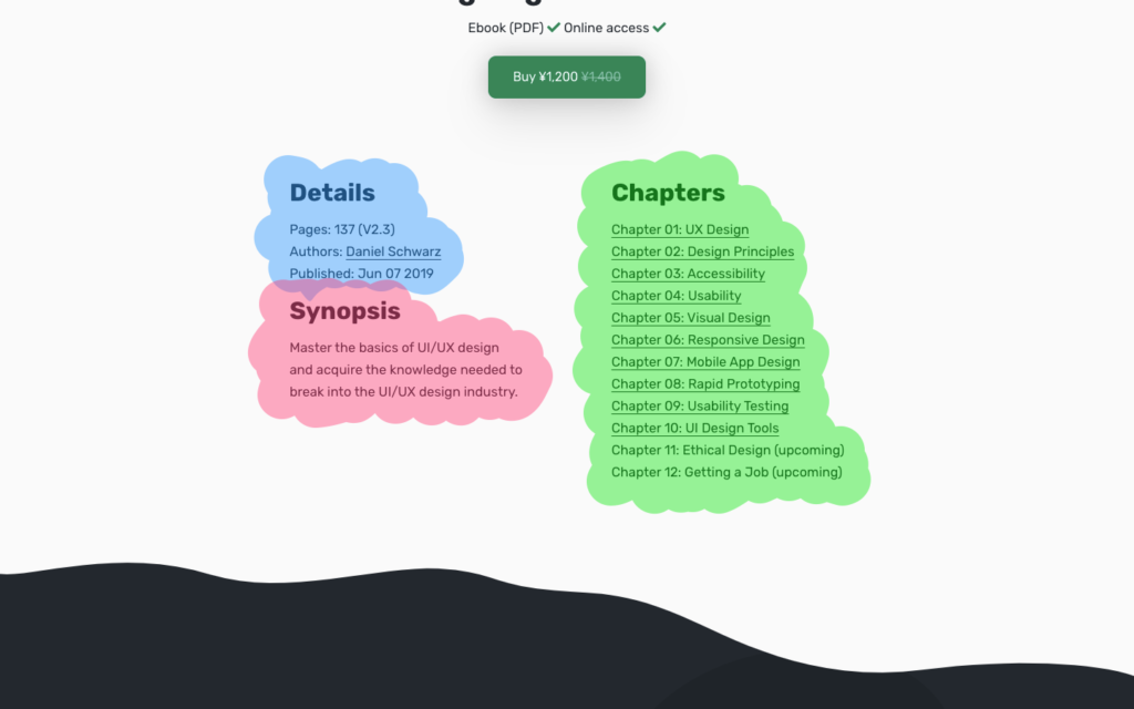
Screen readers often use headings as a way of deciphering a website’s structure, and if we think too visually we run the risk of leaving out these headings. In the example below, the omission of the “Chapters” heading causes screen readers to assume that the list of chapters is a continuation of the content on the left-hand side, which it obviously isn’t.
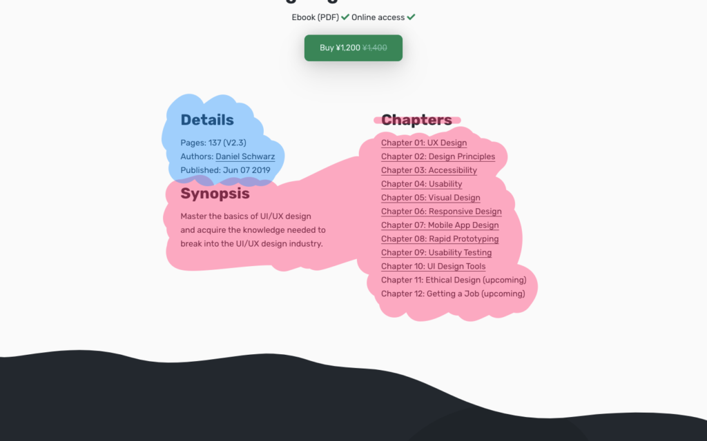
As a result, screen-reader users won’t be able to skip to “Chapters”, and they might not discover the information within.
While there are code workarounds available (such as the aria-label attribute), having a visible heading inclusively offers a clearer experience for everybody, whether disabled or not.
Of course, the section is very obviously a list of chapters, as we can infer from the context (i.e. the content). However, those using screen readers very rarely have the luxury of context. It’s like trying to find an object in storage where none of the boxes are labeled. Our designs need these labels and headings.
On the technical side, the rule is that every section (as defined by a <section> or <article> tag) should have not only a heading, but an explicit heading that conflicts with no other heading. As an example, if the highest level heading within a section is an <h2>, then there should be no other <h2> heading within that section. Otherwise, screen readers are clueless as to which heading is the label for the section.
2. Use Labels
Icons are better — for everybody — when they have a text label. If this approach looks cluttered, then consider using only a text label. Prefer the icon? Well, in that case, at least declare an “invisible label” to developers that will only appear to screen readers (yep, I’m talking about aria-label). The same applies to input fields, where a visible text label is always better. aria-label should be a last resort.

Images have a similar requirement, except that their descriptive text is implemented via the alt tag. That being said, make sure to communicate when an image is decorative, as developers will then need to hide it from screen readers using aria-hidden="true".
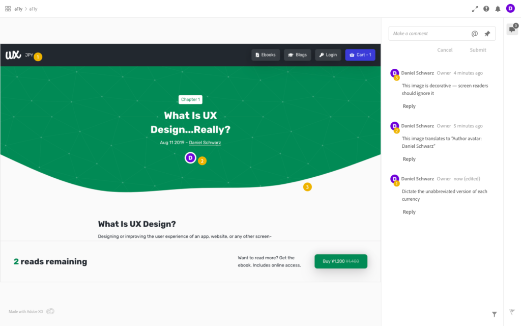
Using Design Handoff to Communicate Screen Reader Text
Whether you’re using alt text, ARIA labels for elements that don’t have any visible text, ARIA labels intended to “overwrite” the visible text (for added context), or even simply stating when an image should be totally ignored by screen readers, Adobe XD CC’s design handoff tool is the right tool to use for this.
The workflow would look a little something like this:
- Click onto the “Share” workspace.
- Configure the settings (on the right-hand side).
- Click “Create Link” and then click on the link itself.
- Within the design handoff window, click the “Place a Pin” icon-button to comment on specific elements in the design.
- Leave comments. For example:
- Dictate the unabbreviated version of each currency
- This image translates to “Author avatar: Daniel Schwarz”
- This image is decorative — screen readers should ignore it
3. Elaborate When Necessary
Let’s assume a tabbed component consisting of two buttons. One is labeled “Recency”, and the other, “Sequentially”.
Without any visual context, one is left to wonder … what’s recency? What’s sequentially? Are these buttons? Am I supposed to do something? Paired with surrounding content, users without visual impairments can easily infer what’s happening: we’re being given the opportunity to sort the order of the chapters.
However, those with visual impairments could do with some elaboration. Specifically, the copy needs to be more actionable.
The following UX copy is better for those using screen readers:
- “Order chapters by recency”
- “Order chapters sequentially”
And when a button is clicked:
- “Chapters are now ordered by recency”
- “Chapters are now ordered sequentially”
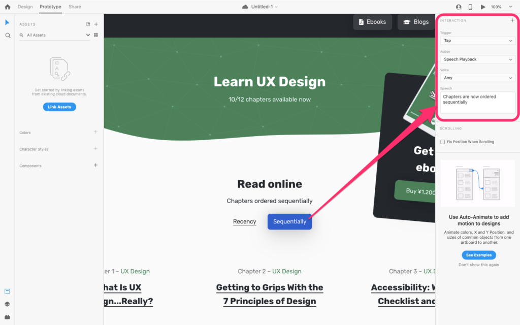
Using Voice Prototyping to Communicate Dynamic Changes
While design handoff is a terrific way to communicate what should happen when a screen-reading user focuses on an element (as mentioned above, aria-label overwrites any visible text to offer additional context), voice prototyping can be used to communicate what should happen as the result of an interaction.
The Adobe XD CC workflow would look something like this:
- Click onto the “Prototype” workspace.
- Create an interaction, as you normally would.
- Select “Action” → “Voice Playback” (on the right-hand side).
- Write the text to be spoken by screen readers under “Speech”.
When something changes on-screen, these changes should be communicated to screen-reading users clearly — especially if said changes require users to respond. Here are a few more examples:
- “(X) has sent you a message”
- “Your session will time out in (x) seconds”
- “Are you sure you wish to cancel? [Yes/No]”
Conclusion
A website isn’t simply a document to be read from top to bottom — at least, not when tasks and interactions are involved.
Reading flows and user flows are rarely linear, so designing for screen readers is a bit more complex than simply translating visuals to text. We have to consider what context the user already has, cater for varying degrees of disability, and more importantly, designers and developers need to work together so that accessibility doesn’t become an afterthought.
Leverage Adobe XD CC’s design handoff and voice prototyping features to your advantage, and always, always, always think about your app and web designs from the viewport of low-sight users. Not everybody has the luxury of visual context.
Bonus: Color Contrast Features in UI Design Tools
UXPin offers a native feature for checking color contrast, and also a color blindness simulator. Small beans, but still, it’s a first. If not using UXPin, then the choices are web-based tools such as WebAIM, UI tool extensions such as the Stark Plugin, Contrast for macOS, or Color Contrast Analyzer for Windows. Unfortunately, for some reason, color contrast has never been a top consideration in UI design tools.
Here’s hoping for 2020!
Bonus: Adobe XD Enables Voice Control
Adobe XD recently began to support Voice Control, meaning that there are now more ways to interact with Adobe XD, and by extension, be a designer. This is fantastic news for those with accessibility concerns, and the tool even benefits those that aren’t disabled. How’s that for inclusive design?
“Open XD!”
Learn more about accessibility with Accessibility for Everyone from A List Apart on SitePoint Premium.