How to Use Adobe XD’s Smart Guides

The following is a short extract from our book, Jump Start Adobe XD, written by Daniel Schwarz, a highly practical tutorial on this fantastic prototyping tool. SitePoint Premium members get access with their membership, or you can buy a copy in stores worldwide.
Smart Guides were originally introduced in Sketch and later adopted in Photoshop after the feature became a hit. Adobe XD explains them in their help section: “When you move an object or artboard, use Smart Guides to align the selected object or artboard to other objects or artboards. The alignment is based on the geometry of objects and artboards. Guides appear as the object approaches the edge or center point of other objects."
Let me start by saying than an object is a common term used to describe a shape layer, text layer, group or bitmap on the canvas. Basically, any type of layer or group is an object.
Guides are visual cues that illustrate how objects align to one another — they can display the distance between two layers, or indicate whether or not a layer has snapped to the bounds of another object or artboard edge. Adobe XD will try to anticipate where you want to move a layer, and automatically snap to that location when you draw close to it, while showing how far you have left until you reach it. You can work out the distance manually by selecting the first layer, holding Option/Alt, and hovering over the second layer.
Manual Alignments
Let's start by aligning a layer manually, so we understand the difference. A moment ago we grouped two text layers together — select both of them once more (hold Shift while you click them) and click the Align Center (Horizontally) button in the Inspector, or use the shortcut: Cmd + Control + C (Shift + C in Windows).
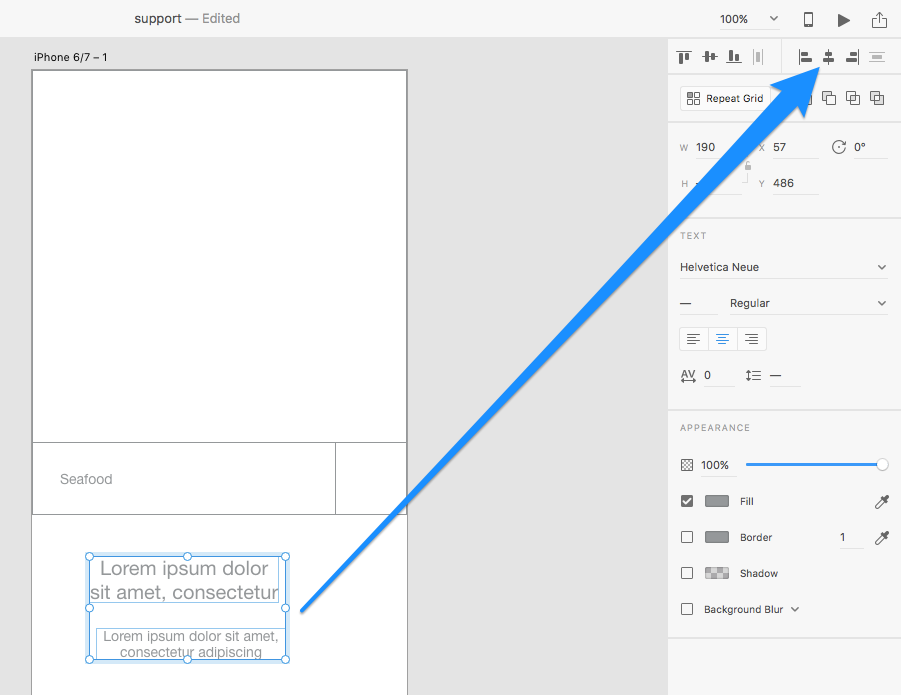
Smart Guides When Moving Layers
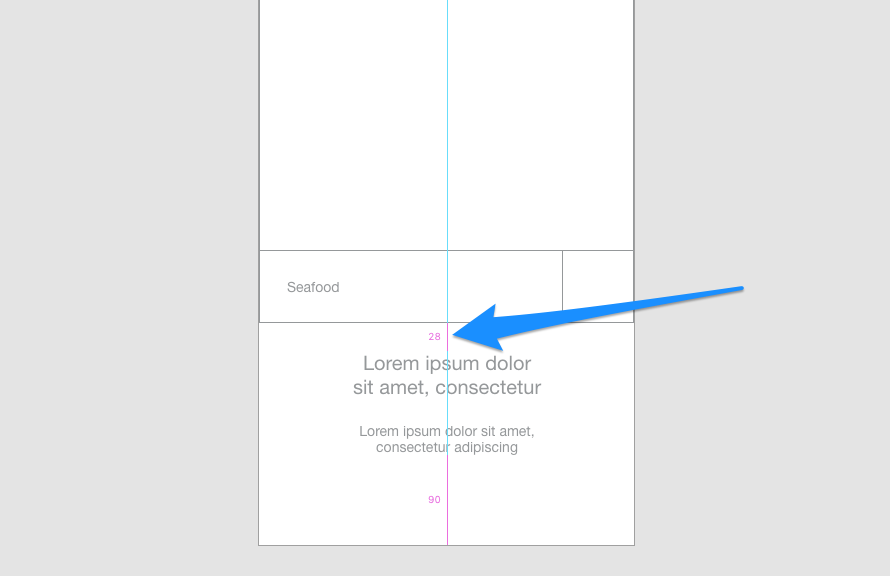
Now select the actual group. You can either use the Select tool (keyboard shortcut: V) and select the group by clicking on it, or use the Esc key to traverse up to the parent container, which is the group. Move it until two things happen:
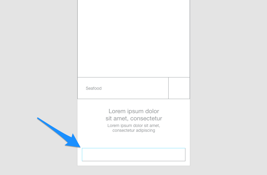
- It appears 28px below the form
- It snaps to the dead-center of the artboard horizontally
You’ll know you’ve done this correctly because the colored lines of the smart guides will illustrate what the object has snapped to (which will be the dead-center of the artboard, as indicated by the vertical line that appears). You'll also notice the relative distance between the search function group and the welcome text group (as indicated by the numerical value).
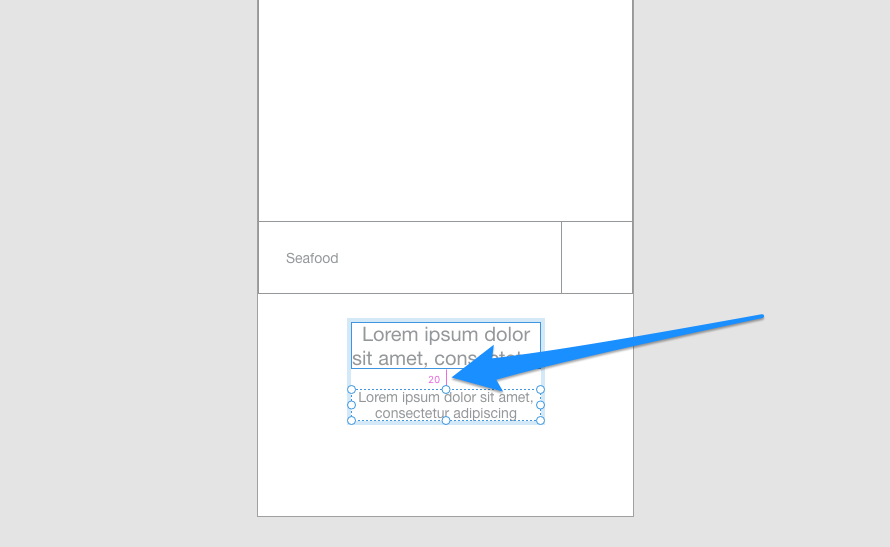
Smart Guides With Option/Alt-Hold
Select the bottom-most layer of this group, hold Option (Alt in Windows), then hover the cursor over the top-most layer. This is a manual approach (also known as Option/Alt-hold) to measuring the relative distance between two layers. You can move layers as normal while option-holding, so use the ↑→↓← arrow keys until the distance is 5px.
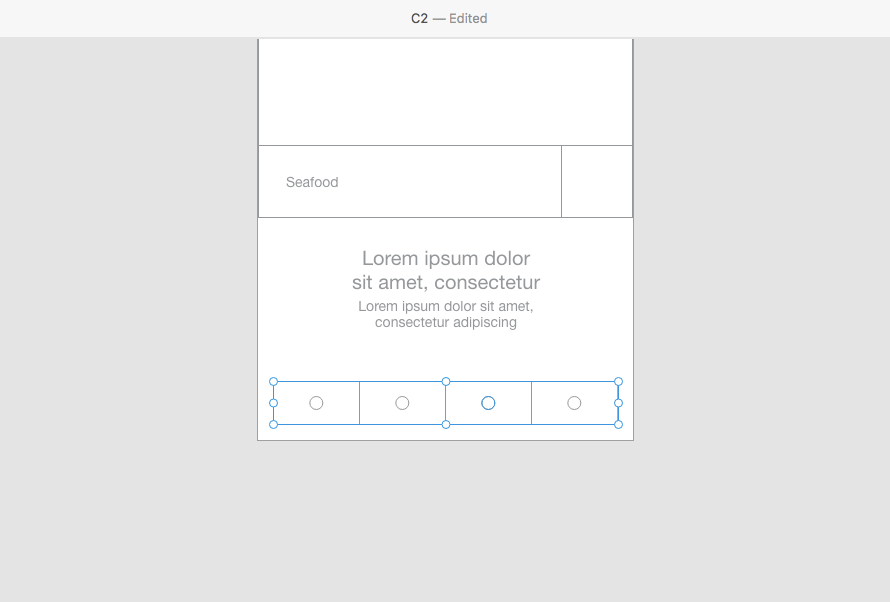
Let's use what we've learned to add some more elements. So far we’ve taken our first look at shape layers, text layers, grouping of layers, alignments, smart guides, and some other basics. Let's recap some of that and finish off this screen, starting with a bottom navigation component with four links.
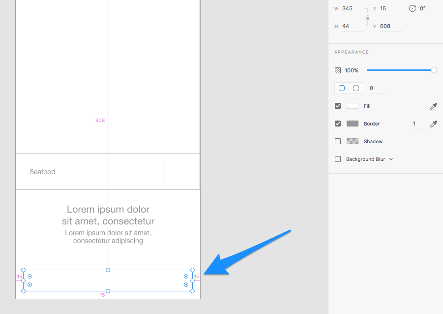
Create a rectangle that’s 345 x 44px (44px, width and height, is the minimum size for a tap target — tap targets smaller than this are very hard for the user to tap). Use Option/Alt-Hold to ensure that the rectangle has a 15px margin on three sides.
Now we have the basic shape of the navbar component.
Draw another rectangle where the width is 25% of the navbar’s total width (because we’ll need to create four links inside the navbar, where each link is 25% of the total width). Start your draw from the top-left corner of the navbar’s rectangle. You’ll see the smart guides again, indicating that your draw will snap from the corner of that layer, which is what we want.
With the Ellipse (E) tool, draw a 14 x 14px circle (hold Shift to maintain aspect ratio) and group together the navbar link and circle, which substitutes for a navbar icon for the time being. Duplicate this group three times and drag each one horizontally to distribute them evenly inside the navbar.
Finally, group the entire component.
Renaming Layers
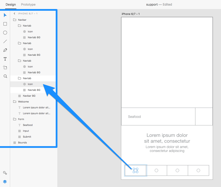
We now have a lo-fi mockup of the navbar, but we also have a lot of objects that are named “rectangle” and “group”, which is confusing if you’re trying to locate a layer within the layer list.
At this moment in time there’s no shortcut for renaming layers, so you’ll have to double-click on the layer’s name in the layer list, and rename it by typing in a new name for the layer. Renaming layers helps you maintain cleanliness in your design, and makes the layer list look a lot less confusing.
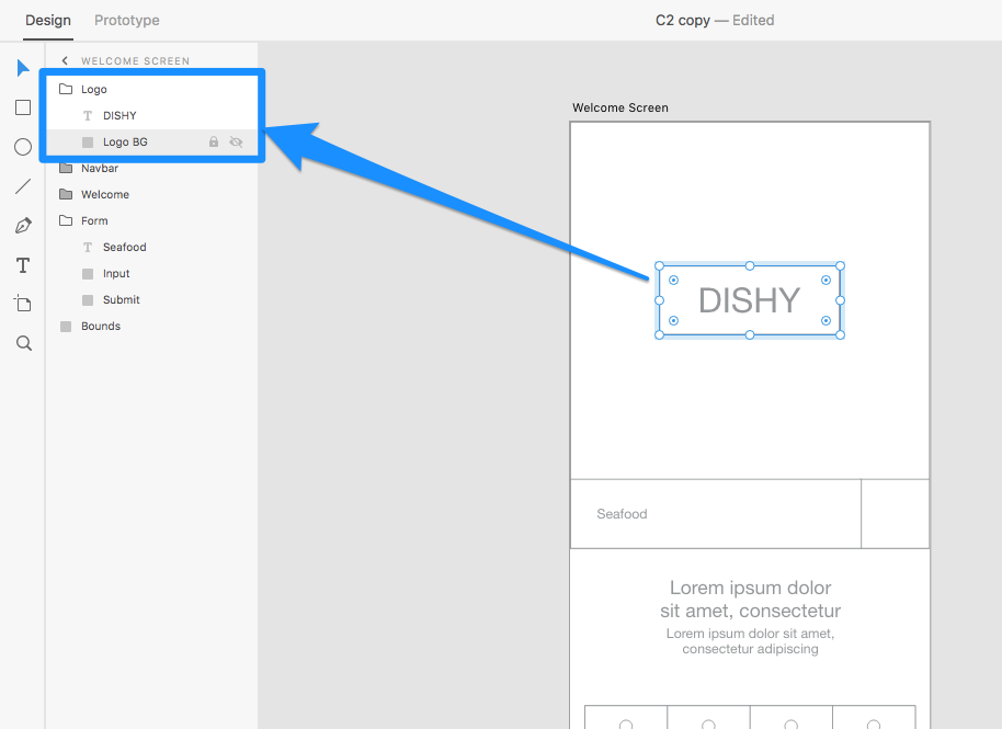
Wrap up this screen by creating three more layers:
- A rectangle, renamed to “Logo BG”
- A text layer called “DISHY”
- A group to contain these two layers, renamed to “Logo”
Centralise the group horizontally/vertically in the top space.
Fast-Forward
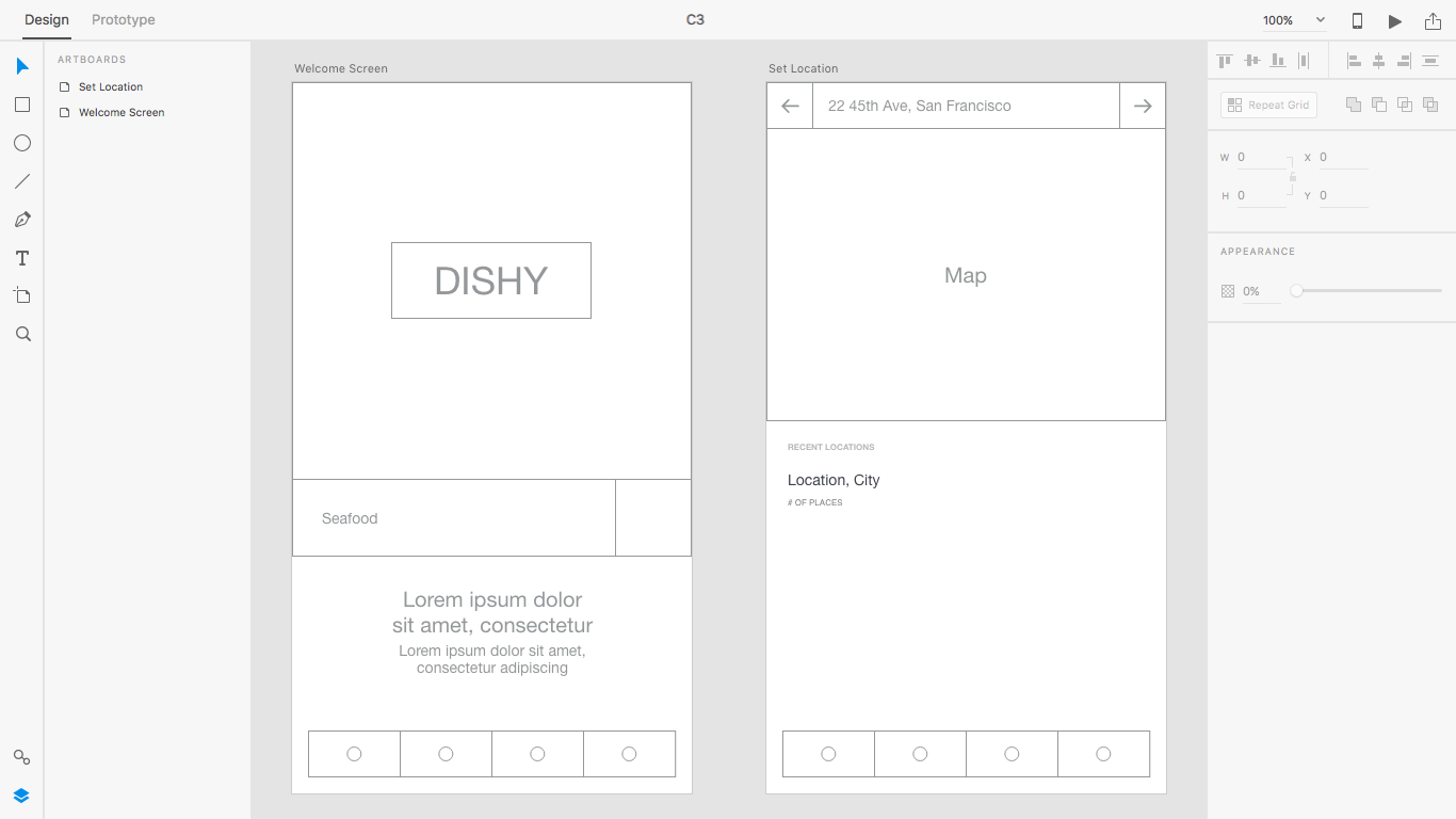
Fast-forward 30 minutes and we have an additional screen. When the user has searched for a type of cuisine using the form on the welcome screen, they’re then invited to set their location so the app can return results relevant to the user's location.
In the next chapter we’ll prototype/demonstrate this user flow, but for now let's finish mocking up this screen while learning about Adobe XD’s other design tools. From the archive, grab the support file named C2.xd to continue.
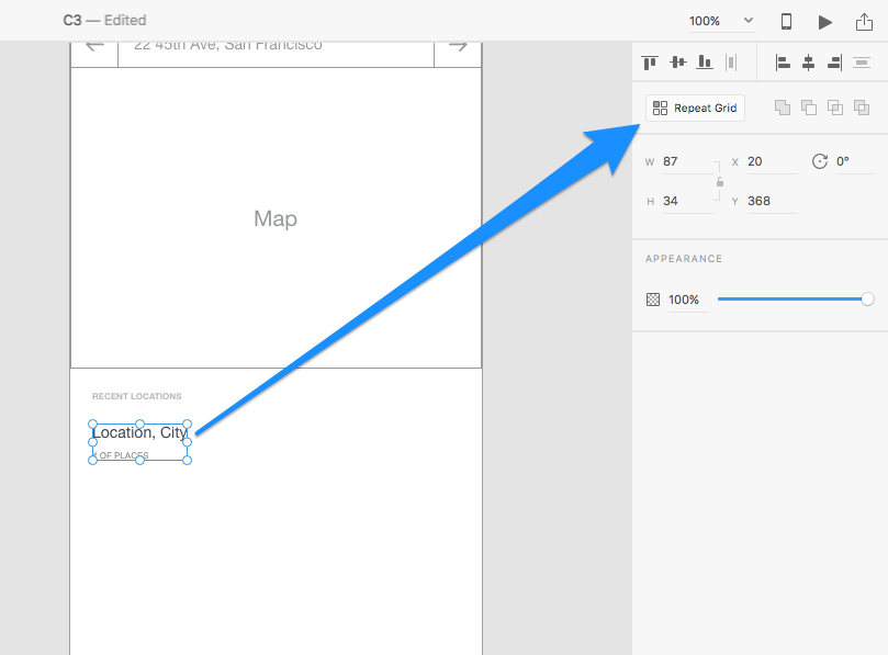
Repeat Grids
Repeat grids allow you to repeat objects horizontally and/or vertically — it’s a much quicker way of duplicating and distributing objects so you won’t have to duplicate and position them manually. Select the “Recent Locations” group from the “Set Location” artboard I’ve added into the support file, and hit the “Repeat Grid” button in the inspector, or use the keyboard shortcut Cmd + R (Ctrl + R in Windows).
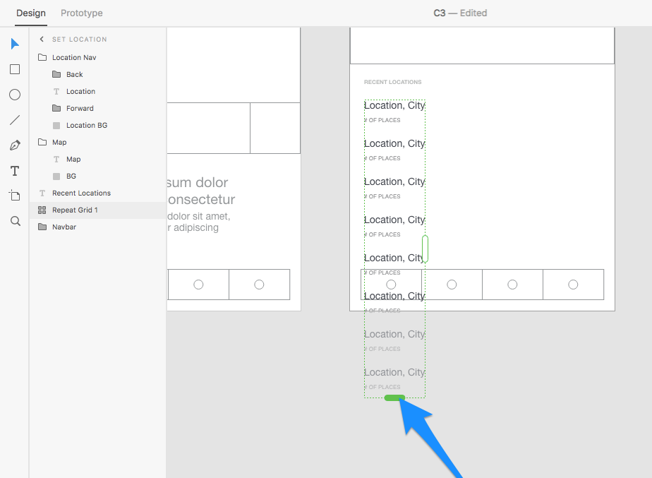
You’ll notice that this component now has two tuggable handles. Pull the right one to repeat the component horizontally, and the bottom one to repeat it vertically. In this case, we want to repeat it vertically, so move forward and do that. Note that it doesn’t matter if the content overflows the artboard; in fact, in the next chapter we’ll learn all about scrollable prototypes.
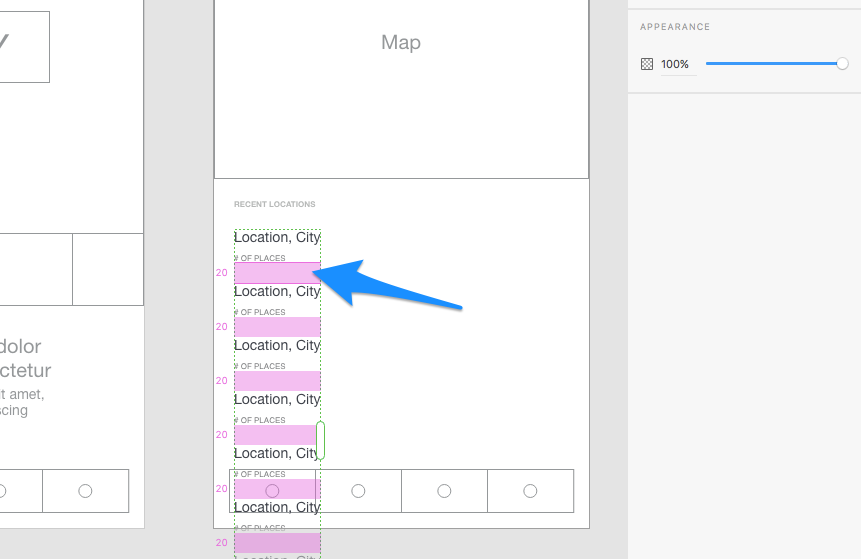
If you use the cursor to hover over the space in between the repeated objects, you’ll be able to click and drag that space to adjust it. Adjust the spacing to 20px (you’ll notice the spacing adjustment applies to all repeated objects).
Next: Prototyping User Flows and Receiving Feedback
In the next chapter we’ll take a look at the prototyping workspace, where we’ll learn how to create user flows and interactions. We’ll also learn how to share prototypes, accept comments on them, and even record user flows so we can make video demonstrations of how the prototype works.