Better Content Creation for the Web

Ask yourself, what is one of the first things visitors look for when they reach your website? Other than a friendly interface for optimum usability, it’s the content.
Content makes up the majority of your site so it is imperative that you pay attention when creating or redesigning your website.
Though you learn earlier on in your career as a designer that your design can make or break your website, it should be noted that poor content can be damaging as well. In today’s article you will learn what makes good content and how to make the most out of it.
What is Good Content?
http://www.akaru.fr/en/
Of course, the first thing we need to define is what exactly constitutes as your content.
Your content is in the simplest terms the visuals, texts and any audio which appears within your design. In a nutshell, content can be classified as most of the things you see when you click on a site. The words you are reading right now are content.
But what makes your content successful?
To be blunt, your content is going to be a lot more successful if you cut out all those bells and whistles. Trust me, it isn’t as necessary as you think.
The average person is going to care less about all your fancy parallax scrolling, jquery ajax and all that other stuff and care more about what you have to say.
This delivers the first rule of good content: keep it simple. You’re not writing a university paper. Don’t cram long, flowery sentences in when all the user wants to know is what you do, and how much is it.
Now that we have got that out of the way, let’s get to the meat of good, successful content.
Generally your content should lend itself to answer questions, guide the visitor through your site and hopefully converts them from visitor to customer and/or consumer by the end of their virtual trip.
If your website isn’t design to sell products or services, that’s ok, you can still follow these content creation guides. Just ensure your content is either informative and/or entertaining if your site leans in such a direction.
Content Should Be Built Around the Target Market
http://www.dreamconsultancy.com.au/
In order for your content to be good it needs to be successful. Typical successful content is developed around the target audience, answers questions and guides the visitor.
The first step to creating good content is to have a clear understanding of who your target audience is. You cannot simply slap information and visuals down without keeping your audience in mind.
You wouldn’t deliver content about clothing on a restaurant site would you? This is why research is important. Get statistical data on who generally visits the site and then couple that with the main objective or goal of the site.
When you have these two main areas defined you will be able to pull together a list of the content needed including a site map to plan out the architecture of said content.
Tip: Site visitors want to know within a few minutes of searching your site whether or not the site is for them i.e. built with them in mind. Quickly answering who your target market is, particularly on your homepage will let the visitor know whether or not they have come to the right place.
Successful Content Answers Questions
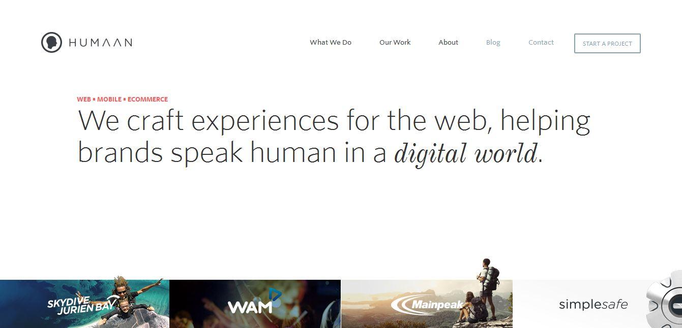
http://humaan.com/
Your content should always succinctly answer questions instead of just barraging information at the reader. Once again this is where you must take in consideration who you are marketing to.
You may not know exactly the questions your site visitors’ may have off the bat but monitoring their activity or simply requesting feedback will help you with that. If you are already attuned to your audience you just need to develop your answers to their primary concerns in terms of how your content is displayed.
In general your site’s content should be able to answer basic questions such as your mission statement , possible services, targeted demographic and the like.
If you are a design agency answer what makes you better than the competitor, what are your services and prices and how exactly do you operate. Any other online business should work the same way.
Tip: While you can have a page dedicated to answering questions such as FAQ pages, try to answer as many as you can on your homepage. If your design doesn’t lend itself to that formula then try to entice visitors by working a hard hitting answer into your tag line. Humaan’s site does this perfectly and you don’t even have to scroll down in order to see this.
Your Content Should Guide
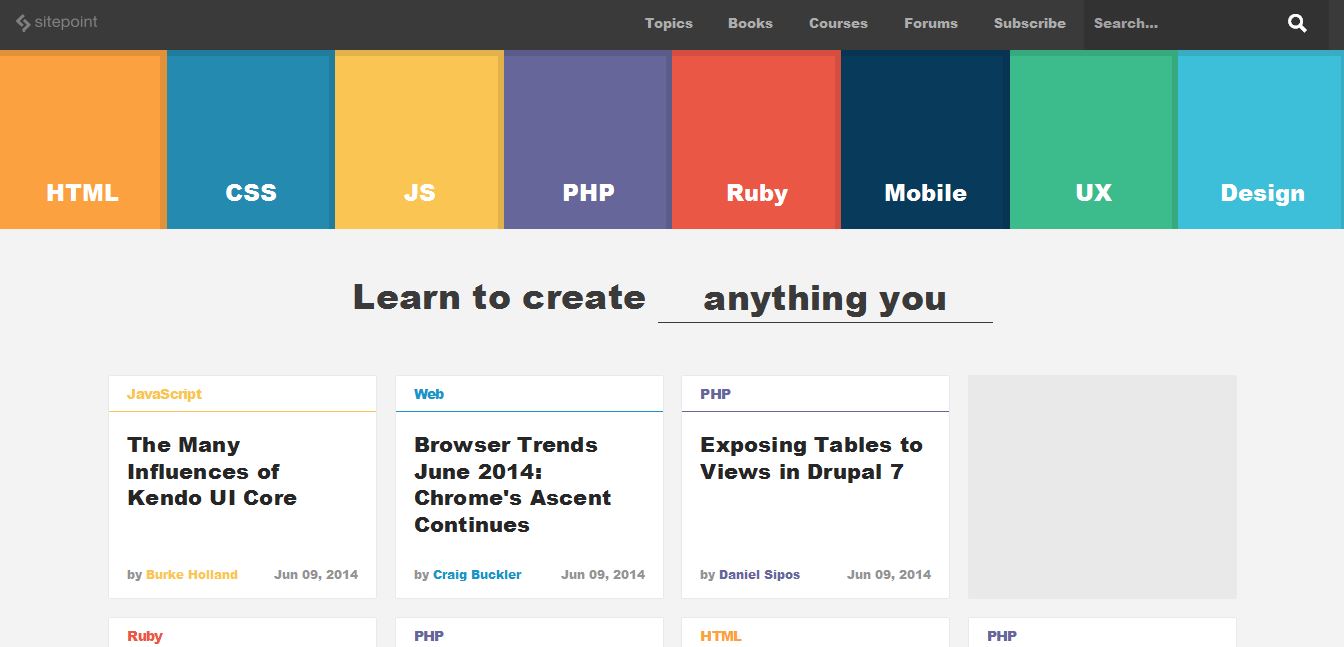
https://www.sitepoint.com/
Other than having research created content and answering those important questions you will also need to make sure that your content helps guide your visitors throughout the site to not only navigate it but to also move to action. It is best to remain subtle in such an area.
Too many call to actions may leave your visitor wary of your intentions so keeping your prompting less heavy handed is ideal. Each page should act as a guide from one page to another as to keep the visitor on track.
As you know successful landing pages achieve this by prompting some form of action which will often lead the visitor to another page. Try doing the same even if you may not have a sellable product.
Think about how product pages try to get you to register, buy or download something. Home pages encourage you to look further, contact pages direct you to fill out a form and so on and so forth. Keep to this formula.
Remember that you want your content to be engaging and prompts or guides are a good way to do this.
Tip: Arrows are great directional tools but you can also use connecting lines to drive the eye to the next portion of pertinent content. Using a gradation of color in buttons or boxes can also help with guiding. Think of how traffic lights do this.
Redefine Your Content
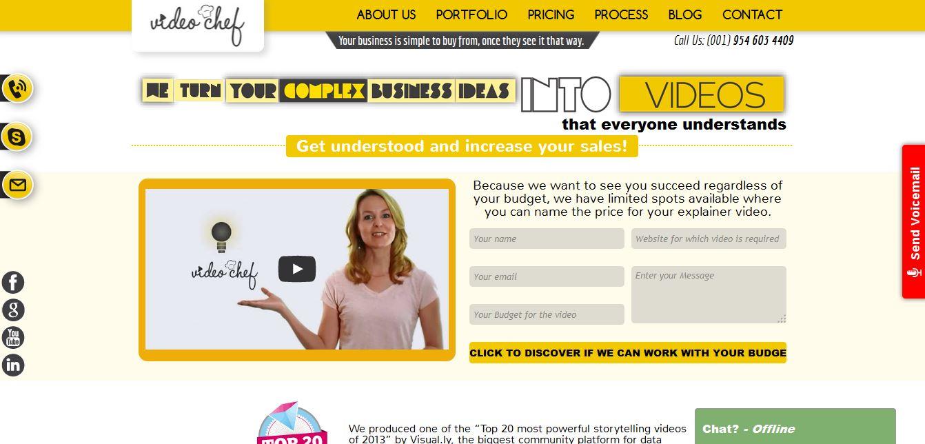
http://videochef.co/
Now that you know how to achieve successful content it is time to talk about how you can make your current content better. While written content is always effective you can make it a lot more engaging than simple text. If you are looking to reorganize and recreate your content you should consider visuals and videos.
With the popularity of Youtube, videos are now being used everywhere even in web design. Aside from websites that utilize videos for their backgrounds the increasingly popular “explainer” video has been making the rounds.
What is an explainer video?
It is simply a video, often animated, created with the sole purpose of explaining, generally a product or service. There are also many that include real life actors.
While not everyone has the skill to create or animate their own video there are agencies, studios and freelancers out there who provide such services. Explainer videos come in all different formats depending on your needs so you have the ability to create a complimenting video to match your website.
Visuals have always been a strong point when it comes to web design and as you can probably guess it is also a great solution when it comes repackaging your content.
Using icons is one way which you can make your content visually appealing but another sure fire way to attract attention is through the use of infographics. Infographics are visual representations of information and data with the use graphics and are generally used to deliver content quickly.
They, just like explainer videos, can be customized to match your site through the use of color and graphics.
Depending on your content and your market one content optimizing option may prove better than another. It is all about testing and getting feedback.
Tip: Before jumping into creating a video in lieu of your content you need to sit down and actually see what you have. Analyze your content and see if you can create a captivating script for it. If you can’t then you either don’t have enough content or the content just isn’t any good.
Let’s See it in Action
Now that you understand how to move in a direction to yield better site content let’s look at how to actually put it into action. Desk.com will serve as our real world example here.
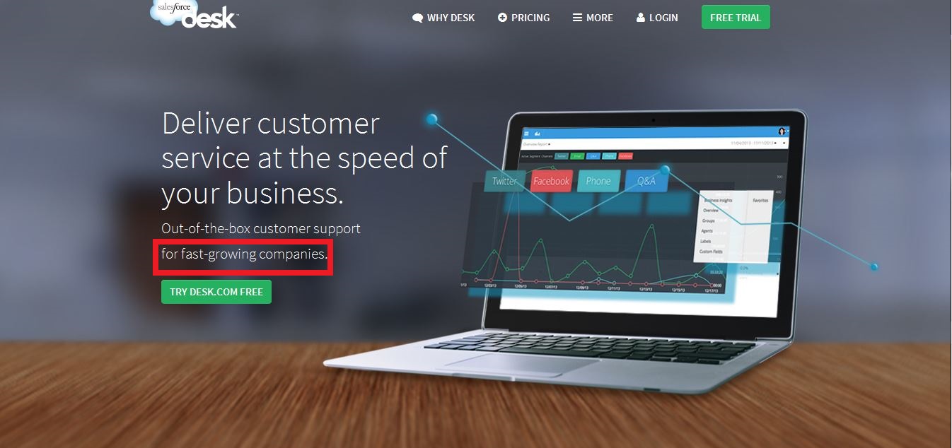
Content Around the Target Market
Desk doesn’t leave you guessing who their intended customers are.
I have highlighted their targeted market. Desk aims their products towards “fast growing companies”. While I am sure all companies with customer service support features are encouraged to use their product you can see that they have a specific niche that they really want to delve into.

Answer Those Questions
So you know that Desk is aimed towards those with businesses who are trying to make the most out of their customer service support.
But what does the service actually do? Luckily you don’t have to search too far to get your answers. If you scroll down just a bit you get a rundown on how exactly Desk will help you achieve better customer service.
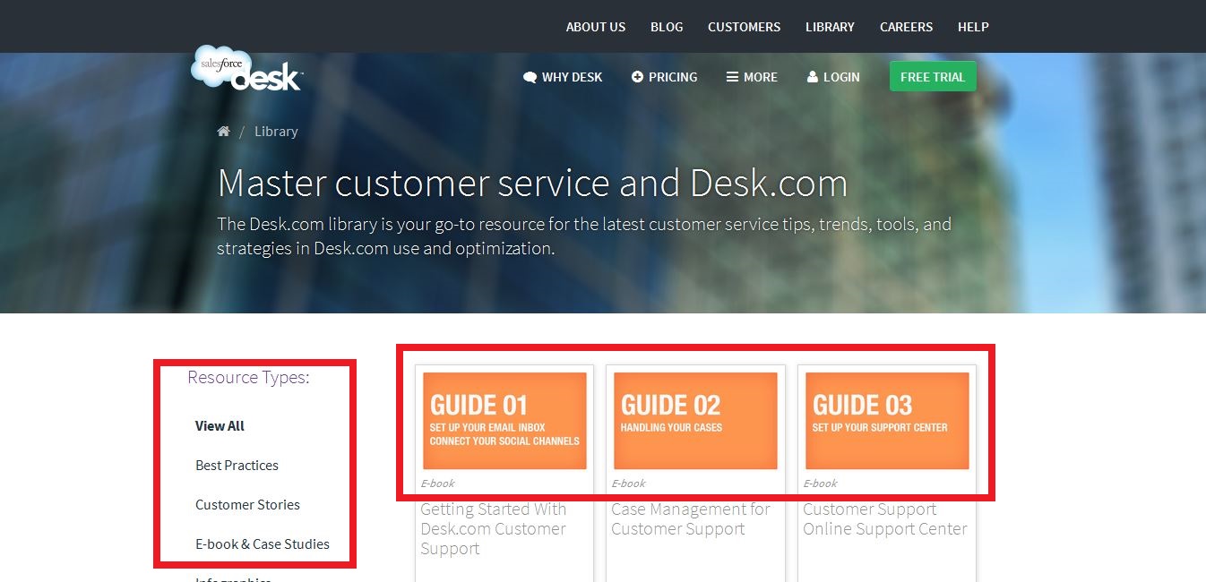
Guide Your Visitors
While Desk’s homepage is linear with their content in general, they take it one step further if you go to their library. There, they actually let you know they are guiding you by actually listing out the guides for you to be able to follow along and find what you’re looking for should you need it. The structuring of the content is also a nice touch with a seamless flow.
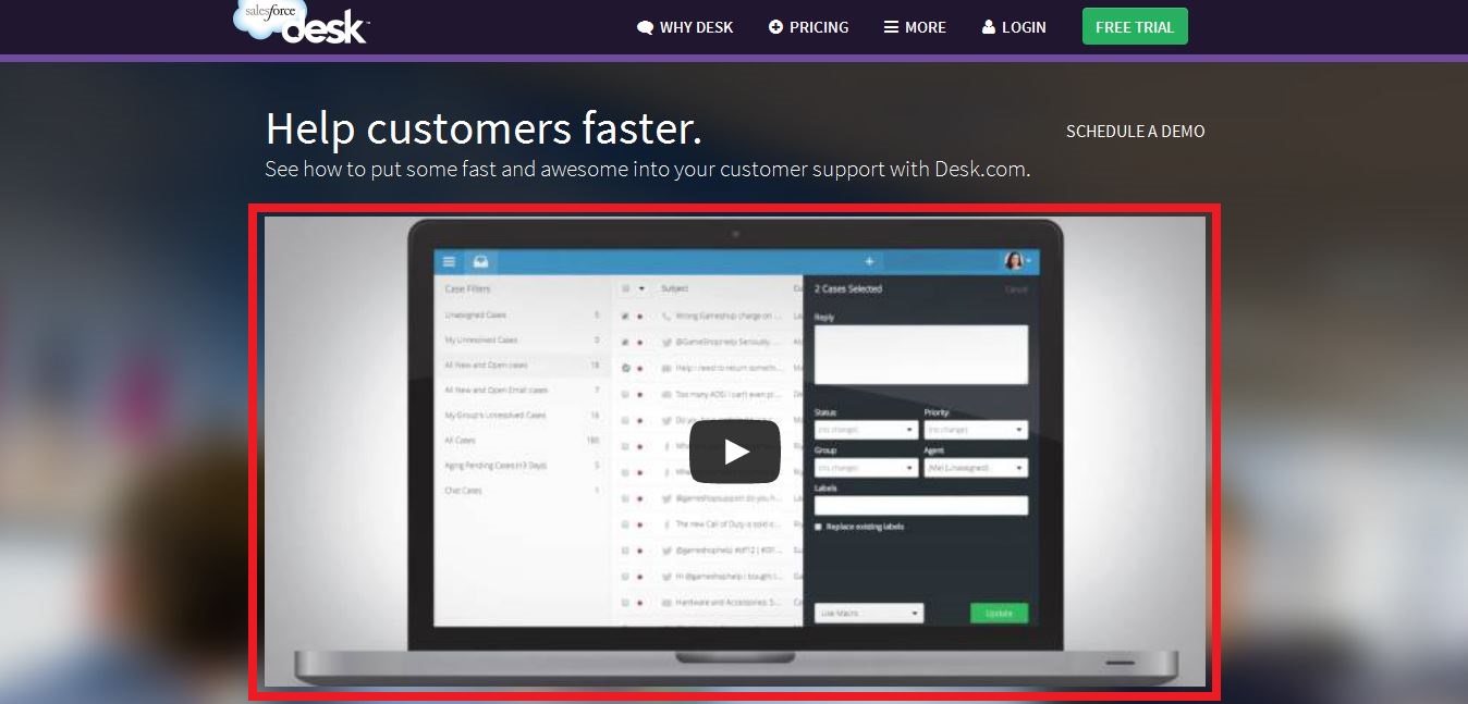
Redefine the Content
Desk keeps their overall website nice and clean so reformatting some of their content into a single video is a wise move. Not only does it keep the flow of the site’s design but keeps the site from being too content heavy for visitors. The video also helps to answer questions that potential customers may have before committing.
Conclusion
It’s easy to just slap together a few words and visuals and call your website done but it takes research and careful consideration to create truly successful content. If you find your target audience, answer questions and guide your visitors you are one step closer to better content creation.