SVG Tip: Create a Bold Vector Halftone Graphic in Under 2 Minutes

Dürer (Surprisingly, not the
guy from Nickleback.)
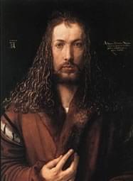
This is a section from a 500 year old woodcut from perhaps the ‘Andy Warhol of woodcut artists’ – Albrecht Dürer. Woodcut is an old printing technique where specialist blockcutters would hand engrave an image into a wooden block. Prints are then taken from the block.
Woodcuts are invariably bold and stark because – unlike most painting techniques – there are no mid-tone colors or blends. The paper is either clean white or drenched ink black – there are no gray areas.
However as you can see above, Dürer was able to mimic mid-tone grays by building up layers of fine linework. In his case, he used parallel fill lines, but it’s possible to get the same effect with cross-hatching, waves, ribbons, arcs, dots and other patterns.
Although it’s a very old technique, we still see it everywhere today – from tattoos to beer labels to bank notes. Most of us have admired the beautiful, wavy ribbon linework used on paper money, sometimes called ‘guilloché’.

It also turns out to be nicely suited to the mathematical precision of SVG – though hand rendering thousands of precision lines may be impractical for many of us. There are professional options available if you’re super-serious – Excentro is cool.
But if that’s overkill, let’s look at a simpler, more affordable solution.
How do I make a Halftone vector graphic?
HalftonePro is an online service that converts photos into ‘halftones‘ – what the printing industry calls these solid-color graphics.
Using this app is relatively simple but the results take some tuning.
-
IMAGE: Upload your photo. If this is your first time, jump to the ‘Preset’ menu at the bottom, as it will give you a feel for the app faster.
-
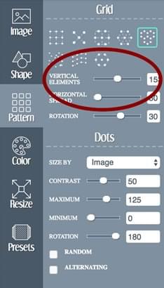
SHAPE: The ‘Shape’ menu lets you change the shape that makes up the image – circles, squares, lines, etc.
-
PATTERN: The ‘Pattern’ menu is where things get complex. You can choose the grid that your shape adhere to. While I’m not going to bore you by explaining all the sliders here, the ‘Vertical elements‘ slider is probably the most important. This sets the level of detail in your conversion. A setting of 25 is chunky – a setting of 150 is finely detailed. TIP: Don’t set Vertical elements higher than about 150 as you’ll be creating a HUGE SVG file and may even crash your browser.
-
COLORS: Pick your palette.
-
RESIZE: You can guess.
-
PRESETS: The dozen or so presets provided give you a good sense of what this app can do. You can also save your own custom presets here.
Tips for Making Good Halftones

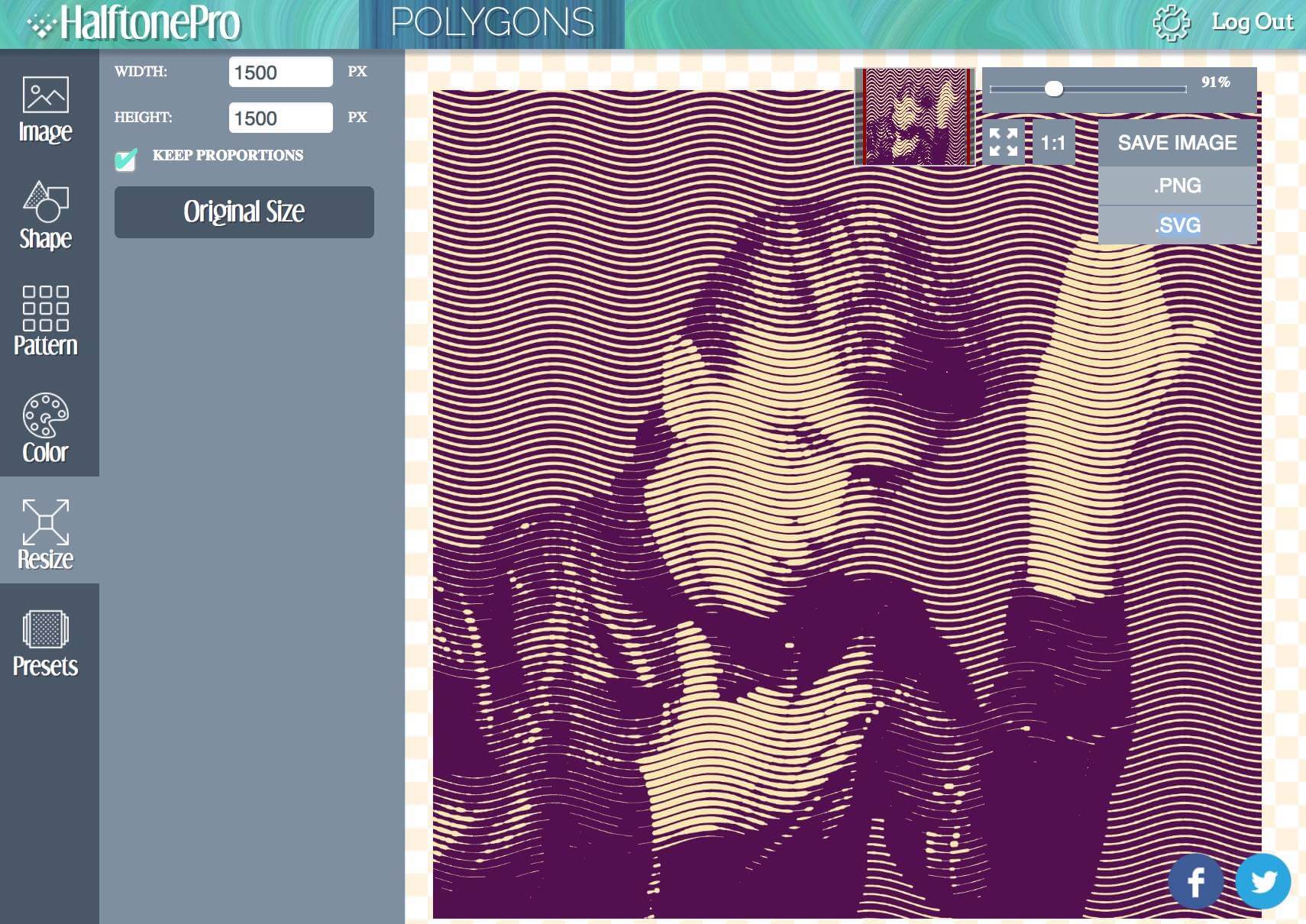
High contrast images are likely to work best. I uploaded this classic black and white Bowie shot as a test and used the default ‘Wave’ preset with a ‘Vertical elements’ setting of 150.
That means the new image has a lot of linework – the converted file was a 5MB SVG, but this came down to under 3MB when I ran it through Jake Archibald’s SVGOMG.
Some judicious use of Adobe Illustrator’s ‘Simplify’ function would likely trim this down to under a megabyte without much loss of fidelity.
Obviously, choosing a coarser grid (i.e. a lower ‘Vertical elements’ setting) in the conversion would slash the file size (and detail).
Whatever the final result, it’s a pretty interesting graphic.
Use Cases
Apart from SVG banners and feature illustrations, this app produces the kind of solid-color, non-overlapping artwork that works well in:
- t-shirt designs
- fabric prints
- art prints
- labels & packaging
- CNC cake designs
- tattoo designs
What does it cost?
- On the upside, the basic Halftone Pro service is free to use.
- On the downside, if you want to download an SVG (which we do) rather than a PNG, you’ll need to pay.
- On the upside, HalftonePro is a one-off $15 payment – rather than the more typical recurring monthly subscription.
All up, that’s not a bad deal IHMO.
Caveat
One little glitch. I’ve paid for the ‘pro’ version but it sometimes takes me 3-4 clicks on the ‘Download > SVG’ to initiate the download. Not sure if this is something about my set-up, but keep it in mind.
The Bottom Line?
I like it. You’ll probably have to play around for a while to get a feel for it. It will likely be wise to manually optimize the SVG if you plan to use it online – there are a lot of repeated properties. Find and replace is your friend.
And make no mistake: This is no true replacement for an artisan painstakingly hand-cutting every line, dot, and curve into a piece over days of work.
Nevertheless, it’s a good starting place to develop a versatile, crisp and scalable design element in a couple of minutes – for a reasonable price too.


