Introducing Portfolio WordPress Theme – and the Design Decisions Behind it

If you’d like to learn more about custom theme development, check out the SitePoint Premium course WordPress Theme Development!
As you may have noticed, SitePoint now offers our own range of premium WordPress Themes. Our newest and – we think – most attractive theme is called ‘Portfolio’. We worked closely with a very talented designer – Shahadat from DroitLab – to try to create the ideal platform for designers, writers, artists, and even front-end coders to showcase their talents. The brief was ‘crisp, open and minimalist’.
I thought it might be useful to break down the key design decisions that drove it.
1). Choosing the Typography: Raleway and Open Sans Regular
Typography choices are always loaded. Arguably no other design decision will be so totally pervasive to the feel of a design, yet also strangely invisible to the user. The may read thousands of words a day on Facebook, yet ask the average user to describe the font used, and they’ll most likely blink and shrug.
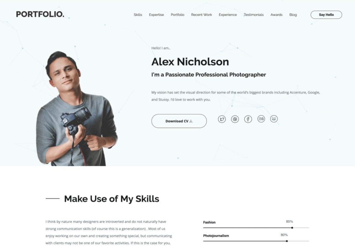
SitePoint WordPress Portfolio Theme screenshot
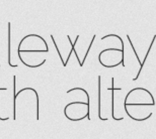
For the headings in Portfolio, we picked perhaps my favorite sans-serif font available in the Google catalog – Raleway, Matt McInerney’s profoundly elegant creation.
Why do I like it so much? Check out that ‘W’!
Raleway has the look of flexed and machined steel – the kind of lettering you see on 1930-40’s era post offices, schools, and public buildings. It’s always razor sharp but not aggressive.
Open Sans Regular was a nice match for the body type. It’s more versatile than Raleway but shares a lot of neo-grotesque qualities – minus some of the distinctive mid-century flourishes (like the ‘w’). They share space on the same page together easily.
2). Selecting Imagery
Our typography pointed the direction towards the iconography we selected. Both Raleway and Open Sans Regular use a light, single weight line – almost like they’re crafted from fencing wire.
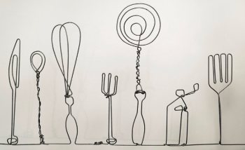
Handmade wireframe imagery – Madebyjoel.com
I’ve seen real-world fencing wire sculptures – this raw piece from MadeByJoel.com is brilliant – so we wanted to continue the ‘wirework look’ for the icons, assembling a combination of linear icons – about 50 all up. As no single icon set had what we wanted, we curated a new icon library from a number of sources including:
- Linear Icons
- Et Icons
- Custom hand-drawn icons
![]()
They’re all in crisp SVG, so they work fine at almost any scale from icon to feature illustration.
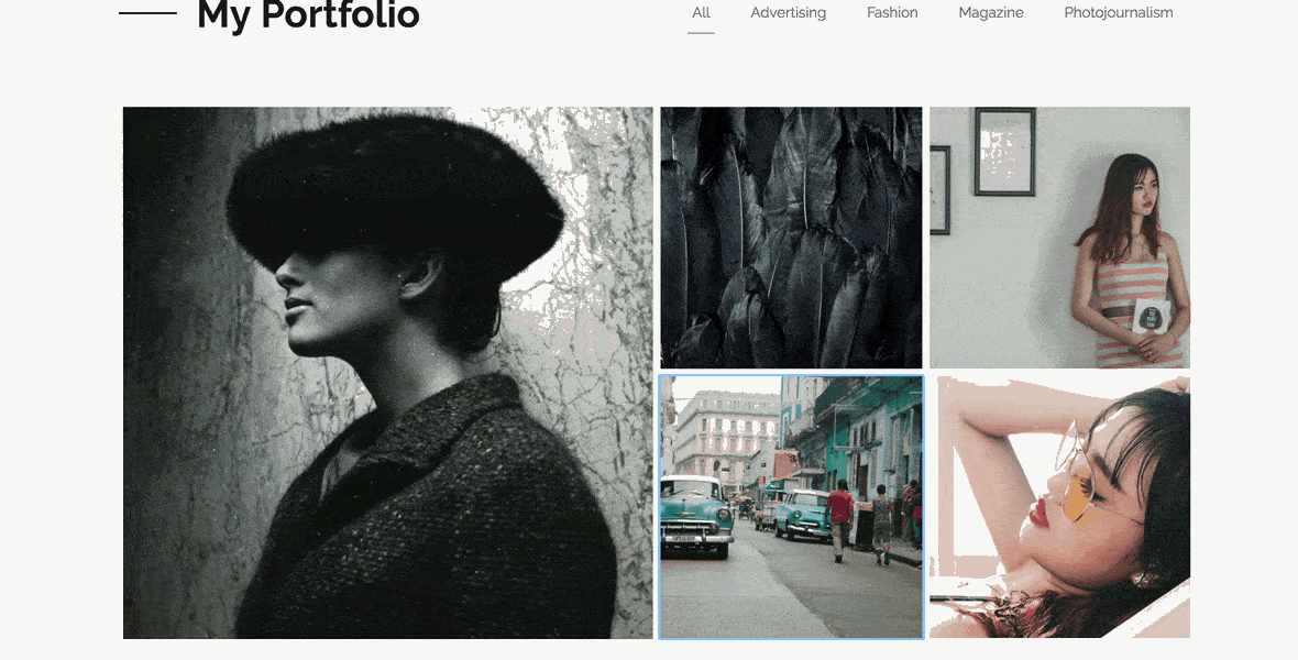
3). The Gallery View
Showing off your work to its best effect is always going to be super important in a portfolio site. We focused the gallery on showcasing collections of visuals in a square-tiled gallery layout before opening each unit into a magazine-like modal. You can filter your images by category or browse them all as an open collection.
4). Particle Geometry Effects
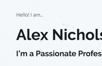
While we wanted the hero area to remain open and uncluttered, we thought a subtle touch of the unexpected wouldn’t be out of place in such an important panel. The particle effect we implemented here fits the bill nicely. It’s calming yet charming.
The floating nodes and linking vectors hint at the theme of idea generation and connections – a relevant skill for designers, writers, and coders. It adds texture and depth to design but doesn’t demand your attention over more important page elements – in this case, you. And that’s a good thing.
The particle effect is rendered in lightweight JavaScript and canvas making it fast to load and run, and scalable to any space. We’re looking at methods that will allow you to craft your own signature particle effect.
The Wrap Up
So, that’s a snapshot of the design thinking behind this project. I think Portfolio is our best work so far, and I’m looking forward to working with Shahadat again soon.
Check it out and let us know what you think.


