How to Get Started with Vuetify

In this article, you will learn how to build an attractive and interactive frontend quickly using Vuetify. Building a friendly application interface with a great user experience is a skill that requires practice and knowledge. While Vuetify won’t make you a skilled UX practitioner overnight, it will help provide a solid start to those who are new in this area.
As a Vue.js developer, there are many fully-featured CSS frameworks specifically developed for Vue that you can take advantage of. One great example is Bootstrap-Vue. I have used it and and it does really make building components easier than just using traditional CSS frameworks. However, you may want to give your apps a Material Design look and feel to make it familiar to new users.
According to the makers of Material Design:
“Material Design isn’t a single style. It’s an adaptable design system inspired by paper and ink. And engineered so you can build beautiful, usable products faster.”
I hope I now have your attention with that powerful statement. Currently, Vuetify is the most complete user interface component library for Vue applications that follows the Google Material Design specs. Let’s quickly dive in and look at how you can get started.
Prerequisites
This guide is written for developers who have intermediate or advanced knowledge of Vue.js. If you have never used Vue.js to build applications, please check out these articles:
- Jump Start Vue, our complete introduction to Vue.js
- Getting Started with Vue.js — a quick primer
- Getting up and Running with the Vue.js 2.0 Framework
What is Vuetify?
Vuetify is an open source MIT project for building user interfaces for web and mobile applications. It is a project that is backed by sponsors and volunteers from the Vue community. The project is supported by a vibrant Discord community forum where you can ask JavaScript questions — even if they’re not about Vuetify. The development team is committed to fixing bugs and providing enhancements through consistent update cycles. There are also weekly patches to fix issues that the community raises.
Most open-source frontend libraries don’t get this level of attention. So you can be confident that when you start using Vuetify in your projects, you won’t be left hanging without support in the future. Vuetify supports all major browsers out of the box. Older browsers such as IE11 and Safari 9 can work too but will require babel-polyfill. Anything older than that is not supported. Vuetify is built to be semantic. This means that every component and prop name you learn will be easy to remember and re-use without frequently checking the documentation.
Vuetify also comes with free/premium themes and pre-made layouts you can use to quickly theme your application. At the time of writing, Vuetify v1.5.13 is the current version, which utilizes Material Design Spec v1. Version 2.x of Vuetify will utilize Material Design Spec v2 which will soon be made available. Let’s go over to the next section to see a couple of ways we can install Vuetify into our projects.
Installing Vuetify
If you already have an existing Vue project that was created with an older version of Vue CLI tool or some other way, you can simply install Vuetify as follows:
npm install vuetify
Update your index.js or main.js and include the following code:
import Vue from "vue";
import Vuetify from "vuetify";
import "vuetify/dist/vuetify.min.css";

Vue.use(Vuetify);
You’ll also need to install Material Icons, which you can include as a link tag in your index.html file:
<head>
  <link href='https://fonts.googleapis.com/css?family=Roboto:100,300,400,500,700,900|Material+Icons' rel="stylesheet">
</head
If you are starting a new project, installing Vuetify is very easy. Just follow these steps:
$ vue create vuetify-demo
>
$ cd vuetify-demo
$ vue add vuetify
$ ? Choose a preset: (Use arrow keys)
$ > Default (recommended)
$   Prototype (rapid development)
$   Configure (advanced)
When asked for a preset, just choose Default, which represents the a la carte system. Basically, this means when you build your application for deployment, only the used Vuetify components will get bundled, not the entire Vuetify library. This will help in drastically lowering your build size. You can also use Vue UI to install Vuetify in your project. Now that Vuetify is installed, let’s start using it.
The Basics
Right after adding Vuetify to our project, you will notice quite a number of changes to our project structure and code. Of importance to us now is App.vue.
<template>
<v-app>
<v-toolbar app dark class="indigo">
<v-toolbar-title class="headline text-uppercase">
<span>Vuetify </span>
<span class="font-weight-light">MATERIAL DESIGN</span>
</v-toolbar-title>
<v-spacer></v-spacer>
<v-btn
flat
href="https://github.com/vuetifyjs/vuetify/releases/latest"
target="_blank"
>
<span class="mr-2">Latest Release</span>
</v-btn>
</v-toolbar>
<v-content>
<HelloWorld />
</v-content>
</v-app>
</template>
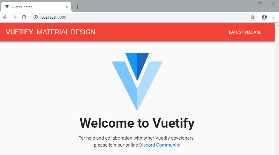
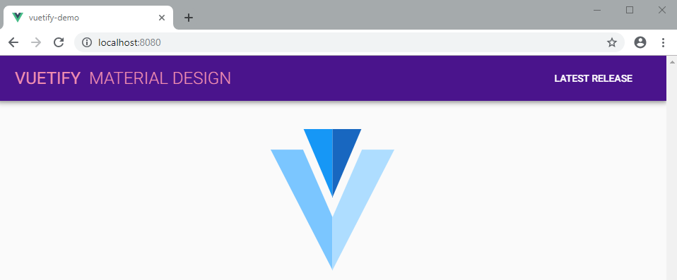
If you start the server and open localhost:8080, you should have the following view:
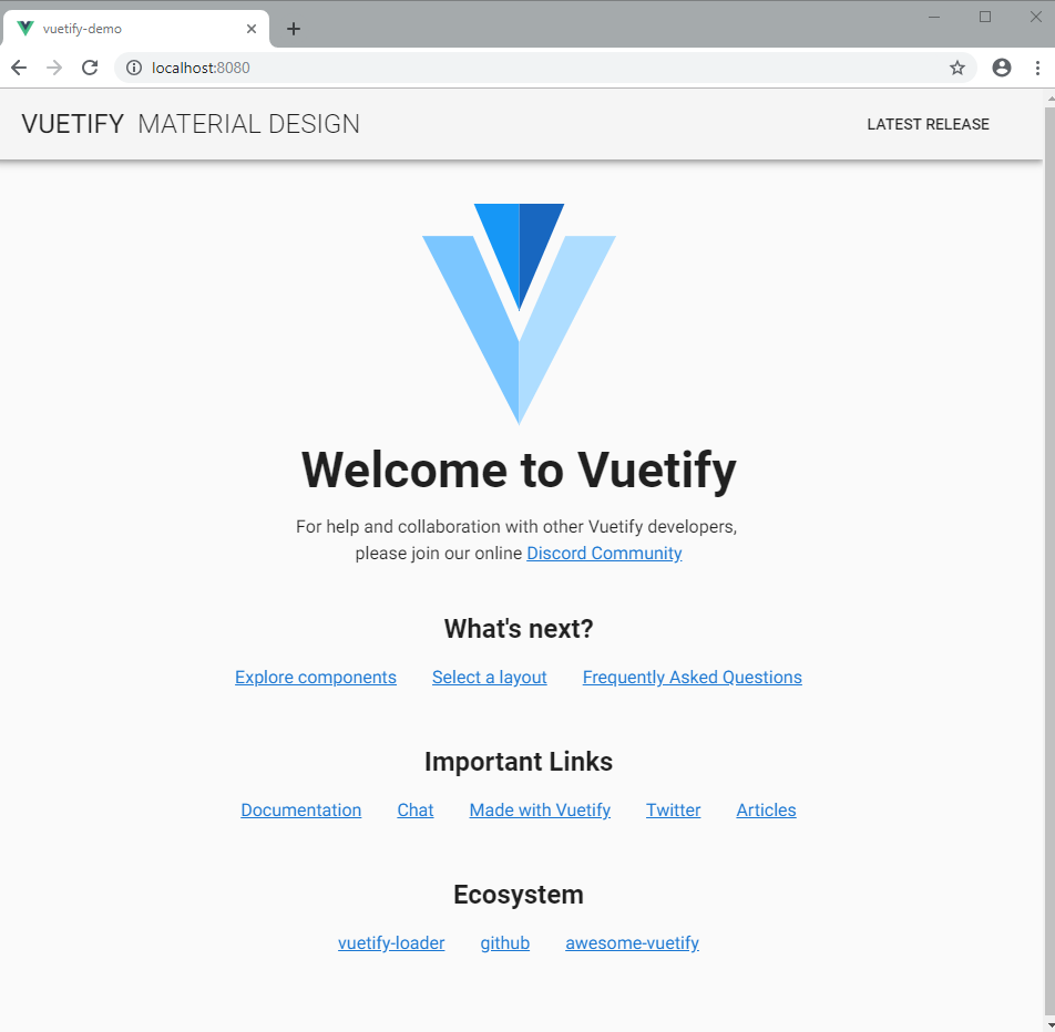
Notice how different the page looks now from the default starter page that is usually created with the Vue CLI create app command. This means Vuetify has been set up correctly. Let’s break down the Vuetify code, starting with this component:
<v-app>
  <!-- put content here.... -->
</v-app>
The v-app component is a mandatory wrapper required for your application to work properly. It is used to determine grid breakpoints for the layout. It can exist anywhere inside the <body>, but must be a parent of all Vuetify components. The v-content component must be a direct descendant of v-app.
The next component that we will discuss is v-toolbar. This can be used as the primary toolbar for your application. You can place icons, menus and other items inside it.
<v-app>
  <v-toolbar app>
    <!-- put content here.... -->
  </v-toolbar>
</v-app>
The first prop you’ll come across is app. This simply tells the toolbar to stick to the top when the user starts scrolling down. If you remove the app prop, the toolbar will scroll away with the rest of the page. Try it yourself and see what happens. We can further add more props to customize the appearance of our toolbar.
One thing you’ll come to realize with Vuetify is that you will hardly need to write any CSS code to customize the appearance of your app. However, if you want your application to support multiple themes, then you may need to define multiple stylesheets. Vuetify does provide a theme generator to help you pick a set of colors for your theme.
For now, let’s focus on customizing our app using props. The first one we are going to learn is called dark. Just update your code as follows:
<v-app>
  <v-toolbar app dark>
    <!-- put content here.... -->
  </v-toolbar>
</v-app>
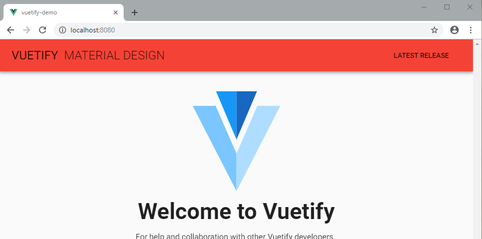
Your browser page should update as follows:
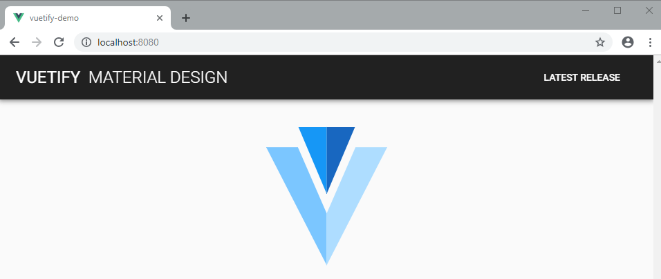
The dark prop simply changes the background to black and the text to white. Let’s use another prop called color:
<v-app>
  <v-toolbar app dark color="red">
    <!-- put content here.... -->
  </v-toolbar>
</v-app>
As expected, your browser page should update as follows:
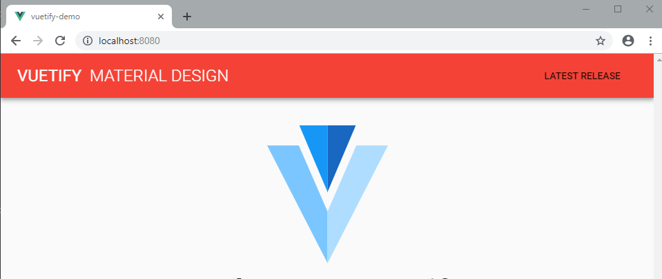
Remove the dark prop and see what happens:
So what just happened? The text went back to the default color black. When you specify the color prop, it overrides the background color that was defined by the dark prop. To make the text white again, you can re-add the dark prop, or you can simply do this:
<v-app>
  <v-toolbar app color="red white--text">
    <!-- put content here.... -->
  </v-toolbar>
</v-app>
Your browser page should update as follows:
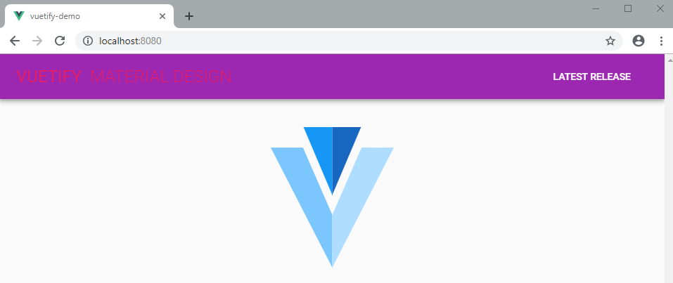
The text font color has changed to white, but the button component color has remain unchanged. You can add the prop dark or color="white--text to the button component to make it white. Instead of using the prop color, you can also use class and it will give you the same result. As rule of thumb, any color you specify on its own becomes the background color. To specify the font color, you need to append --text to the color name. Feel free to use any color that is not white or red — try orange, blue, green, etc. Let’s do something cool in the next step. Update the toolbar code as follows:
<v-app>
  <v-toolbar app dark color="purple pink--text">
    <!-- put content here.... -->
  </v-toolbar>
</v-app>
Your browser page should update as follows:
The text is not very legible, is it? One way of fixing that is by using colors that contrast each other. Another way we can fix it is to darken the background and lighten the foreground. Update the code as follows:
<v-app>
  <v-toolbar app dark color="purple darken-4 pink--text text--lighten-3">
    <!-- put content here.... -->
  </v-toolbar>
</v-app>
Your browser page should update as follows:
The text is much more legible now. To darken the background, you can use the values from darken-1 to darken-4. Each level increases the darkness. You can use values from lighten-1 to lighten-4 to lighten the background. If you want to change the text color, add text-- in front of the lighten or darken attributes — e.g. text--lighten-3. We also have accent-1 to accent-4 which seems to control saturation. accent-1 desaturates the color while accent-4 increases saturation and becomes more vivid.
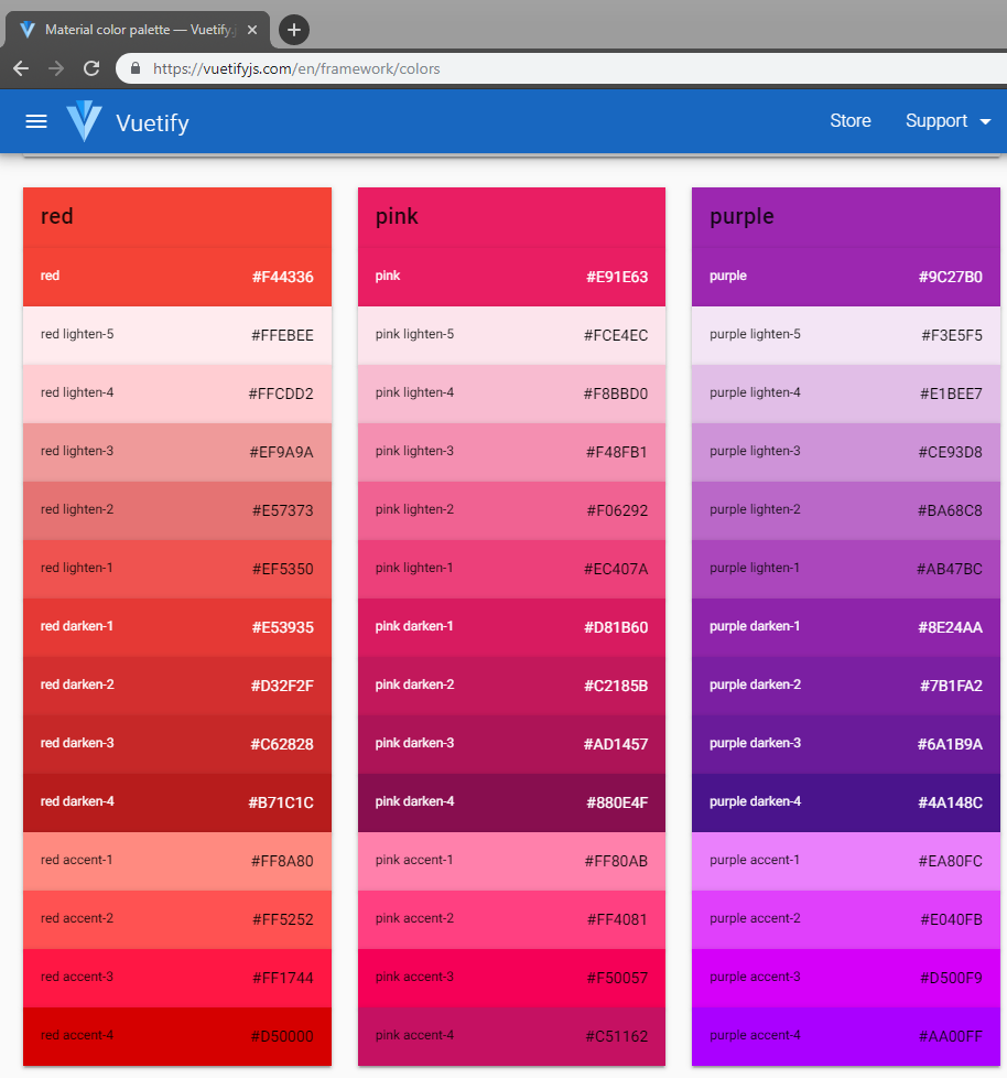
Please note am not pulling these props and values from thin air. Here is the documentation for Vuetify colors.
Do not bother memorizing names of props or classes. Simply visit the Vuetify documentation and you’ll find what you are looking for. Here is the documentation for v-toolbar. Notice there are so many props we haven’t tried out, such as:
heightlightcarddense
Feel free to have fun with them all. See what they do. Please note that majority of Vuetify components share the same props such as color. Next, let’s briefly look at the grid system.
The Grid System
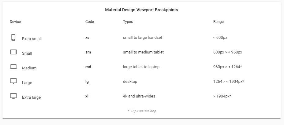
Vuetify uses a 12 point grid system to lay out an application’s content. It’s built using the CSS Flexbox Layout Module, which is a system for distributing items in a responsive layout structure without using floats or positions. The grid supports 5 media breakpoints targeting specific screen sizes or orientations.
For a practical demonstration, head over to components/HelloWorld.vue and take a look at the file. Below is a simplified version of the code:
<template>
  <v-container>
    <v-layout text-xs-center wrap>
      <v-flex xs12>
        <v-img
          :src="require('../assets/logo.svg')"
          class="my-3"
          contain
          height="200"
        ></v-img>
      </v-flex>

      <v-flex mb-4>
        <h1 class="display-2 font-weight-bold mb-3">Welcome to Vuetify</h1>
        <p class="subheading font-weight-regular">
          For help and collaboration with other Vuetify developers,
          <br />please join our online
          <a href="https://community.vuetifyjs.com" target="_blank"
            >Discord Community</a
          >
        </p>
      </v-flex>

      <v-flex mb-5 xs12>
        <h2 class="headline font-weight-bold mb-3">What's next?</h2>
        <v-layout justify-center>
          <a href="#" class="subheading mx-3">Explore Components</a>
          <a href="#" class="subheading mx-3">Select a layout</a>
          <a href="#" class="subheading mx-3">F.A.Q</a>
        </v-layout>
      </v-flex>
    </v-layout>
  </v-container>
</template>
The v-container component simply centers your content in the middle of the screen. If you add the fluid prop, your content will occupy the full width of the screen. v-layout is used to group content and align it. There’s a live demo of v-layout that’ll help you understand how it can be used. The v-flex component is basically a box of content that can occupy one or more columns.
We won’t go into detail on the Vuetify grid — it’s a topic that deserves its own article. If you are new to grids, you can check out our article, Introduction to CSS Grid Layout Modules. Otherwise, simply scroll down to the next section and learn how to setup routing and navigation in Vuetify.
Routing and Navigation
During installation, there is an option for installing the router package. If you did this, then you should have some files in the views folder. Confirm that the file router.js exists and has been set up correctly. Vuetify was built with vue-router in mind. Hence you will find that you don’t need to use the router-link component. A number of Vuetify components can act as route links by simply specifying the to prop.
Replace the code in App.vue with the following:
<template>
  <v-app>
    <!-- Start of Navigation -->
    <nav>
      <!-- Start of app toolbar -->
      <v-toolbar app>
        <v-toolbar-side-icon
          @click.stop="drawer = !drawer"
          class="hidden-md-and-up"
        ></v-toolbar-side-icon>
        <v-toolbar-title class="headline text-uppercase"
          >Vuetify Demo</v-toolbar-title
        >
        <v-spacer></v-spacer>
        <v-toolbar-items class="hidden-sm-and-down">
          <v-btn flat to="/" exact>Home</v-btn>
          <v-btn flat to="/about">About</v-btn>
        </v-toolbar-items>
      </v-toolbar>
      <!-- End of app toolbar -->

      <!-- Start of mobile side menu -->
      <v-navigation-drawer app v-model="drawer" right>
        <!-- Menu title -->
        <v-toolbar flat>
          <v-list>
            <v-list-tile>
              <v-list-tile-title class="title">Menu</v-list-tile-title>
            </v-list-tile>
          </v-list>
        </v-toolbar>
        <v-divider></v-divider>
        <!-- Menu Links -->
        <v-list>
          <v-list-tile to="/" exact>
            <v-list-tile-action>
              <v-icon>home</v-icon>
            </v-list-tile-action>
            <v-list-tile-content>Home</v-list-tile-content>
          </v-list-tile>
          <v-list-tile to="/about">
            <v-list-tile-action>
              <v-icon>description</v-icon>
            </v-list-tile-action>
            <v-list-tile-content>About</v-list-tile-content>
          </v-list-tile>
        </v-list>
      </v-navigation-drawer>
      <!-- End of mobile side menu -->
    </nav>
    <!-- End of Navigation -->

    <v-content>
      <!-- Display view pages here based on route -->
      <router-view></router-view>
    </v-content>
  </v-app>
</template>

<script>
  export default {
    name: "App",
    data() {
      return {
        drawer: false // Hide mobile side menu by default
      };
    }
  };
</script>
I’ve put comments in the code so that you can follow along. It would be wise to put menu items into an array data structure. However, for simplicity, I have left the code duplication intact so that you can understand the structure of Vuetify components easily. Below are links to documentations for some of the components we’ve just used:
In case you haven’t noticed, Vuetify automatically added a link to Material Icons in index.html. You can start accessing Material Icons right away. Next, replace the code in views/Home.vue with:
<template>
  <v-container>
    <v-layout>
      <h1>Home page</h1>
    </v-layout>
  </v-container>
</template>
Also, replace the code in views/About.vue with:
<template>
  <v-container>
    <v-layout>
      <v-flex xs12>
        <h1 class="display-1">About Page</h1>
        <p>
          Lorem ipsum dolor, sit amet consectetur adipisicing elit. Excepturi
          obcaecati tempora sunt debitis, minima deleniti ex inventore
          laboriosam at animi praesentium, quaerat corrupti molestiae recusandae
          corporis necessitatibus vitae, nam saepe?
        </p>
      </v-flex>
    </v-layout>
  </v-container>
</template>
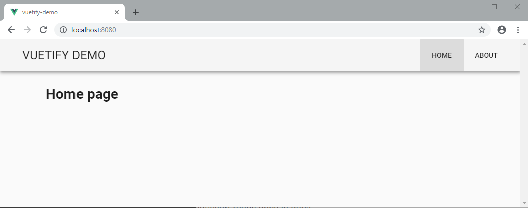
After making the above changes, your browser should automatically update. Here’s how the app should look like in full desktop view:
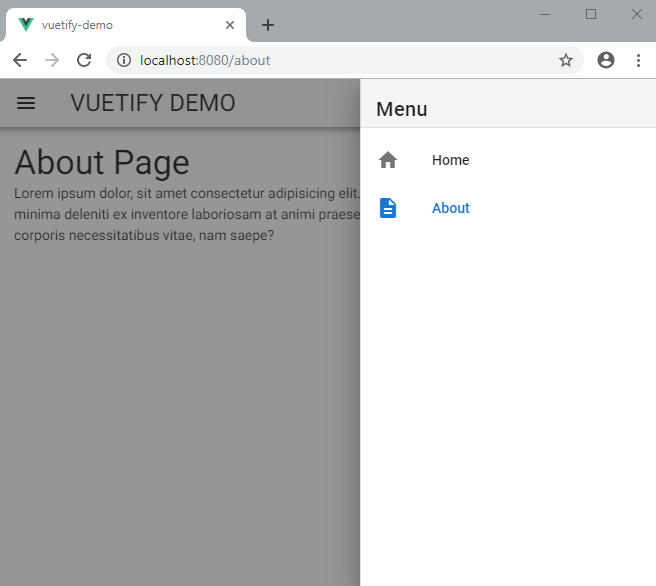
When you resize the browser, the app should switch to the mobile view. This is how it should look with the side menu open:
I think it’s pretty incredible how we’ve built an attractive responsive web app with not many lines of code. Let’s finish up by building a LoginForm component in the next section.
Building the Login Form
Building the Login form is pretty straight forward. Create the file components/Login.vue and copy the following code:
<template>
  <v-layout align-center justify-center>
    <v-flex xs12 sm8 md4>
      <v-card class="elevation-12">
        <v-toolbar dark color="purple">
          <v-toolbar-title>Login Form</v-toolbar-title>
        </v-toolbar>
        <v-card-text>
          <v-form>
            <v-text-field
              prepend-icon="person"
              name="login"
              label="Login"
              id="login"
              type="text"
            ></v-text-field>
            <v-text-field
              prepend-icon="lock"
              name="password"
              label="Password"
              id="password"
              type="password"
            ></v-text-field>
          </v-form>
        </v-card-text>
        <v-card-actions>
          <v-spacer></v-spacer>
          <v-btn dark color="pink">Login</v-btn>
        </v-card-actions>
      </v-card>
    </v-flex>
  </v-layout>
</template>
I’ve used the following components to build the login screen:
Do take a look at each component’s documentation to see what else you can customize about them. Next update views/Home.vue as follows:
<template>
  <v-container>
    <v-layout>
      <h1>Home page</h1>
    </v-layout>
    <Login class="mt-5" />
  </v-container>
</template>

<script>
  import Login from "../components/Login";

  export default {
    components: {
      Login
    }
  };
</script>
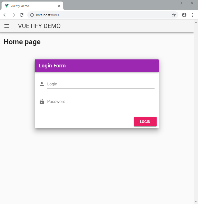
If you are wondering what the class mt-5 means, it simply adds a margin-top of 48px. Check out the documentation for spacing to understand how it works in Vuetify. You can easily add preset margins and paddings in any direction on your content by specifying classes. Your home page should now display the following:
Summary
Now that you’ve come to the end of this introductory article, you should know that we’ve only scratched the surface. If you have previous experience using other CSS frameworks such as Bootstrap, you’ll find Vuetify very easy to use. In fact, you’ll find that Vuetify has a many more useful features and components than most popular CSS frameworks. If you are looking to build a web application with a completely custom look, Vuetify may not be right for you. Vuetify is for those who want to rapidly build a web interface using a design that is familiar to most people. Material Design is a popular system that has been implemented in every Android device that doesn’t come with a custom skin installed.
Vuetify can help you save time and money by using a highly researched frontend design. You don’t have to spend a lot time creating your own design language. You don’t even have to write CSS, other than declaring the default colors for your application theme.
I hope you enjoyed learning Vuetify, and that it’lll be your go to UI framework for building Vue.js applications in the future!