How to Speed Up Your UX with Skeleton Screens

Want to learn UX from the ground up? Get an entire collection of UX books covering fundamentals, projects, tips and tools & more with SitePoint Premium. Join now for just $14.99/month.
However well-designed your user interface may be, at some point or other, the people using it are going to have to wait for something to load.

Photo: Marco Giumelli, “Waiting”
A 2014 MIT study showed that humans can perceive discrete images in as little as 13 milliseconds however deciding where to focus takes between 100 and 140 milliseconds. In practical terms, this gives us around 200 milliseconds to present a user interface state change in order to appear instant.
Between 200 milliseconds and 1 second, people feel they are within the flow of their actions. After 1 second without any other feedback, focus starts to shift. Beyond 10 seconds, user focus is likely to be lost entirely.
To make people happy, we need to give an indication that something is happening. This leaves us with three basic options:
- progress bar if we can measure the duration;
- spinner if we can’t; and
- nothing at all.
Psychological studies into progress indicators show that our interpretation of them is anything but linear. Our method of processing a delay doesn’t match up with reality.
Understanding this concept leads us into the realm of manipulating interfaces in order to improve perception.
In software design, skeleton screens provide an alternative to the traditional methods. Rather than show an abstract widget, skeleton screens create anticipation of what is to come and reduce cognitive load.
Skeleton Screens in the Wild
Apple have incorporated skeleton screens into their iOS Human Interface Guidelines under the name “launch images”. Apple’s guidelines recommend showing an outline of the initial application screen excluding text and any elements that may change.
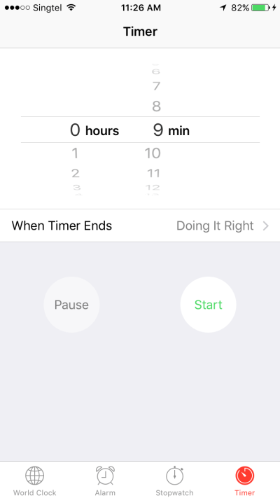
Apple’s Clock
Apple’s Clock is a classic example of a skeleton screen. The launch screen sets the expectation of what the app will look like and creates an impression of the app loading faster than it actually does.
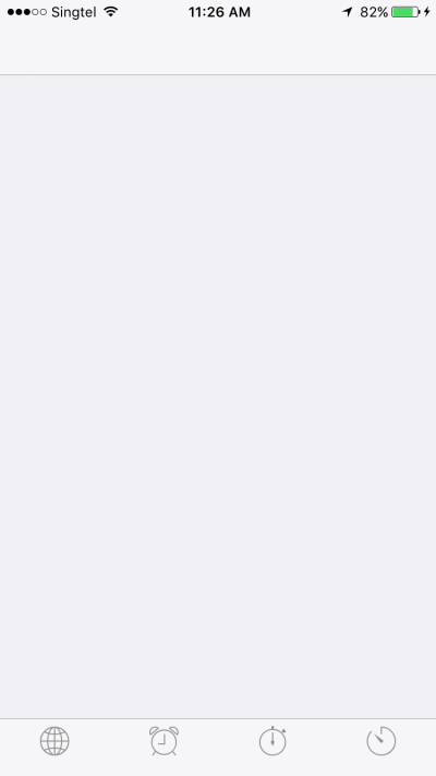
This launch screen shows the basic outline of the app and the four icons at the base of the screen.
Once launched, all the text and variable UI elements are filled in.
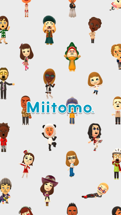
Nintendo
Nintendo has recently launched their first mobile application, which pays absolutely no attention to UI guidelines or common decency.
The initial launch screen shows the title of the app and a background image none of which reflect the application’s use.
After launch, a load screen first has a “Loading” text indicator as a minimalist spinner.

Then you get a numeric progress indicator.

And that’s followed by another spinner.

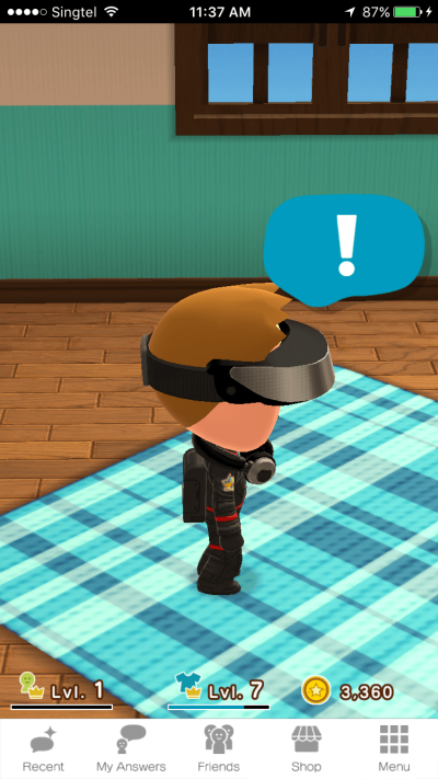
Finally, the application itself appears.
Over an incredible 14 second load time, Nintendo use two spinners and one progress bar, none of which do much to ease the load time. The dynamic “tips” during the load screen also act as a spinner by changing the UI state and creating a sense of progress.
Each discrete screen requires a new visual scan and makes the launch process seem even slower than it actually is.
While Nintendo gets it very wrong, Facebook gets it very right. Their initial launch screen follows Apple’s guidelines.

Having met the goal of the initial guidelines, Facebook now populates more of the screen with the header, footer and placeholder images in the body. Because the time taken to load the final content is unknown, there’s also a subtle animation on this screen in place of a spinner.
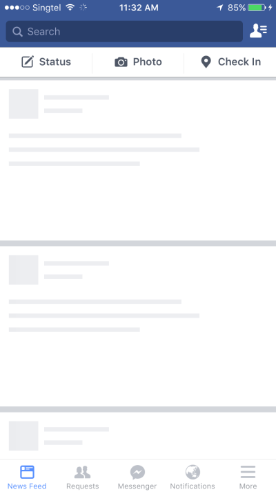
Then the final UI is loaded.

Making it Happen
Looking at the examples above, you may have noticed that the images used aren’t drastically different from wireframes. It’s in this observation that a lot of the work may already be done for you.
In this demonstration, we’ve identified that the initial load is taking longer than we’d like, so it’s time to add skeleton screens to improve the perceived load time.
Here’s our initial wireframe showing the screen layout.
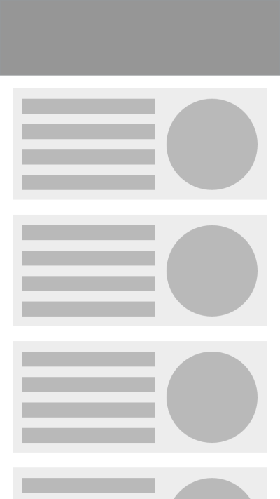
On initial rendering, only the header and a reserved space for the content are shown.

While we’re waiting, the image from the wireframe is shown.
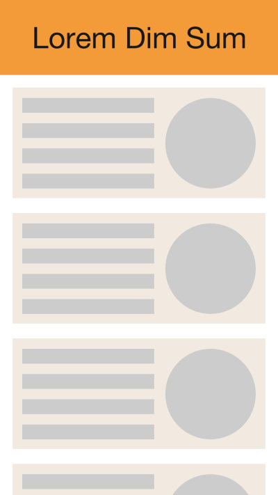
Next, the text is rendered while we wait for the images.
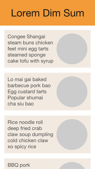
The final rendered content is then shown.

By progressively rendering each component, the wait seems shorter.
Summary
Skeleton screens can improve the feel of any action taking longer than a few hundred milliseconds. Applying them to your rendering bottlenecks will make your UI feel faster and make people happier.


