Designing Form Layout: Alignment
The following is a short extract from our book, Designing UX: Forms, written by Jessica Enders. It’s the ultimate guide to form design, a key part of effective UX design. SitePoint Premium members get access with their membership, or you can buy a copy in stores worldwide.
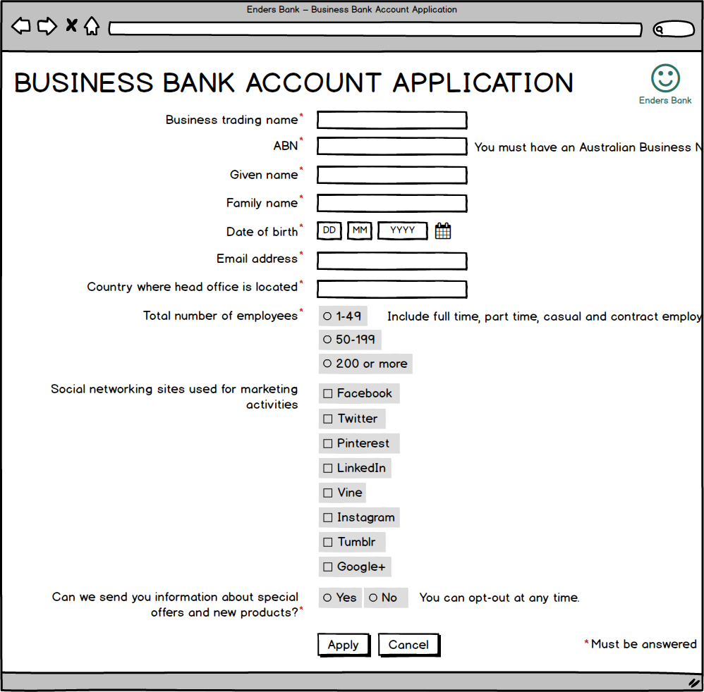
You and a friend are each driving to a restaurant for dinner. Both of your routes go down a highway with two lanes. The highways are the same length. On your route, all the slow cars are doing the right thing and sticking to one lane, so you can whizz past in the other. On your friend’s route, the slow cars are scattered across both lanes of the highway, so she has to weave in and out. Which one of you will get to the restaurant first?
Vertical Path to Completion
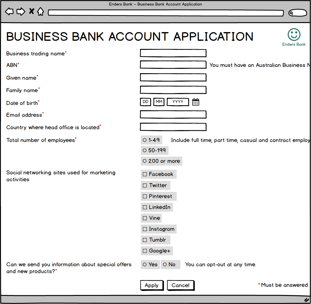
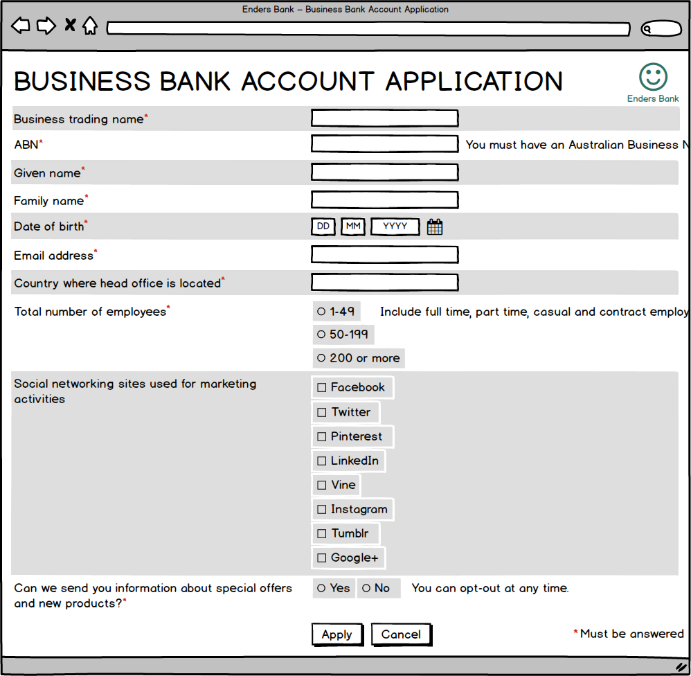
A straight, unobstructed route is fastest for driving, and also for form filling. So your next step is to vertically line up all your form fields, as well as the main button on the page (called the primary action button):
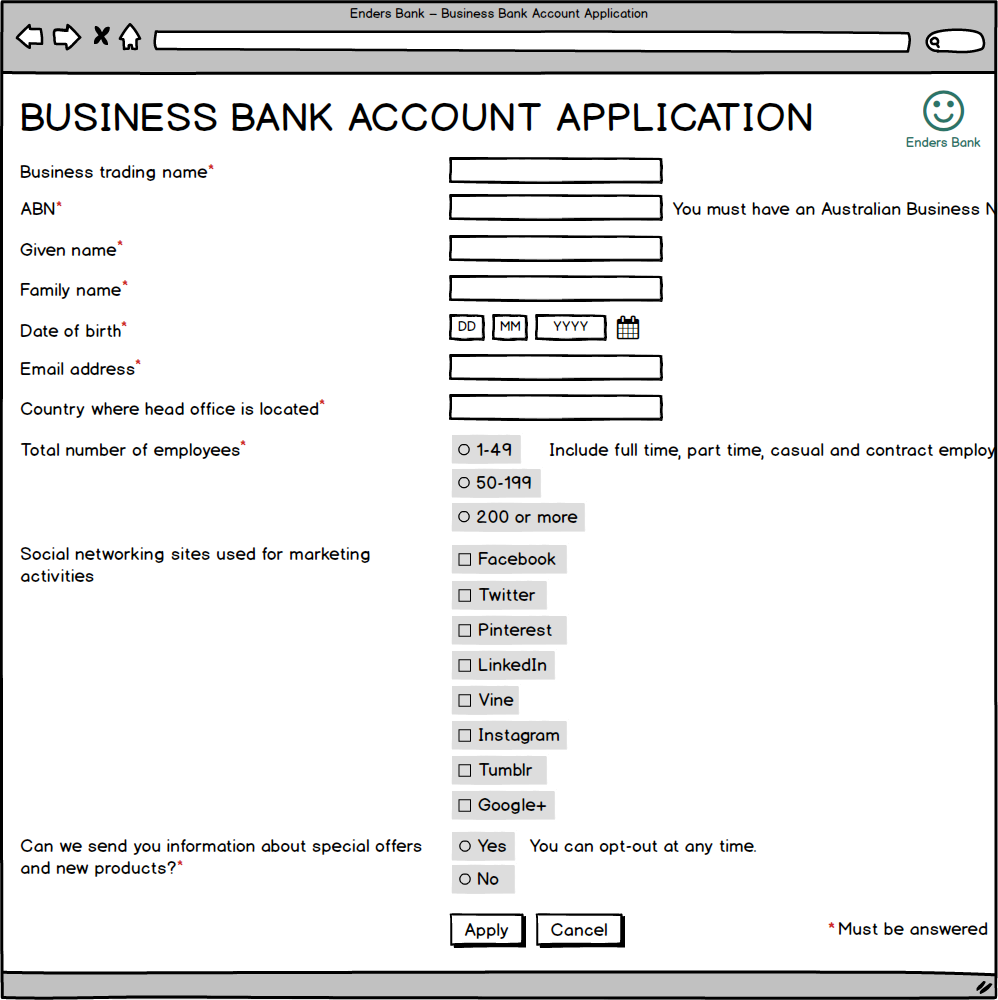 Now you’ve created a straight, unobstructed, vertical path to completion. Not only have you made it faster for your form to be filled out, it looks neater and simpler too. (We’ll talk about the distance between some fields and their labels shortly.)
Don’t Put Questions Beside Each Other
Because a vertical path to completion makes a form longer, you may be tempted to squeeze some questions next to each other:
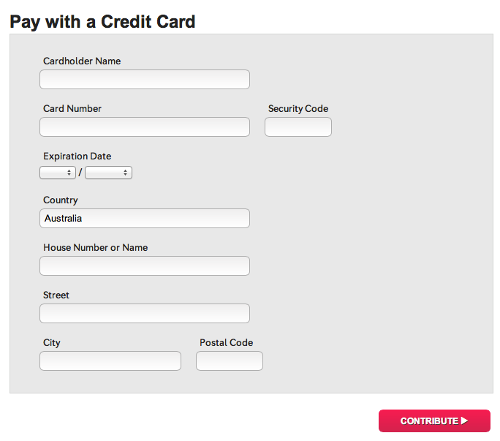
In this form, the Security Code and Postal Code questions have been put beside other questions
This is a bad idea, for the following reasons:
- It interrupts the smooth flow through the form (like a broken down car in your fast lane).
- Users will often not see the question on the right-hand side, because it’s outside the focus of their vision (this is only about nine characters wide).
- It prevents the form from working seamlessly on both large and small screens. (More on this shortly.)
Also, as you may recall from Chapter 3, for users it’s the perceived length of the form, not the actual length, that matters. The vertical path to completion makes form filling not only objectively faster, but it makes it feel fast.
Aligning Answer Fields
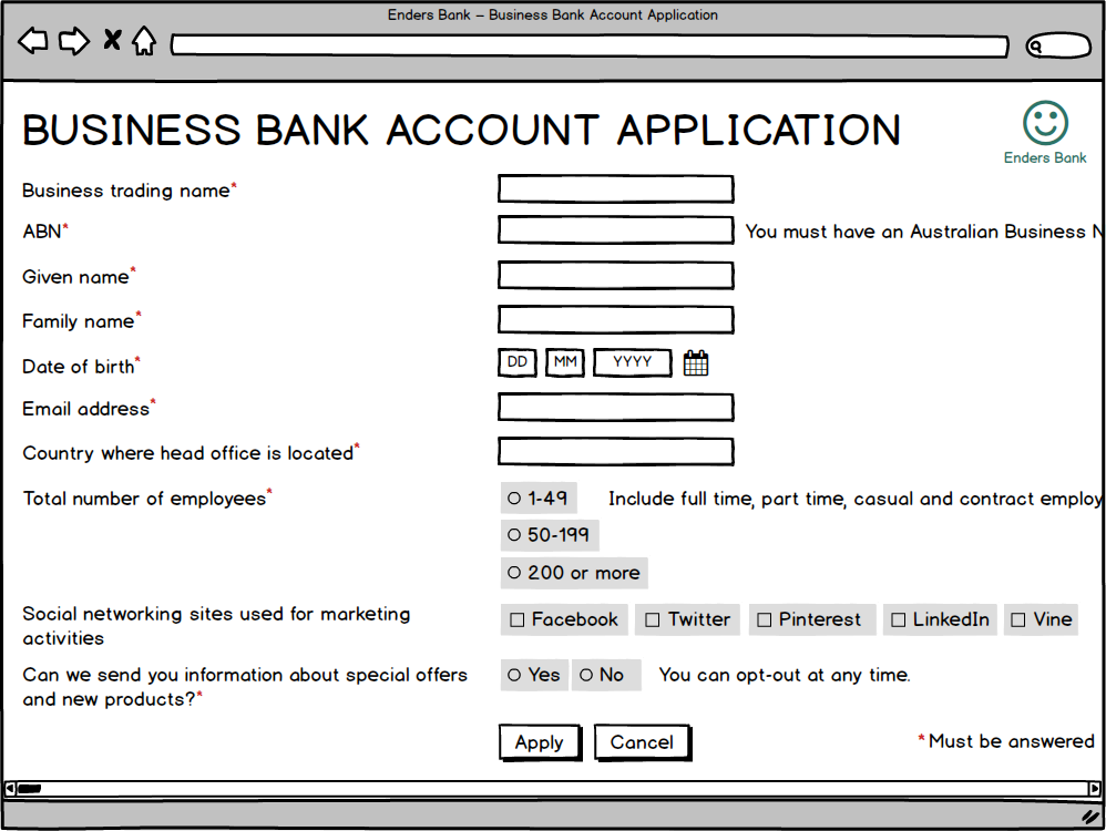
One way you can sometimes save space, however, is with answer fields. Look at the answer fields for the marketing consent question:

Whenever the answer fields are small, we can put them horizontally. (For this purpose we define “small” as three or fewer options, all with short labels.) The form will still work for touch, and on small screens. Marketing consent is just such a question:

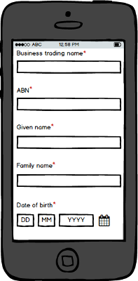
In fact, date of birth is also a question with small answer fields. You may not have realized we’ve already put them on one line:
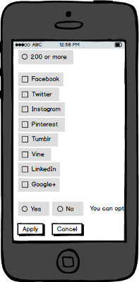
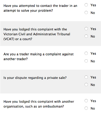
But remember: you can only put answer fields beside each other if they’re small. Otherwise, the design won’t work in some cases. Social networking, for instance, has quite a large number of answer options. If we try to put them horizontally, they’ll go off the edge—especially on mobile—and invoke the dreaded horizontal scrollbar:
If we position a long set of answer fields horizontally, we’re likely to conjure the horizontal scrollbar, even on larger screens
If our answer fields aren’t small, it’s even more likely we’ll cause the horizontal scrollbar to appear on mobile.
Assuming we can’t build a custom widget, it’s better to leave these as a single vertical list:
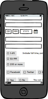
Larger sets of radio buttons or checkboxes should be vertically aligned.
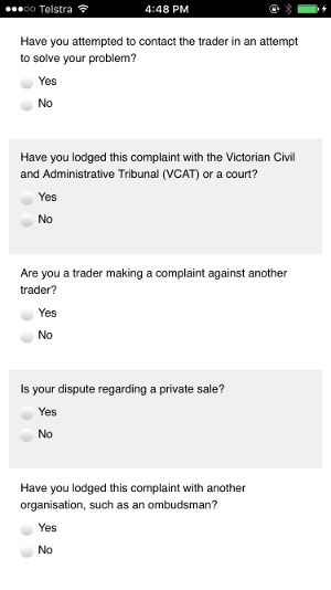
Vertical alignment of sets of radio buttons or checkboxes works on mobile too.
Label Placement
There’s a problem with the mobile view of our form, which you may have noticed from some of the illustrations above. On a small screen, when the focus is in a text box, the corresponding label isn’t visible, just like this example:
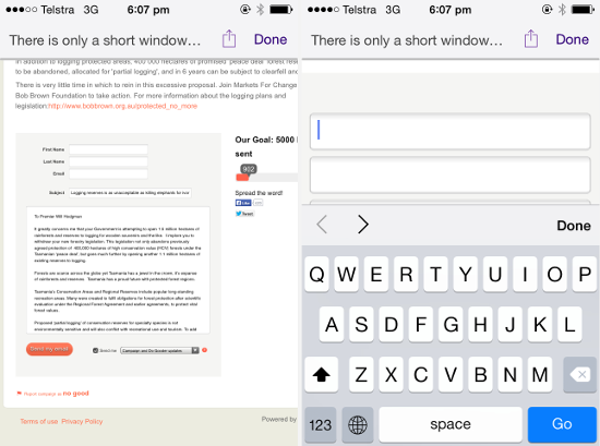
Labels on the left are seen initially but disappear when the user starts to fill in the form.
We could avoid this problem by always putting the labels above the fields. But this creates a new problem: the form becomes a lot longer visually.
Here’s how it would look on a large screen:
Forms are longer when labels are positioned above fields.
What you need to do is code the form to be responsive. When the screen is larger, labels should go to the left of fields; when the screen is smaller, labels should go above fields. That way, we make use of the space we have on larger screens, while ensuring the form can also be filled out on smaller screens.
If we code our example form to be responsive, this is how it would look on a mobile:
On mobile, labels are positioned above the fields so they’re visible when you need them.
This is how it would look on a larger screen:

Here’s a real-world example of responsive form labels—first the larger screen version of the form, then the smaller screen:
On larger screens, labels are to the left of fields, so the form appears nice and short.
On smaller screens, labels are above fields, so they’re always in view.
What about That Study?
One of the most popular articles on the UXMatters website, and quoted in Luke Wroblewski’s book and articles, is an eyetracking study by Matteo Penzo. This study is frequently used as evidence that labels should never go to the left of fields, but always above.
The problem is, you should never base design decisions on a single study, especially one with an unknown methodology, and very minor differences in results! Instead, you need to weigh up all the different pros and cons, based on theory and observations from user research. When you do this, it’s clear that—on a large screen—the benefits of having labels to the left of the fields outweigh the costs. It’s worth a very minor increase in eye movement to have a form that’s half as long.
Avoiding the Gutter
In addition to what’s been said already, there are two ways you can increase the usability of your form when you have labels to the left of your fields. These techniques are important to prevent a big “gutter” appearing between the labels and their answer fields:
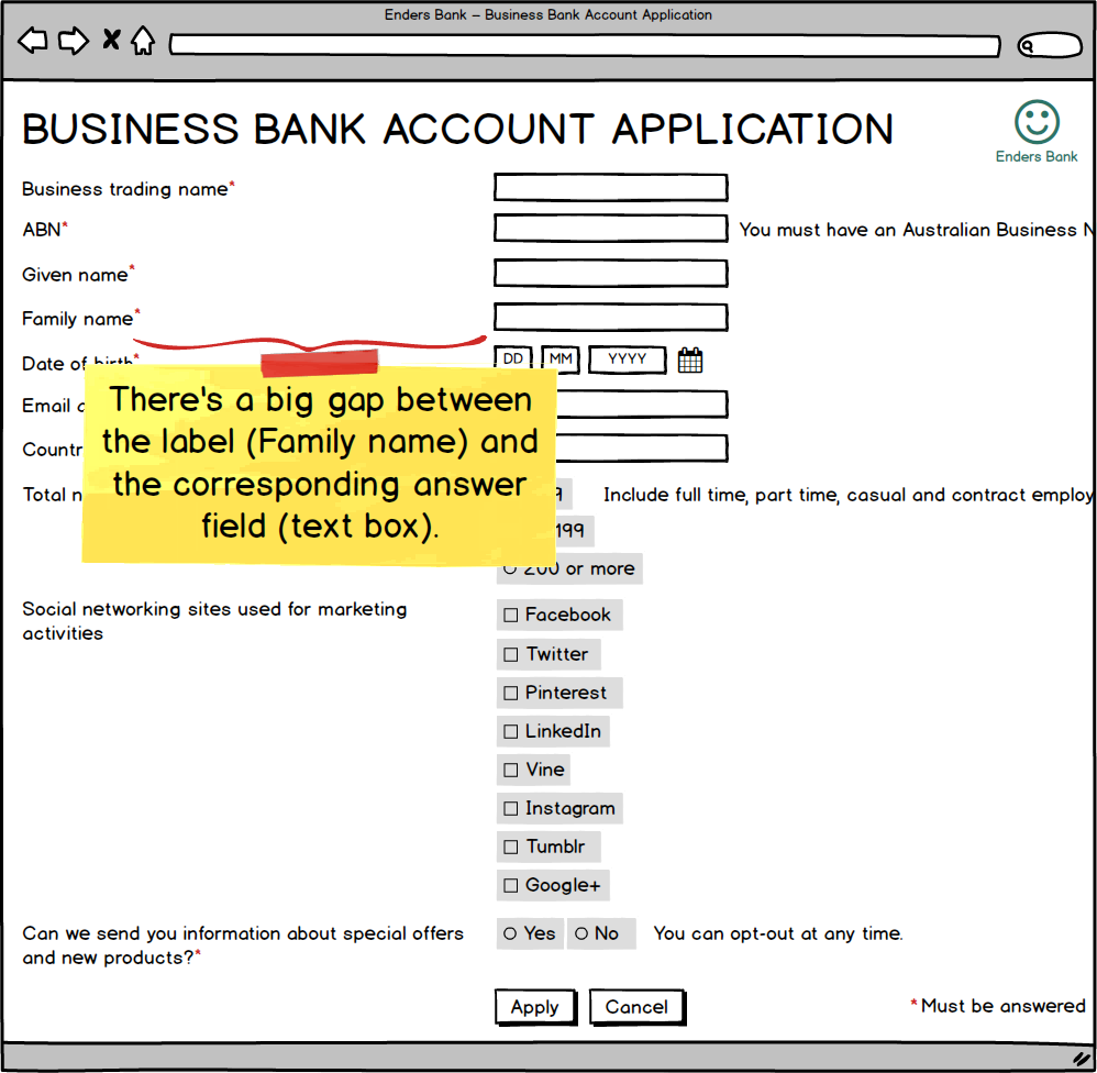
For many questions on our example form, the label is far away from the corresponding answer fields.
These gaps can make it hard for the user to associate labels with their answer fields.
If the labels are mostly short, you can set them flush right, so they’re next to the fields:
Labels set flush right.
If the labels are mostly longer, they’ll get hard to read if they’re flush right. In this case, set them flush left (like normal text) but add zebra striping to your form:
Zebra striping behind labels set flush left.
Zebra striping is the faint shading you see behind every second question. It helps the eye connect the label to the field (as demonstrated by a study I conducted a while back, and its follow up).
(If you want to read more about label placement, I wrote a detailed article on the SitePoint website, and provided some commentary on my own website too.)
Button Alignment
Single-step Forms
If you have just one primary action, line it up with your fields for fast completion. This is what we’ve done with our example form:
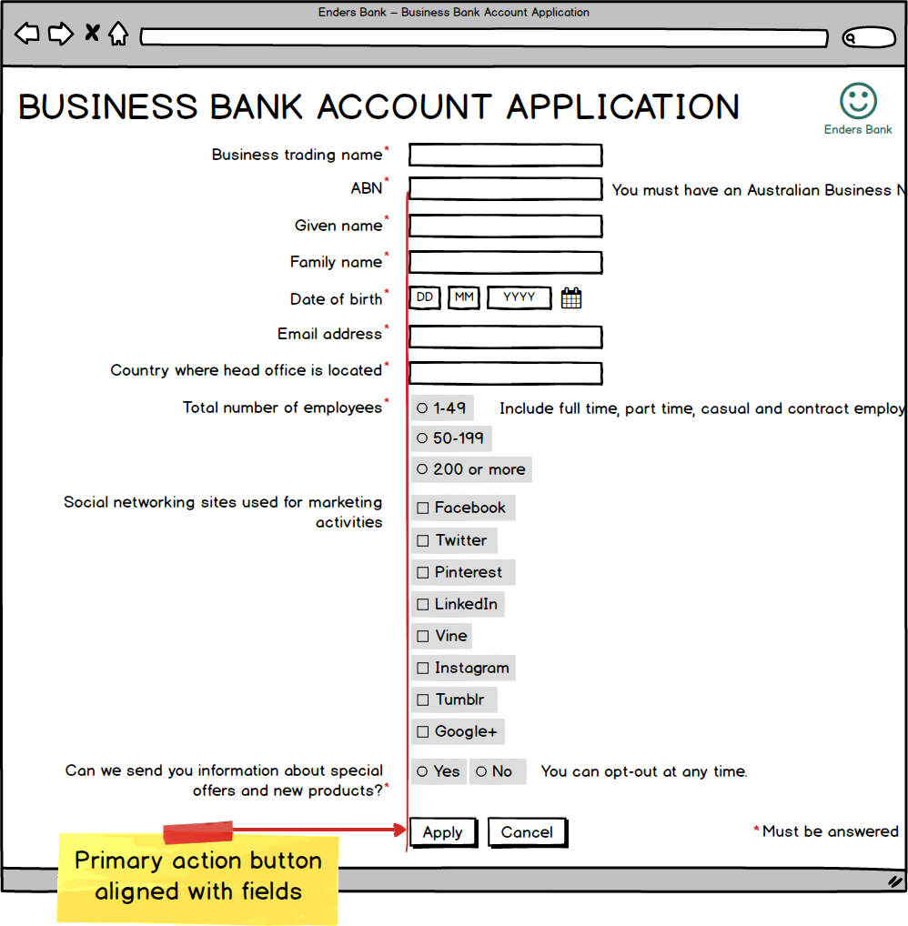
Left edge of the primary action button lines up with the left edge of the fields.
Multistep Forms
If your form goes over multiple steps, you’ll need to provide buttons for the user to move between steps. One option is to put the next button in line with the fields, consistent with our single-step forms:
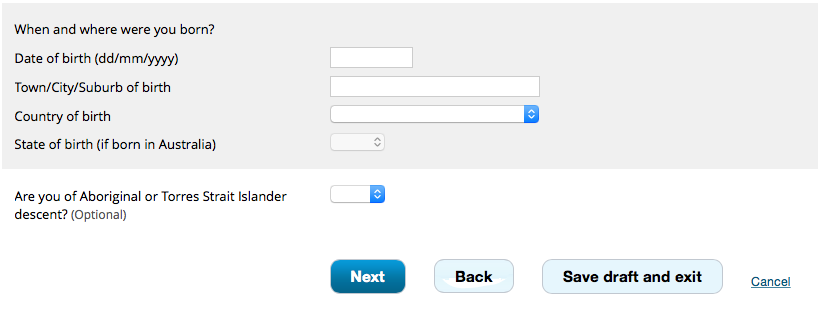
Next is our primary action, so it’s vertically aligned with the fields.
Another option is to put the next button to the right and the previous button to the left (for an English-speaking audience):

English speakers typically think of right as forward and left as backward, so we can align our buttons this way.
Both approaches have been shown to work well, but it can depend on the context. If you’re not sure which is right for your form, run some usability tests with your target audience.
(You can also put multistep forms into an accordion, but accordions have a number of usability issues so are best avoided.)
Buttons on Mobile
On small screens, you may want to design your buttons to be responsive, so that they:
- are stacked, with the primary action on top
- take up the full width of the screen, except for a little bit of whitespace on either side (so that they’re still clearly buttons).
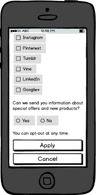
Coding our form to be responsive to screen size, we can make sure buttons still work well on mobile.
By now our form is looking really good, and is highly usable to boot. But there are further improvements we can make, which we’ll explaore next