How to Make Paper Prototypes

The following is a short extract from our book, Designing UX: Prototyping, written by Dan Goodwin and Ben Coleman. It’s the ultimate guide to prototyping. SitePoint Premium members get access with their membership, or you can buy a copy in stores worldwide.
There are no rules for making paper prototypes––that is what's great about it. You need materials that are commonly found in any home or office, but if you have to buy them, they are relatively inexpensive.
What You'll Need
At the very least you'll require paper and a pen––this low barrier to entry is one of the best aspects about this approach. For more complex and interactive prototypes, though, you'll need a bigger arsenal, and if you're running workshops or doing a lot of prototyping, assembling a toolkit of the following items is a good idea.
We'd suggest the following items when undertaking a prototyping session:
- paper with a grid or dot grid (preferred)
- sticky notes (never leave home without them!)
- pencils
- eraser
- pens (Sharpies in different colors and thicknesses are ideal)
- scissors or craft knife
- glue (preferably restickable)
Items that are nice to have include:
- index cards
- mounting putty
- adhesive tape (preferably removable to move items around)
- highlighter pens
- double-ended marker pens with fine and normal nibs
- transparent sheets and markers
- a box for filing or transporting your prototype
We’ll look at the possibilities involved in using different materials later in the chapter.
Your Approach
Strictly speaking, you could just dive in and start making; however, a process we’ve found helpful at fffunction is to think outward-in, focusing on increasingly smaller pieces as you go, such as:
- devices
- screens
- elements
- interactivity or state changes
Devices
What size viewport or device are we designing for in this instance? Any available user research may inform this. Analytics data will indicate what an existing audience may prefer to use. A goal of the design work could be to prototype an improved experience on small-screen devices.
Desktop or Laptop
An A4- or US letter-sized piece of paper is suitable here, where you could use different orientations to mimic the device, such as landscape for a desktop or laptop. If you want a more realistic source, you could print out a browser frame graphic.
Tablet
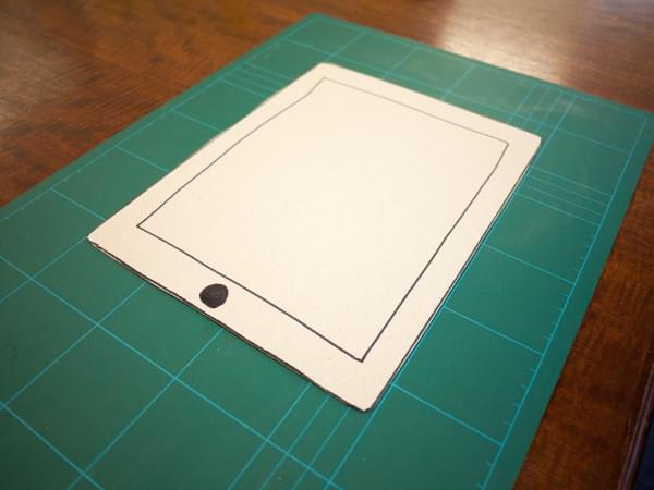
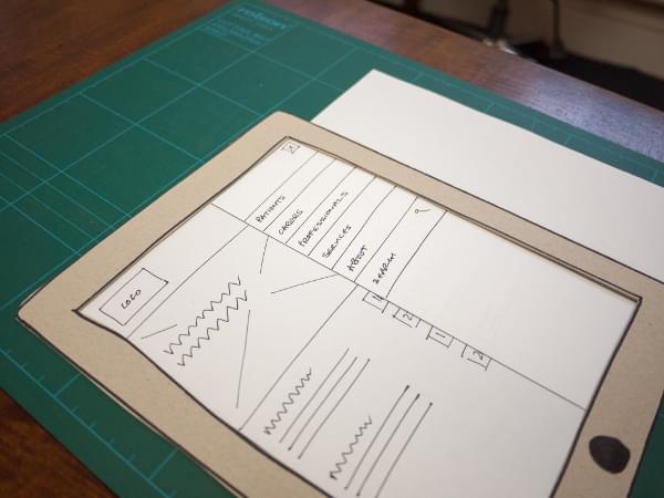
A5- or US half-letter-sized paper should suffice, although if you're designing for a large tablet such as the Apple iPad Pro (12.9 inches), you might want to stick with the A4/Letter size. Again, you can choose an orientation depending on what you expect the user to have. If you want to make this more realistic, creating a dummy device is an option. The most lo-fi approach would be to draw it on a piece of card and cut out a hole where the screen would be, as depicted below.
Laser-cut and 3D-printed devices have been created specifically to help use paper prototypes in a more natural way, allowing the prototype to be part of a device.
Phone
As with the previous examples, you can sketch directly onto paper: A5- or US half-letter-sized, index cards, or sticky notes, and use different orientations. There are more options available for mobile devices, though, than any other form.
You could make a cellphone border with a cutout window for the screen, or use cards laid on top of the device to act as different screens.
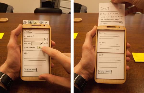
As mentioned, there are also laser-cut and 3D-printed device models available. The figure below shows a laser-cut plywood phone model that we use in our work.
Plastic or card model devices with a channel to insert pieces of paper to simulate scrolling are also available. You could even place all the screens on a long piece of paper and slide it around to simulate navigation.
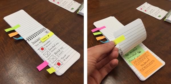
Another option is to use a small spiral-bound notebook to flick between screens, with tabs or colored dots forming navigation elements, as seen below. This is a nice approach as it mimics how people use their cellphone: held in one hand while the other taps it to interact.
Screens
Now we'll define what screens are required to communicate the design. It’s helpful to consider what steps in the journey the user will take. We can develop a list from existing work such as user journeys, task models, sitemaps, information architecture, or a functional specification. Some of this was covered in the Gather Resources section of Chapter 2, to which you can refer back if you need a refresher. Once you've developed a list, you can start to think about what elements will be required for each screen.
If you don't know the screen size, or have an incomplete picture of what you are designing, sketching the steps out on cards can be useful for working a product at a high level before going into more detail. We'd recommend beginning
with smaller A5 or index cards to help you focus on the individual interactions on each screen; aiming for one purpose per screen is a good way to start. You can then arrange them on a table to experiment with different flows through a process.
Elements
When looking at the elements that make up your screen, consider how users will interact with them during the prototype process. What needs to happen when they touch that element?
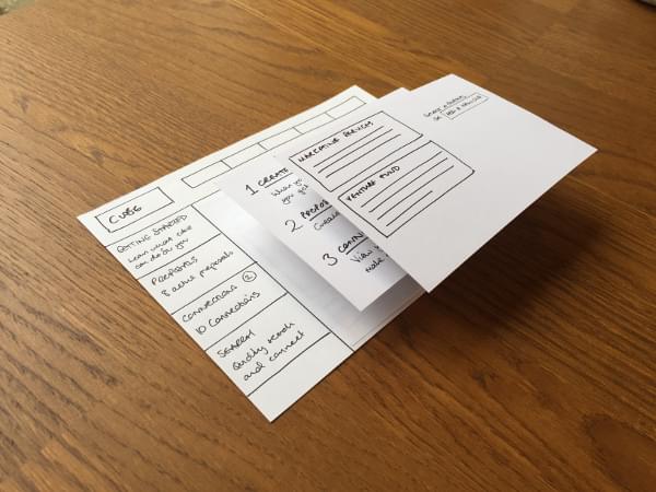
In some cases, you may have a consistent interface with only one window changing based on interactions around it. A simple example would be a menu in a left-hand column that changes the content of the right-hand column. This could be represented with the same card on the left, and separate cards for each piece of interchangeable content on the right, as shown below.
Interactivity
All the elements you've established will each be interactive at various points. There’s a challenge here in how to replicate that functionality with paper. Again, there’s likely to be no “right first time” solution to this so it’s worth experimenting with different materials and approaches.
Scrolling and sliding
One approach we’ve used is to cut parts out of the screen and then threading strips of paper through to enable sliding and scrolling elements. A 1–2 mm hole is large enough to slip paper through and enable the right amount of clearance for “scrolling.” The figure below depicts a paper vertical scrolling device.
Another approach is to use a more advanced device model with a slot to slide paper through indicating a horizontal scroll.
Menus
For a menu, pieces of paper can be placed into position on an interaction, or, similarly, you could use sticky notes so that they hold their position but are easy to move.
If you’re using a cutout device, the menu could be positioned off the canvas or out of sight, then slid in to be revealed as depicted below.
Messages and Pop-up Boxes
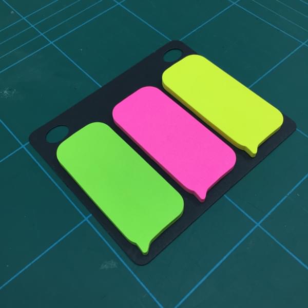
Sticky notes are handy for messages, popups, or tooltips as they can be placed on the screen and then removed following an interaction or after a period of time. You can purchase them in smaller sizes, even speech bubble shapes that are perfectly suited to this as shown below.
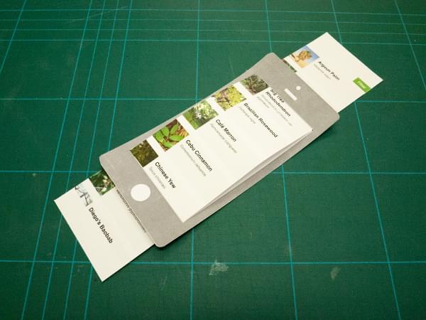
Tabs
You can either create your own tabs by cutting them out of paper, or buying index cards. When selecting another tab, shuffle through the deck of tab cards and arrange the selected tab on top.
>
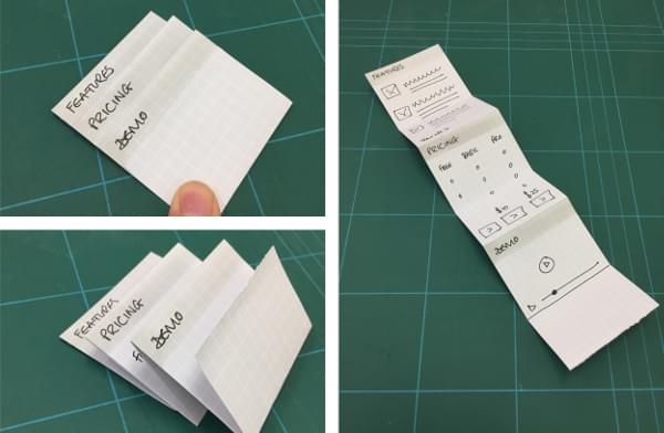
Accordions
Now's the time for a little origami. Draw the accordion content with everything in view on the page. Starting at the top, fold up the accordion so that just the titles are visible and the drawer content is hidden. Then, when you tap on a title, you can reveal the folded piece of content. The figure below presents this process.
If you'd prefer to skip the folding you could make individual pieces, or use sticky notes for the sections that will be revealed.
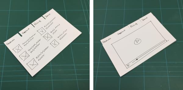
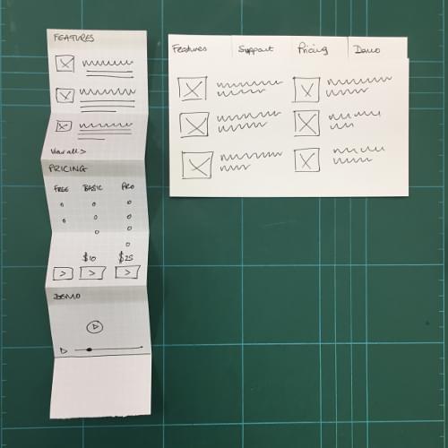
A common responsive design pattern is to interchange an accordion style menu on smaller screens with tabs on larger screens. You can see this prototyped as two distinct elements in the figure below.
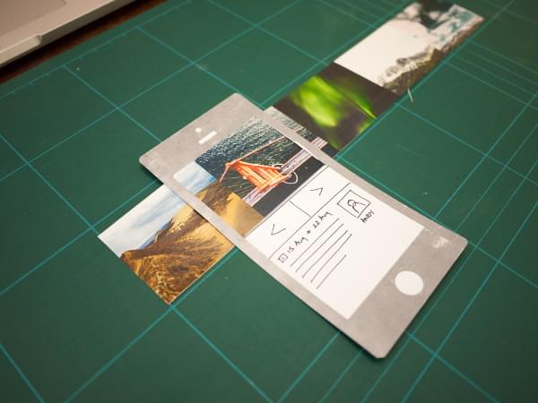
Slide Up / Down Reveals
The techniques that we’ve already covered can be employed here. You could elect to hide the content off canvas, or slide it in to view from a slit in the paper. Or you could simply place the content on a separate card and lay it into place when required.
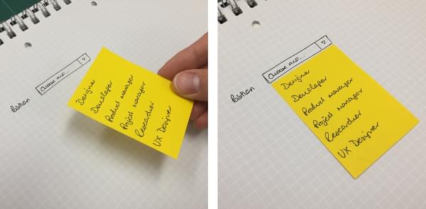
Select Boxes
Sticky notes work well here to depict a moveable list of items that you would see in a select element, as shown below. The user will be able to see the choices and select one, at which point you can remove the list from the prototype.
Checkboxes and Radio Buttons
Simply drawing these often suffices for a prototype. You could go as far as to place checked versions on top of the unchecked version following an interaction.
If part of the purpose of the prototype is to experiment with the positioning of elements on a page, a strip cut of a sticky-note would work.
You have to weigh up the complexity of building and operating this element in a test scenario against the benefits of having the detail. Make it too fiddly and operating your prototype will become difficult.
iOS / Android Native Design Elements
There's the option of adding complicated design elements from iOS or Android that could be tricky to replicate or take time to sketch. For example, to reproduce a calendar, it’s simpler to take a screenshot of one from a device, then print and cut it out, rather than sketch it.
You could elaborate on this and print out a stencil or toolkit library for a device, should you think it will speed up the process and not make the design too prescriptive.
Literally Anything
The aforementioned examples are common design elements that can be found on a standard website, tablet, or phone, but there’s no reason to be constrained by what you've seen before. As has been mentioned, one of the pros of paper prototyping is that you're not bound by the constraints of a digital medium. If you can imagine it, you can probably make it out of paper and prototype with it.
Drawing Tips
When creating paper prototypes, you'll need to draw elements to make up your sketches. In some circumstances, you may not have to spell out content or be particularly detailed about the elements you're laying onto the page. This could be because you're focusing the interaction on a certain module or element, and want to avoid any distraction with other elements.
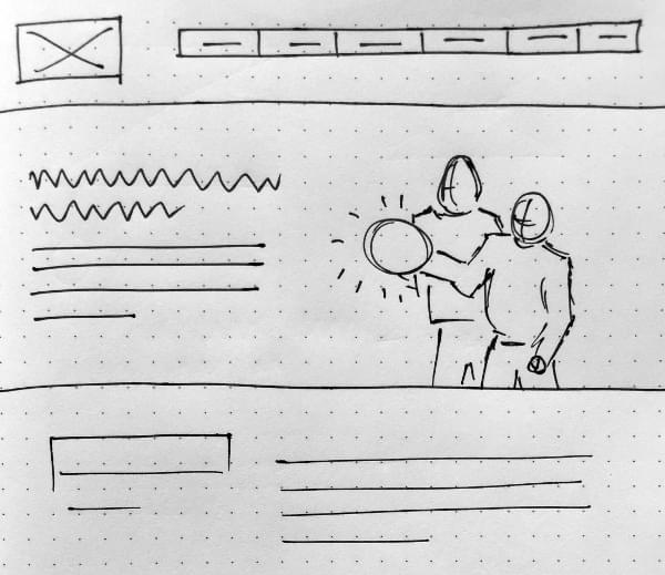
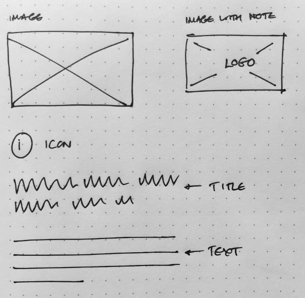
In this scenario, you can utilize a sketching shorthand to represent common elements. As depicted below, titles can be wavy lines, paragraph text with straight lines, and images boxes with diagonal lines across them as you would see in a wireframe.
Of course this ignores another pro of using paper prototyping compared to wireframes. Wireframes use a box with diagonal lines to represent an image. You might label a box to indicate what it is, but unless you add an image, your communication is fairly limited. In sketching, you can explore further and sketch the actual content of the image. In the figure below we're introducing a new product by sketching a hero image with two customers using the product. This provides the user with a rough approximation of the experience with the final design.