How to Boost Usability with Intelligent Color Choices


Color plays a critical role in our lives; from differentiating between objects, to understanding traffic signals, to using tools correctly.
What’s even more interesting is the huge impact that color has on our cognition and mood. Recently I read a short research article that explains how different people perceive color and the impact that they can have on their mood and emotions. They cited a study in which workers lifting boxes that were painted black complained that they were too heavy – but when the same boxes were painted green, they felt lighter.
Similarly, in regards to websites, colors can have a significant impact on the usability and cognition of users. While each design element contributes to the usability of a website, a designer needs to be extra careful when choosing which colors to use on them.
Let's took a look.
How Bad Color Combos Impact Readability
Background and foreground elements on a screen/webpage must be different colors. When both are the same, it's difficult to identify the foreground elements right away. Obvious, right? Yes, but there's more.
Not all combinations of foreground and background colors are suitable for use, but with that in mind, how do we know which colors to choose? Answer: choose colors that contrast each other well.
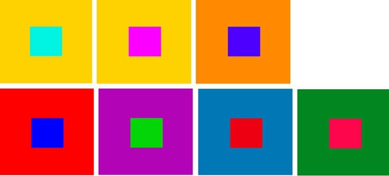 Source: Color Interaction and Color Effects
In the image above, even though the color used on the background square is very different from the one used on the foreground square, it's nonetheless extremely uncomfortable to look at, despite the high level of contrast. If the foreground was text, it would be unreadable as well as uncomfortable, and the same applies when there is low contrast as well.
Is there a sweet spot?
Yes there is – keep reading.
Finding the Contrast Sweet Spot
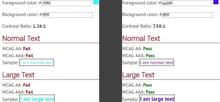
The solution is to choose a color combination with sufficient contrast. According to the WCAG 2.0 guidelines, the contrast ratio for text should be at least 4.5:1. For example, it would be quite difficult to read the text if the contrast ratio was 1.26:1; however, if the contrast ratio was 7.58:1, it would be more legible and readable.
Is there a tool that helps you check the contrast ratio of background and foreground colors for apps and websites? Yes! WebAIM tool.
Choosing the Best Colors for Eye-Catching CTA’s
Color contrast also matters when you need to divert a user’s attention to a specific element, like a call-to-action button (also known as a CTA).
In an experiment, two A/B variations of a webpage were created. The first variation had a blue background and used a different shade of blue for the call-to-action, the other had a navy background with an orange CTA. Users were asked to click on the element that draws their attention the most. The orange CTA received more clicks than the blue CTA because the orange-navy contrast was higher than that of the first variation.
The variation with blue background had a contrast ratio of 1.39:1, which is a little below the "sweet spot". In the second variation, the contrast ratio is 4.73:1, which means that the orange-navy combination contrasted better than the other version.
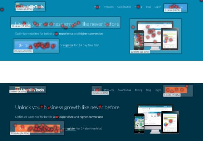
When choosing a color for a call-to-action, we need to choose one that contrasts well with the background color. But how do we know which colors create the most contrast? For that we can use a color wheel to find "opposite colors". For instance, in the above case study, orange is opposite to navy on the wheel, and thus the contrast is stark (i.e. more effective).
How to Make CTA's More Accessible
As individuals, we all experience color in different ways. Some of us have a vision deficiency called color blindness, which is described as the inability to distinguish between certain colors (most commonly between red and green, or blue and yellow). In fact, it's estimated that 1 in 12 men and 1 in 200 women suffer from this type of blindness.
Colorblind users will have difficulty perceiving certain colors. For example, a blue CTA might appear as desaturated blue, and this may cause the contrast between the CTA and the background to appear quite low, which in turn would make the CTA far less attention-grabbing.
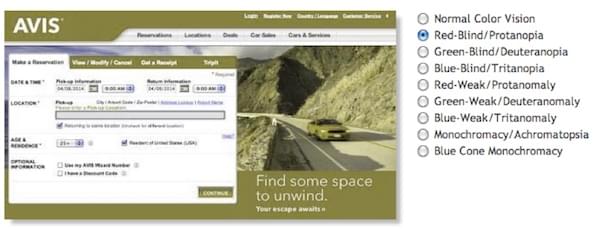
Here's an example of a sign-in screen viewed using a colorblind simulator.
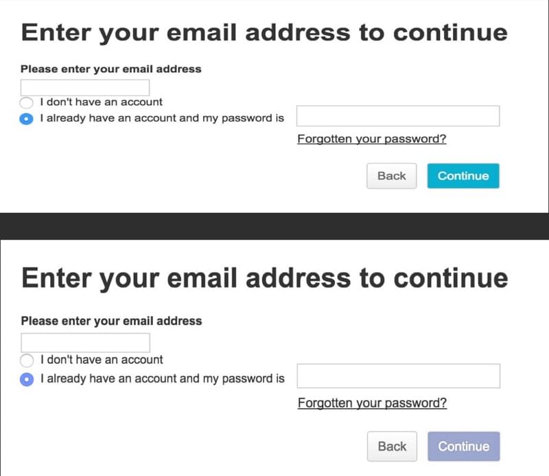
The solution is, once again, contrast. By using high-contrasting colors you can make CTA's accessible regardless of the actual colors used!
Colorblind users will experience the same troubles with links. By default, clickable text appears blue, but for a colorblind person it's difficult to notice clickable text unless it's underlined.
The image below shows how a colorblind person views a piece of written content. Notice how the clickable and non-clickable text is almost identical? If the links weren't underlined, it would be near-impossible for a colorblind person to spot the clickable links.
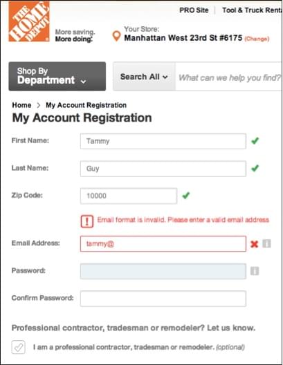
Sometimes, colored text is used to convey a special message on a website. Often, red is used on a form to show an error or alert a user, whereas green text is used to show an affirmative message. For example, when you make a mistake while filling out a form, red text is shown above the field that needs to be corrected.

Such reliance on color can be a huge hindrance for your colorblind users. Alternatively, to highlight a mistake/show an alert, you could combine red with an appropriate background color to improve the contrast, and also use subtle animations to further clarify the alert. You should never rely on a single design technique to offer an exceptional user experience.
Some varieties of blindness reduce the user's ability to detect motion, in which case color would be the most useful, and animation would be the least useful.
Let's explore some more examples.
The image above depicts how a colorblind person will see the webpage. Notice how the alert above the input field is barely noticeable? The solution here is to use different visual elements to convey such a message. For example, some forms use text and icon to show an error. This is because icons are easily noticeable, even for a colorblind person. Usually, X or exclamation mark is used along with text to show important alerts on forms. Here's another example:
The Take Away
So, as we've learned, colors can drastically affect usability. When deciding on a color palette to use on an app or a website design, it's important to understand that a website must not only look good, but should also be usable for the range of different demographics that you're catering to, even hidden demographics such as those with certain disabilities.
This not only applies to websites, but also for mobile apps. Don't design for yourself, don't design for the client, design for the users.