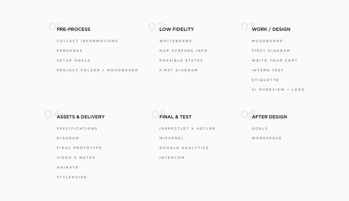
26 Steps of Product & Dashboard Design

What I have learned during my 4-year journey as a Product Designer & Dashboard Designer.
For the last four years, I have continued to design dashboards and applications, I have learned to deal with different departments, and utilize their knowledge in order to make product designs both better and more efficient.
Today, I’m going to share all the steps I have learned and incorporated into my daily routine. I believe these steps have helped to make me a much better designer and I hope you might find them useful too.
1. Pre-Process
Get as much information as possible (Ask for three examples)
For me, nothing gives me more clarity than seeing a real working example. When I am working with a new client or on a brand new landing page for a product, I find as the easiest to ask the client to provide three or four inspirational pages, because this really helps both parties.
Getting your client to put ideas onto the table gives you an opportunity to easily understand what they like, and what they expect from the finished design.
If you’re working with multiple teams you should aim to spend as much time with the developers on a product as you do with your designer colleagues. While working on Tapdaq, I’ve learned the key to making an effective design decision is to ensure you speak with the dev team as much as you can.
In my case, there are always cases of a solution to a problem whereby I couldn’t come up with that solution by myself. I’d say the goal is to eliminate as many questions as possible before you move into development.
Learn about personas
At first, I must admit I was skeptical about personas, but now it all makes sense to me.
So, in complete contrast to my older work processes, I can see how personas are super important while working on product features, especially when the solution has many different edge cases. It helps you to understand who are you really designing for. I aim to have around four to five personas. If possible, it’s best to have personas based on actual users, as this can help you identify issues while chatting or walking through your solution with them either on a call or in person.
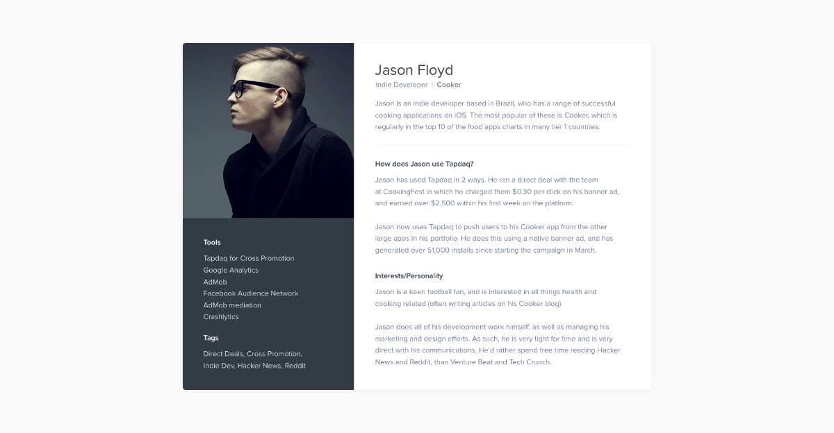
Persona Template — Download it here: http://janlosert.com/persona-template.zip
Setup Exact Goals – What Exactly Should We Track?
I think most designers/clients ignore this step, but one of the most important aspects of design for both parties is to understand the goals of the product you are designing. We tend to jump straight into pixels and quickly flesh out the UI of the project. If it’s a brand new website or a new feature, be sure to set clear goals of what you want to achieve.
Since everything is trackable, discuss the exact points you’re going to track. For example, these could range from new sign-ups to an expected number of customers using Paypal vs. purchases with credit cards. Always make sure you know how high you’re aiming for at the start!
P.S – You’ll need this anyway for setting up funnels on Mixpanel later in this process.
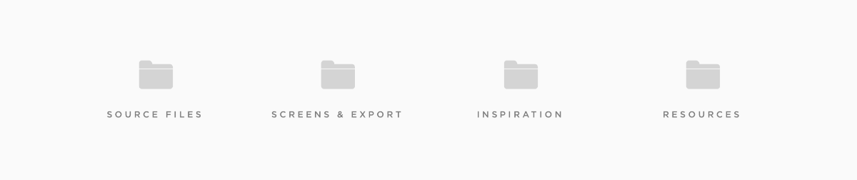
Project Structure
Set up a Project Folder and Start Collecting Moodboard
There are plenty of sites for inspiration — Dribbble, Behance, Pttrns, Pinterest etc. It’s really easy to find similar projects to the one you shall be working on. Additionally, there may be already a solution to a problem you’re experiencing and trying to solve.
When I start working on a new project, I always setup a folder with folders named — Source Files, Screens & Export, Inspiration & Resources. I save everything I find on the internet to my ‘Inspiration folder’ ready for later use in basic moodboards. This folder could be filled with anything from plugins, swatches or even full case studies from Behance.
2. Going Low Fidelity
Whiteboard
If anyone can remember, I didn’t care much about the quality of wireframes in my previous article. The methods I use now are the following:
If we want to add a new feature or redesign a process we sit down and everybody at the meeting starts sketching ideas on a whiteboard, paper or even an iPad. This action allows us to put everyone on the team in the designer’s position. Later we end up with two design options to see which one works the best.
We always try to go through the whole experience and discuss most of the edge cases during this part of the process. It is really crucial to address them now as opposed to during the design phase, or even worse, during the development part. That's when you can lose a lot of time and energy instead.
Map out all of your screens info (What data a user needs to input)
This is the time to go beyond the whiteboard and list out all of the user’s inputs and stories. Write down what exactly should a user insert into a particular screen and how can a user achieve the desired goals.
Write down all possible states
Because all dashboards, apps or websites’ forms have different states, this is another important step you shouldn’t forget.
While designing we need to be sure to address all of them. It’s nice to have shiny graphs and cool profile pictures in our Sketch files or PSDs. However, most likely, users will see the opposite side of your app. Especially when they come to your product. It’s necessary to be prepared. Below is an example of how we deal with empty states in one of our data components.
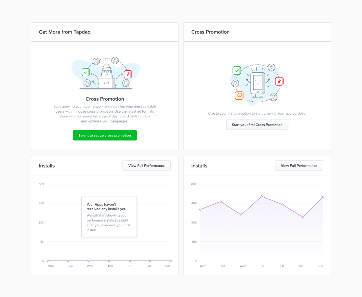
Tapdaq — Cross Promotion Widget States
Prepare First Diagram
All of this leads to the final part of the low fidelity phrase. Thanks to the outcome result of the whiteboard task we now know all of the possible states, user’s inputs and goals. To sum up all interactions, I create a diagram and – to be honest – I’ve changed the style I use doing this many times. They can be anything from Sketch files with rasterised layouts to nothing more than rough rectangles symbolizing each page with their names below.
That being said, the process was always painful, I usually end up in a situation where we want to change or add something later on in the process. With these solutions, I’m usually forced to do many more steps; such as changing the positions of lines, arrows and images.
After all this, we ended up with using Camunda Modeler, which is a not exactly a design tool. It’s a simple app for creating technical diagrams. Which sounds odd, but this app is developed to help you build basic diagrams. Most importantly everything created is completely scalable. You can easily drag and drop any point and it will automatically create lines and arrows for you.
You can also choose from different types of points which can be helpful, for example, for highlighting when a user receives an email from Intercom. Camunda allows exporting to SVG that makes it easy to color trackable points in Sketch.
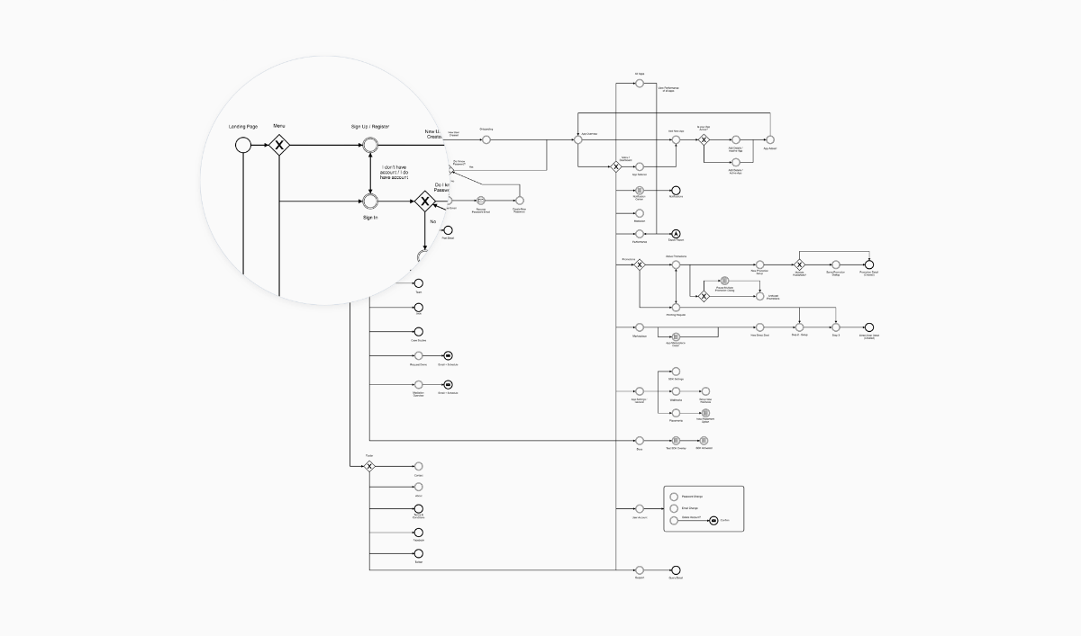
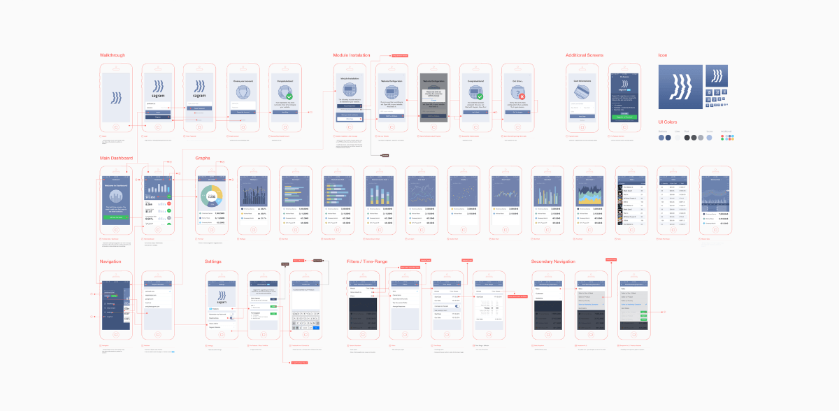
Tapdaq Menu + Screens Structure (Export from Camunda Modeler)
3. Work / Design
Moodboard
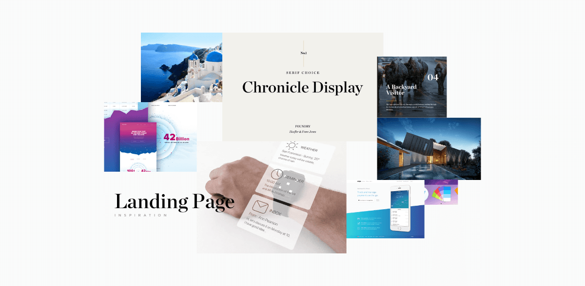
Moodboard with Chronicle Display and bright blue colours
I’m able to start with the creation of moodboard, as I collect imagery to my Inspiration folder. I use moodboards mainly to discuss my thoughts with colleagues and describe some of the visual ideas before I start with the pixel process.
First draft
Designing is always an ongoing process. You’re going to iterate a lot along your way to a great result. With first drafts, it also comes gathering feedback. You don’t have to come to pixel perfect design in order to start receiving feedback from your teammates, clients or potential users.
To get their first thoughts and to start a discussion, I usually mix in screens from our current designs (as you can see below). This allows us to start playing with real looking designs in less than a day. You can do a first simple prototype to test if things connect well together.
Write your copy (Tone)
Copywriting is one of the key aspects of users’ decisions and I take it as a crucial part of the design. Though I’m not a native english speaker, I’m still capable of setting the tone of the copy. There is nothing worse than a nice design with confusing dialogs where users are struggling to find the next step.
First Intern Test
With your first draft you can quickly create a prototype in Marvelapp or Invision. This is something that I started doing recently and it turns out it's another amazing validating aspect. With a prototype, you can now easily set up a call with 3 or 4 people from your team and share the Invision or Marvelapp prototype with them and try to ask a few questions while test on them particular flows/scenarios.
This way you can easily test your questioning skills and obviously test your design decisions on real users without worrying about wasted resources and time. I usually tend to choose people who are not that much involved in dashboard development. Also, try to avoid watching someone who has already had a chance to play with the prototype before.
Etiquette
We all know how hard it is to stay tidy. How to deliver yet another feature. This usually leads to a messy Sketch or PSD files. I’ve learned a lot while designing the Dashboard UI Kit , especially about differences between working as a one-only designer in a startup, working in teams or working on my digital products. While I’m working in Tapdaq, I’m confident about the skills of my colleagues and even when I know I’m trying hard to keep files tidy, sometimes it’s impossible!
However, when you do work in a team, I think about my PSD’s like I’m creating them for someone else. I use the rule that if you have more than 8 layers in a folder, then you should create a new one.

Dashboard UI Kit — Folders Structure
I found one great plugin for Sketch, which saved me hours while I worked on my UI Kits. Rename – github.com/rodi01/RenameIt
You can still take a look at these old Etiquette guidelines (most points work for any editor you’ll use anyway) — Photoshopetiquette.com
Put everything in canvas
I’ve always struggled with designing nice headers while I the rest of the canvas was white. While designing I learned to put all the content in place first – just play with the layout and typography. It’s much easier to design nice details and play with the whole concept with the content in place.
Create UI Elements and start playing with Lego
I’m probably late to the party and this will already sound outdated while I’m writing it. The reason why we haven’t done any wireframing on the journey here is simple. Sketch 39 comes with something that I have found incredible and that is “shapes with resizing properties”. It forced me to finally recreate all 50+ Tapdaq screens. This is something that makes designing easy for everyone on the team. Our Sketch file is pure drag-and-drop now. You can easily give any of your teammates a blank canvas and they can create almost hi-fidelity drafts. Thanks to this we are able to skip all wireframing tools and start with almost real looking pixels.
This also goes hand in hand with us being able to actually convert wireframes to real designs. Any PM can create wireframe and then I can easily take it over and transform to hi-fidelity.
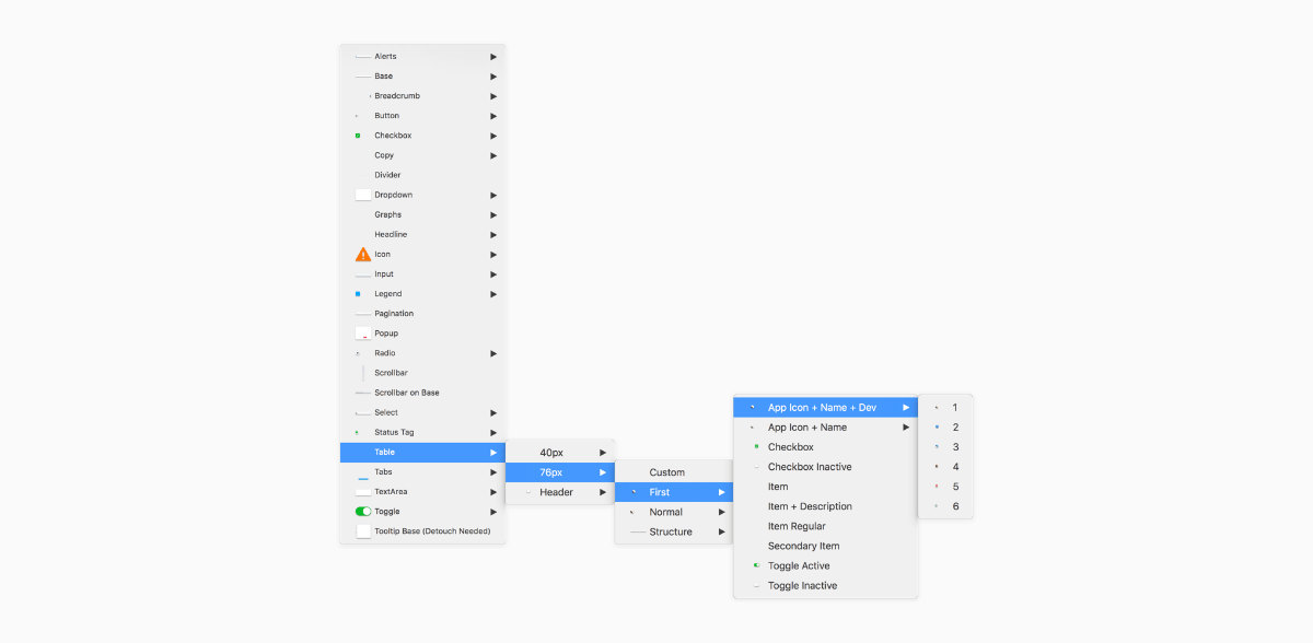
Drag & Drop Elements in Tapdaq Sketch File
4. Assets & Delivery
When you’re done with designing and iterating based on first feedback you’re not done yet. Now comes the time to hand your designs over to your engineers/devs.
Specifications
One of my main aims is to always be able to communicate my decisions with the team and be able to reduce difficulty for our developers as much as I can in order to provide them with the best possible resources. That for me is definitely the most important part of my job as a designer.
Since we documented all the interaction and have everything ready from the beginning of our process, creating specs is a piece of cake. I tend to write specs in Google Docs or below the screens in Sketch files. It’s nice to handle your designs with explanations of all features so anybody can grab your file in the future.
Diagram
We used to do this technique while I’ve worked in Badoo for presentations with the team and stakeholders. This technique is nice for printing out designs and discussing them with the team. But nowadays I think there are better options. Such as having ready the final prototype.
Full Diagram of Sagram Analytics App
Final Prototype
One of the key thing for me is to always have all interaction ready in prototype. I’m usually ending up having 3-5 prototypes on the way to the final one for those little session with teammates or to show some particular flows. I tend to prepare all states in Sketch in one artboard and then duplicate those artboards to have every state ready when exporting.
Like I said before, you can either use Marvelapp or Invision. It’s great to add comments to parts of your designs to expand your specification much more so that even copywriter can easily go and check in real pixels and flows if every copy and dialog works as required.
Quicktime Video is better than notes
When I’m not presenting stuff on Hangouts to the team or a client I’m sending a screenshare video of me going through the prototype and explaining everything that I’ve designed. It’s a nice way to confirm to myself before any presentation that I know the answer to any question and possible fancy interactions I’ve decided to design. It could also be nicely used when working in remotely based teams. Everyone has access to replay the whole interaction thinking at any time.
Animate
A nice final touch of your design you can use After Effects or Principle. It’s good to explain how do you want this and that to move or hover.
Styleguide
Another crucial point for engineers is to know how things will react in different scenarios. Think about error state of input or where to show error message. Similarly, consider how the disabled state of submit buttons will look, where to position spinners in input etc. It’s super-easy for engineers to just go through your Symbols artboard and one-by-one style elements before they even start coding all screens thanks to having a Sketch file as ‘Lego blocks’.
Styleguides and visual overviews of all elements is actually one of the most requested features/designs for the next update of my Dashboard UI Kit.
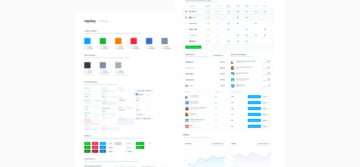
Tapdaq UI Overview — Styleguide
5. Final & Test
Since we are done with handing over our designs to engineers we are able to focus on the last part of the process – Tests of our decisions!
Inspectlet / HotJar
After the designs are turned into working code don’t forget to include your Inspectlet or HotJar JS snippets. I’m always excited (or frustrated) to see how users navigate through our dashboard or what are they doing on my portfolio page.
Inspectlet is amazing in capturing all of your user sessions and it works great for bigger projects as well. It comes with easy “/page” filtering which helps you watch sessions of a particular feature or flow. We use Inspectlet in Tapdaq.
For my personal portfolio I use HotJar’s free features to generate heatmaps and record at least a few users browsing my portfolio.
Mixpanel
Mixpanel works great for validating our goals ( which we set up at the very beginning of our process). Mixpanel helps to see how many users complete particular flows. How many users dropped before setting up the account. How many people went from main landing page to store and to our most valuable product.
Google Analytics
I’m not capable of coding big things, but I am able to work with CSS files and simple code. Lately, I’ve been interested to see where users click and while looking at Hotjar heatmaps I’ve decided to setup basic click tracker in Google Analytics as well. You can easily track every of user’s clicks on your website as well.
Here is sample code for tracking clicks
**1. Paste script to your code**

<script>
        function track(name,label){
        ga('send', 'event', name, 'click', label, {
            hitCallback: function(){
            console.log('Event sent to Google Analytics');
                }
            });
        }
</script>

**2. Add onclick to your links**

<a href=“link” onclick="track('Click-Name','Click-Label')">Link</a>

**1. Paste script to your code**
Google Analytics Tracking Results
As you can see I’m tracking every button, every link and I always attach a different label to each of these anchor points. This helps me to easily map out user’s behavior. For example, I found out that people used top navigation 5x more over the highlighted link in intro text. Feel free to code this snippet to your website as well.
P.S. It doesn’t sadly count clicks from users with AdBlock. Thanks @snapeuh for helping me set up this.
Intercom
When we agreed on our initial flows, we were talking about part of the flows where users receive an email from Intercom. Our responsibility here is to ensure that all copy and the message itself makes sense and is actually helpful for the visitor. Be sure that your emails are guiding your user to your result. And always try to provide specific support articles and info how to continue in the flow.
6) After Design – How do I manage my work?
Goals
For the last part of the journey, I’m setting myself up for one-month sprints – divided into work/Tapdaq related goals, personal project goals and life goals. I’m still using Things by Cultured Code to split down those projects into small tasks which are easy to sign off. I used to work on 5 different projects at the same time and always ended up frustrated by not being able to push anything over the finish line.
Currently I’m aiming to release at least one thing each month. That “thing” could be anything from 2 new subpages on my portfolio, a new product or a client’s new landing page – just to keep myself going and stay happy with finishing stuff.
Originally from Siavash Mahmoudian — https://mobile.twitter.com/siavash/status/618093511066435585
Workspace
I’m already using Sketch for most of my designs, but I’ve got a lot of people on Instagram asking for my Photoshop workspace, so here you go! janlosert.com/workspace.zip
7. The last few words
This was an overview of all the steps I take to deliver my designs. Obviously I’m not following precisely the same routine all the time, but this gives you an idea of how I do work.
Leave Dribbble behind
From what I’ve learned and how my designs have changed over past 4 years, I’ve got to the point where Dribbble is the best way for us designers to attract new clients and show off our work. But it’s not necessarily the place you want to create your designs for. I’ve always aimed to have nice pixels with sexy profile pictures for Dribbble, but that’s not what real users need and will use.
This is one example from Tapdaq – something I’ve designed as a nice shot for Instagram and Dribbble in mind. But I’ve also shown how the current screen looks after we’ve spend hours watching people editing their profiles and after I’ve realized what info they actually request and need.
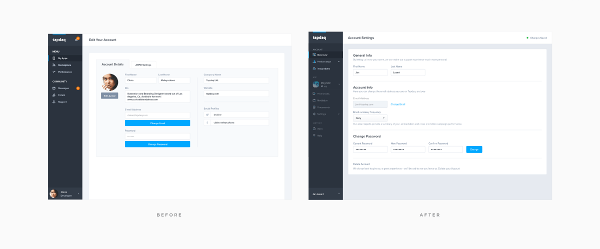
Account Settings — Before & After
You may receive 500 likes for bright crazy animation of a potato or sliding pizza but what’s really important is that your users will find how to manage the frequency of company emails or how to filter their performance analytics.
Future (What I want to learn)
My next mission is most importantly to dive more into UX and research. To be able to share in my next article an overview of the UX tools I use for A/B testing and for gathering data. I’m still quite new to UX and I haven’t had many opportunities to learn in previous jobs. But, currently, I’m passionate about tracking and watching every user’s move on every new project I’m working on.
The End
I’d be happy to hear about your work process – which steps you usually take in your personal projects or how your process is different while working in teams. I love to see other people’s workspaces. And most importantly feel free to share your thoughts about all/additional steps in my process.
I’m posting more from Tapdaq and my personal projects on dribbble and I’ll be happy to hear your thoughts on Twitter.
Originally published on Medium. Republished with permission.


