5 Most Common Wireframing Mistakes (And How to Avoid Them)


A client comes up to you with a web project, you sit with them and determine the outcomes you’re looking for. After you finish you need to organize your ideas and explain your vision back to your client in a simple, understandable way. This is where wireframes come into play.
But first, what is a wireframe?
A wireframe is a visual representation or a mockup of an interface using only simple shapes. They’re void of any design elements such as colors, fonts or images and they’re used to communicate ideas and represent the layout of a website in the early stages of a project
That being said, wireframing is an area that’s often either neglected or poorly executed by many designers.
So today let’s take a look at some of the most common wireframing mistakes and how to avoid them.
Mistake 1: Overcomplicating the Design

Although your wireframe is a representation of a future website, always remember that it is a product designed for a very different target audience. Your wireframe is designed to communicate ideas to clients, bosses, developers and other stakeholders. Too many details and graphical elements on a page might confuse users, so keep those to a minimum. If the only person who understands your wireframe is another designer/developer then something has gone wrong.
Use this as a rule of thumb: whenever you finish sketching and ask people without any design/development backgrounds – the office manager, a friend, your barista – whether they understand the basic function of the page .
Mistake 2: Prioritizing Style Over Functionality
Unfortunately, this is one of the most ignored facts by web designers who let their personal taste get in the way. Designers who add elements such as logos, colors and complex typography to wireframes are a case in point. When you add graphical elements to a wireframe you confuse its function with a graphic mockup. This makes it harder to define the visual clarity of the wireframe thus it’ll lose its purpose which is communicating ideas.
A wireframe should always represent the function and content flow of a website, not how good it looks. Therefore there’s no actual point in including graphical details in them.
Mistake 3: Taking shortcuts
When you sketch a wireframe you might come across moments where you’ll say “The sign-up page is not important lets not do it” or “The navigation is simple, I’ll skip it“, doing so will put your whole sketch to danger since you’ll eventually destroy the flow of pages in the website when viewing the final document to the stakeholders.
You need to move that pen and sketch every single detail even if it’s a simple line, so you’ll get a fully fleshed out wireframe that explains the function of each page and how it relates to others. Most projects end up at around 10 to 15 different wireframes in order to accommodate the different page types so keep that in mind.
Mistake 4: Not Getting Proper Feedback

Before starting to wireframe, it’s important to determine who is in charge of the project – who makes the final call. Generally, in small companies/startups it’s the founder, but it could be an art director, design lead, or manager. They’ll be the ones with the idea and vision of the project and a deep understanding of the end goal and give you proper feedback accordingly.
In small projects and single clients, it’s generally the designer who’s in charge, so he has to understand the end goal and vision of the product and discuss it thoroughly with the client.
Mistake 5: Not Understanding the Difference Between Low-fi and Hi-fi Wireframes
Generally, wireframes are split into types, low fidelity (lo-fi) wireframes, and high fidelity (hi-fi) wireframes.
-
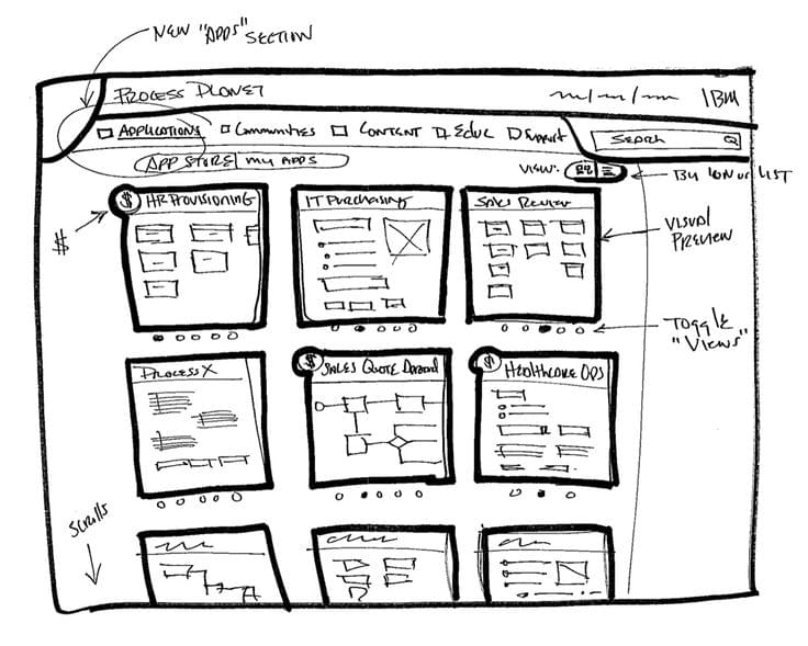
Lo-Fi wireframes are the best place to start your wireframes. They’re very simple and can be easily created with pen and paper and are most useful for defining navigation, layouts and how elements flow in a page. However this type is NOT useful for showing actual interactions.
-
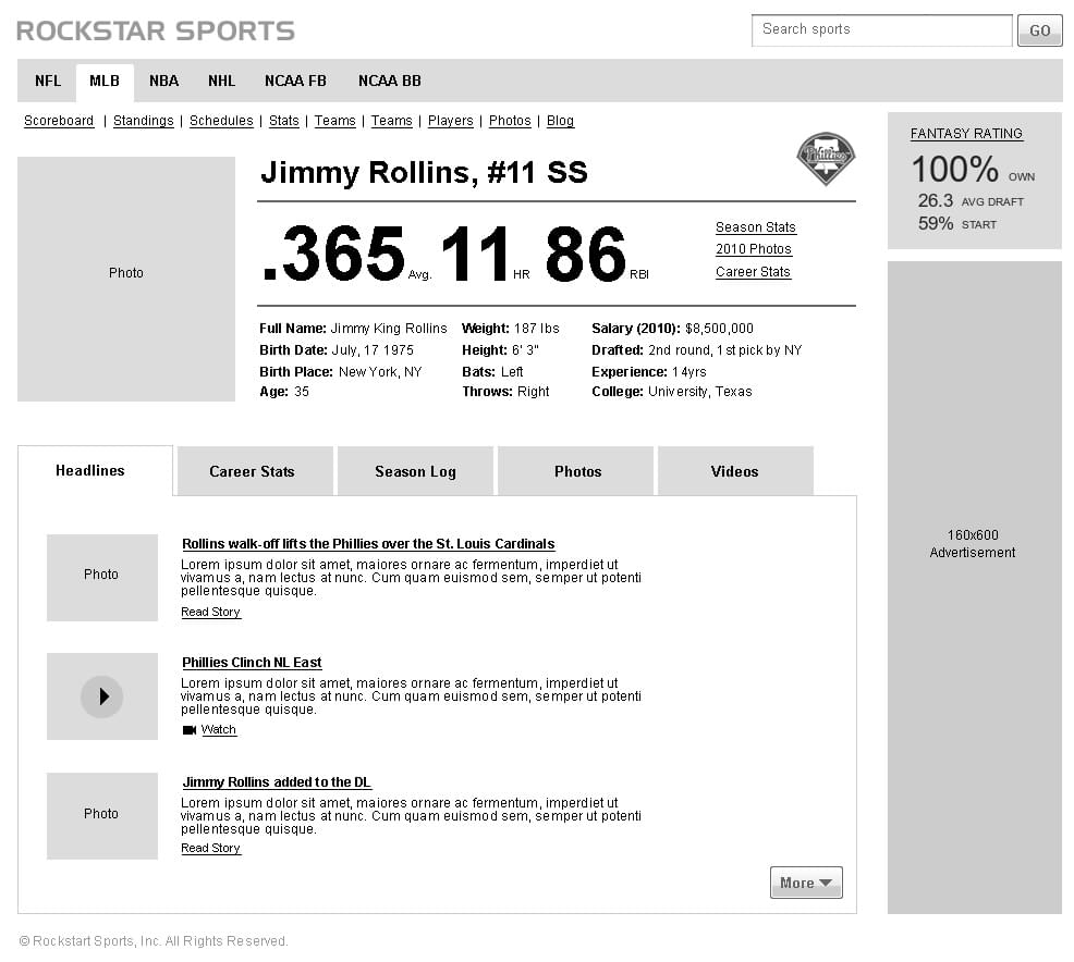
Hi-Fi wireframes fill in the details that were missing in their simpler predecessors (Lo-Fi). They define the visual hierarchy of the page, forms and other interaction elements and even labels, instructional text and paragraphs, this type of wireframing should provide clear enough visualization of a website to allow development team to begin their work.
Designers should be able to use both of them since there’s no correct approach to wireframing. Selecting the proper type of wireframe depends on the scope and context of the project. Also, do note that you don’t have to use only one of these types. It’s common to start with low-fi wireframes and then move into detailed hi-fi wireframes along the way.
A Quick Recap..
Keep your wireframe as simple as possible and avoid adding extra graphical elements such as colors, typography, and images. Fight the laziness and procrastination whilst wireframing and sketch every single page of a project. The wireframe itself has to have an owner whether it’s the designer himself, the client or the owner of the company.
Lastly understand the difference between low and high fidelity wireframes and when to use each one will immensely improve your quality and speed.


