How to Create Responsive Layouts in Sketch (with a Drop of Fluid)


BREAKING NEWS: If you’re a Sketch fan, Daniel has just released his first book for SitePoint. Check out Jump Start Sketch!
Some of Sketch App’s most impressive functionality is derived from the Sketch community of developers. JavaScript/Cocoa developers can make use of the Sketch Plugin Engine to extend and enhance the workflow of user interface designers using Sketch – one such extension is the Fluid Plugin, which brings an element of responsive design functionality to Sketch.
Fluid is very similar to Xcode’s “Auto Layout Constraints” feature, which helps those building “Universal Apps” (singular apps designed to work on both iPhone and iPad) design responsively. Fluid isn’t a complete solution to responsive design in Sketch – you can’t add/remove content – however, the constraints do allow users to keep objects “aligned” or “pinned” when resizing artboards.
If you can’t quite wrap your head around the mobile-first approach to responsive design, then you’ll definitely want to check out our How to Rewire Your Brain for Mobile First UX video (below), which is a core aspect of our Master Mobile UX course.
Let’s start by installing Fluid.
Installing Fluid
Plugins can be installed by downloading them manually and dropping them into the correct folder, which can be found via the Sketch menu at Plugins → Manage Plugins… → (click cog icon) → Show Plugins Folder. Else, simply download Sketch Toolbox and search for/install Fluid there.
Setting Constraints
For this tutorial we’ll be using a .sketch freebie by Dmitry Kustov, focusing on the desktop header section of the template. Download the freebie, open it up in Sketch, and then use the keyboard shortcut command+option+3 to make the Layer List and Inspector interfaces disappear – we won’t need them today.
Start by opening the Fluid toolbar with control+shift+T.

Centering Objects
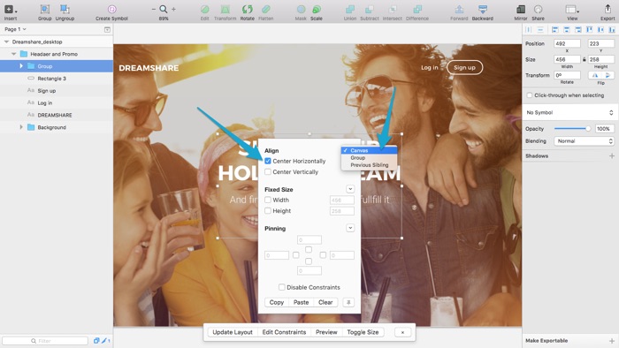
Hold shift while you click the four layers in the center of the artboard (the ones that make up the headline and call-to-action) to select all of them at once – if you need to click-through any Groups, hold command as well. Since these four layers will be dependent on one another, they really should be inside a Group of their own; use command+G to do that.
Now choose the “Edit Constraints” option from the Fluid toolbar.
Later when we resize this artboard, we want this Group of four layers to remain in the horizontal center at all times, so under the “Align” heading, check the “Center Horizontally” box. You’ll also notice a drop-down menu nearby; these options let you specify what your alignment is relative to, which can be a neighboring object, a parent Group, or the entire canvas.
We want our Group to be centered according to the “Canvas”.
Pinning Objects
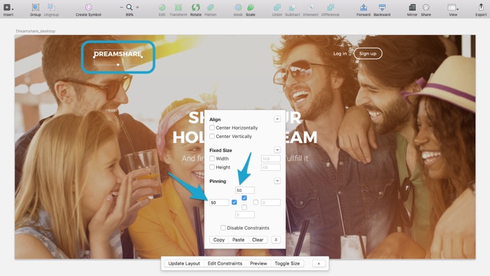
Lets repeat these steps with the items in the menu, only this time, we’re going to pin the layers rather than align them. We don’t need to Group the logo since it only consists of a single layer. Go back to the Edit Constraints modal and input “50” into the top and left input fields under the “Pinning” tab.
Essentially this means that the layer will always be offset by 50px from the top and left sides of the canvas.
You may have noticed that the artboard doesn’t actually change when you add constraints, but don’t worry, the changes will certainly be evident when we use Fluid’s preview function.
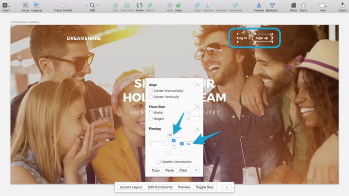
Next, select the three layers from the right side of the menu and Group (command+G) them together. Repeat the constraints steps again, only this time apply 50px offset constraints to the top and right sides of the canvas, instead of the top and left.
Applying the Changes
Like I said a minute ago, the artboard doesn’t reflect the constraints we’ve added until we hit “Preview” in the Fluid toolbar; after all, we only want to apply the constraints to smaller devices. In any scenarios where you do want to see the changes in the artboard, click “Update Layout” in the Fluid toolbar.

As you can see, the logo and the menu items in the header have been “pinned” to the edges of the canvas with a simulated 50px margin. Press command+Z to undo the changes, as we don’t actually want our desktop version to reflect these constraints.
Designing Fluid-Width Containers
We don’t need to define any fluid-width containers in this tutorial, but we’ll cover it for completeness. Ordinarily, when declaring number-based styles in the Inspector we can use math operations like “100%-100px”, which means that the layer (let’s assume we’re talking about width) will span the entire width of the artboard (or Group, if the layer is inside one); minus 100px.
For example: if the artboard width was 1440px, the layer width would total to 1340px – the mathematical operation is performed and the width is the result. However, if you’re declaring these width or height styles within Fluid, it will recalculate the result of the math operation when you change the device in “Preview”.
(Hence, fluidness).
Previewing on Alternate Devices
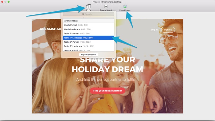
Hit “Preview” in the Fluid toolbar. A modal will appear; click “Resize” and choose the “Tablet 7″ Landscape (960 x 600)” device.
Everything looks fine – our constraints have worked and the design appears to be optimized for this device. We don’t need to create a separate artboard for these dimensions. If you’re using collaborative design tools like InVision App you’ll want to export this screen still; click “Export Image” to do that.
Assembling Device-Optimised Designs
Repeat these steps, choosing “iPhone 6 (375 x 667)”. While the constraints were clearly effective for tablet layouts, it’s clear that we’ll need to specify alternative constraints to make our layout work on devices smaller than tablets. Luckily, Fluid doesn’t force you to work with a one-size-fits-all mentality.
Select “Copy Artboard” and then close the modal.
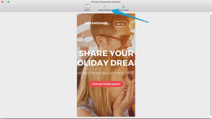
Paste (command+V) it into the canvas. We now have the opportunity to optimize our layout for the iPhone 6, in a separate artboard. Even though this artboard originated as a copy of our desktop artboard, the constraints no longer exist. In fact, we could add new constraints and repeat this workflow as many times as necessary, but since we won’t be supporting devices smaller than the iPhone 6, we won’t need to do that in this case.
But we do need to optimize our layout for the iPhone 6. You have the choice of styling the layers as normal, with the Inspector, or setting constraints and finishing up with “Update Layout”.

Conclusion
Responsive layouts is a first for Sketch, thanks to Fluid. It’s not a complete solution, like Webflow for example, but it is a flexible and non-destructive one. You can use Fluid to quickly test a concept for responsiveness, or you can use it to rapidly assemble device-optimised layouts, either of which can significantly improve and speed up your workflow.
NEWS: If you’re a Sketch fan, Daniel has just released his first book for SitePoint. Check out Jump Start Sketch!