Parallax Burns: Converting Photographs from 2D to 3D with SVG

Last week we talked about ZorroSVG, a tool for converting your chunky transparent PNG-32s into slim and flexible SVGs.
That got me thinking.
A few weeks earlier, I talked about the use of the Ken Burns effect in film and television.
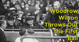
Figure 1: The ‘Parallax Ken Burns’ effect (as a GIF)
But there’s another similar, but slightly more sophisticated technique that pans and/or zooms different layers of a photograph at different rates to give the image a slightly 3D effect. Sometimes this is called a ‘Parallax-Ken Burns effect’, other times ‘The 2D to 3D Effect’, sometimes it’s the ‘2.5D Effect’. You might think of it as the ‘History Channel effect’ but it could just as easily be the ‘VH1: Behind the Music effect’.
This is a classic videographers trick, so all the tutorials you’ll find on Youtube for this effect are aimed at Adobe After Effects users.
But what if we could mimic the effect entirely inside a standalone SVG graphic?
That was the plan.
It didn’t quite work out that way (yet) but I thought it might be useful to share what I have so far. Let me be clear: this is a jumping-off point for people, rather than a finished production-ready product. I know it doesn’t work in Opera 3. ;)
I don’t want to get super code-heavy here, but you should be able to pick through the CodePen to understand the detail.
The plan was to…
- Break down a photograph into three overlapping layers – front, middle, and background.
- Convert those layers into SVGs using ZorroSVG.
- Manually re-combine those layers into a single multi-layered SVG
- To use CSS animation inside that SVG to get the Parallax-Burns effect.
First take
The Photograph
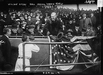
Figure 2: Woodrow Wilson archive image
My first task was to find a good image to work with. I found this nice copyright-free archive photo of Woodrow Wilson from Flickr (fig 2) that has a good sense of depth to it.
After dropping it into Photoshop, I repaired the damage in the bottom half and then split it into three separate layers (all PNG-32s):
- Foreground: The fence in the foreground
- Middle ground: Wilson and his fellow VIPs
- Background: The remainder of the grandstand
As we’re going to be moving these layers in relation to each other, we’ll need to create some extra image to fill the gaps. I used Photoshop’s ‘content-aware fill’ to clone in new image behind the fence and also behind Wilson and co. It’s pretty rough but it will do.
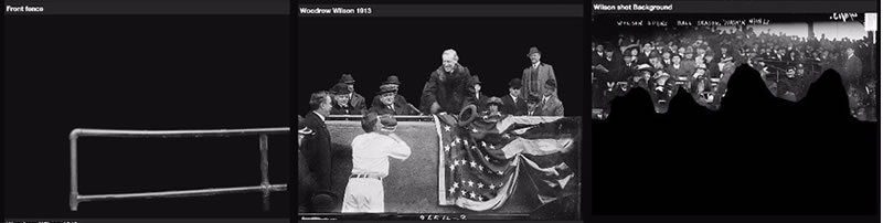
Now we have our raw image components.
The SVG Markup
CodePen allows you to write SVG markup straight into the HTML panel so it’s a great place to play with SVG ideas. Let’s go straight to my first ‘proof of concept’ test:
See the Pen SVG Parallax Burns by Alex (@alexmwalker) on CodePen.
You’ll notice that the fence layer moves farther and faster than the middle layer as it’s closer to us. That’s the key to the parallax effect.
In SVG, there are two ways to put pixel-based images into your file – and it’s really no different to HTML in that regard.
Method 1. Encode & embed your pixels:
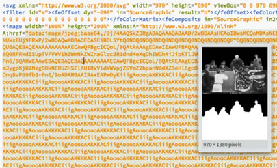
Figure 3: Brackets live preview of the encoded image
You can base-64 encode your pixels. This just turns your image into a long string of numbers and letters that you can paste into your SVG document in any text editor. This is precisely what ZorroSVG does – and if you open a ZorroSVG file in a code editor you’ll see something like this (fig 3):
Encoded images are a little unwieldy to work with, but it’s worth it to be able to encapsulate everything in a single, standalone file. This won’t break if you download it, or move it to another folder, or lose your internet connection.
Method 2. Link your pixels via URL:
As we commonly do with our HTML, it’s possible to link to an external image from inside your SVG like this.
<image class="back"
      xlink:href="https://i.sli.mg/lZPsUt.png"
      x="0" y="0"
      width="970" height="690">
  </image>
This is neat and easy-to-work-with, but if your SVG and its image resources get somehow moved or separated, your SVG will have sad ‘missing image’ flags in it. I don’t like that idea.
Nevertheless that’s exactly what I’m doing in the CodePen test above. The three IMAGE elements are stacked back to front. We’ve given each IMAGE element a sensible CSS classname too – .front, .mid and .back.
I’m not going to explain every line of code but the noteworthy parts include:
- Inside the STYLE tags at the top of the SVG, you’ll see two simple CSS scaling animations – parallax-front and parallax-mid.
- I’m getting a bit fancy by adding an SVG blur filter (
filter:url(#effect-1);) to the front and back layers, but leaving Wilson’s layer sharp to increase the depth. Ideally, I’d love to slowly dial-up that blur effect as we zoom in to increase the 3D feel. But not for this demo. - The ‘
transform-origin’ property of50% 50%means we will be scale/zooming into the exact center of our image. A value of50% 100%would feel like we were moving in-and-under Wilson. A value of50% 0%would feel like we were zooming over his head.
As a test, I think this is very successful. There’s a real sense of time and space that isn’t present in the original photo. But on the down-side, the SVG relies heavily on external files that may not always be available. Things would be much more robust if we could sink it all into a single, standalone file.
Second Take
Figure 4: Brackets live preview of the encoded image
If we run our three PNGs through ZorroSVG we get three new SVG files that we can open in any code editor. When I open one in Adobe Brackets and hover over the image code, I get a cool little preview of the encoded image (see figure 3).
You’ll see that ZorroSVG puts the image in the top half and encodes the alpha-channel (or mask) in the bottom half. The little section of filter code at the top does the magic of automatically applying the mask.
If you run all three PNGs through Zorro you’ll notice that the filter code at the top is identical. So… if we manually edit those three encoded image sections into a single SVG file, the image layers should stack perfectly, right?
And they do! The stacked three-layer SVG image is probably about the same size as the original flat PNG.
We can then add the same CSS classes and animation code to this file and BAM! – we should have a standalone ‘Parallax Burns’ SVG file.

Figure 5: London Olympics – 1948 – Football
London-olympics-football-1948.svg
And we do. With some issues…
But it works. The example (figure 5) is a single SVG file that you could download, upload, email, or pop on a USB as you might with any JPEG.
The Problem?
If you viewed the above file in Chrome or (ew…shudder) Safari, you would have noticed a jerky, ticking to the animation rather than the smooth glide we saw when we were manipulating PNGs in CodePen.
On the other hand, if you viewed the file in Firefox (and I warmly encourage you to), you would have seen gorgeous, swoon-worthy, buttery-smooth loveliness. (oh, it’s so nice…). Firefox blows every other browser away when it comes to SVG manipulation.
To be honest, this SVG example (fig 5) is far higher resolution than I needed to make it, but I wanted to push the browsers. Firefox doesn’t break a sweat.
As this is an alpha, I haven’t tested it in IE11 yet, but be interested in hearing people’s experiences.
In general, it seems that SVG can interpret most CSS successfully, but there’s little doubt that it isn’t as polished with CSS as our HTML browsers are. For instance:
- SVG can’t handle 3D transforms in CSS (it flattens them to 2D)
- CSS animation seems generally less smooth and robust when rendered in SVG (with the exception of Firefox). Give it simple tasks and it’s fine but don’t push your luck.
Final thoughts…
There may be some simple coding fixes to fixing this animation smoothing problem.
- Maybe setting image dimensions helps?
- We could use SVG’s built-in animation syntax called ‘SMIL’.
- Perhaps it’s more efficient to use SVGs clip-path as the mask rather than the alpha channel filter we’re using.
I’ve only been playing around with the possibilities for a few days and there is still plenty of room for experimentation.
Nevertheless, I think this is an effect that has a place in web design if we can get the technical bits right. I could see this technique working really well in a re-imagined slideshow unit – each image slowly zooms in until it fades to be replaced by a fresh zooming image.
Anyway, have a play and let me know if you come up with any improvements.
Originally published in the SitePoint Design Newsletter.
Update – March 11, 2016

Figure 6: Wilson Parallax Burns using clip-path to mask. SVG image link
In the original post, I mentioned that I thought SVG’s clip-path masking might provide a more efficient and more performant masking options than the alpha channel filter we used in my first examples.
I’m happy to report that in this quick test, that seems to be the case.
The image you see here (fig 6) is a standalone SVG of about 245kb. It has a natural (unscaled) size is 965px x 664px and definitely seems to animate much more smoothly than the original version.
Using a vector mask on the JPEGs provides a sharper, lower-fidelity mask edge than the alpha channel filter version – but it’s not a deal-breaker (I could have done a nicer job cutting the mask).
I also applied the blur filter to the fence AFTER I applied the clip-path mask, so it has a defocused blurred edge anyway.


