How to Make Your Users Enjoy Waiting

Waiting is typically an enormously displeasurable activity: It’s unproductive, boring, and even tense.
And so, if you ask users to wait, many of them will refuse. According to a study by Forrester Research, almost half of consumers expect a site to load in two seconds—and if it takes longer than three, 40% leave.
So, should you prioritize page load time over everything else? If you do that, you’ll have to get rid of many of the features enriching your UX—like that interactive graphic, or video clip, or high-resolution image.
The solution: Make waiting fun. Or at the very least, make waiting more efficient, less dull, and less stressful. Here are five techniques to help you do just that.
1. Give Feedback Strategically
There’s a reason kids ask, “Are we there yet?” during long car rides: It’s harder to wait when you don’t know how much longer you’ll be waiting.
Knowing that, you might be tempted to show users a progress bar whenever loading occurs. But hold off.
According to the “king of usability,” Jakob Nielsen, there are three time limits to be aware of.
-
If a response occurs within 0.1 seconds, users perceive it as “instant,” meaning that you don’t need to do anything but show them the result.
-
If a response occurs within 1 second, users will notice the delay. However, special feedback still isn’t necessary.
-
If a response takes more than 10 seconds, you’ll lose user attention. Either distract them, or tell them how much longer it’ll take so they can start another task.
These time limits are fairly well-known. However, note that there’s a big swath of time between 1 second and 10. What do you do if a response takes 4 seconds? What about 9?
Two researchers from Carnegie Mellon found that showing users a progress bar when a task took less than 5 seconds actually made the task feel longer. It turns out, a progress bar (while fantastic for managing expectations) draws attention to the wait-time.
With that in mind, I recommend using progress bars for load times expected to be 5 seconds or more.
2. The More Updates, the Better
Interestingly, when given the choice between a speedy long line and a slow short line, people will choose the long line. We like to feel as though we’re continually making progress. (To test this theory, ask yourself whether you’d rather drive 30 miles in stop-and-go traffic or 100 miles down a deserted freeway.)
And that’s why progress bars or loading symbols that frequently “pause” aren’t as desirable as the symbols that constantly update.
Compare the two progress bars from Pic Monkey and Photo Cat.
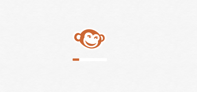
Pic Monkey’s loading bar updates in big chunks, going from roughly 20% to 45% to 90% to completion.
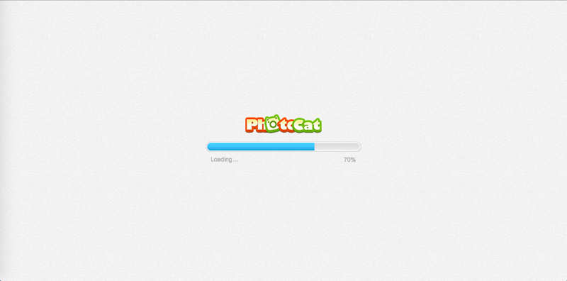
While Photo Cat’s image editing tools took an identical amount of time to load, the bar updated far more frequently, showing at least 15 steadily higher percentages. This gives the illusion of a faster load time.
You can achieve the same effect by using a pulsating progress bar. When Chris Harrison and his colleagues studied the effects of five different progress bar “types,” they discovered they could increase the perception of load time by 11% simply by using a bar that pulsed from light blue to navy at an increasing frequency.
3. Use Early Completion
Have you heard the phrase, “Done is better than perfect”? Well, it definitely applies to loading. If you render the page in sections, rather than all at once when it’s completely loaded, you’ll reduce your users’ passive wait time (i.e., the amount of time they’re sitting there with nothing to do.)
Google uses this technique with Inbox, its email app. The skeleton of the page shows up immediately: a second or two later, your messages appear; a second or two after that, your Google Hangout chats are displayed.
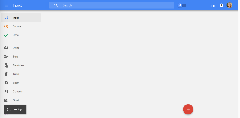
Google Inbox: Done is better than pefect
The user barely notices what’s missing, because he or she is too busy looking at what is there.
This strategy also works with smaller elements.
When you upload media to Facebook, the loading process is depicted by a grayed-out picture frame (also called filler content). This frame is replaced by the real file once the process is complete.
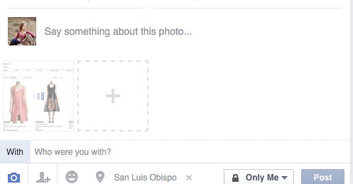
And this technique effectively halves your wait time, because rather than waiting for the whole file to finish, you’re waiting for the frame. Once you’ve seen that, the wait is so brief it doesn’t register.
4. Make It Fun
Here’s where you have the opportunity to bend the rules. The more fun and engaging you can make your loading page or symbol, the more distracting it’ll be.
One of my favorite examples comes from Pretty Loaded. You’re shown a fairly standard percentage bar–but each percentage comes with a description:
Right before you reach 100%, the screen flashes “TTYL.”
The loading screen of Lordz dance academy is almost entirely yellow. Your eyes immediately are drawn to the tiny dancing silhouette in the middle–and kept there, because watching him move is mesmerizing.
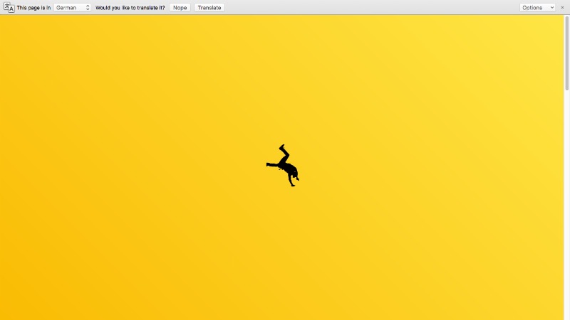
In fact, the illustration is so cool that I was almost disappointed when the home screen finally loaded.
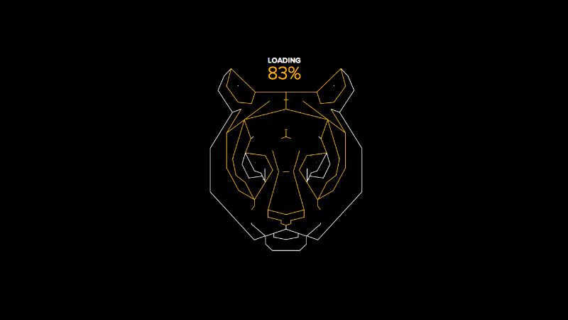
Run 4 Tiger, a project from the World Wildlife Fund, also has a hypnotizing screen.
A tiger’s face is sketched in tandem with the loading progress. By the time you’ve reached 100%, the full drawing has emerged.
These examples are not only beautiful, they’re also relevant. When designing your loading page, it’s important to take into account user psychology and best practices, but if you want your loading screen to feel unique and special, riff on your brand or product.
5. Integrate the Experience
To truly make waiting pleasurable, make your loading screen “flow” into the rest of your app. That means instead of two discrete, stand-alone experiences, it should feel like one extended experience.
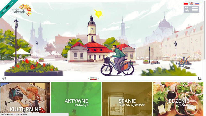
Take a look at the tourism website for Bialystok, a city in Poland.
The loading screen incorporates a loading percentage (technique #2) and an illustration of a man on a bicycle, pedaling furiously (technique #4).

When the actual site shows up, you see the same man on the bicycle–now proceeding much more leisurely across your screen. This visual continuation makes me smile every time.
And loaded..
Illusion, a digital arts magazine, uses the same basic concept.
It’s got a low-contrast, static loading screen…
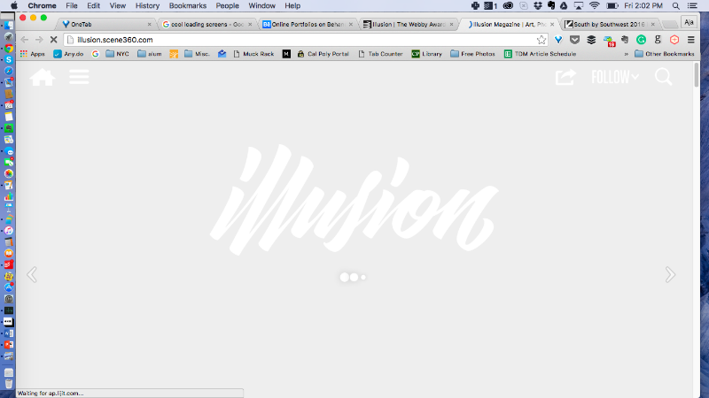
Which transitions to a high-contrast loading screen with a GIF hero image.

Despite the different effects, notice how the placing, size, and style of the logo stay consistent. This design choice reminds me of the yin-yang symbol.
We can see a third application of the integration technique with National Geographic’s EAT: The Story of Food website.
If you judged the loading screen as a stand-alone, it wouldn’t fare very well. A small unidentified object spins in the middle of a black screen.
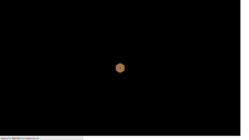
However, the object doesn’t disappear when the website loads. It spins into the center, revealing itself to be an innovative “menu” (both literally and figuratively).

Each segment represents a different component of the human diet, like sugar, grains, etc. When you click on one, the same loading symbol shows up in miniature.

For more loading inspiration, check out 4 Tips for Using Animation in Design and 12 Creative, Clever Loading Screens.


