What Do Super High-Res Displays Mean for Your Website?

When retina displays hit the market, web design experts and web developers gasped at the thought of having to deal with a new resolution.
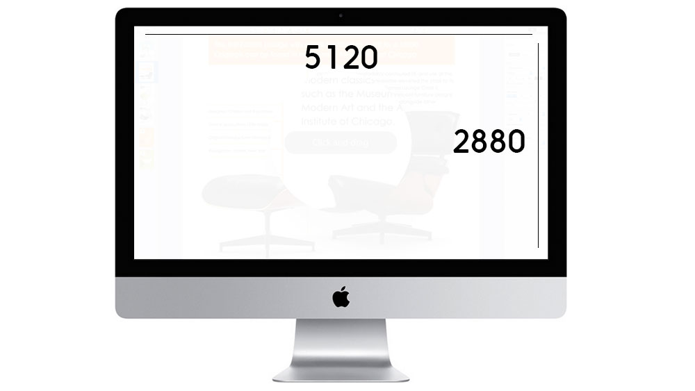
From a web design standpoint, it was a nightmare. Responsive design dealt with content for different screen sizes and device widths, but pixel ratios were a whole new ball game. Now Apple is releasing iMacs with 5K displays and a lot of web designers are sweating at the thought of scaling everything up once again.
The problem with this comes from the fact that the main consumers for these types of machines are web and graphic designers. We are always upgrading our equipment. We're only human, and we are looking for the most features for our money. The problem is that in order for graphics to appear crisp, so they'll need to create images that are 4 times as large in pixel size.
Problems Arise
There are several problems that arise when screen resolutions drastically increase. For Retina displays, images doubled in size. Now, with the 5K display, they doubled again, meaning they are 4 times larger than typical images.
Bandwidth is limited
Serving large images is fine when you're on your desktop computer with a high-speed internet connection. However, it's impossible to ignore the 80% of browsers who are looking at your site on a mobile device. 4X images will crush 3G and 4G internet connections. You will have to serve smaller images to those devices for quick load times and to save as much bandwidth as possible.
Another Size to Remember
Not only is it rough on bandwidth, but it's another image size you have to remember. When building a website, you'll have to accommodate those devices, creating an image size optimal for those devices. If you're concerned with conserving resources, it's an issue. A handful of 1-4MB images may not cause an issue, but what if you have thousands?
How Can We Address These Issues?
Fortunately, our field is working on solutions and workarounds to increasing image sizes. It would make our jobs more difficult to create multiple versions of sites or pages, but with simple scripts and options, we can serve the best version of our site and its files to the right people.
Images
The newer version of Photoshop has the ability for you to export an image in multiple sizes at once. This single feature can save you a few minutes per image of saving it at different sizes, including 2X for Retina displays. All that is needed is for Adobe to add 4X to their size options. It will be as simple as clicking a button and saving the image to a folder.
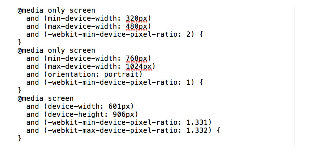
Media Queries
Media queries will allow you to serve different images to different devices with different pixel ratios, whether they are 1, 2, or 4. This will give you some degree of control over images looking crisp on the right device.
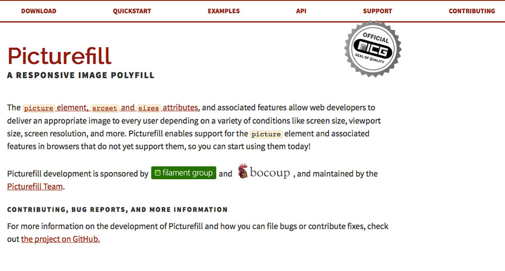
PictureFill
This lifesaver allows you to serve images to every user, depending on a variety of conditions you may encounter, with all of the different devices out there. PictureFill handles situations like screen size, viewport size, screen resolution, and more. It enables the element feature, as well as workarounds for browsers where it isn't supported.
Other Issues
With all of these issues to address and things to consider, as well as the solutions we've covered so far, there is still the issue with the weight of your site. With these huge image sizes, your site's weight is going to drastically increase. Most hosting companies allow limited resources. Not everyone can afford abundant hosting. The biggest issue is keeping your site's weight down.
SVG
SVG is constantly evolving, and it's a great way to cut down on weight. SVG file sizes are small, so whenever you can use them, it will help trim the fat on your site. Responsive SVGs means that the same graphic resizes to fit the screen size and different devices.
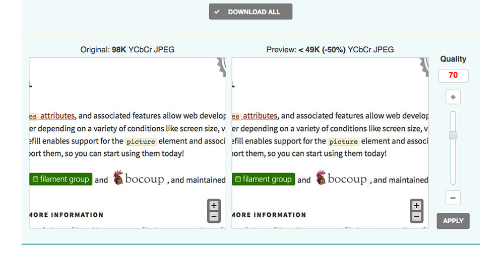
Image Compression
Image compression is another way to cut down on the weight of your site. Just because your images are large and you have multiple copies, it doesn't mean they have to be full size.
There are several image compression services available to use and they are free, too. The top choices are WP Smushit, TinyPNG and Optimizilla. You'll want to choose the right one for you. You may want to try them out yourself to decide which one gets the best results for your images.
Just as an example, in the image above, I reduced the quality to 70%, but I couldn't notice a visual difference, but the file size was reduced by a significant 50%.
Services
If you're concerned with eating up too many resources, you can also serve those images from a service such as Amazon Web Services, which is an affordable way to serve files without worrying about hosting limitations. This is a case where you only pay for what you use, which can help serve a lot of files quickly. It really depends on the size of your site.
Conclusion
It's no question that screen sizes and resolutions are growing. Technology is ever-growing and ever-changing, so the need to accommodate the newest devices will always be a challenge. It's important to note that web technology is growing with it.
It won't be long before we have a rock-solid system in place for handling and serving different images for different screen sizes and pixel ratios.
In the meantime, it is important to keep our sites as lightweight as possible, using the methods we have available.