5 Emerging Trends to Amp-up Your Web Designs in 2017

With 2017 already shaping up with some very interesting moments, fresh web design trends are also starting to emerge. This year we’re seeing a large number of visual trends changing the face of web design, including some that subtly improve the user experience as well.
But while user experience is undeniably important when it comes to website design, you cannot let your visuals go by the wayside, as the awe and emotional appeal of the design also influences whether or not a user sticks around for the ‘experience’.
In today’s article I give you a rundown on 5 visual trends that will help you renew the creativity your web design in 2017.
1. Serif Fonts
Sans-serif fonts appeared to be dominating the world of web typography for a while there. We saw beautiful fonts like Maven Pro, Futura, and Helvetica Neue emerge from our screens, and they became top choices for the everyday web designer. But now, Serif fonts have started to become fashionable again (and not only in formal settings but in fun, modernized settings as well).
We witnessed serif fonts seemingly gain more traction in 2016 as more typographers started to develop modernised serif fonts. Fonts like Slab Tall X, Justus and Novello began reshaping how we typically use serif fonts in modern web design.
Most design trends appear in a completely different medium before they spread to other mediums – here’s one example where serif fonts made quite an impact on television before they did in web design.
2016 delivered us the mega-hit television show, Stranger Things; the short Netflix series opening is a visual delight and the serif font animating around in their red-neon glory is darn attractive. Fun fact: the title itself is a serif font inspired by several Stephen King novels, a modified version of ITC Benguiat created by Ed Benguiat. Like so many other design trends, they can cycle back years or even decades later.
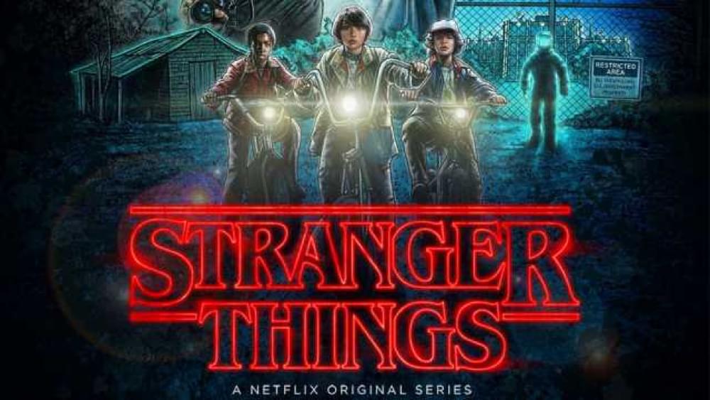
Stranger Things
Not familiar with Stranger Things? Serif fonts were also used in several 2016 Oscar-winning films such as Bear Story, Room and The Hateful Eight!
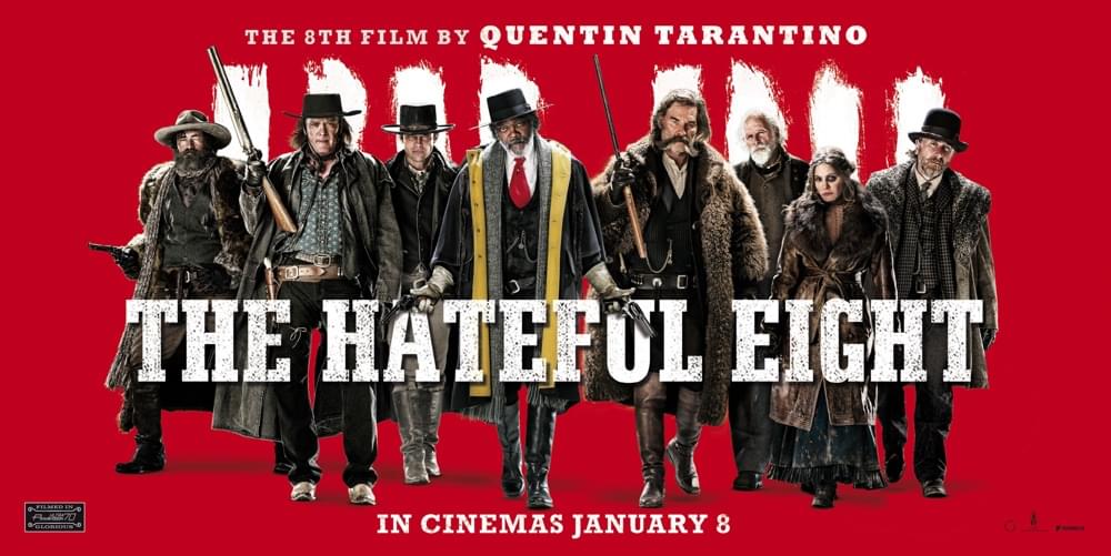
The Hateful Eight
2. Natural Color Palettes
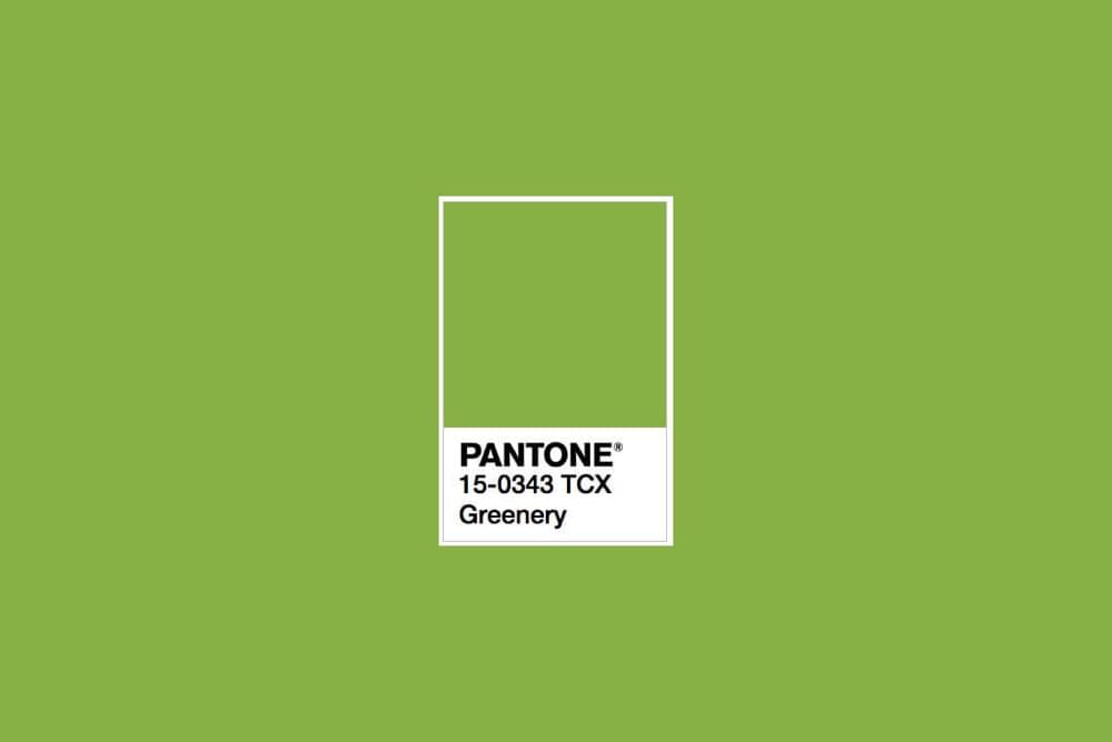
Pantone recently announced that “Greenery” is the 2017 Color of the Year, a color that symbolizes new beginnings, which is very fitting considering current events of the world. Leatrice Eisemen, Executive Director of the Pantone Color Institute says: “Greenery bursts forth in 2017 to provide us with the hope we collectively yearn for amid a complex social and political landscape”.
Natural and neutral toned palettes will certainly be taking over 2016’s bright and bubbly tones. That’s not to say that bold colors won’t be used, but they certainly won’t be the highlight of web design.
In 2016 we began to see natural colors coming to light, especially when it came to television shows. Both The Walking Dead and Westworld come to mind here. While the palettes in The Walking Dead were used to help relay the dark tones of the atmosphere, Westworld also used a natural color palette but imbued their colors with rich tones that fuelled the fantasy world. You’d be surprised at how much impact television has on our lives, how it influences which types of visuals we respond to.
Natural doesn’t necessarily mean “brown”, or even Pantone’s “Greenery” color set – you can mix-and-match or additional natural accent colours to compliment these colors. 2016’s home decor trends were heavily leaning towards natural color schemes, and perfectly demonstrated how one might go about dropping the bright colors while still crafting an attractive layout.
Don’t forget to consider usability when choosing colors. Trends aren’t everything!
3. Mega Navigations (Meganavs)
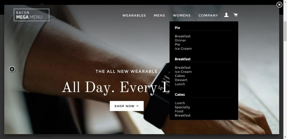
Slowly but surely we could see the death of, or at least the minimization of, the hamburger icon. While the icon does help to free up space, it can also create friction between the user and where the user wants to navigate to, so whether or not this trend will sink or swim is still a mystery. In 2017, expect to not only see desktop navigation menus taking on new layouts, but to grow in size. As the saying goes, “go big or go home”, and right now it looks like meganavs might be a big thing.
Huffington Post has had their own version of a meganav for some time now.
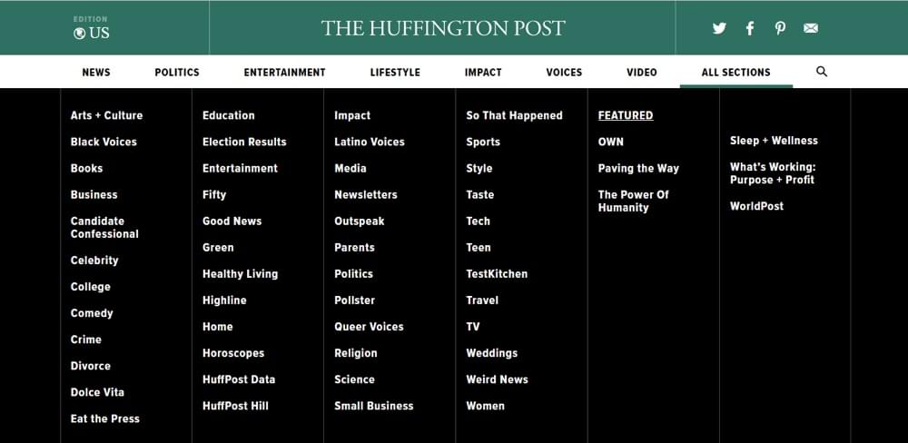
Mega navigations, ‘meganavs‘ for short, as the name implies, are large navigation menus that completely take over the screen to immerse the user and keep them on track, boosting conversions and the user experience at the same time. It doesn’t stop there however; meganavs also can reveal subpages, featured content, and in some cases, advertising Meganavs are more than a visual trend, they can completely change the structure and content strategy of the website.
4. Overlapping Content
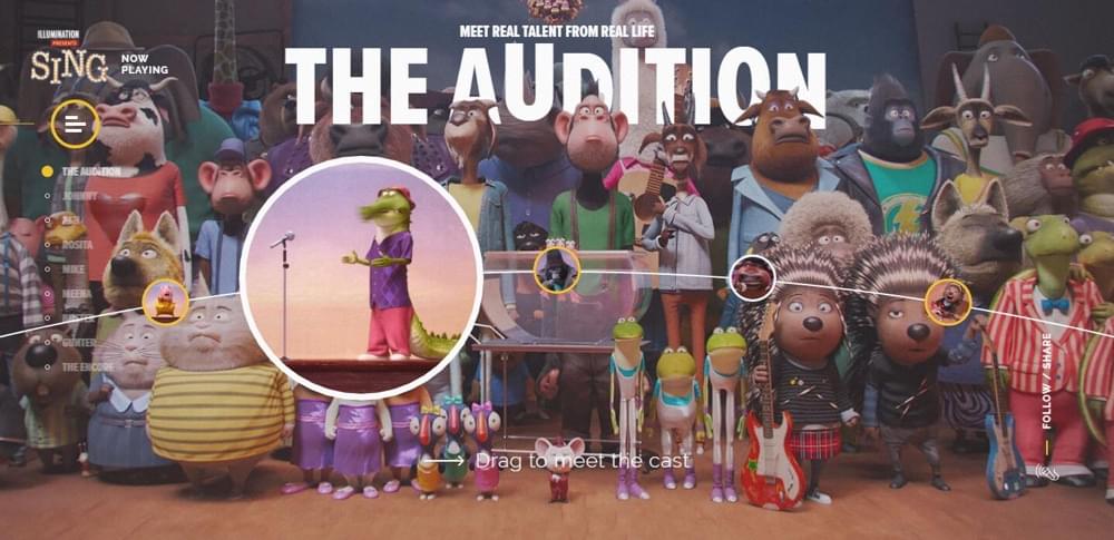
Overlapping content works well with artistic websites with lots of imagery – it helps create designs that are dynamic, with the ability to bring multiple trends together to create depth and immersion.
Overlapping content isn’t about inserting one element on top of another, it’s about rearranging a layout artistically so that each element has a chance to shine. For example, if you were Instagramming your delicious home-cooked meal, you wouldn’t simply dump it in a bowl and hope for the best, you’d carefully position everything, ensuring that each food item is clearly visible and that the colors are complimenting each other. Overlapping content follows the same design philosophy.
Placing text in front of textures and shapes is becoming more and more common because it draws the users’ attention to the content, and the use of drop shadows can ensure that these elements aren’t drowned by these textures and shapes (because legibility and contrast should still be a #1 priority).
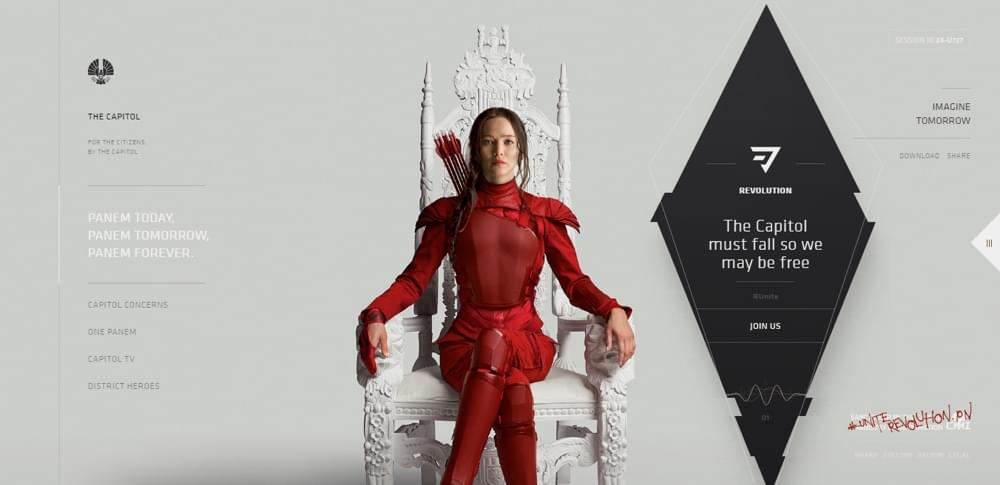
Overlapping elements can not only help your content stand out, but it can let the user know where their attention should be, and where they attention should go. Overlapping content can be used to establish a seamless flow across the webpage, a trend that can captivate the user immensely, especially if you decide to incorporate animation as well.
5. Gradients (Again?)
Gradients continuously come in-and-out of fashion. Remember Instagram’s change to their logo in 2016? It received a huge amount of criticism upon its reveal, and subsequently thereafter. Despite the negative reception, its shift from skeuomorphism to a multi-hued gradient was certainly impactful.
Last year, Pantone decided that we needed not only one color, but two. We were gifted with the beautiful duo of Rose Quartz and Serenity that flowed into each other gracefully. The gradient it formed when the two colors met was definitely one that was appreciated, and even though two colors were not selected this year, we can nonetheless expect gradients to play a huge role in visual design this year.
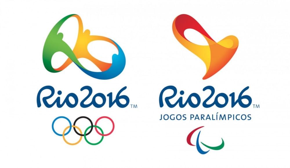
Gradients in web design are a fantastic way show off some spark. Gradients aren’t solely for backgrounds, as they can also work for well for logos, lifting them off the webpage – the Rio 2016 Olympics logo is a wonderful example of that.
Wrapping Up
As you can see, design trends that exist in interior design, graphic design, title screen design and so on, can influence trends in web design too (and vice-versa!). This is why it’s so important to take inspiration from the things around you. You may even find yourself starting a trend of your own!
Don’t be afraid to adapt or mix-and-match trends; after all, the user experience should come before visual aesthetics, but they should also find a way to compliment each other. This results in a unique experience altogether, and your ability to entwine creative ideas with an effective user experience is what will set you apart from other designers. 2017 will bring us many more visual trends, but if you implement and experiment with the five listed above you will almost certainly renew your creativity!