Review: Is the New and Improved Google Fonts Better?

It’s been six years since Google first unveiled one of the world’s largest, free web font services. Their easy-to-use interface was instrumental in bringing what was often considered a brittle technology to the masses. Since 2010 the service has steadily grown in both library diversity and scale.
Recently the service received a full make-over, bringing a more streamlined way for you to preview fonts and get up and running in no time.
But is it actually better? Let’s take a look.
Latest website on the left with the legacy site on the right
A Polished and Updated Look
I certainly believe that the overall look and feel of Google Fonts has improved. One of the first big things you will notice will be that the whole site uses Material Design. Gone are the thick borders, low-resolution graphics, and bright blue buttons. These are replaced by subtle animations and interactions helping you to focus on narrowing down your fonts.
The updates to the visuals are pretty impressive, but what’s also good is that the site is now fully mobile responsive. The previous version of the site didn’t handle smaller resolutions or resizing gracefully, leading to lots of random UI bugs that made the site look weird / remove functionality.
On the right, as the screen gets smaller you can see we lose the ‘Preview Text’ input field making it impossible to get a live preview of our text. Also, as the screen gets narrower the action buttons start to cover up both the font name and the author, eventually vanishing entirely.
The legacy site has been around for a long time and provided a heap of functionality so we can generally cut them some slack. It’s refreshing to see that the new site looks great and works across all device types.
Dynamic Theme Chooser
One area of concern for designers was choosing a font which works well across different foreground / background colors. Sometimes a font might look great when it’s black on a white but then could be next to impossible to read when a bright color is used.
Google added a custom color chooser right at the top of the site. When clicked it provides a quick swatch of colors to let you preview how your fonts will look. You can use this to see how your fonts will pair up when used on dark / light backgrounds with dark / light text.
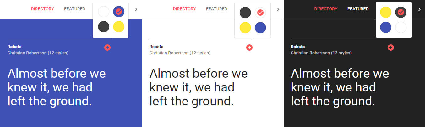
Even though you can’t precisely specify the colors you want, this is a nifty tool that everyone should use when picking out their fonts.
Showcasing Featured Fonts
Featured Fonts are a brand new introduction to the updated Google Fonts website. Accessible right from the top menu, these featured fonts are collections of fonts that Google wants to highlight. These collections are created by either Google themselves or by outside agencies to showcase a particular design style or philosophy.
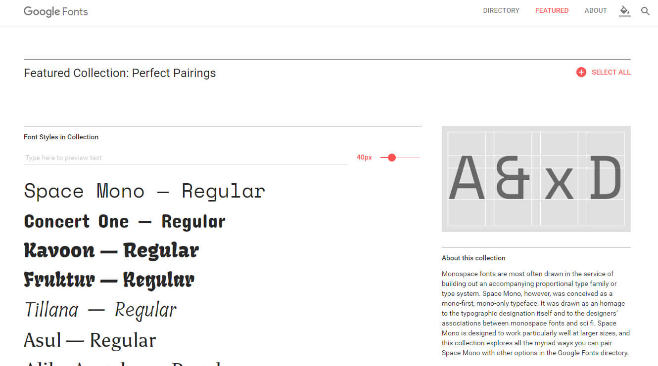
Currently, there are only a few sets of featured fonts, however, it would make sense if this range will increase in time as more fonts are added and the previous Google Fonts website is discontinued.
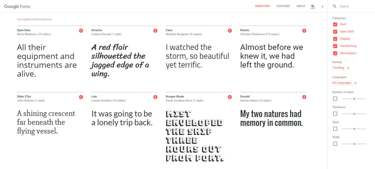
A Supercharged Inline Font Selector
The main experience with Google Fonts is how to preview and select your fonts, some would argue this is the most important part of the website.
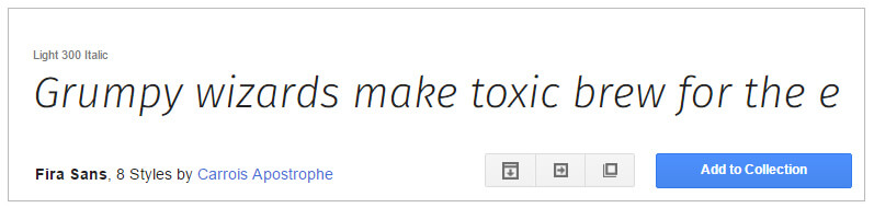
![]()
Previously, when viewing your fonts you would see something similar to the diagram below – a simple preview of text with a series of action buttons. Your view might look different depending on how you’ve filtered your search but generally, it’s a simple square box with a series of actions a big blue add button.
While there wasn’t anything particularly wrong with this approach, it just didn’t feel polished or intuitive. For example, the action buttons on the bottom of each font, could you determine what these did without clicking / hovering over them? If I hadn’t used the site before I would swear they were ‘download’, ‘forward’ and ‘copy’.
The only element that really made sense was the ‘Add to Collection’ button.
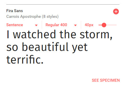
The new design is much more refined and provides everything you need to preview your fonts. Here are the highlights of what you can do:
-
You can choose to see a sentence, paragraph or even your own text to see how it will look. It’s really quick to load and helps showcase how the font will work across characters.
-
You can instantly swap between the different font weights. The site loads the new font almost immediately and lets you navigate them via the keyboard for simplicity.
-
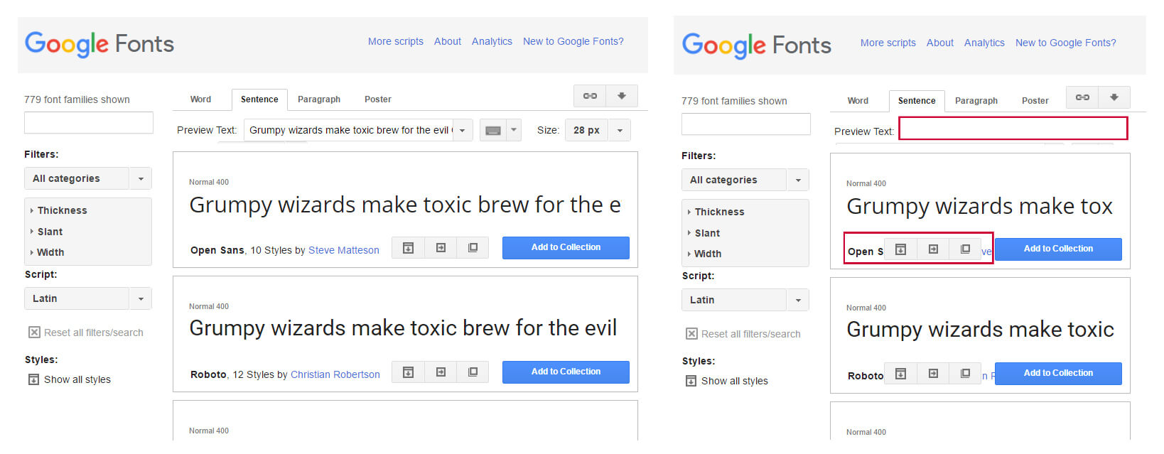
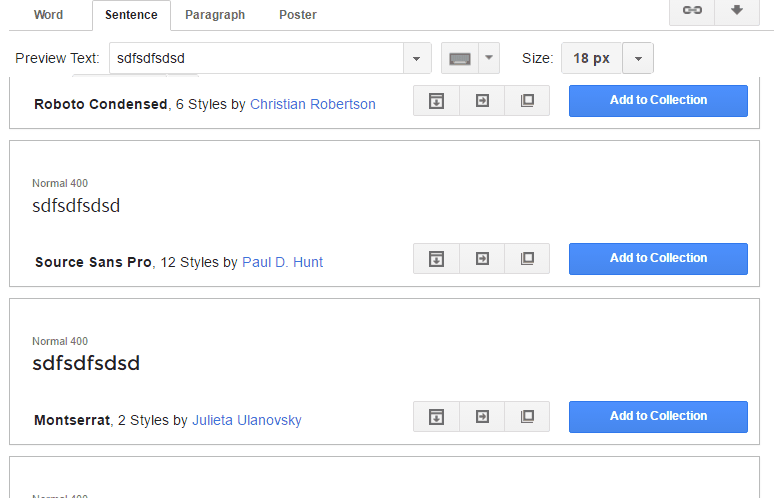
Adjustments to the font size are easy, with a simple slider you can adjust just the font you’re looking at or every other font on the page. In addition, when resizing to a larger font the rest of the page reflows (unlike previously where the text would be clipped inside a box)
Beforehand if you changed your font size it applied by default universally to all fonts on the page. While that seems great in theory, it had the side-effect of reflowing your page. This meant that if you were looking at a font half way down the page and then resized, you had to scroll to search for the font again.
Let’s use ‘Montserrat‘ as an example and see what happens when we re-scale the font size
The original font resize feature
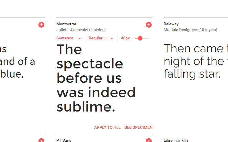
The new font resize feature
Notice that it was harder to keep track of our font as we resized? This was one of the smaller annoyances that made live previewing your font tedious. With the new site, you can change the sizes of fonts in the preview window individually, meaning other fonts won’t move and you don’t need to scroll as much.
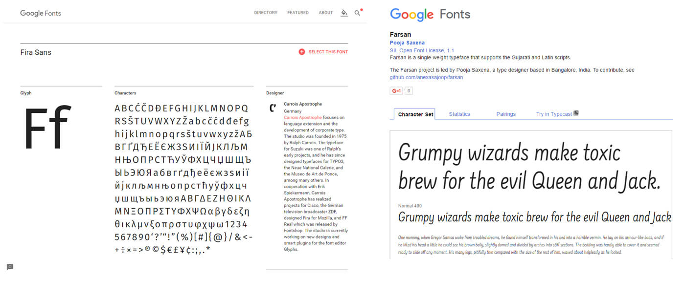
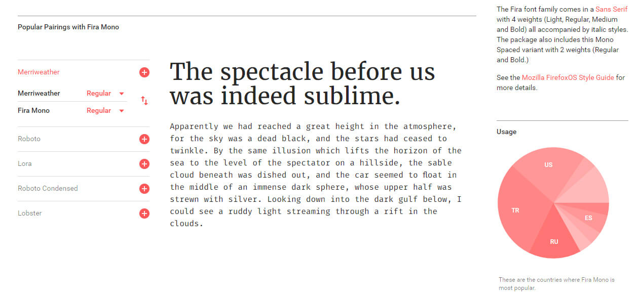
A Refreshed Specimen Preview
As part of the redesign, Google fonts has changed the way the specimen / sample preview works. Previously to get to the specimen view you would need to click the ‘popout’ button when viewing a font. This would open a popup window that outlined the character set, statistics, pairing and a link to typecast.
The refreshed specimen preview
The updated site does away with the popup functionality altogether. When you click the word ‘See Specimen‘ on each of the fonts, the page loads a single long page, outlining all of the characters in the font, it’s various weights, the author / designer, along with secondary information such as where it’s most commonly used and what font’s pair well with it. Overall it’s a fresher modern look that actually draws in my attention.
Simplified Font Configuration Panel
After you’ve added the fonts you would head over to the configuration page, where you would select the various weights and styles for your fonts. It worked pretty well on the old site – a simple one-page interface.
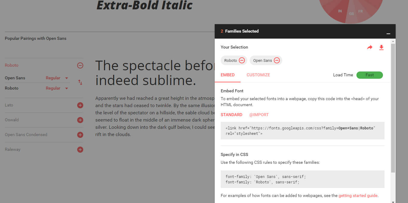
In the updated version your configuration panel sits at the bottom of the site. As soon as you add fonts it shows itself, giving you quick access to configure what you need without leaving the page.
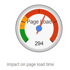
The old page load metric
The screen is split into the ‘Embed’ and ‘Customize’ panels respectively. The Embed section gives you access to the URL of the stylesheet and the CSS rules you need to use. The Customize panel is where you select your font weights/styles and see the speed impact your fonts will have.
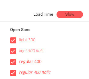
My only critique is that the page load indicator no longer reflects metrics, i.e you can’t see that your fonts impact will be 150 points, only that its impact weight is ‘moderate’.
The previous site attempted to more accurately describe exactly what the impact of adding this font would have.
The new page load metric
For example, if you have several styles, the impact might be judged as ‘slow’, but without numbers, it’s hard to understand the scale of the impact.
It doesn’t really give you enough information to make an informed decision. Sure, it’s good that Google is looking to simplify a complex process, but I believe, in this case, having a number here would be beneficial.
Bonus: Provide your Feedback on Google Fonts
If you look carefully at the bottom left-hand side of the new site you will see an exclamation mark. If you press this you can provide feedback on the site. While that might not seem exciting or even noteworthy, it’s actually a really awesome tool that lets you select a section of the website to screenshot.
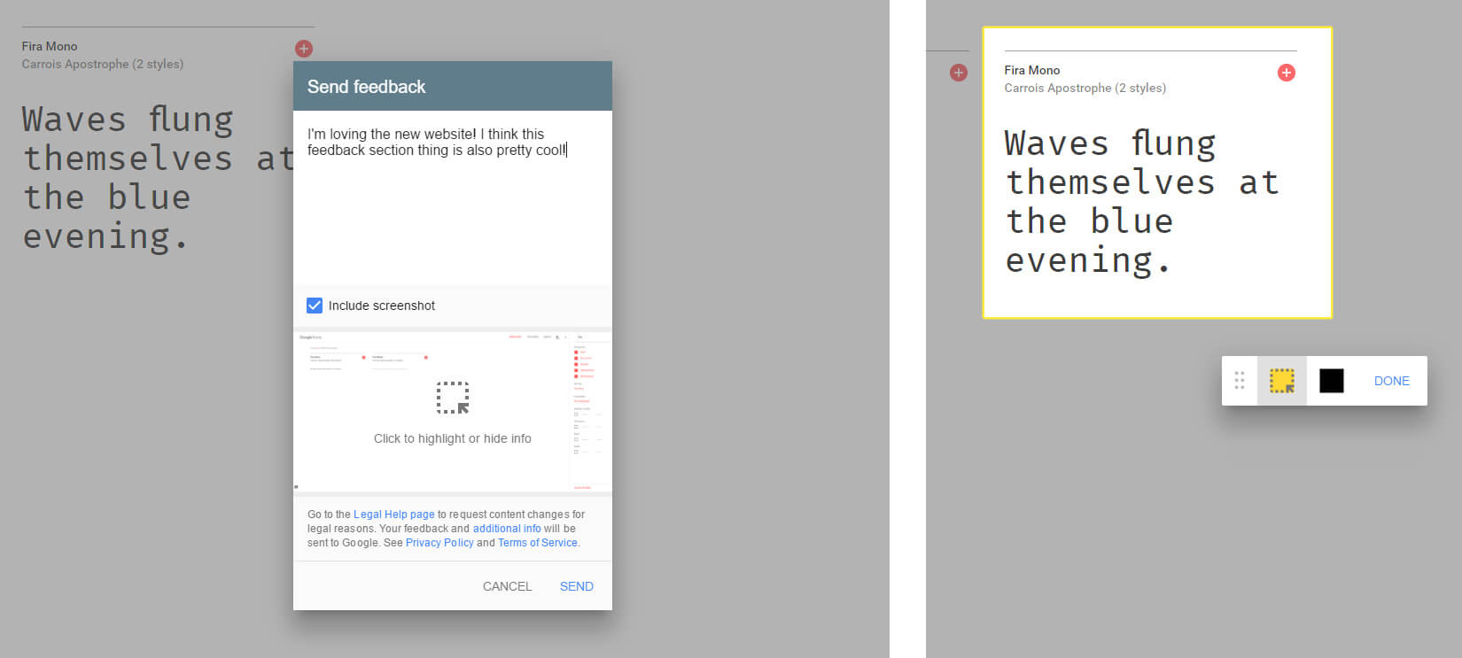
You don’t need to use the screenshot functionality to provide your feedback, but it’s great that it gives you the opportunity just in case you wanted to highlight something for them to focus on.
So, It’s Pretty Good Then?
If you liked Google Fonts before, then you’re probably going to love the new site. It’s all the things you loved about the old site with none of the downsides. The whole experience has been streamlined so that previewing, selecting and implementation of fonts is almost seamless.
Everything feels new and has that level of polish that you would expect in a modern web service from Google. Now’s the perfect time for you to have a play around with the new site so you can see first hand how significantly better it is and how it should make your task of choosing fonts that much simpler.
Perhaps one downside is that it can (still) take a while to find the perfect font. IDEO built a font map that uses machine learning to display Google Fonts on a map – they’re arranged so that similar fonts are placed next to each other. Could this be a better way to discover the perfect font?
Now is as good a time as any to take the new service out for a test-drive. Let me know what you think!


