Is This the Dawning of the Age of Interrobang‽

You see, I’ve turned the moon into what I like to call a “Death Star”.
The spoken word and text are like close siblings. They don’t see eye-to-eye on everything but are constantly borrowing stuff from each other.
When we want to highlight a word or phrase in speech as noteworthy or questionable in some way, we might use ‘air quotes’ (don’t pretend you’ve never done it). That’s a writing device that we’ve pinched for speech.
But it works the other way too. Writers have invented – or, at least, tried to invent – new typographic elements to mimic what we are communicating with our speech. Let’s have a look at a few and what they can do for us.
Oh sure, we need to more punctuation

In GroundHog Day, TV weatherman, Phil Connors (Billy Murray) pitches this line to his viewing audience:
‘This is one time where television really fails to capture the true excitement of a large squirrel predicting the weather.’

Genius, but Murray’s delivery is so deadpan that he could almost be serious. We know he’s being insincere but how do you pick that up in the text?
In 2006, Douglas Sak proposed the ‘Sarcmark’ and still runs a project to promote its adoption. Plug-ins are available to provide the sarcmark on WordPress and Windows but the campaign seems to have stalled ten years after it’s birth.
Though there is no official sarcmark built into the unicode set our computers use, there’s a pretty close match for it built into the Unified Canadian Aboriginal Syllabics block called ‘Yi‘. It has the HTML code of ‘ᘒ‘ and looks like this:
ᘒ
ᘒ Regardless, I’m certain things will improve for the sarcmark campaign very soon.. ᘒ
Oh, the Irony

Irony is a difficult enough concept to explain and a number of attempts have been made to find a way to mark it in text passages. Options have included dashes, square braces and slashes, but the original – dating from the 1580s – probably still has the most traction.
English printer Henry Denham proposed a reversed question mark called a ‘percontation point’ which was used mainly for rhetorical question that don’t require answers.
The glyph is easy enough to find and use with two potential options available. You can go with the more crafted Arabic Question Mark (&#1567 – ؟) or you stick with the mare standard Reversed Question Mark (⸮ – ⸮).
Interrobang Bang!
In one episode of ‘Parks & Recreation’, Ron Swanson’s first reaction to seeing the Tower of London is:
You call that a tower? Try the Sears Tower, friend.”
As funny as that line is, it points out a failing in the English language. Clearly Ron isn’t genuinely questioning whether this structure is truly a tower. He’s being deliberately incredulous, but there’s no way to tell the difference when it’s written down. We have to guess by context.
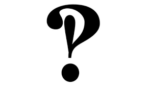
In the early 1960’s, ad-man Martin Speckter wrote an article pointing out the missing feature and proposed a solution. Where he’d previously used a combination of ‘?’ and ‘!’ , he combined them into an overlapping amalgam that shared a period (the dot) – ‽.
He called it the ‘interrobang’ – the ‘interro’ part means ‘question’ while ‘bang’ is traditional printer’s slang for an exclamation mark – although ‘exclamaquest‘, ‘quizding‘ and ‘rhet‘ were all entertained as names. I don’t know what an exclamaquest is, but, gee wilikers, I want to go on one!
You can summon an interrobang with ‽ – ‽
Unlike the sarcmark or irony mark, Speckter’s new glyph gained enough momentum over the next decade for Remington to begin producing typewriters with interrobang keys. In fact, you could even get kits to retro-fit one to your current typewriter. I can imagine the excitement of a typist unboxing that bad-boy and setting it up for battle.
But for whatever reason, the interrobang never made it to the standard computer keyboard and so it has hung in typographic purgatory since the 1970’s. More’s the pity. At its best, it may be second to only ampersand in pure glyphic elegance.

People seem to genuinely love the interrobang as a shape. You only need to do a quick image search on ‘interrobang tattoo’ to understand the psychic pull this little glyph has. Etsy offers dozens of interrobang cufflinks, earrings and other jewellery options.
So, why are people so quick to emblazon their bodies with it?
I’m not entirely sure, but it does tempt me to try using it in important text headings.
It’s certainly neater than using two characters and is unusual enough to really draw your eye. At the same time, I think it’s still close enough to ‘?’ and ‘!’ to be self-explanatory – a claim you can’t make for the sarcmark.
I haven’t got an obvious place to use it now, but I’ll be looking.
Would you?
The big question remains, though: Are all these typographic flourishes destined to be swamped by a rising sea of grinning yellow emoticons and poop icons?
Originally published in the SitePoint Design Newsletter.

