UX Lessons from Amazon: 4 Hacks Guaranteed to Boost Conversions
- BusinessContent MarketingContent strategyConversionCopywritingDesignEmail MarketingMarketingRevenueTechnologyUI DesignUsabilityUX

I’ll admit, Amazon’s visual design is awful and kind of outdated. I’m sure many designers and UX experts will agree with me on that, so naturally, an article stating UX lessons from Amazon might raise some eyebrows at first. Bare with me though.
While Amazon still has much work to do in terms of visual design (it’s 2017 after all, users care about aesthetics!), we can still learn a lot from Amazon in regards to UX. In fact, Amazon has an amazingly-effective UX system, where research shows that they were responsible for 53% of all online retail sales growth in the U.S. in 2016.
Yes, read that again. One single company was responsible for 53% of retail sales growth in a country as big and diverse as the U.S. How did Amazon do it? Let's take a look.
1. Having a Well-Oiled Recommendation Engine
If there's anything that Amazon has mastered, it's the subtle art of reading their users’ mind (or putting things into their users’ mind?). If you shop on Amazon, as soon as you order something, before you even realize that you need something to complement it, complementary options are staring you right in the face. Here’s an example:
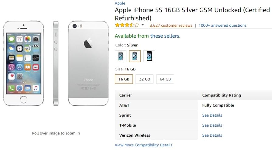
Below is an item I’m taking a look at on Amazon—a refurbished Apple iPhone 5S:
Slightly scrolling down below reveals the following:
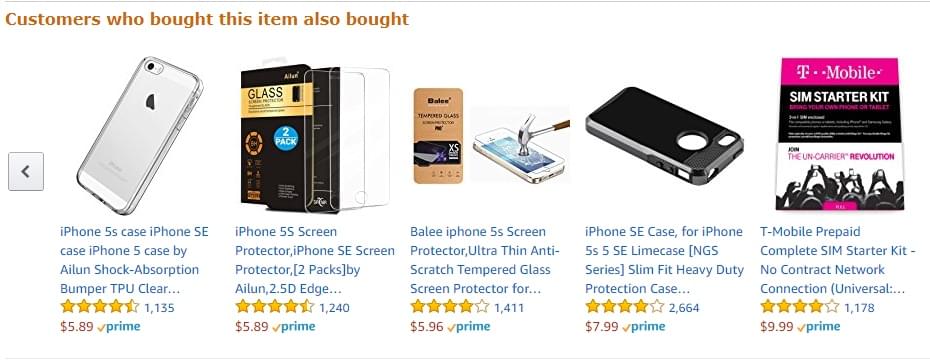
As you can see, Amazon has recommended a number of things I might need alongside my new iPhone: an iPhone case, a screen protector, and a T-Mobile starter kit. Not only are the recommendations timely, but they're also essential, useful and relevant.
Now, as simple as this looks (bearing in mind that simplicity is usually the foundation of terrific UX), it’s worth paying special attention to, and here's why. This system of recommendations, in which Amazon recommends highly-relevant products to people who are about to purchase something on its website, is so effective that it's responsible for over 35% of their overall sales. In case that doesn’t sound impressive enough, it’s worth noting that Amazon’s Q2 revenue for 2017 was $37.96 billion dollars.
So, the first UX lesson from Amazon is to have a clear understanding of your users—their habits and reasons for using your site—and tailor your offering to them accordingly. This can boost revenue by up to a whopping 205%, according to some sources.
2. Employing a Unique Approach to Email Marketing
Amazon's approach to email is very unique. No spam, no daily emails (like a lot of other e-commerce sites), but they drive most of their revenue via email. In fact, research shows that email plays a core role in the recommendation engine mentioned above, where it converts a lot more than Amazon’s on-site recommendations (which already converts at an impressive 60%!).
So what are Amazon getting right when it comes to email UX?
- Personalization: Dale Carnegie famously said that the sound of our own names is the sweetest sound to us, and it seems Amazon knows this. As a result, one of the notable things in their emails to users is that users are addressed by their name.
- Relevant and targeted emails: the difference between useful email and spam is often whether the user wanted it or not. Sometimes Amazon rarely emails. Sometimes, they email very frequently—almost every day. When Amazon sends a lot of emails, you can count on two things: one, it's heavily targeted and tailored towards the interests of the user; and two, it's intelligently timed around the time when the user engaged in browsing on the site. In other words, Amazon doesn’t email users "just because". Instead, they send super-targeted emails when they know you're looking for something (all the while also knowing exactly what you're looking for). Really smart.
- It's an extension of their site: there’s no confusion about where the emails are coming from. It's clear that it’s Amazon, because of the email experience—the look and feel, the organization of items, literally everything in the email almost feels as if you're browsing the site. It's a seamless experience that users are familiar with.
- Following the KISS principle: Amazon is especially good at KISS (Keep It Simple, Stupid), one of the most proven UX principles where reducing friction and barriers to users’ taking action can result in a better conversion rate. In emails, Amazon makes it very easy to get to the next step, whether this is to learn more about a product, add it to the cart or wish list, or review something you just ordered.
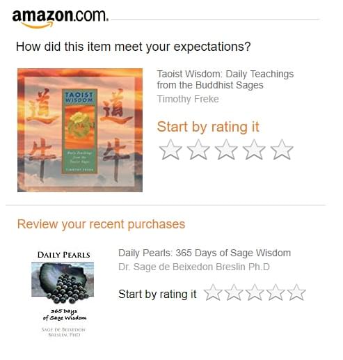
Here’s an example of an email they recently sent me asking me to rate a product I ordered. Clicking on a star in the email automatically takes me to the rating page with my star rating preloaded. Amazingly simple, and considerate of my time!
3. Removing Roadblocks to the Desired Action
Removing roadblocks is something that Amazon does well on their website too. A careful look at Amazon’s website reveals something: an intentional design in which roadblocks to the desired action have been intentionally eliminated, saving the user time, reducing their frustration and boosting conversions.
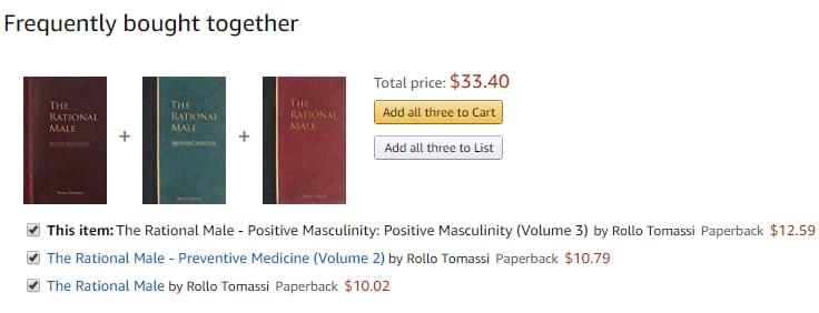
Example 1:
I was taking a look at books on Amazon when I came across a book, The Rational Male – Positive Masculinity: Positive Masculinity (Volume 3). Interest piqued, I quickly realized that the book it part three in a three-part series. Amazon wasn’t behind—they had already grouped all three books together as part of their "Frequently bought together" feature. There and then, I could add all three books to my cart all at once without having to go through the three books individually and add them to cart separately. This saves me a lot of time, and Amazon instantly increased its sale revenue by 200%.
Example 2:
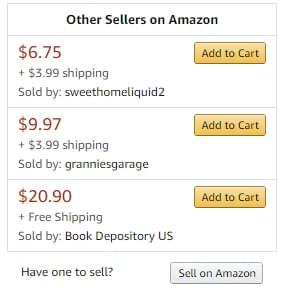
For a different order, for a book that would normally cost $13.16, there’s an option in the sidebar to buy used books from other sellers. And guess what? Right there in the sidebar, different options from different sellers, including how much the shipping cost is, and whether or not it comes with free shipping, has been included. I’m sold! How easy!
Amazon is also known for how astonishingly easy they make it to place your order; some Amazon users will see both an option to add a product to cart (in case they are interested in multiple products) or to simply buy the product of their interest "Now!".
4. Incorporating a Trusted Feedback System
Not only are users allowed to rate products, but they can also see the ratings of others. Many designers might not want to admit this is UX, but it is: research shows that almost everybody will conduct research to see what other people think about something they want to purchase online. By making reviews an integral part of the sales process, Amazon reduces steps users have to take to conduct that review independently, and in the process they accelerate their sales.
For many people, feedback is not synonymous with UX. However, in today’s internet age where 92% of people read online reviews before making a purchase decision, integrating an online review and feedback system is good UX practice. Why? Because, consumers will otherwise go elsewhere to find this review, so by integrating reviews into your website, you'll reduce the chances of them leaving your website and losing the sale.
Amazon takes additional steps to gain users’ trust in a world rife with scams and security breaches: first, they indicate whether the person making the review has purchased the product (letting people know the authenticity of the source of the review). Secondly, they introduced an option allowing others to agree or disagree with other reviews. Thirdly, even when a product has overwhelmingly positive reviews, they make sure to include one or two not-so-positive reviews to give potential buyers "the full picture." These steps once again reduce the extra actions that users have to take to make the decision to buy or not buy. That, in my opinion, is terrific (and ethical) UX.
Conclusion
More often than not, you'll get the best UX advice from successful companies who have been there, done that, worn the t-shirt. They've had their failures and learnt from them, and today they're a stronger company because of it. One of those companies, perhaps the strongest of all companies, is Amazon.


