3 Pro Tips For Finding the Perfect Image

We Held a Webinar!
You may have heard that we have partnered up with Graphic Stock recently to bring your a chance to win $5,000. You may have also seen that last week we held a webinar with our very own Design & UX channel editor Alex Walker.
It was our first webinar, and we were pretty happy to see such a great turn out! Sure there may have been a couple of early hiccups which are now hilarious playbacks, regardless Alex did a brilliant job speaking to us all about stock images! In case you missed last week’s webinar, I’ve created a recap from part 2 of his presentation.
3 Tips for Finding the Perfect Image
Tip #1. Work on Good Copy First
Killer copy can make ordinary images great! Now let’s take a look at an example of this, the Volkswagen Print Ad in 1960.
Volkswagen (1960)
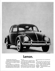
At first glance, it’s clear that this layout uses a very stock-standard – even boring – car image with the plainest composition you could imagine. But it’s the single-word headline below that is so jarringly brilliant that it forces you to do a mental double-take. A single word: “Lemon”.
After being drawn into reading the copy, you learn how a small blemish on the glove-box caused this car to fail VW’s quality testing.
Just to prove how clever they were, Volkswagen’s ad team re-used the same, fairly tedious car image in a different way not long after.
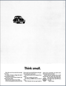
At a time when Time Magazine charged $6,000 for a full-page ad, Volkswagen was brave enough to leave most of their page empty, shrinking the car image and running with the simple headline ‘Think small’. In a world of big, glossy cars and big glossy car ads, a simple layout combined with sharp copywriting got amazing cut-through with readers.
In both cases, VW decided to go against current advertising norms and had great success breaking into a very competitive US car market. They didn’t need expensive photo shoots in exotic locations – in fact, the image looks like it could well be from the Beetle drivers manual.
The lesson from this example is that of clever copywriting (and some good layout) can make an ordinary image GREAT !
Tip #2. Identify the ClichéS – and Break Them
Once you have identified the cliché images for your project, then TWIST them…. Bend them… and then BREAK them! That’s right, be unique. Some of the clichés you may be looking for could be the subject matter, camera angles, typography, color or style.
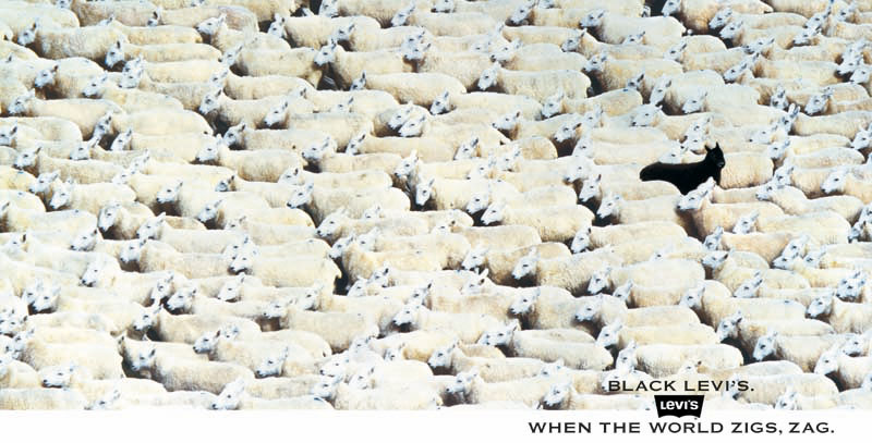
Levi Jeans
Consider this thought. You may have grown up watching your parents wear Levi Jeans, and there’s a high chance you’ve had Levi’s at one stage, you may even be wearing them now. Levi Strauss has been operating for 160 years now which makes them an old, old company.

So, how does an old company like Levi Jeans stay young and hip in the eyes of its customers? The standard approach has always been to ‘show young, hip people wearing their denim’. Unfortunately, almost all of their competitors will market denim with the same approach, making it hard to get cut through.
So to change their game up little, Levi selected a photo of a flock of white sheep heading in one direction and photoshopped in a single black sheep heading in the opposite direction. This ‘stand out from the crowd’ message might have taken 30 minutes to create in Photoshop and a modest budget.
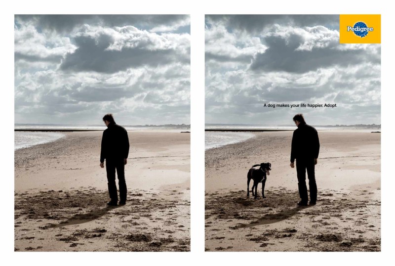
Pedigree Dog Food
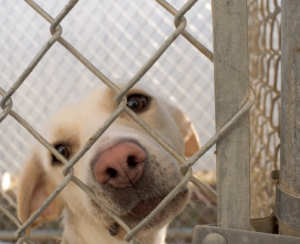
How does Pedigree dog food break the cliché to promote the idea of dog adoption. The obvious approach is to show a sad puppy and ask us to “Please save all the sad puppies” – or help us with our problem.
Pedigree took a less obvious approach by making the pitch all about you and your problems, showing how dog adoption can help your mental health and happiness. A 10-minute photoshop trick changes the meaning of the original image, and the tagline of ‘Take care of yourself and adopt a dog’ delivers the ‘payload’. Clever.
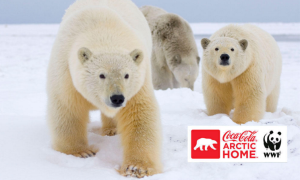
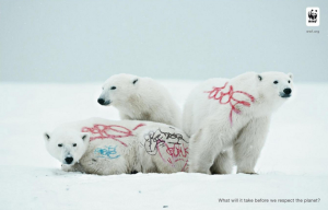
WWF Ads
How did WWF twist the cliché with their campaigns to protect the Arctic?
The obvious approach would be to say ”Nawww! Aren’t polar bears so cute? Save the arctic!” And readers will look at the picture of cute polar bears and agree – because they ARE cute – and turn the page.
But to make their message really land and twist the obvious, WWF used Photoshop to deface those beautiful, pristine white bears with grungy, colored graffiti ‘tags’. Even though I know it’s been photoshopped, I still can’t help feeling a little sick looking at it. It’s a silly trick, but this image impacts you on a much more gut level which I think makes it harder for readers to just smile blithely at the cute bears and turn the page.
These are a few of the topics covered, but you can watch all the examples in the webinar below.
Tip #3?
To get tip 3, you’ll have to watch Alex’s video below.
Watch: 3 Pro Tips for Finding the Perfect Image
You can also find a copy of his slide deck here. Thanks Alex!


