How to Create a Web Style Guide You’ll Be Proud Of


“Always design a thing by considering it in its next larger context – a chair in a room, a room in a house, a house in an environment, an environment in a city plan” — Eliel Saarinen
The quote above is from a wonderful, 20th-century Finnish architect called Eliel Saarinen – and that’s the train station he designed in central Helsinki. While Eliel was specifically talking about architecture, his concept is one that applies to all type of design – from sculpture to culinary arts to landscaping to web design.
However web design is uniquely challenged in this regard. How do you get a single, unified view of a website and its components? It’s like trying to understand a planet from ground-level – there’s no easy way to take a step back and look at your website as a whole. It’s hard to a sense of context.
So, what do you do?
This is why style guides are particularly important in web projects. They are often the only way to get a consolidated overview of all the components of your site in a single place. That is why this article is designed to be a crash course in style guides for web design. Hopefully, by the end, you’ll be able to create your own guide that can be edited for future use and expansion.
What is a Style Guide?
A style guide is simply the definitive visual documentation for a project and outlines the rules you set for your brand. It’s a set of design guidelines that could be as simple as a one-pager for a small site, right up to Coke’s 150-page style bible (PDF) covering the design of umbrella panels and truck painting requirements.
Your style guide should be ‘the mother of all references’ for your project and a living blueprint to help you maintain consistency from start to finish. No matter what part of your design you’re working on the style guide will and should have a guideline or rule to make your job a lot easier. If it doesn’t, then it isn’t a complete style guide.
Researching Your Brand
Understanding your ‘baby’ is the first step of developing a style guide. If you don’t know anything then chances are you’re going to be running to the design ER telling a specialist you “just did something and prayed it would work”. So if you have to spend a day, a week or a month to truly understand your brand then do it.
Sure it seems like a boring task but it will be more than worth it. You have to understand the mission goals, statement and the face behind the site. These understandings will tell you whether York Whiteletter or Bebas Neue in mango peach on a pastel blue background will work on not. For more on brand research, you can hop over and check out Richa Jain’s great article on Creating a Brand Identity.
Configuring the Color Palette
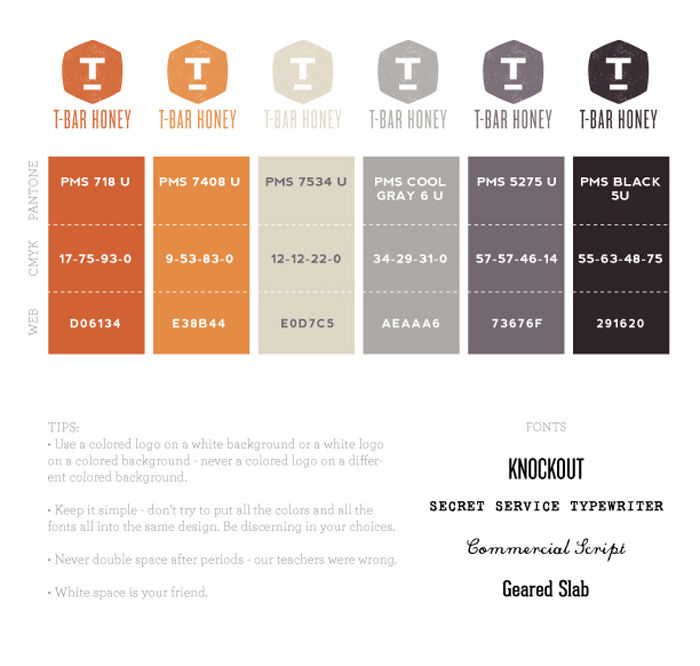
Color is a good place to start your style guide. When deciding your colors it’s best to use no more than three core colors, but feel free to branch out as much as you need on shade variations per color.
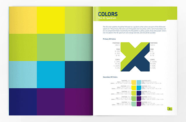
Your style guide should always reflect the hex codes as opposed to using a name. What you may consider canary yellow may not be viewed the same by a collaborator. Most people will reference the color name or perhaps the hex code instead of the image.
Along with your hex codes for screen work, it’s always useful to provide CMYK values as well as the Pantone color codes – even if they aren’t required immediately. With your color preferences listed, you will most certainly need to specify when and where a color may be used, and any exceptions. This may not be critical with a small site, but you should do it nonetheless.
Rules and exceptions cover situations like:
- What happens in black and white settings?
- Is color or monotone preferred in small formats?
- What happens in reversed settings (light on dark)?
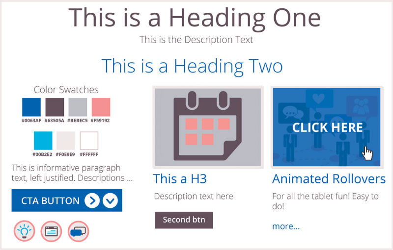
Defining Buttons and Icons
No matter the style of buttons you are using or trend they are abiding by, you need to set a design rule. Most sites have their own custom buttons so this is important especially if you are doing vastly different from the competitors.
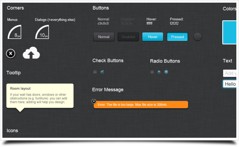
As with your fonts, your buttons and icons need usage guidelines. There should be a clear graphic distinction on your guide between your primary and secondary buttons. Icons should adhere to their own specific rules including their maximum and minimum pixel guidelines listed either beside or inside of an example image.
Color and any further style applied to your icon will be based around your color palette and general voice of the site so make sure to double check to make sure everything lines up.
Font Selection
Inconsistent type usage is one of the most common design faux-pas on the web, so consistency in your use of type should be one of the first rules you set.
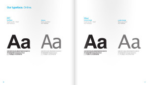
Not only are font inconsistencies tacky but they decrease readability, particularly for people with vision impairments.
Try to stick to no more than three font types in your design. When choosing your fonts, decide your primary font, the secondary and then (maybe) a tertiary font.
In other words, pick what font will host the main content, the font for your headings and the font for all those smaller areas not covered. Don’t forget to specifically list what sizes each font can be maxed out to and the smallest it is allowed to be.
Imagery and Video Specifics
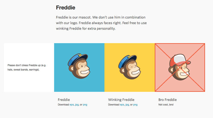
Mailchimp set rules for using Freddie.
Your style guide should cover as much as it can including images. Image guidelines are typically created during collaborative efforts where you may be working with writers and designers who are posting and adding content to your site. This will help keep your site looking consistent.
Imagery is subjective but typically for your style guide you want to set size and data constraints. If your site follows a more vintage feel you may want to note that all images should feature a muted color palette. Another site may require that all images must be 500px, 300dpi and be highly saturated.
Videos may also be treated the same but with slightly different rules. One type of style guide may require that all videos must be from Vimeo and not YouTube with the exception of YouTube videos that are 720p and above and under five minutes. In essence image and video specifications from size to content come down to the brand just like most of the other elements.
Give a Voice to the Copy
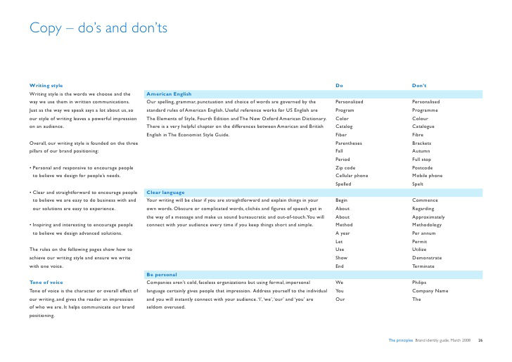
Since brand identity is important you will want to make sure there is a style guide how the “voice” of your content should be. This is more important for larger sites as the creator of a small site that they solely run typically already knows how the character of their site.
Your brand research will come into play when it comes to constructing an outline of how the copy should be written at all times. The voice of the copy will let users know how formal or informal the people behind the site are as well as whether or not this site is really for them.
Note that your style guide should not be a dictator in regards to what is written – just how.
For instance, a site targeting the homeless may strive to always maintain a thoughtful, positive and warm voice. For more help and reading on how copy can be worked into the guideline check out MailChimp’s Voice and Tone.
Extras
More recently, there has been a movement towards automatically generating a style guide as you code your website. While you could argue this is a somewhat backward approach to guide production, it certainly guarantees that up-to-date documentation is always maintained.
Guide generators exist for a range of technologies:
- Node.js StyleDocco
- Gulp KSS
- Ruby LivingStyleGuide
- PHP Barebones
The Final Word
Knowing how to create and apply a style guide can not only boost your workflow, but also your design confidence.
Designing your own personal guide really doesn’t take that long and can be a fun and creative process. Not only do you learn to better edit your work, but you also come to understand your brand more deeply than any simple mission statement could ever teach you.
Give it a go and see what you can come up with.


