How Words Are the Foundation of Interaction Design

Source: Language & The Brain
Communication is the basis for interaction, and we don't need to remind you how important language is to communication.
Copy may not seem like an immediate priority (especially if you have a larger team with content strategists and copywriters), but you must understand that writing is affected by (and also affects) the design.
After all, if a visual designer only leaves enough space for 10 characters in a headline, that can disrupt the flow of the entire page.
The words you choose, and how you put them together, will greatly influence your product's overall message – and we'll explain how using some words of our own. Below we'll show you why words are the base of interaction design and how to know the context of the copy.
The Purpose of Copy in Interaction Design
As technology advances and new modes of communication become commonplace, on-site and in-app copy may be given less attention than impressive graphics, animations, and touch-screen gestures.
Not to downplay the new possibilities opened up by technology, but it's important to ensure that the written word doesn't get left behind. Just as a finger swipe can accomplish things that written copy cannot, words, also serve functions that can't be replaced – no matter how far technology advances.
Source: Shedrof
Words complement the other dimensions instead of competing with them.
Since they are one of the first meaningful interactions that users seek out on-screen, words help frame our experience with the other elements of interaction design. In her piece Copy As Interface, Erika Hall, Co-founder of Mule Design Studio, cites the specific roles writing fulfills in a product's interaction design.
Let's examine the 4 main duties of your copy.
1. Words as a Greeting
More than just a friendly "Hello!" your product's copy explains what the site is and recommends a good first step, whether suggesting signing up or directing to content that's likely to hook your user. As we mentioned in the previous chapter, interaction design should be treated as a conversation, so this is your first opportunity at creating a sense of humanity.
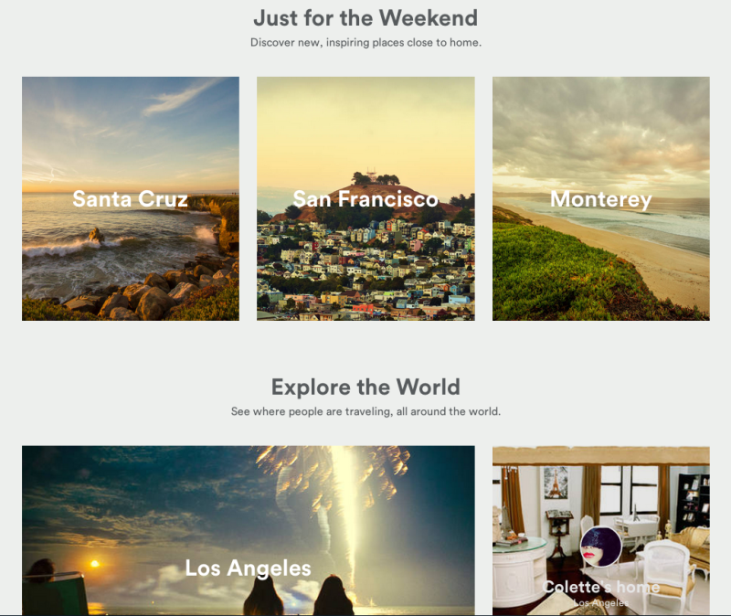
Source: AirBnB
You can see in the above example that AirBnB uses copy in a minimalistic yet effective manner. The titles Just for the Weekend and Explore the World help users visualize the benefits of AirBnB before diving into specific locations. The interaction is subtle, but it frames the experience as one step closer to a dream vacation.
2. Words as Navigation
Copy tells users where they are and suggest new or lesser-known options to deepen the user's experience. Any advertiser knows how word choice can make a difference in promotion, and an enticing description can "sell" a specific webpage as well as tell users what content is contained within.
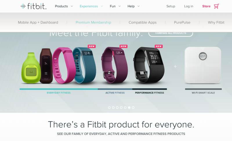
When you look at FitBit's homepage above, you can see the multiple functions of the site copy.
Firstly, it serves the immediate purpose of navigation with clear copy on the dropdown menus. Secondly, it helps explain the different products available (with smartly placed subcopy next to each product).
Thirdly, it entices on-the-fence users to dive deeper in the site with a section titled "There's a Fitbit product for everyone," which drives users to a page featuring products categorized by level of use.
3. Words That Suggest An Action
Words in menus, on buttons, and within instructions are all necessary to the usability of your product – without them the user would grow frustrated figuring out the mechanisms on their own.
Simple writing saves time, and with the right word choice you can increase the chances of a sign-up, sale, etc. Users are coming to your site to do something to achieve their goals, so create copy that encourages interaction.
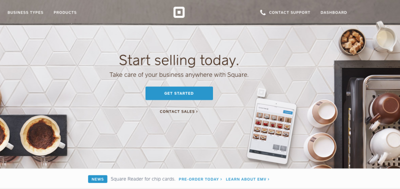
Source: Square
Payment processor Square 's homepage is an excellent example of action-oriented copy because it connects the site pages to user motivation without cluttering the interface. As a user, I only need to know that I want to get started; the interface handles the rest by pointing me to the right action. Of course, if I want more control, I can simply scroll down for more options.
4. Words Providing Service
Along the same lines as the actionable functions, wording also plays a vital role in certain services. In addition to explaining clearly a problem and/or resolution, wording influences the users' mood – which can help take the edge off when things go wrong (whether it's your fault or not).
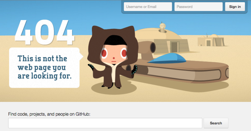
Source: 7 of the Best Error Messages
Github's 404 error page is a perfect example of great customer service during a frustrating experience. The copy is funny, syncing with the visuals to distract the user with a Star Wars reference. But functionally, the copy at the bottom of the page also tells users how to get back on track.
This is most important to call out, because personality will only get you so far until users remember that they still aren't where they need to be.
Just as a color scheme, graphics, or layout will show a product's personality, so too will the style of writing affect the "big picture." For example, a no-nonsense banker may appreciate by-the-book language on a investment website, but the same language wouldn't suit a new social media outlet for younger users.
Remember that understanding context is the first step to fulfilling the 4 purposes of interface copy.
Context Is King
It doesn't matter how funny you think Larry the Cable Guy is, he'd probably bomb with the audience at the Metropolitan Opera House. Copywriting for interfaces is a mostly subjective process, but the context is always fixed.
That's why the first step to any writing endeavor is to know both your audience (your target users) and your medium (web page content, sidebar, pop-up, etc.).
Source: Competitive Analysis: Understanding the Market Contex t
As we recommended in our free ebook Interaction Design Best Practices Vol.1, if you've developed personas, now would be a good time to dig them out. They can help you determine your writing tone just as readily as they help with layout and system choices.
But there's more to it than just knowing whom you're writing for. In a piece on writing for interaction design, Des Traynor, Co-founder of Intercom, presents some helpful questions to ask yourself. Use the below checklist to identify the specific context for the interface copy:
Who will read it?
More than simply knowing who your target users are, you need to know what category they fall into: new users, old users, account-holders, free users, etc. For example, new users require more direct language.
When will they read it?
Does a message appear out-of-the-blue, or as a response to a user action? Will they expect it, or should it grab their attention? These timing details can help smooth over otherwise jarring interactions.
What do they need to know?
Make sure your wording conveys exactly what you want to say, in the best way possible. We'll discuss how to communicate clearly in the following chapter.
What's the next step?
Is the task completed, or are further actions required? Like the Github example earlier, every interaction needs to get the user at least one step closer to achieving their goal.
What is the format?
By format, we mean the medium of the interface (website, app, email, etc). Will you use pop-ups or an alert on the top of the screen? Each different format has its benefits and shortcomings
For example, a pop-up alert needs to be more concise than a modal window. Pay attention to subtleties since 250ms might make the difference between annoyance and delight.
What's the best tone?
A product's tone should be the voice of the brand, so it's a stylistic choice that needs to be taken seriously. A fun tone or a serious tone are not inherently good or bad, but in the wrong environment they can be downright atrocious.
With the "characters" (your users) and the 'setting' (user scenarios) in place, you're able to move forward and create the best 'story' possible for your site or app.
The Takeaway
Interaction design succeeds or fails based on how well you can communicate with your user – or more accurately, how well you can design your automated system to communicate with your users. Don't underestimate the power of words in your communication, especially because the "speaker" is using prewritten text.

For detail on what we’ve covered today, grab the free e-book Interaction Design Best Practices: Words, Visuals, Space . Visual case studies are included from 30+ companies including Google, AirBnB, Facebook, Yahoo. Expert advice is included from Stephen P. Anderson, Jared Spool, and many more.


