Using Data Journalism to Generate Content Ideas

Photo: justgrimes
Strictly speaking, data journalism is about telling stories with numbers.
But let’s use a wider definition in this article, as for me the data used to tell a story can take many faces, including mere facts (historical, biographical, geographical) and different multimedia supports (interviews, photo reports, video footages). The idea here is to give you a broad view of what data journalism is and how you can use its lens to get great content ideas.
Identifying Data
The first step is to identify the data you can use. But before that, you will have to define your needs.
What topic do you want to cover? Are you following a seasonal trend (fashion week, movie premiere, holidays), or do you want to cover your field with content that does not change through time, aka cold content (dog breeds, recipes)?
Whereas cold content data is easy to find online and can make great long tail content, warmer content is tougher to obtain. You have to be aware of any news event in your field, and to be ready to act as fast as possible with many competitors doing the same thing at the same time.
Once you have identified the kind of data you are looking for, you need to put your hand on it.
Open data is a great way to get free data that has been gathered by governmental organisations. Data Catalogs is a good starting point for your search. This site provides open data sources for a number of countries.
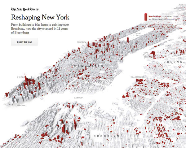
Reshaping New York: From buildings to bike lanes to painting over Broadway, how the city changed in 12 years
under Mayor Michael R. Bloomberg.
For example, let’s say you are interested in Queensland oral health services. You can get a monthly extract of statistics about waiting list per clinic. Likewise, you can get crime statistics for incidents in Washington, DC.
These open data catalogs are a good source when you are looking for specific data. But you can also browse them to get new ideas of content.
When surfing through open data sites, it is important to keep an open mind: you can dig some completely unrelated data and find a new edge about your content.
For instance, flipping through the US Social Security dataset can inspire you some ideas, like babies named from movies or TV shows, from celebrities, for specific countries or periods of time. You can correlate this data with movies premieres or sport events in the news to add some depth to it.
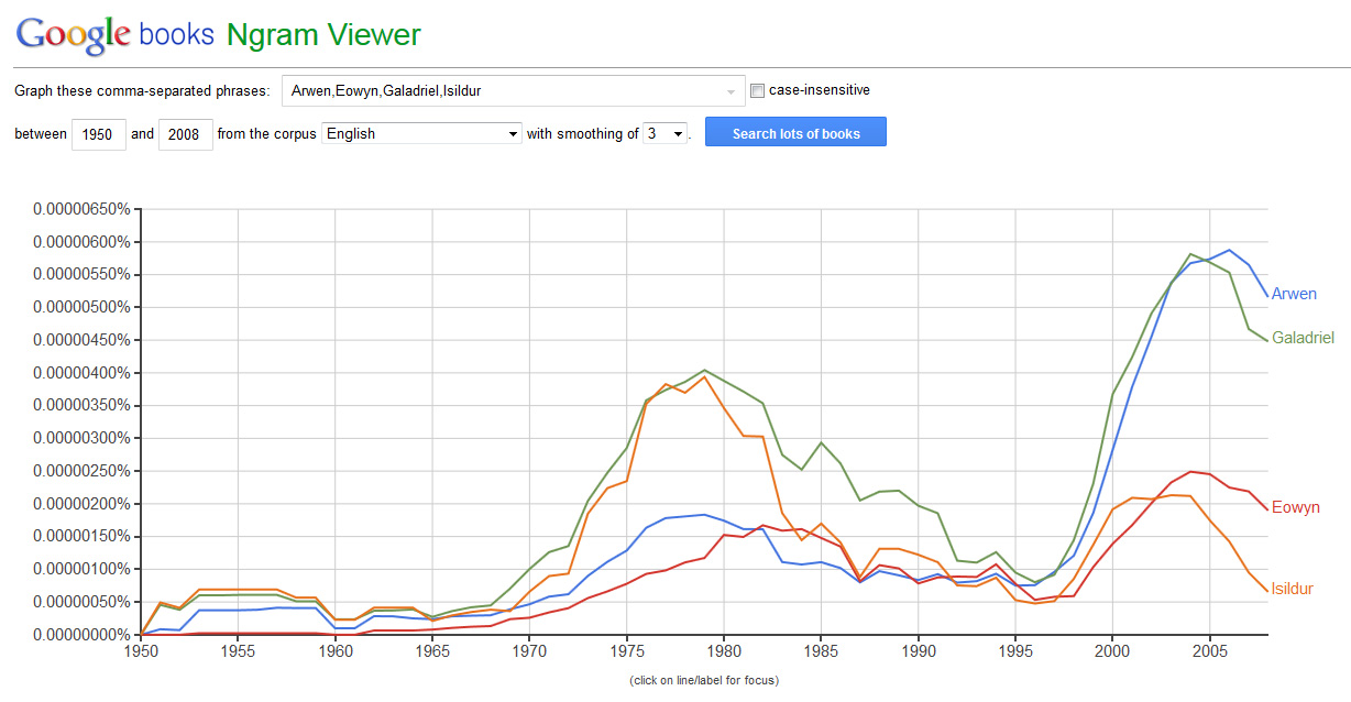
The Google Books n-gram viewer is a great tool to visualize words appearing in books for a specific period of time and a given language.
For example, the following graph shows the presence of four names of Lord of the Rings characters in the literature – namely Arwen, Eowyn, Galadriel and Isildur – with a first peak in 1979 and the second one in 2004 and 2005.
If you are looking for warm content, two sources can help you identify what is trending in a specific country or language right now or at a specific time: the Wikipedia article traffic statistics and Google Trends.
Both sites can also help you identify patterns in the searched terms.
For example, dog breed is mostly searched for on Sundays in the US, while the matching Wikipedia page in English is mostly viewed on Tuesdays. Well, I can’t make much out of it, but if your content is about dogs, maybe you can. At least, you know when to publish your content and when to promote it on social media to get the maximum impact.
Google Trends goes a bit further as it links the reasons for peaks to specific news and can give results down to a city, which is a good way to get insights from local audience.
For instance, fashion week peaked between February 9 and 15 in the US (for the NYC fashion week), and between April 6 and 12 in Australia (for the Sydney fashion week).
So depending of your audience, you know when to prepare yourself for warm content a bit in advance. A good rule to keep in mind is that local audience is generally more interested in local news first.
Storifying Data
Who, what, when and where are in data journalism the main questions to answer, such as in any other kind of journalism. The why is not so easy to convey, as it needs a real analysis that is hard to express in visual elements. Why needs more space and more words to be explained thoroughly.
To transform pure data into a good story, you need to find an edge, which means to ask yourself what specific question you want to answer.
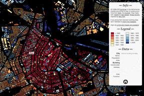
All 9,866,539 buildings in theNetherlands, shaded
according to year of construction.
Finding a narrative can also bring life to the facts and data you gathered.
One good starting point is to identify what piece of data does not fit well with the rest: the outliers. In statistics, an outlier is a point distant from other observations. In the Washington, DC, crime statistics dataset, it could be an area more prone to specific crime type, or a type of crime that rarely happens during the day. In short, anything different from the data pattern can give you an edge.
But if outliers can make a good story, they can as well be the sign of an error in the data, so don’t forget to double-check them.
Most of the time, the data gathered can raise different questions. If it is useful to propose different ways to interact with the same data for your users, for instance by providing both a map view and a chart view, it is also a good opportunity to create different contents from the same dataset.
An overview story can bring a global awareness about your subject. This broad view can be illustrated through views closer to your audience (both topically and geographically), resulting in much more content in the end.
As an example, let’s try some brainstorming on the fashion weeks topic. It can be addressed through different points of view:
- map of the next fashion weeks with faceted search (Haute Couture/ready-to-wear, fashion houses, men/women collections)
- comparison of colors/patterns/materials between different years of a local fashion week
- comparison of colors/patterns/materials between different local fashion weeks for the same season
- biography timelines of creators/fashion houses, with representative works
Testimonials are also a great way to bring life to your content. In Boston Marathon Moment 4:09:43, the goal was to go beyond the catastrophic event and to provide insight from regular people who were there when it took place. With such an overwhelming event, the number of casualties kept the audience away from the people behind the numbers.
By putting faces and voices before numbers, the readers were able to get a feeling of belonging to the story, of being part of it. If this example is particularly strong, you should keep in mind that data can be perceived as very dry, and testimonials can bring emotion back to them.
Visualizing Data
Sometimes, the simplest visualization is the best one to convey your point. As a matter of fact, you should restrain yourself to put visualization and interaction before your content, as it still have to tell a story.
After this customary precaution foreword, let’s see the different types of visualizations grouped by the kind of data you want to show, each of them expressing a special meaning.
A Tour Through the Visualization Zoo groups them in five sets:
- Time series (temporality): index chart, stacked graph, small multiple, horizon graph
- Statistical distributions: stem-and-leaf plot, q-q plot, Scatter Plot Matrix (SPLOM), parallel coordinates
- Maps (geography, spatial representation): flow map, choropleth map, graduated symbol map, cartogram
- Hierarchies: node-link diagram, dendrogram, adjacency diagram (sunburst, icicle), enclosure diagram (squarified treemap, circle-packing)
- Networks (interconnections): force-directed layout, arc diagram, matrix views
Whereas Christian Behrens groups them in eight sets:
- Correlations: bubble chart, scatterplot
- Continuous quantities: sparklines, stacked area chart, multiset line chart, simple line chart
- Discrete quantities: span chart, isometric bar chart, stacked bar chart, dot matrix, multiset bar chart, simple bar chart
- Proportions: ring chart, simple pie chart
- Flows: thread arcs, sankey diagram
- Hierarchies: tree diagram, tree map
- Networks: diagram map, relation circle, pearl necklet
- Spatial configurations: topographic map, thematic map
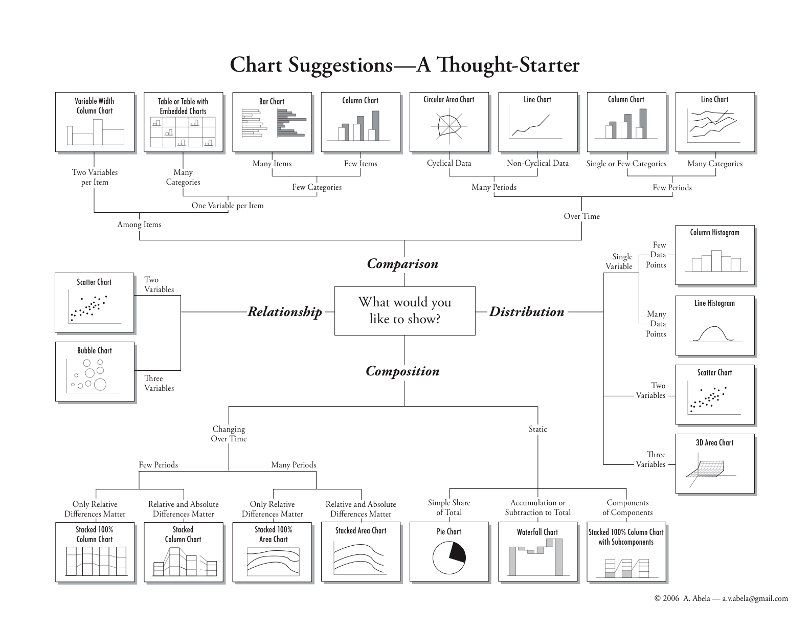
In order to choose the best graphic form, another approach is to think about what you would like to show: comparison (among items or over time), relationship and distribution (depending on the number of variables), or composition (changing over time or static).
The following chart suggestion tool has been designed by Andrew Abela and is available on his Extreme Presentation method site.
Once you have chosen the best type of visualization to express your message, you still have to implement it. There are many javascript libraries that can be used, see for instance Thomas Greco’s article for a short list of them.
If you prefer to keep your hands away from the code, some services can help you create embed visualizations directly from your data:
- Datawrapper is used on many newspapers’ digital editions. This free open source project is aimed to be a tool for data-driven journalism.
- Tableau public is a free tool to create interactive visualizations and publish them on the web.
- Infogr.am is a free application to create infographics and charts.
- Story Maps combines interactive maps and multimedia content. It provides some interesting apps, like the spyglass or the map journal to bring out predefined user experience. This service is based on the ArcGIS mapping platform which has a nonprofit organization program.
Inspiring Sites
- If the Snow Fall longform content has been one of the first widespread multimedia story, The New York Times keeps publishing great content in data visualization, explanatory graphics and other visual and interactive features. They compile their most emblematic production in yearly pages (2012, 2013), you should give an eye to for great inspiration.
- The Guardian Interactive lists the latest interactive stories published on their site, from multimedia longform articles to interactive infographics and videos.
- The Texas Tribune website has a whole section to let their users interact with data. Even though this data is freely available elsewhere as it comes from public data sources, this section of the site accounts for 45% up to 55% of the whole website traffic. It clearly shows that if you provide data targeted to your audience in a meaningful and engaging way, your visitors will come back for it, use it and share it, a traffic that can be easily leveraged through social medias.
- La Nación, a newspaper from Argentina, offers its best data visualization articles on their site.
- Le Monde, a French newspaper, also presents its visualizations on a dedicated section.
As you can see, a lot of newspapers try to spice up their digital edition with interactive dataviz. If the most renown are a good source of inspiration with their big data teams, you should make your own selection of less globally renown ones, as a smaller team can come up with an innovative idea that can be inspiring for your own content.
Dive Deeper into the Subject
This article is mostly focused on finding content ideas from data sources, to bring food to your ideation process. But this is only a very narrow view on datajournalism. If you are interested in the multiple activities involved in data journalism, here are some links to go deeper:
- Data driven journalism is an initiative of the European Journalism Centre. On top of being a hub for news and resources, it provides a MOOC course entitled Doing Journalism with Data: First Steps, Skills and Tools. The course is now closed and available in archive mode only until the end of the year, but it really worths the time you can dedicate to it.
- The Data Journalism Handbook is a free open source reference book from both the European Journalism Centre and the Open Knowledge Foundation. It covers data journalism in newsrooms, case studies, and how to get, understand and deliver data to your audience.
- School of Data, backed by the Open Knowledge Foundation, provides a lot of tools and articles to deal with data extraction, cleaning, analysis, presentation and sharing.
I hope you have now a whole idea of what datajournalism is, and especially how it can help you come up with content ideas. Using different data sources, correlating unrelated data to freshen up your point of view, getting exposed to visualization techniques, and most of all getting inspired by what others are doing: these are the lessons you should take away from this article.
Cet article est aussi disponible en français


