15 Color Schemes From Disney Heroes and Villains

The Walt Disney Company was first established in 1923, and their first full-length film, Snow White and The Seven Dwarves was released in 1937. What’s interesting about the character of Snow White, is that she’s one of the most archetypal symbols of “Good” in the Disney universe.
In the story, the Evil Queen is envious of Snow White’s beauty and purity, which is represented by her ever so pale skin, and serves her the nickname, “the fairest of them all”. Allocating a dominant color/brightness to this character helps the audience better identify to what degree of good or evil this character is. The Evil Queen, on the other hand, is made up of predominantly darker shades of black and purple, to help portray her as the villain.
But just how much does color impact the characteristics of various Disney heroes and villains? And, can a certain color scheme dictate the way in which we, the audience, interpret a character, or in the case of design, a brand?
Color Psychology
Color psychology has always been a somewhat controversial topic. When you consider that different cultures, upbringings and experiences vary from person to person, the way in which we interpret certain colors (and their many hues and shades) differs as well. It’s easy to say that “yellow makes us happy”, or “red makes us angry”, however many of these statements are in fact highly subjective. In China, red means happiness, prosperity, celebration, long-life, and so on—not angry.
Alas we turn to Disney in order to get a better idea of how color is used in the design of various heroes and villains, and how those choices influence the way in which we interpret and emotionally react to the color schemes they use.
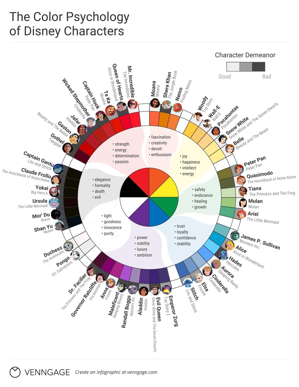
As you can see, the Disney infographic below shows some of the most well-known Walt Disney heroes and villains on a color wheel, and categorizes their demeanor on a scale from good to bad. Generally speaking, characters that are made up of mostly yellow, green and blue were considered to be more “good”, whereas those that are primarily made up of red, black and purple were interpreted as more “evil” by the audience.
So…what does this mean for you, as a designer? Well, if you’re looking to communicate a certain message in your web designs/brand/infographics/…, using color is one of the ways that we can do that. Let’s take a look a 15 Disney color schemes, ranging from “Innocent Princess” to “Malicious Queen”, to better understand how colors affect us.
15 Color Schemes From Good to Evil
In this section, 15 color schemes have been organised into 7 different categories, ranging from good to evil. They’ve been draw from the above color wheel and you’ll notice they tend to range from lighter schemes to darker ones.
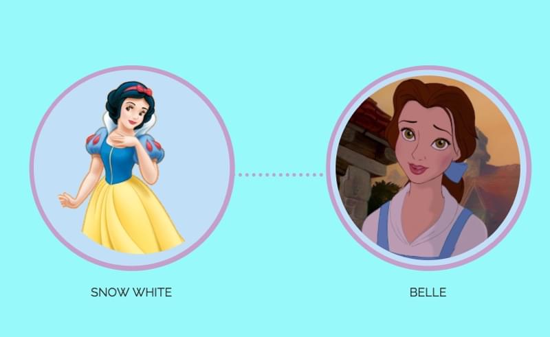
1. The Quintessential Princess Color Schemes
These “Quintessential Princess" color schemes are perfect if you’re trying to depict that innocent/selfless vibe. If your company is a charity or social enterprise dedicated to helping humankind, then these colors are right up your alley.
Who inspired these color schemes?
Snow White and Belle.
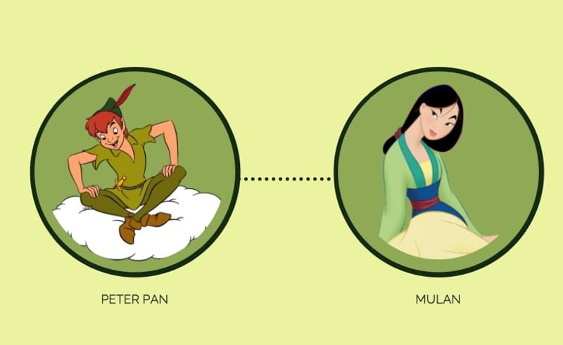
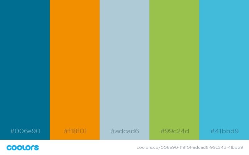
2. The Adventurer Color Schemes
"Adventurer" color schemes are ideal for brands and businesses with a focus on travel, nature, or anything outdoorsy. Can you guess what well-known Disney characters they’ve been inspired by?
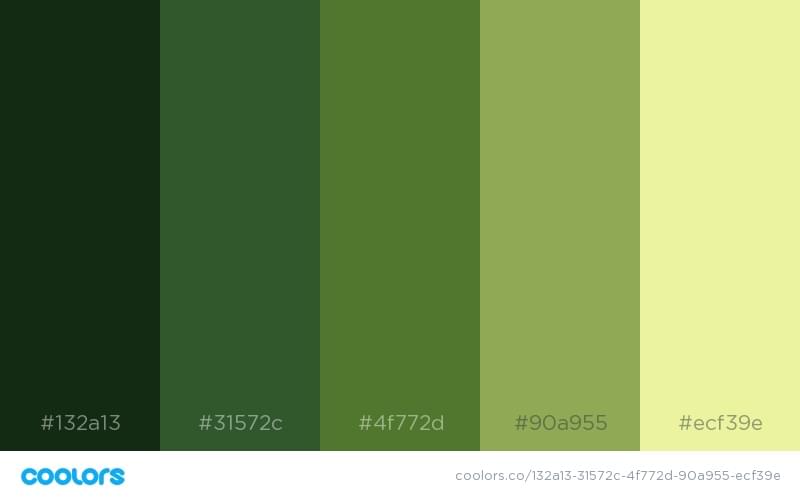
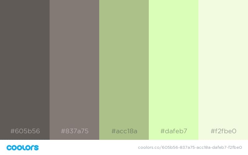
Who inspired these color schemes?
Peter Pan and Mulan.
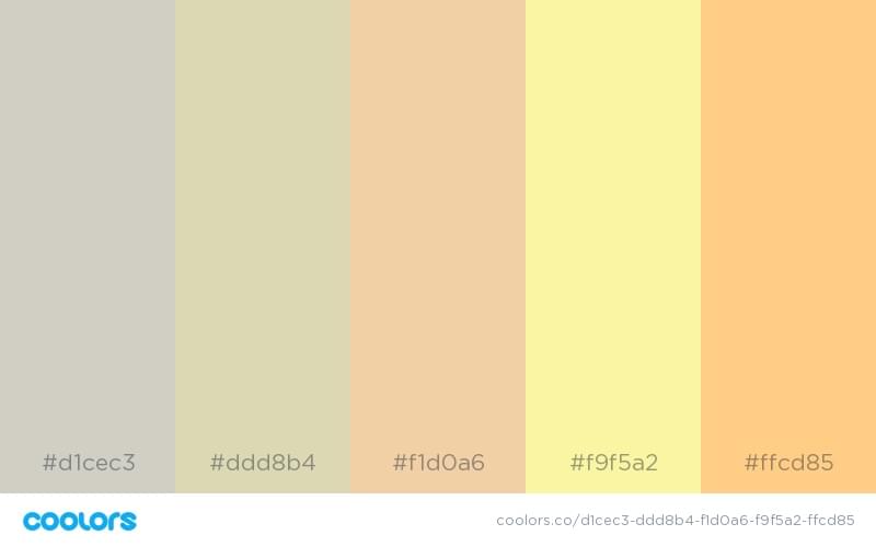
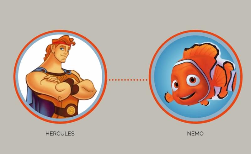
3. The “There’s Something Bigger Out There” Color Schemes
The “There’s Something Bigger Out There” color schemes are for those that have an innovative vision for changing the world. Is your project the next Tesla or Google? You can convey that with these stunningly ambitious color schemes.
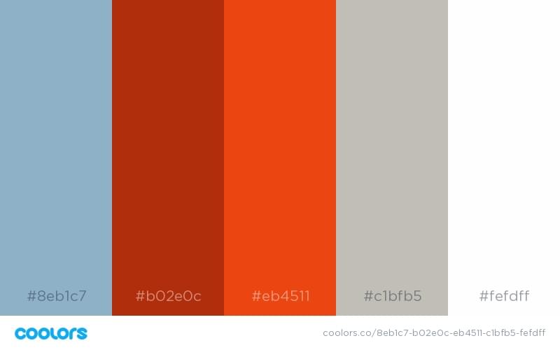
Who inspired these color schemes?
Hercules and Nemo.
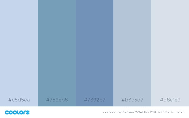
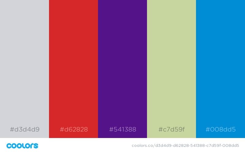
4. The Powerful Femme Color Schemes
Are you trying to send the message that your brand is confident, strong, high-end and maybe even daring? Well, these “Powerful Femme" color schemes are exactly what you need to add that sense of alluring dominance to your designs.
(think: the Sketch App website).
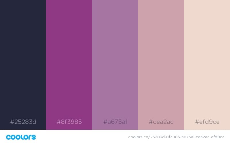
Who inspired these color schemes?
Maleficent and Evil Queen.

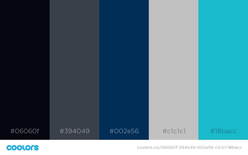
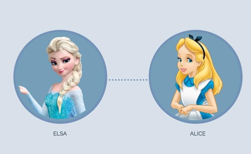
5. The Sombre Internal Monologue Color Schemes
Maybe you’re trying to represent a smart, independant man or woman, and the design you’re creating is to convey that. Try out one of these “Sombre Internal Monologue” color schemes and let your internal creativity shine.
Who inspired these color schemes?
Elsa and Alice.
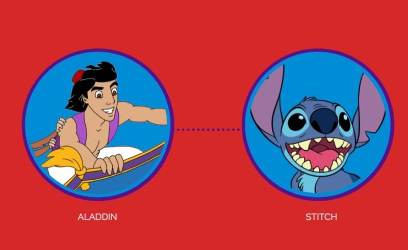
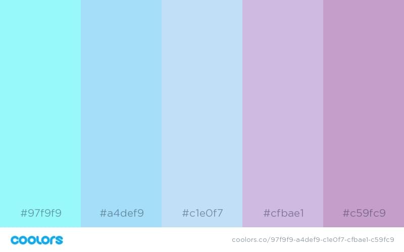
6. The Mischievous Color Schemes
Perhaps you’d like to exhale a daring but playful vibe? If so, try on some of these “Mischievous” color schemes to show off your edgy side. It might be hard to convey "trust" with these schemes, at first, but you’ll definitely stand out!

Who inspired these color schemes?
Aladdin and Stitch.
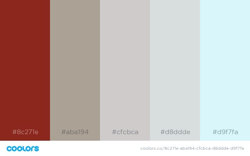
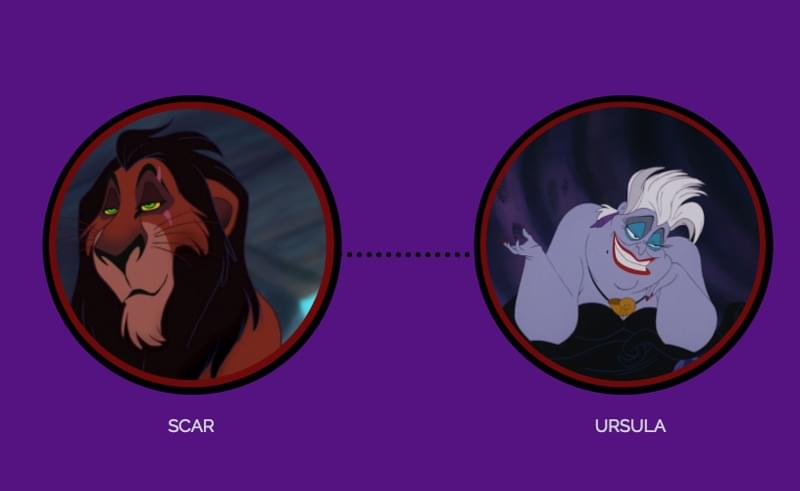
7. The Dark Past Color Scheme
And finally, the “Dark Past" color scheme. Maybe your cause isn’t one for the greater good, but that doesn’t mean your users and customers won’t be interested in a little self-indulgence, in which case these naughty color schemes might be right up your alley. I’d suggest to use them if you’re trying to convey an air of mystery, allure and regality.
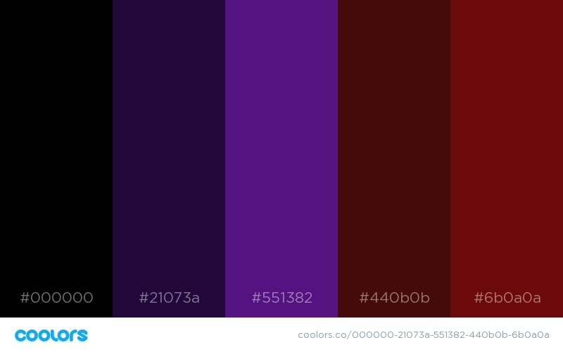
Who inspired these color schemes?
Scar and Ursula.
Conclusion
Remember: whichever color scheme you do decide to settle on for your designs or branding, because of the user psychology associated with various colors, your choice might send a different message than what you initially intended. So choose wisely, and don’t opt for a scheme that doesn’t reflect your overall mission and company values. Always consider your audience and target demographic (especially their geographical location), and, if you’d like to explore and experiment with more color schemes, you should take a look at these 5 apps to help you choose mesmerizing color schemes.


