4 Photoshop Styles to Lift Your Photos Above the Crowd

In an earlier SitePoint article, we talked about the importance of evoking emotion with your imagery choices. I also showed you how to nail those photography styles in Photoshop to create engaging, heartfelt designs.
This time around, I’m going to share four more eye-catching effects that can be achieved in under 10 minutes using Photoshop.
Here are the photography styles I’ll be covering today:
- Purist Effect
- Muted Black & White Effect
- DuoTone Effect
- Targeted Blur Effect
The Purist Effect
As the name implies, “The Purist” effect is at its best when people don’t even notice it’s there – like ‘natural look makeup’ for your photos.
You probably won’t be aware of any special filters or gradients going on in this image. The goal is to achieve a look that is close to SOOC (Straight Out of the Camera), while still bringing out the natural beauty of your photo.
In most cases, you’ll be tweaking the colors on the RGB curve to subtly enhance your work.
Purist effects work well with food and fashion blogs, where the imagery needs to appear authentic. You’ll also see this style used on websites that cater to any form of news (sports, local, technology, current events, etc), where the core aim is to tell a true story, as opposed to a surreal or fantastic version of your story.
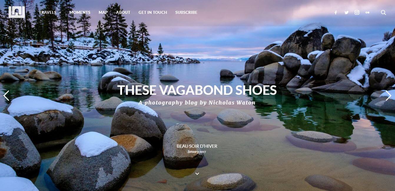
https://www.nicholaswaton.com/
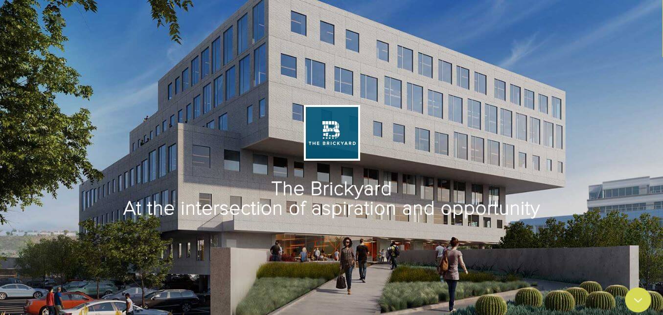
http://thebrickyardplayavista.com/
Master Class: Doing it by hand
Question without notice: On an RGB screen, what happens when to your blue tones – skies and oceans – when you add more red and green to them?
Answer: They closer and closer they move to pure white. So, by the same logic, slightly reducing the red and green tones in our blue areas will make them appear cleaner and stronger. The same idea applies to the red and green areas. That’s what we’re doing here.
Step 1
First thing’s first, open up your desired image. For each of these looks, I will be using photos taken by Flickr users offering their photos under CC licensing. Photo credit:
(A perfectly nice enough photo)
Step 2
Add a new Adjustment Layer by either clicking at the bottom of your layer menu or on the side of the layer menu depending on your setup and select Curves.
Step 3
Adjust the RGB curve by setting the Output to 54 and the Input to 76. This will push the overall contrast.

Step 4
Now select the Red curve (in the dropdown) and change your Output to 116 and Input to 133.
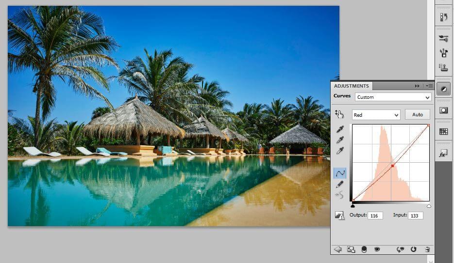
Tweaking the red channel
Step 5
Move to the Green curve and drop the top of your line so your Output is 242 and your Input remains at 255.
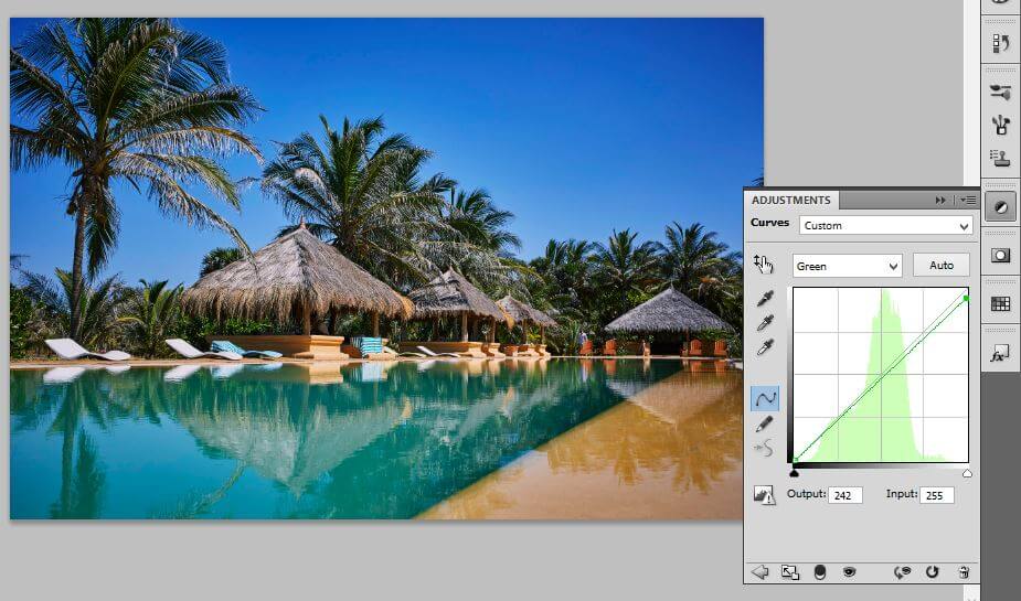
The Green channel
Step 6
Finish up by adjusting your Blue curve so that your Output is 122 and your Input is 130.
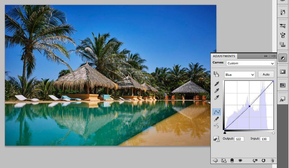
The Blue channel
Before and After
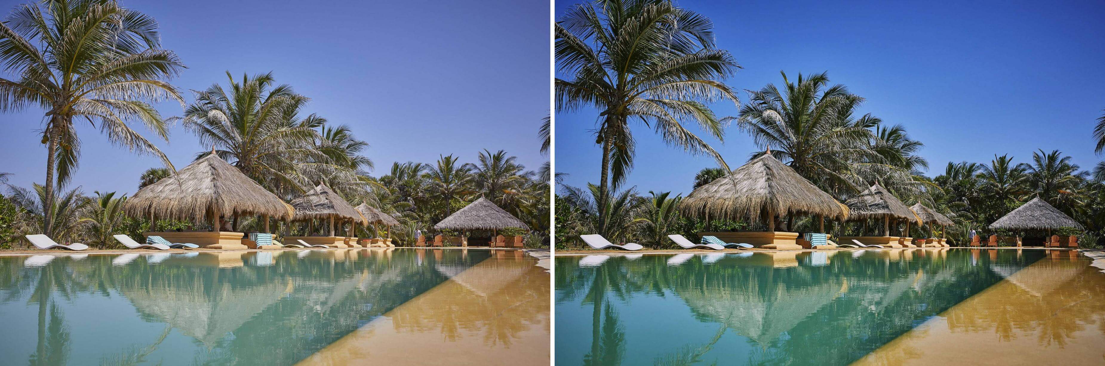
Not bad. Rich and lush not unrealistic.
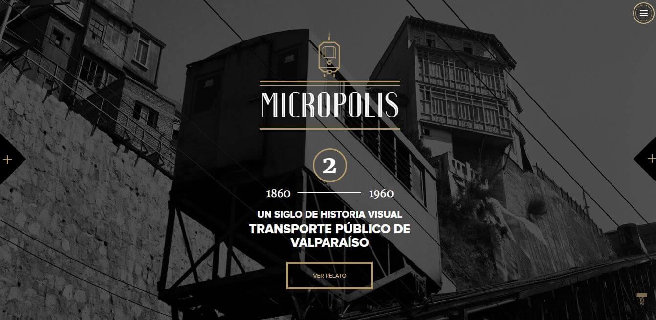
The Muted Black & White Effect
While Black and White photos will always have a vintage feel, they also often project a sense of dignity and stripped back truth earned through their long history of use in photojournalism. Today we’re going to focus on what I’m calling “The Muted Black and White”. This is the faded black and white image that doesn’t have an abundance of contrast and features a lot of gray tones.
You typically see this look used on fashion based sites including those that fall into the category of art, culture, and education. The look is seldom used in news and food sites but it doesn’t mean it can’t be.
Unlike The Purist look, this one can’t be used for every photo especially given your subject without changing your workflow. For example models and subjects that feature darker hues and skin tones can get drowned out with the muted combination with a black and white application if the background is already dark. If that’s the case you may want to opt for either the muted look or a black and white look with a high contrast.
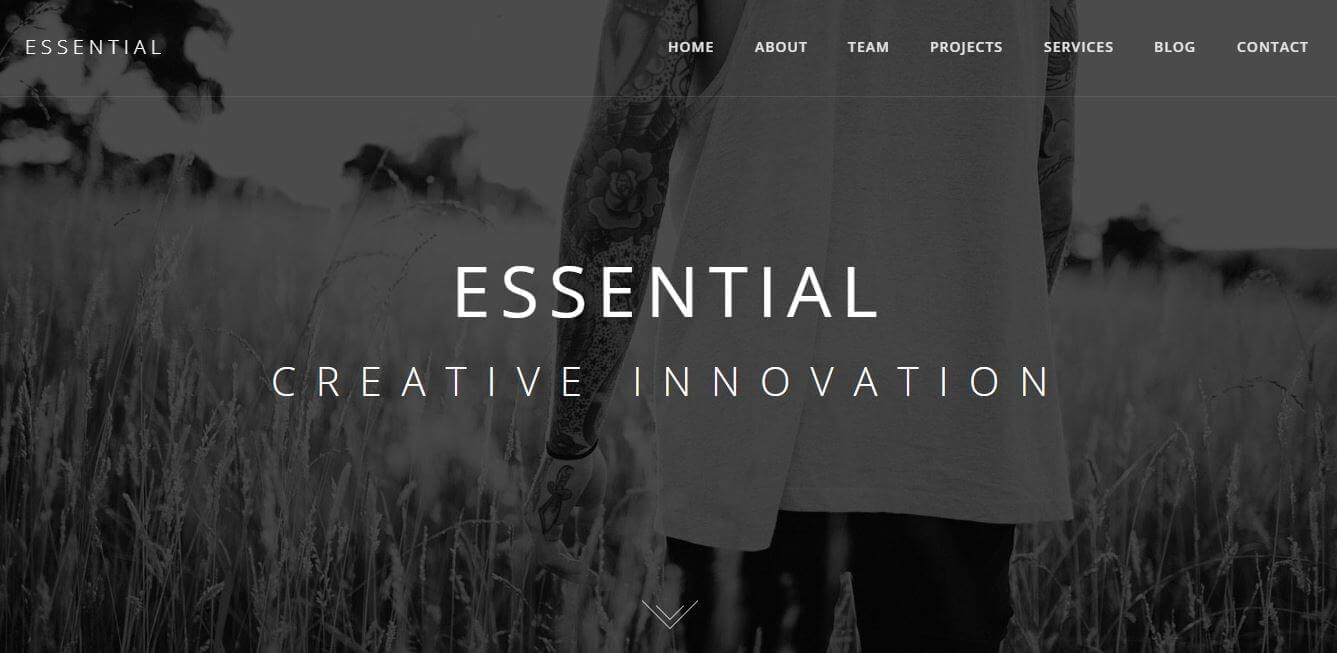
http://essential.riccardoborchi.it/
Master Class: Doing it by hand
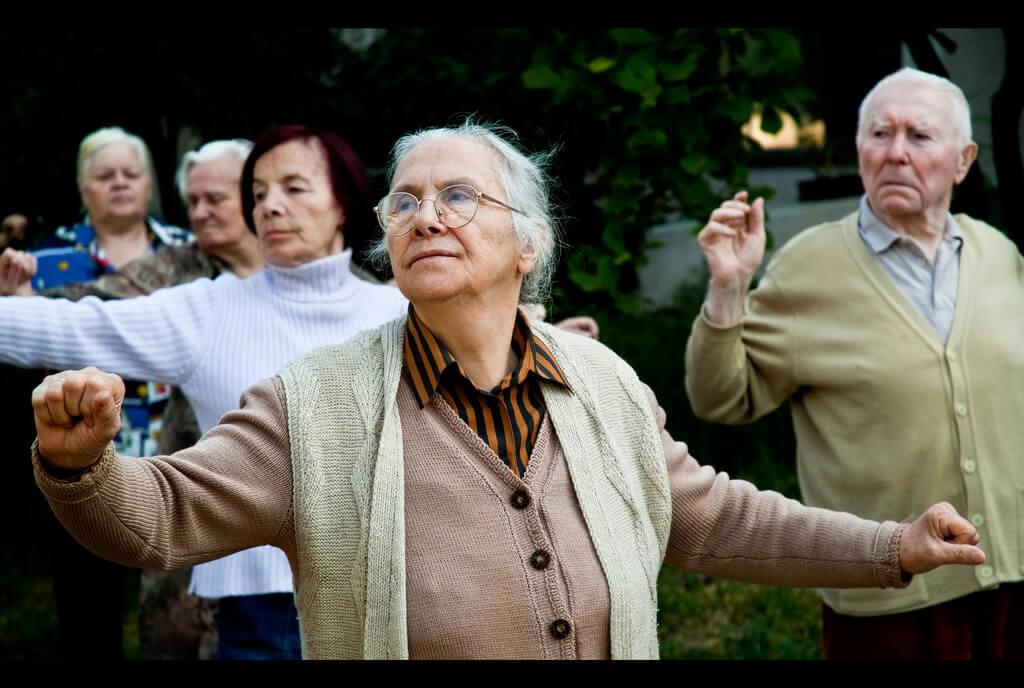
Step 1
Open up your image. In this case I will be using an image courtesy of Sima Dimitric via Flickr CC licensing. Photo credit: https://www.flickr.com/photos/simajr/4182166296/
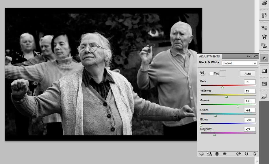
Step 2
Create a new Adjustment Layer by either clicking the icon at the bottom of your layer menu or on the side depending on your setup. You will want to select the Black & White option.
Step 3
Depending on your particular image you will adjust the hues to your liking. In this scenario, we will adjust each hue accordingly so that the below image is your final output.
Step 4
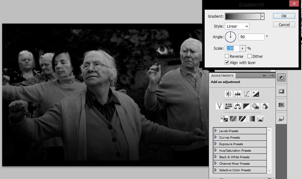
To achieve our muted look you will first want to make sure your paint colors are set to default black and white. If not first click (D) on your keyboard then (X) so that black is your foreground color. Next, create a new Adjustment Layer and select Gradient.
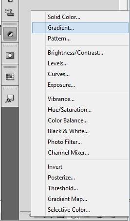
Step 5
When the Gradient dialogue box pops up change the scale to 130% and click OK. That’s it, you’re finished. For a more muted look, you can always duplicate your gradient layer and adjust the opacity as desired.
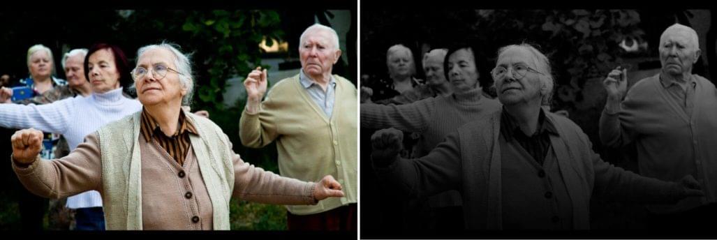
Before and After
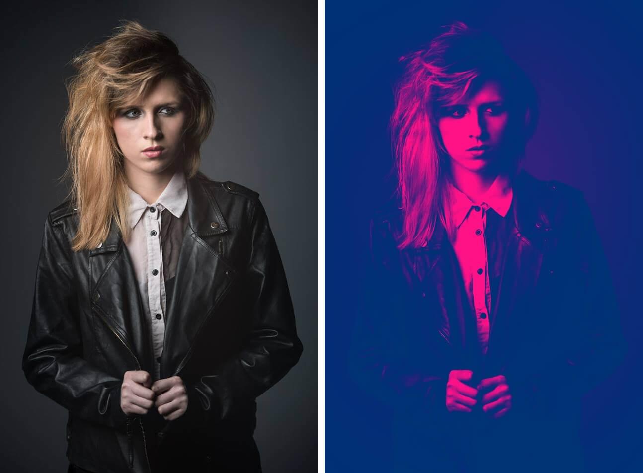
The Duotone Effect
One of the more creative photography looks, “DuoTone”, is a stylish effect that is lifted from the printing and illustration technique where you combine one halftone with another, usually of a contrasting color. The final look is a cross between colors that give you a look that is reminiscent of Pop Art.
DuoTone as one can guess is not a look that is for every photo let alone all website niches. You are more often than not going to see this look with promotional marketing such as for high fashion, athletic sports and music. Spotify anyone? Formal sites like financial businesses and news organizations will probably want to shy from this one.
Camera and lighting settings will have an impact on your final look but with a couple manual tweaks here and there you should be able to create something you’re proud of.
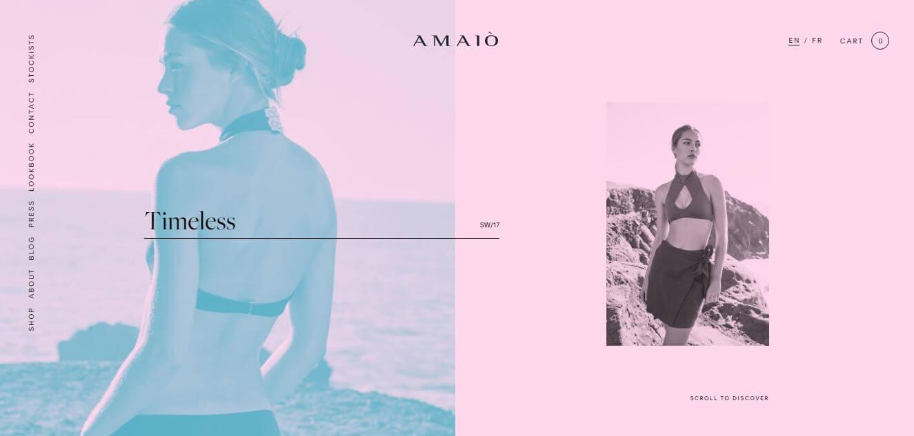
https://amaioswim.com/
Master Class: Doing it by hand
Step 1
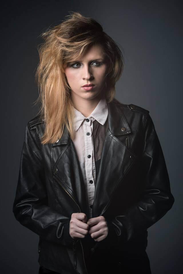
Start by opening your photo. To better illustrate this effect we’ll be using a portrait courtesy of Rebecca Watts courtesy of CC licensing via Flickr. Photo credit: https://www.flickr.com/photos/rebeccakatielouisexo/13387211315/in/photostream/
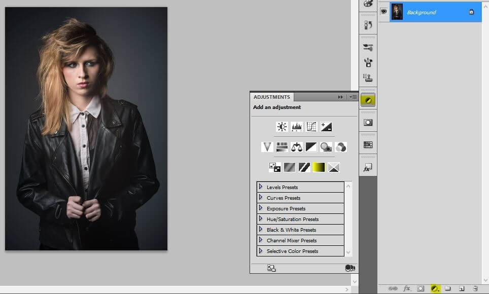
Step 2
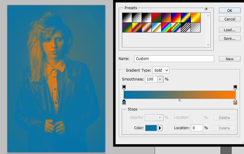
Create an Adjustment Layer and select Gradient Map.
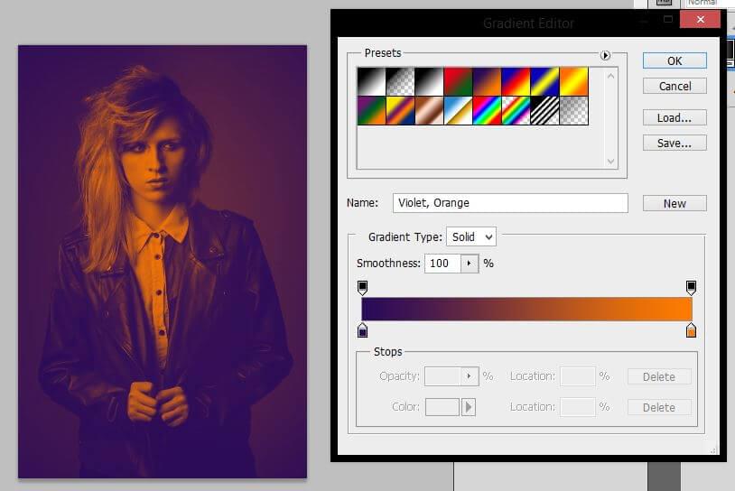
Step 3
When the dialogue box pops up, double-click on the gradient and choose the purple and orange gradient. At this point, we have achieved the look but I will show you how to alter the colors and percentage of each color cast.
Step 4
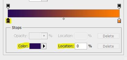
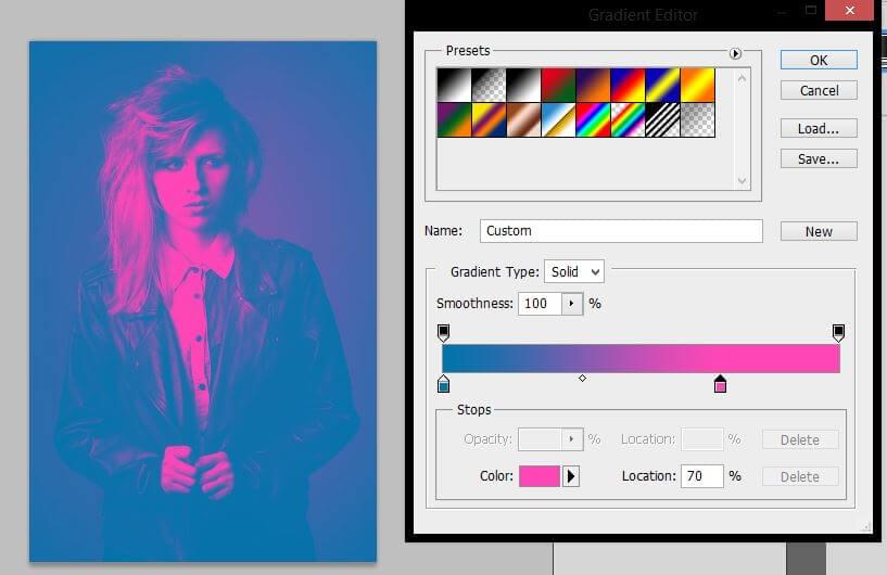
Use this to change the purple to #0073a9.
Change the orange to #ff46b7 and change the Location to 70%.
Step 5
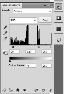
Finish up by making the photo pop so your facial details aren’t lost by making another Adjustment Layer and selecting Levels. Change the levels to reflect the image below and then you’re done.
Before and After
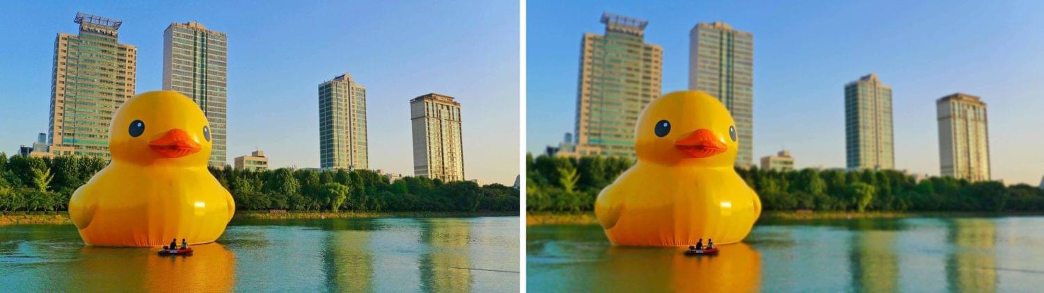
The Targeted Blur
[author_more][/author_more]
Obviously, in many scenarios, a photographer will consciously select a specific depth of field for a photo using the lens and exposure settings. That doesn’t mean that you’re always stuck with that. With Photoshop, you can create what we will call “The Targeted Blur” look in order to draw attention to a specific element in the photo.
This is a technique that you will see in most site niches because after all the purpose of a photo is to enhance content. Fashion, sports, and food sites are notorious for featuring shots that have a primary focus thanks to using a shallow depth of field.
While with other photography looks your lighting and camera settings play a huge role in the outcome of your photo you have no limitations when it comes to creating a focused blur unless the area you want to focus on is already out of focus.
[caption id="attachment_157402" align="aligncenter" width="1340"]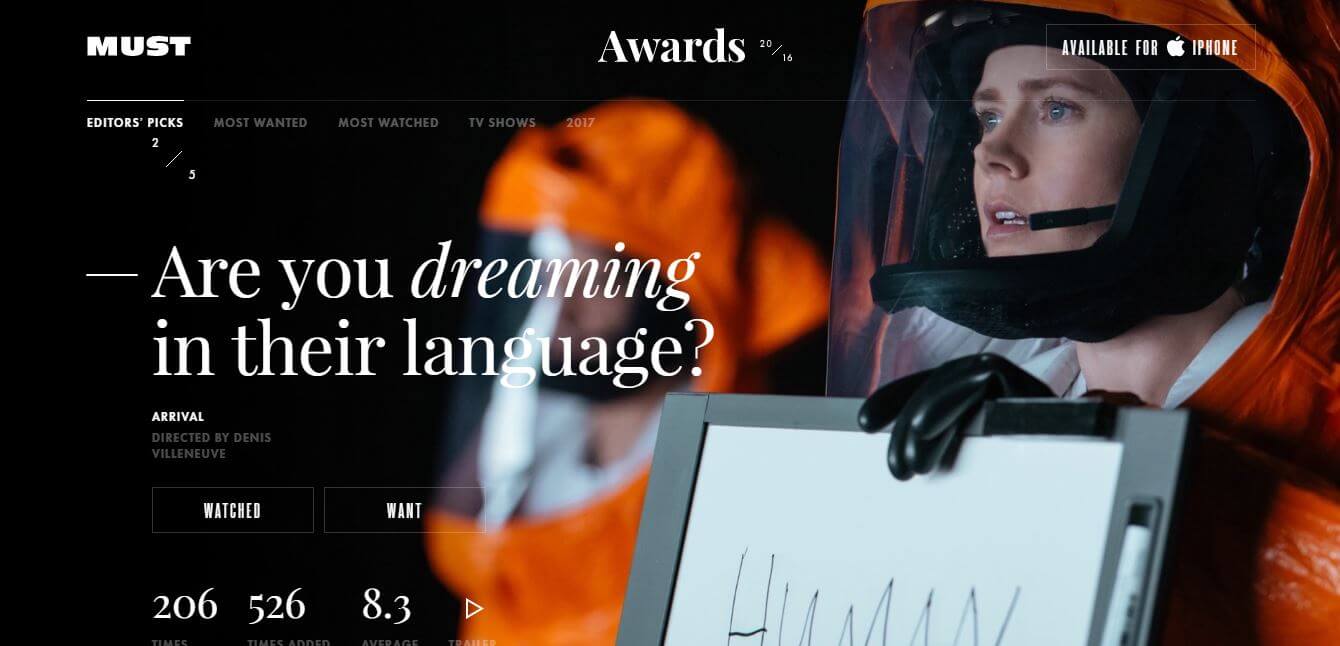 https://mustapp.me/2016/editors-picks/2
Master Class: Doing it by hand
Step 1
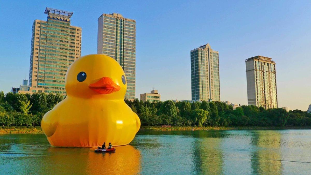
Open your desired image. We will be using the photo below via CC licensing of Flickr user Travel Oriented. Photo credit: https://www.flickr.com/photos/traveloriented/15348035017/
Step 2
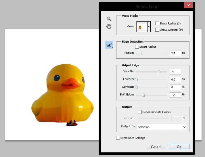
Select the Quick Selection Tool (W) and select both the duck and the people in the foreground.

Step 3
At the top of your toolbar click on Refine Edge and adjust the settings as shown below and click OK.
Step 4
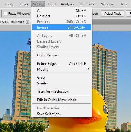
Next go to Select >Inverse to invert your selection or hold Shift+CTRL+I.
Step 5
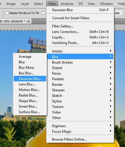
Go to Filter > Blur > Gaussian Blur and change your radius to 3.9 pixels. Click OK and that’s all to it. You can edit your photo passed this stage now if you want.
Before and After
That’s a Wrap
Which of these styles did you already know how to do? Did you do them using the same technique as me? Let us know in the comments, as I’d be curious to know if you used another method!


