How to Boost App Downloads by A/B Testing Icons

How can you tell which app icon will result in the most app store downloads? Answer: simply by looking, you can’t. Even an experienced designer couldn’t answer this question with certainty, however, there is a solution — A/B testing.
A/B testing is not a new concept, however, when trying to increase downloads/conversions, many make the mistake of revamping the app’s interface, while neglecting the first thing users see ⏤ the app icon! Plus, all app stores have a dashboard where marketers can measure the success of the different tests.
Read on to find out how A/B testing works, and how it helped us increase our app store downloads by a whopping 34%.
We A/B Tested These 4 Icons
Begin by taking a closer look at these icons:
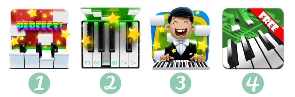
Can you guess which one resulted in the largest number of app store downloads? Spoiler: it’s #2. I’m going to show you how we reached that conclusion by A/B testing the different concepts.
The Problem
Piano Master 2 is an app where if you press a piano key, a small brick falls over it. By doing this, you play a previously chosen melody. It seems like a game, but it’s actually very useful to those who want to learn how to play a real piano.
This app was once unique, but now it has many rival applications. This is why our customer wanted to create a new icon so that the game could stand out among its competition.
Here’s what the app icon looked like before:

The customer filled out an application form and we agreed to design three unique icons for the Google Play store, and A/B test them to see which resulted in more app downloads.
Subsequently, we began by designing the first iterations of the three unique concepts. Let’s take a look at the brief.
The Project Brief
The first icon concept had to be serious and classical (two-dimensional piano keys with note signs falling over them). The other icons were to be bright, dynamic and somewhat abstract. Also, the customer wanted to have stars on at least one of the icon concepts (because you can see stars in the game when you play the piano). The customer sent us this image as a visual reference:
Step 1: Iteration and Feedback
We sent the customer these six drafts:
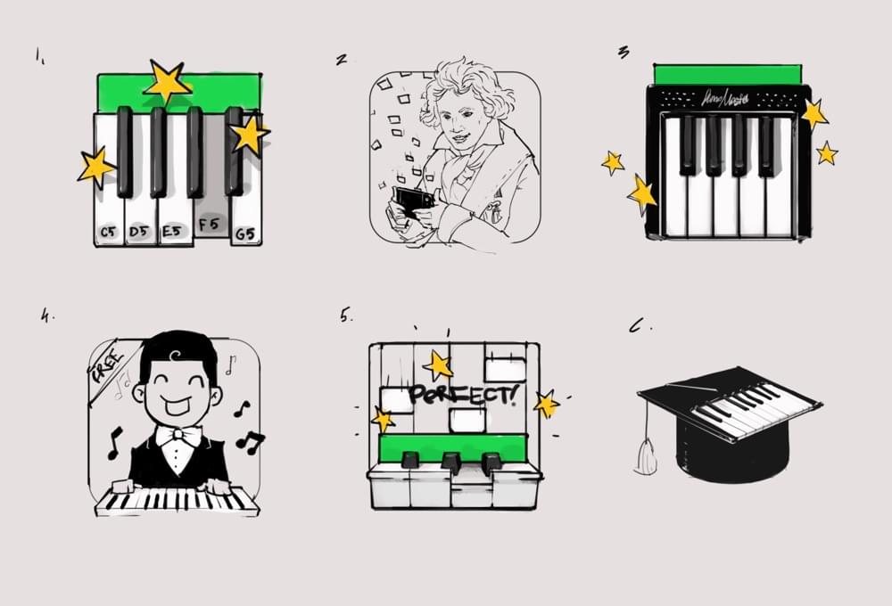
The customer liked concepts 5, 4 and 1 (in that order). The only concern was the green bar that we took directly from the game; the customer asked us to make the green bar a little narrower.
After taking the feedback on board, we then reiterated over the three chosen concepts and they began to look like this:
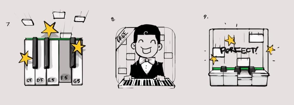
During our second round of feedback, the customer told us that the word “free” on one of the concepts was unnecessary, as the paid version of the app no longer existed, and only the free version remained. We were slightly worried that the experiment wouldn’t be fair if we tested the old icon with the word “free” against our new concept without it, however, the customer insisted that it be removed. The designs were then approved, and here’s what we ended up with after adding some color:
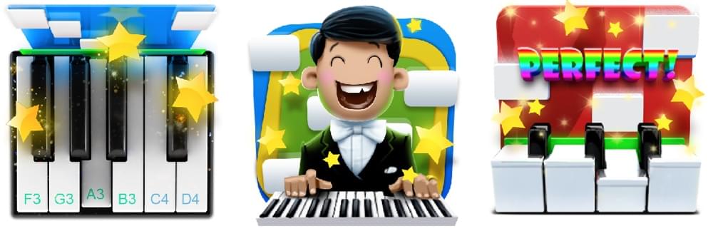
Step 2: First A/B Test (Choosing a Design)
We then tested the three concepts on the Google Play app store, where we realised that the winning icon increased the number of application downloads by 27.1%. Surprisingly, this was the concept that the customer liked the least!
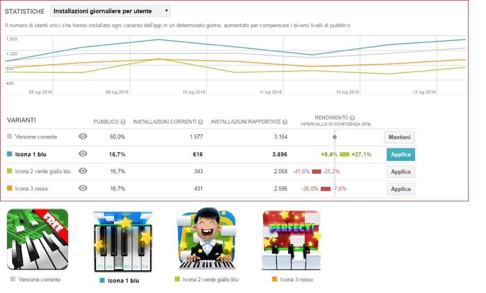
From the graph above, taken from the client’s dashboard, we also deduced that the second-best performer was the original icon, and we had a sneaking suspicion that it was because of the word “free”. We moved onto our second A/B test nonetheless, putting this suspicion aside for now.
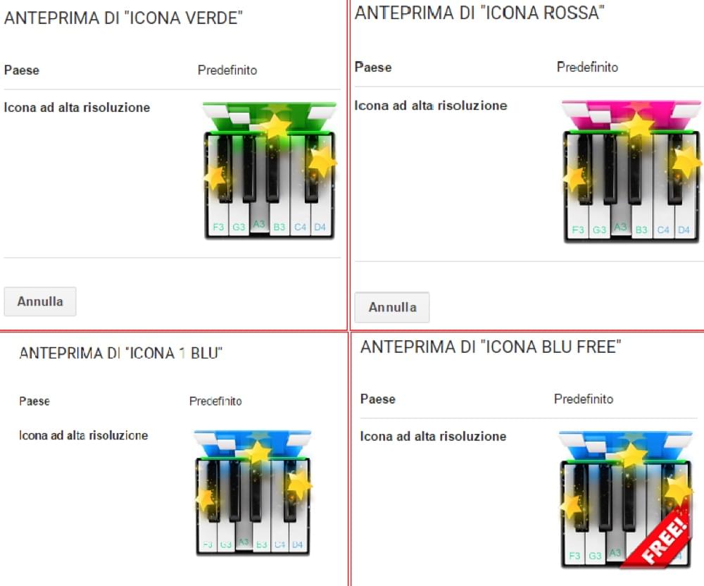
Step 3: Second A/B Test (Choosing a Color)
Now that the customer was no longer in doubt of which design to move forward with, we needed to choose a color for it. For the next experiment we A/B tested the winning concept with 3 color variations, where the customer expected the blue icon to be the winner, and since we still had nagging concerns about the impact of the word “free”, the customer agreed to include a fourth variation that was blue and had the “free” label.
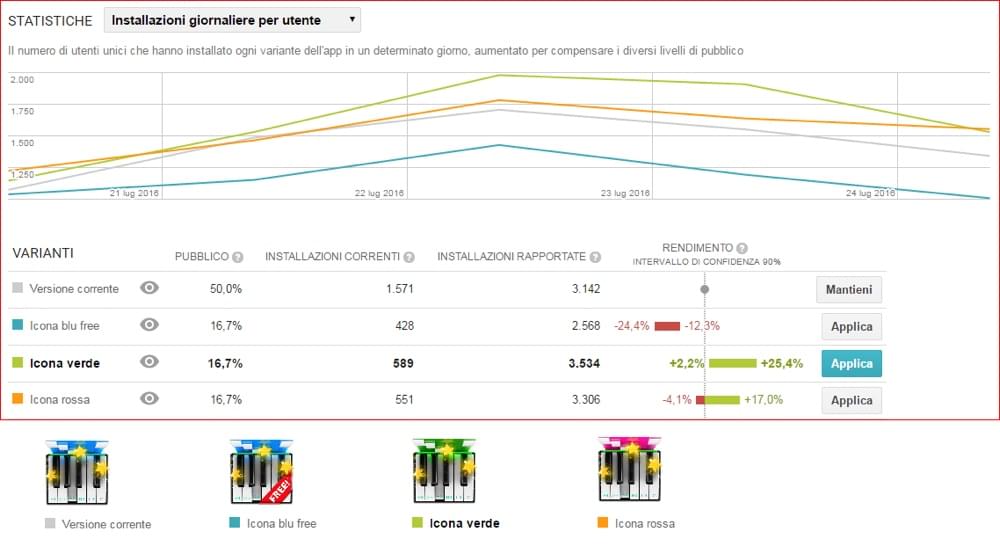
Much to our surprise, the green (verde) icon without a “free" label took the lead. In fact, the icon with the label appeared to be the least impactful, making our assumptions very wrong (twice!).
Conclusion
The customer’s least favourite icon was the most successful icon, where the difference in conversions between the best and worst icon was fourfold — this means that had the customer chosen the icon they liked (without A/B testing the different concepts), they would have ended up with four times as less organic downloads when compared to the most successful concept!
So what does this tell us? It tells us that icon design can massively impact the number of app download, and that A/B testing is a terrific way to compare multiple variations of a design. A/B testing can be applied to literally any design workflow, so next time you need to compare/decide upon various concepts, don’t choose your favourite idea based on zero reasoning, use A/B testing to deliver bulletproof evidence!
Plus, as we’ve seen today, your instincts can deceive you!


