Web Layout 101: Making the Most of the Top Right Corner

User behavior studies show the upper-right corner of a website is the area that draws the least attention from the human eye. It’s simply a reflection of our reading habits. We start at the left, head to the right, and then go top to bottom.

Many viewers examine a website in an ‘F’ pattern, with a top bar of the ‘F’ extended some way across the screen, then they move down horizontally and scan the second part of the letter, until finally they look down the left-hand lower parts of the site.
Site visitors overlooking the upper-right corner means it’s not the proper location for important information that the designer is expecting to generate clicks or other actions. Instead, it’s ideal for a contextual image, one that is seen by the viewer but doesn’t require the reading of any text.
However, the trick for designers is finding imagery that fits this dynamic.
When viewers look at a site for the first time, most look to the upper-left corner where there’s an expectation to see the name of the site and other important information. They quickly scan downward, with maybe a glance to the right.
As design teams came to understand viewer eye patterns, they began using the upper-right for less interesting content, such as disclaimers, instructions, and perhaps flags identifying different language version options for the site. While this is an older style of design, the underlying human behavior hasn’t changed.
Larger websites contain different pieces of content that are all vying for the viewers’ attention, but the upper-left remains the most valuable space. The upper right is ideal for images, as they are seen peripherally and can convey information or prompt emotions subconsciously.
Finding the Right Background Images
To illustrate upper-right site images that are a good fit for the screen, let’s review three different sets of background images and how they might interact with the content.
Example 1: Ballet Shoes
Let’s begin with two different images of a ballet scene – one where there are shoes in the upper-right part of the frame, the other with the shoes on the left side.
Image 1
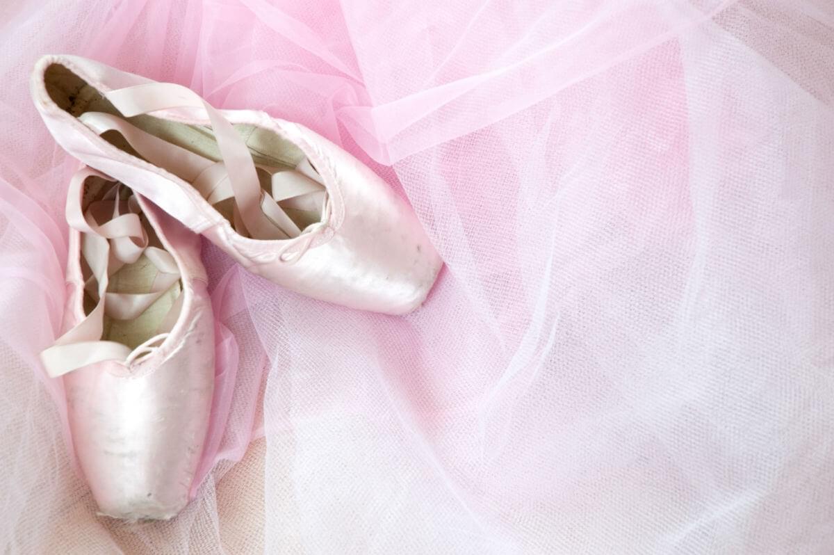
Image 2
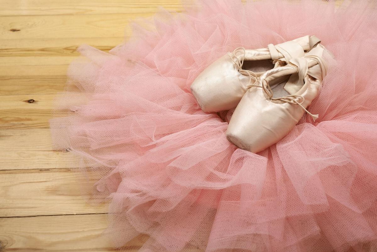
Image credit: Dreamstime
Here are some design thoughts on the preferred ‘right side shoe’ image:
- It clearly illustrates the power of a sharply focused image for the upper-right corner.
- The image itself is intimate and draws the viewer into the site with a feeling of sensuality and grace.
- It does leave the left-bottom corner a little bit weak, especially if a contextual content image was placed to the right of the text, then the upper-right would be too dominant. A possible solution would be richer toned wood flooring.

A simple composition.
Website photography should lend a human touch, but creating that warm and personal look is difficult when looking for ways to fill the ‘blind’ upper corner. A photographer that creates a composition with the center of attention (and actual focus) into the upper-right corner has made a highly unnatural site, one where the rest of the composition must be boring in order to draw attention.
With too much dominance in the upper corner, there’s a risk of distracting the viewers, and encouraging them to leave the site before they’re engaged.
Example 2: The Autumn Forest Road
Our second example uses two broadly similar views of a scenic road twisting through an autumnal forest. Both images feature a road that travels off into the distance, but the first travels directly towards the upper-right corner, and the road reaches the end of the frame. The second road winds towards the center of the composition.
Let’s dissect the two:
Image 1
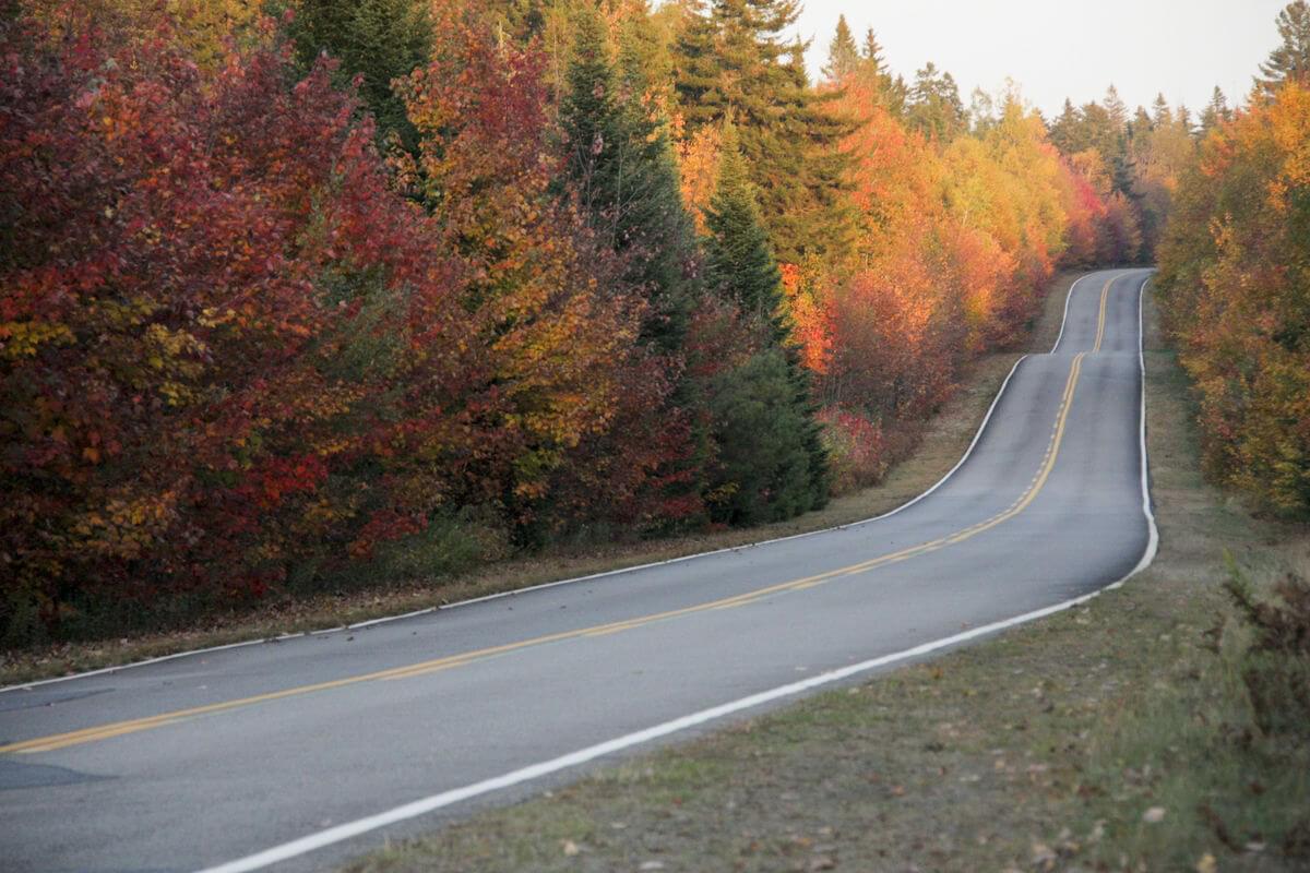
Image 2
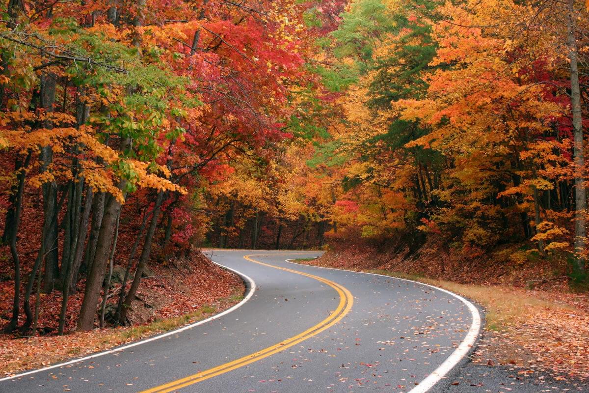
Image credit: Dreamstime
 A simple layout.
Example 3: The Beach Scene
The final set of examples are beach scene images containing one with the waves and setting sun, and another with palm trees on the left side.
Image 1
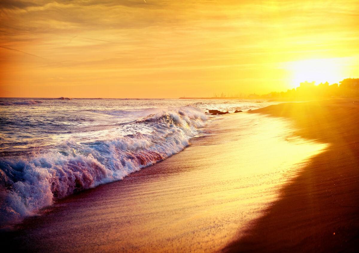
Image 2

Image credit: Dreamstime
- The image without trees has an eye-catching horizontal line of ocean that has an interesting sun featured on the right, with only sky on the left.
- The diagonal effect of the wave pulls the viewer’s attention and is dynamic and powerful.
- The detail of the wave helps balance the sun, giving the designer a lot to work with.
- Trimming more of the sky and including more water and shore would improve the image further.
- The sun should be up against the upper margin, which is against the photographer’s instinct.
- The image with the trees is a more typical scene, with dominant features to the left, and less interesting angles.
A simple composition.
The Takeaway?
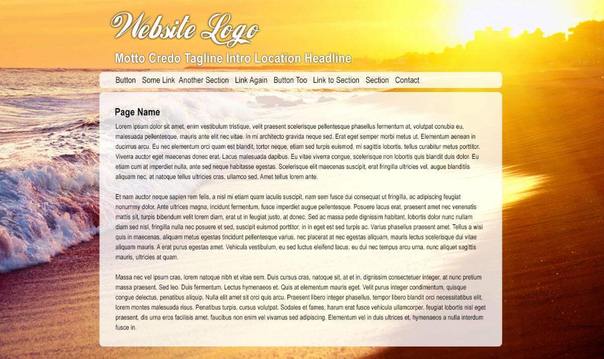
Ideally, images for a website background should have some visual interest in the upper-right corner and a vertical, narrowing band across the top of the screen.
There should be some visual interest down the right-hand side, which does run against the instincts of many photographers, but it’s a design style that works well for impactful sites.
All images: Dreamstime