How to Take Advantage of the Psychology of Speed Perception


If User Experience is the ‘Prime Directive‘ of website design, could we say ‘speed’ is its first rule? Users are moving fast, and they expect sites to load quickly. We live in a world where milliseconds matter!
But here’s the interesting part: Research shows that it’s not so much the raw loading time, as it is the perception of load speed which retains website visitors.
Users don’t measure site load time with a stopwatch; they measure it with their personal patience meter. This means there are tricks we can use to make a site feel faster than it is. Conversely, some web design decisions can make a fast site seem slow — you want to avoid these.
And remember, we’re after conversions! Research shows that mobile websites that load as much as one second more quickly than other pages improve conversion rates by 27%. That can make a tremendous difference.
Again, perception is reality. So, what can we do to make our websites feel even faster than they are?
Color Me Blue

Color has such an impact on people; I’m sure you’re not surprised to learn that color is among the factors that influence how users perceive the speed of your site.
A study conducted at the Hong Kong University of Science and Technology, School of Business and Management and reported in the Journal of Marketing Research affirmed this.
Manipulation of the hue, value and the purity or intensity of color showed that the colors that made people feel relaxed also contributed to their perception of quickness. Furthermore, the study showed that this perception impacted evaluation of websites and likelihood of recommending it to others.
Psychologists call this the “time-emotion paradox.” Decades of research have shown that humans can estimate time with incredible accuracy. The paradox? Under the influence of emotion, we can be extremely inaccurate in our judgment of time.
We’ve all experienced this. Time flies when you’re having fun, right?

On the flip side, watching an airport clock after a canceled flight is mind-numbingly slow experience.
So, back to web design and how you can make this paradox work for you.
If you want a quick and easy way to understand the power of color, think of nature. Is there anything more relaxing than looking out over a bright blue ocean? Or up into an azure sky? Interior designers use shades of blue to help keep people feel calm in meeting rooms and at home.
Blue speaks of trust and authority, too. It helps build confidence. There’s a reason they call the blue suit a power suit!
So, to help keep website visitors calm while they’re waiting for the site to load, think blue or some other relaxing color with similar values.
Progress Indicators
I’m sure you’ve noticed the plethora of progress indicators used in an attempt to minimize visitor tension while websites are loading.
In keeping with the psychology of color, these have the effect of relaxing users and keeping them happy while they’re waiting, in part because they feel more in control when they know something’s happening.
Remember, we’re talking seconds and even milliseconds here, but that’s the world we live in today.
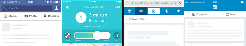
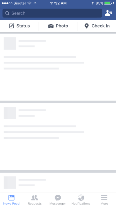
But all progress indicators are not created equal. At least one case study has shown that a skeleton screen works better than spinners or progress bars at keeping people engaged while they suspend reality and believe that your site is loading faster than it is because you’ve tapped into their relaxation paradox.
You’ve almost certainly seen a skeleton screen even if you didn’t know it has a name. As a site loads, the blank page gradually fills up with content.
Spinners project a perception of slowness. Like watching a clock tick in a waiting room, they literally mark out the time you’re wasting.
Skeleton screens intrigue the visitor who relaxes while waiting for the display to fill. It’s a little like getting handed a tray at the canteen. You know you’re going to eat – it’s just a question of what’s going to fill your tray.
Skeleton screens create a subliminal sense of progress and allow users to feel like your site is loading faster than may be the case.
Don’t Be Shy
In a perfect web world, a business creates a website and users who want or need what the company sells find each other and – voila! – we have conversion!
It doesn’t always work that way, but make no mistake, consumers visit websites because they’re looking for something. If your site doesn’t have a strong, compelling CTA, you’re missing the boat.
Furthermore, research shows that having the CTA show up quickly as a site is loading is among those factors that influence the perception of speed.
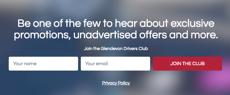
Make sure your CTA isn’t small and hard to read. Don’t bury it at the bottom of a site with lots of content. Make it simple for visitors to know what you want them to do. They’re looking for something, or they wouldn’t be on your site. And be sure the CTA pops out in some way while the screen is loading and you’ll enhance visitor perception of your site’s speed, too.
Perception is Reality
The best web designers understand human psychology. It makes sense that when people are more comfortable, they will have a more positive view of whatever they encounter. Research shows that more relaxed users are easier to convert and deliver more likes and shares of your website or content.
That’s not too hard to figure, in a sense they’re having fun, and they want to share it.
By the same token, if your site bores or frustrates them, I’m sure you can imagine the reaction. You’ve probably experienced such situations yourself.
Wrapping Up
There are many things a designer can do to enhance actual speed, and all of these are essential to the user experience.
At the same time, it’s important to understand that if you follow all of the technical best practices but don’t understand the psychology of the “time-emotion paradox,” your site will be less successful.
Balance real speed and perceived speed as you design your website, and you’ll have a winning combination!


