4 Expert Tips for Getting the Most Out of Google Fonts
Google fonts has been with us for almost five years now. If you work with web front-ends, there is every chance that you have used the service in at least one of the websites that you developed.
While the licensing costs have remained zero, Google’s font library has grown steadily in both number and quality, with Google taking over both the copyright and infrastructure responsibilities for you. What's more, implementing Google fonts requires minimal work on your part as their magic servers handle many of the trickier issues we used to have to manage ourselves.
We probably take it for granted today, but it’s easy to forget how difficult, hacky and expensive it used to be to use custom typography on your site. Reacquaint yourself with ‘sIFR‘ if you want a quick reminder of what we used to go through.
Having such a useful resource at your disposal, it makes sense to get the most out of it. In this article, I'd like to present four tips to help you use Google fonts like a pro.
Tip #1: Request Multiple Fonts in a Single Request
Using different fonts in heading and paragraph text can often improve readability. However, we also know that requesting many small files from a server is significantly slower that requesting one large file.
So, instead of requesting each font separately, it's advantageous to combine those multiple font requests into one. As an example, let's say you wish to load two fonts — Lato and Raleway. The proper way to load the fonts would be:
<link href='https://fonts.googleapis.com/css?family=Lato|Raleway'
rel='stylesheet'
type='text/css'>
Though this no difference to the total number of bits downloaded, the number of HTTP requests is reduced, and this has been proven to improve page load times. The more fonts you are using, the bigger the potential saving – though there are good other good reasons for limiting the number of external fonts you use.
Additionally, this method makes the code is more concise and readable. You only need to look at one line to understand all the fonts that your webpage is requesting.
Tip #2: Specify Font Styles and Script Subsets
There are times when you may want the italic or bold version of a font. In situations like these you can specify the font style using i and b respectively after the font name separated by a :.
Here is an example:
<link href='https://fonts.googleapis.com/css?family=Lato:i|Raleway:b'
rel='stylesheet'
type='text/css'>
You can also use bi to load a bold italic font style if available.
If you want a different variation of a bold font you can use a numerical weight. Raleway, for example, has four versions of bold with weight 600,700,800 and 900. To request the ultra bold font you need to call:
<link href='https://fonts.googleapis.com/css?family=Raleway:900'
rel='stylesheet'
type='text/css'>
If you are not comfortable with the abbreviations, you are free to specify the full name for a font style, as I've done in the next example:
<link href='https://fonts.googleapis.com/css?family=Lato:300italic'
rel='stylesheet'
type='text/css'>
In this case, instead of loading a normal italic font, we are loading the light version.
Some fonts in the directory support multiple scripts like Latin and Greek. One example of such a font is Roboto Mono. To request the Greek subset of the font you can use the following URL:
<link
href='https://fonts.googleapis.com/css?family=Roboto+Mono&subset=greek'
rel='stylesheet'
type='text/css'>
Tip #3: Optimize to Only Send the Characters You Need
In specific situations, you might need to use only a strictly limited set of characters from a given font. This may also be the case when you only require the digits from a given font.
In cases like this, it's simple to reduce the request size by cherry-picking the specific characters we need by using the text= value in your font URL. This way Google will return the version of the font file you requested optimized for your specific needs. This can dramatically reduce the file-size of the font that is supplied – particularly with intricate display fonts and elaborate calligraphic typefaces.
Consider the following example:
<link href='https://fonts.googleapis.com/css?family=Raleway&text=SitePoint'
rel='stylesheet' type='text/css'>
Instead of loading the complete Raleway font file, we can choose to only load the characters we need for the word 'SitePoint'. This reduces the font file size by 90%.
These optimizations can add up and have a significant impact on the overall load time of a webpage. Keep in mind that you need to URL-encode the value of text.
See the Pen dYmZzM by SitePoint (@SitePoint) on CodePen.
Tip #4: Take Advantage of Font Effects
Once in a while you might need to create text with some special effects. Although simple effects like multiple shadows can be created in pure CSS and are flexible, creating complex effects can be tricky. Google fonts make it ridiculously easy to create some specific text effects like neon glow and fire animation among others.
To enable this feature you need to add the effect= value in the Google Fonts API request. To use it on a specific element you need to add the corresponding class.
For instance, here is an example to show how easy it is to create a neon glow effect. You begin by adding this stylesheet request in your webpage:
<link href='http://fonts.googleapis.com/css?family=Monoton&effect=neon'
rel='stylesheet'
/>
To use it on any text element just add the class name font-effect-{effect-name}. In this particular case effect-name is neon. Therefore, the class name would be font-effect-neon.
See the Pen Glow Effect – Google Fonts by SitePoint (@SitePoint) on CodePen.
This is another demo slowing the glow effect on dark background.
See the Pen Glow Effect in Google Fonts by SitePoint (@SitePoint) on CodePen.
Obviously, not all effects work well with every font. This feature is designed to be used on headlines and other prominent text. As a result, most of these effects work better on heavier weights and slab fonts.
Here is another CodePen demo with outline effect.
See the Pen Outline Effects in Google Fonts by SitePoint (@SitePoint) on CodePen.
Web-kit Effects
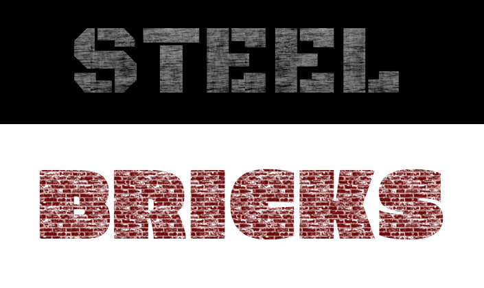
Some effects like bricks and scuffed steel are supported by Chrome and Safari only. Users using other browsers will just see font rendered without the texture effects.

- CodePen demo for scuffed steel (Chrome and Safari users only).
- Codepen demo for the brick effect (Chrome and Safari users only).
Good taste would dictate sparing use of these types of effects, but it’s useful to know they are there.
The Wrap Up
The basic Google fonts service is relatively easy to use. The features discussed in the tutorial make the services all the more impressive.
The first three tips focus on improving website load times – the major complaint with webfonts. If you are going to load external font files, these optimizations will reduce wait times as much as possible. Making one request instead of three reduced load time by 200ms. This may seem insignificant, but it surely adds up.
The last tip not only reduces the code you need to write while providing a hassle-free method to add striking effects to your text.
To learn more about the service I recommend reading the article on official website.
- How has your experience with Google Fonts been?
- Are there reasons you've opted for Typekit or one of the other commercial services?
If you have already used any of these features please let us know about your experience in the comments.


