3 Ways to Combine Text and Images

photo: Leo Reynolds
In recent years, panoramic background images have become all the rage in web design.
The Web is full of impressive examples that well illustrate the technique: eye-catching landing pages, lavish portfolio sites, and increasingly, even big corporations use majestic full-screen background photos to project a sense of grandeur and awe.
A picture is worth a thousand…?
Even though studies have shown that information conveyed through imagery is remembered more readily than written data (and in different parts of the brain), developers need to pay attention to how and when to apply this principle to web design.
Don’t underestimate the effect these huge, retina-ready backgrounds can have a loading times, and by extension, the user experience. Since these background images are usually about setting visual tone or mood, rather than communicating required information, they tend to pile on the page weight for not a lot of user benefit.
According to a recent Web Performance Today report:
A 2-second delay during a transaction results in shopping cart abandonment rates of up to 87%
* Source: WebPerformanceToday.com
That is a potentially huge hit to your bottom line for what amounts to a decorative flourish.
Although some images make a very impressive visual impact on a website, you’ll often need to consider alternatives to this practice, particularly for sites which have an important mobile audience.
A good first tip is to use a small amount of well-chosen words to describe your product or service, and combine them with attractive and incisive imagery. Avoid choosing generic images if more specific imagery will more adequately communicate your goals.
Focus on the emotional evocation and literal context of the image, especially as it relates to the tone of the message your text is intended to convey.
Tips for selecting large format/panorama image
When sourcing large format images, keep an eye towards choosing photos that will compress well. This has less to do with the subject matter, and more to do characteristics, framing and styling of the photo. You image will probably need to have at least one of the following characteristics:
- Lots of darkness/shadows
- Large areas of lens blur
- Limited color variation
- Large areas of flat color (i.e. sky, water, paint, etc)
Below are some examples of images that incorporate some these qualities. Even though each is evocative of a distinctive mood and tone, each is surprisingly low in visual detail, and ideal for heavy compression.
Blurred or soft focussed images
There’s a wonderfully dreamy feel to this shot and the haziness only increases the charm, while aiding the compression.
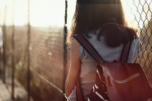
photo credit: gioiadeantoniis
Night shots
Large areas of darkness generally compress well. This shot is mostly shadows but the warmth and color triggers memories of camps and barbeques and bonfires for many of us. Our brain fills in the detail in this image.
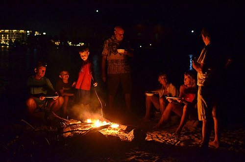
photo credit: behang
Flat Color
There are areas of detail in this shot, almost half of the image is fairly flat areas of blue sky that are ideal for compression.
photo credit: dhammza
Each of these examples also has another nice aspect — each contains empty spaces that almost suggest positions to place overlayered text.
So, now that we’ve got some ideas on what images to choose, we can focus on the best way combine text and images in the most effective way possible. Often this is not just a question of what text we choose, but precisely where and how we place it.
1. Let’s play with Colors and Contrasts
Even if using darker imagery with light text, or perhaps darkening those images with filters or overlays, appears a relatively ‘obvious‘ solutions to you, this practice is not so widely adopted. Many designers still make the mistake of juxtaposing colors that don’t ensure enough contrast.
If you want to be sure that color and brightness contrast is good, you have to remember:
- To check that you can immediately see the letterforms, with any effort. On the contrary, your contrast is off.
- Contrast is not limited to dark VS light; complementary colors also provide natural contrast. You can use free online services like Color Picker to find out complementary colors once inserted the code of the one of your choice.
- You can use filters to manipulate the contrast and brightness of an image. Brightness and contrast affects the overall tone of the photo and changing the brightness will make an image lighter or darker. If the image is fully in focus, usually the quickest solution is to create an darker overlay (CSS) or editing the image. Adjusting brightness and contrast in Photoshop is one of the easiest things you can do. You can find a plethora of tutorials and videos which explain how to achieve a good result.
That said, in this example, you can see how difficult is to read the text placed on the flower. The contrast between the white color of the text and the lightest shades with the flower prevents the eyes from effortlessly distinguish the letterforms. The result is obviously not good.
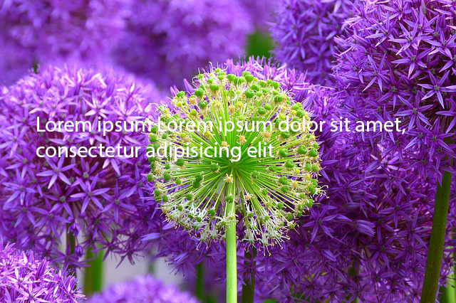
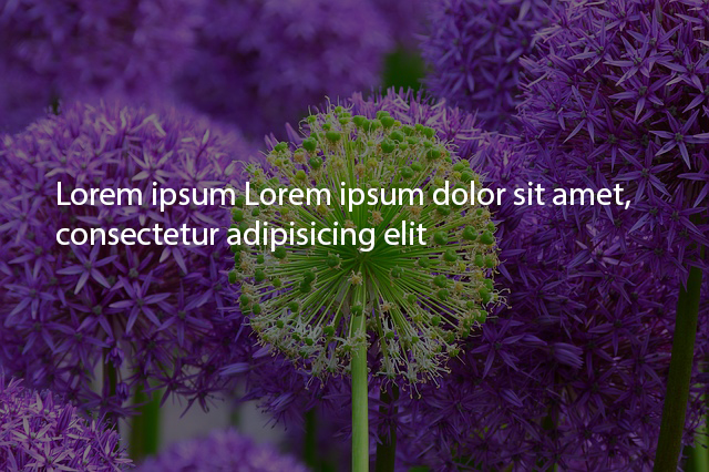
Now see how much the legibility improves when we make the image marginally darker. CSS filters allow you to accomplish this effect on the fly in newer browser, but Louis Lazaris shows a method here that works fine even on older browsers.
2. Let’s change size and position
In addition to color, the contrast of your image can be improved in relation to overlaid text. In fact, size and position of the texts can help improving the readability of the text itself. Let’s see how different positioning of the same text on the same background can instantly improve its readability.
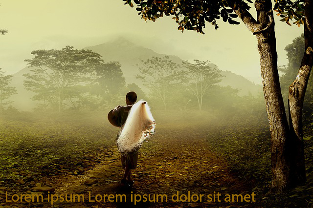
In this first image, the position (in addition to a bad choice of the color, of course) detracts from the rendering of the image.
The color — probably too similar to the ground tone — and the position of the text at the bottom, constitutes two choices that have a negative impact on users’ eye.
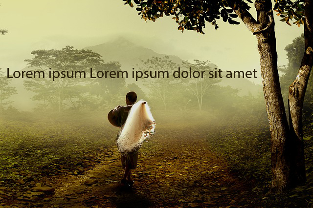
Moving the text from the bottom of the image to the top, would let the text be much more readable, easily and immediately accessible.
3. Let’s consider depth to improve readability
A third factor you should keep in mind when combining texts and images is depth of field.
We’ve already touched on the file compression advantages of selecting photographic images with blurred areas. Selecting these images will also provide a smoother, more readable backdrop for your text.
These blurred image areas will give you an ‘averaged’ color for that general area, so just make sure there is adequate contrast with your text color.
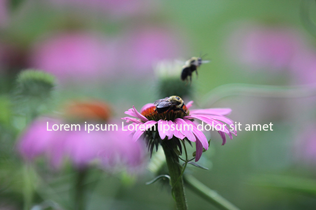
In this first screenshot, you see that the text is placed on the focus section of the image. Actually, it is not effective as expected.
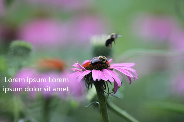
What an improvement when we position the text slightly to the left, in the out-of-focus area. This lets us emphasize the message without compromising the image.
Some examples done, three final tips for you:
- Pick images with a single, strong focal point.
- Don’t forget the importance of clarity in the image. If the image is there to evoke emotion rather than to ‘tell the story’ and less about the details, heavy overlays or filters may be applied without losing the effectiveness of the image.
- Think about where the text appears in relation to the focal point of the image: does is sit behind the image, or in the foreground, or does it hold its own unique position in the composition?
Conclusions
As we’ve said previously, don’t make the mistake of thinking you can simply set text in a standard position and expect it to look right with any image. If we want to standardize our text positioning, we’re going to have to also standardize the composition of our photos too.
We need to study the best solution possible considering the images we want to add, the text we want users read and the message we want to convey.
Remember: study first, win later.


