Uploadcare: Your Super-Powered Image CDN

This article was sponsored by Uploadcare. Thank you for supporting the partners who make SitePoint possible.
A good Content Delivery Network will boost your website’s performance. Files are hosted on different domains or sub-domains on servers across the globe to ensure users get the fastest download wherever they are located. The best CDNs will help manage your data and save hosting costs.
CDNs are regularly used to host static assets such as images. You push an image file to the CDN server then reference it in your page’s <img> tags. That’s as far as most go, but Uploadcare are taking CDN services to another level and could save you considerable development time.
Uploadcare Services
Uploadcare provide accounts ranging from free (500MB of space and 5GB traffic per month) to white-labelled commercial services supporting up to 5TB file sizes and virtually unlimited bandwidth. All plans include:
Configurable Upload Widget/Dialog
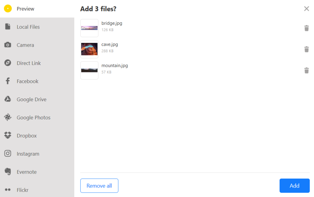
Despite HTML5 advances, uploading files to a server requires significant development effort. The upload widget provides a simple, ready-made, style-able component for your site. It allows users to drag and drop or choose files from their local file system, camera, URL, Google Drive, Google Photos, Dropbox, OneDrive, Facebook, Instagram, Evernote and Flickr directly to the Uploadcare CDN (the list is always growing and you can also easily add a custom source):
REST API
A REST API is provided so any language or system can upload and manage files in bulk. A simple cURL example to upload image.jpg:
curl -F "UPLOADCARE_PUB_KEY=demopublickey" \
     -F "UPLOADCARE_STORE=1" \
     -F "file=@image.jpg" \
     "https://upload.uploadcare.com/base/"
The JSON response returns a Universally-Unique Identifier (UUID) assigned to all files so they can be referenced later:
{
  "file": "17be4678-dab7-4bc7-8753-28914a22960a"
}
CDN API
This feature will be considered essential by anyone creating responsive web and mobile apps. Once an image has been uploaded, it can be resized and manipulated via the URL alone. This is best illustrated with an example. Consider this image of a chap with headphones (thank you Alex Blăjan who provided it at Unsplash.com). I uploaded a 1600 x 900px, 140KB file to Uploadcare:

The resulting URL contains the image’s UUID:
https://ucarecdn.com/718f79c5-2868-41c8-b56e-c87237674adb/
You can add any filename at the end to help you remember what image you’re using and aid SEO, e.g.
https://ucarecdn.com/718f79c5-2868-41c8-b56e-c87237674adb/man.jpg.
Ignoring the impact of high-density Retina screens for the moment, there’s little point using this full-sized image on a device with, say, a 500px-width screen. Normally, I would need to create a resized version of this image using Photoshop or a build system but Uploadcare removes this requirement. I can simply change the URL to:
https://ucarecdn.com/718f79c5-2868-41c8-b56e-c87237674adb/-/resize/500x/man.jpg
This instantly provides a 500px-width image, which now has a reduced file size of less than 20KB:

Uploadcare claim super-fast resizing speeds, which are typically 15-30x faster than ImageMagick (and with substantially less hassle!)
Alternatively, I could have changed the image height using a URL such as:
https://ucarecdn.com/718f79c5-2868-41c8-b56e-c87237674adb/-/resize/x300/man.jpg
Or perhaps my site requires a 100x100px cropped and scaled grayscale thumbnail with maximum compression? The URL:
https://ucarecdn.com/718f79c5-2868-41c8-b56e-c87237674adb/-/scale_crop/200x200/-/grayscale/-/quality/lightest/-/progressive/yes/-/format/auto/man.jpg
The image file size has now dropped to less than 3KB. In Blink-based browsers, including Chrome, Opera, Vivaldi, and Brave, the /format/auto/ directive detects WebP support and returns an even smaller 2.3KB image.

The CDN API URL can contain any number of processing directives separated by a /-/ delimiter. The documentation provides full instructions for:
- changing the image format, quality, and progressive loading
- creating thumbnails, resizing, cropping, and stretching
- filters such as enhance, sharpen, blur, grayscale, and invert
- rotating, flipping, and mirroring
- adding image overlays, extracting prevalent colors and more
You can even detect faces and convert animated GIFs to videos, to save bandwidth but without losing quality.
Using the CDN API for Responsive Images
The CDN API also makes it easy to define responsive images. Assume a site wants to use the above image in a 100% width hero block in sizes which are suitable for screens less than 400px, 800px, 1200px or 1600px and above. This is set using the HTML5 srcset attribute on the <img> tag which defines a comma-separated list containing:
- the image filename followed by a space, then
- the images inherent width in pixels, e.g.
400w– note thewunit rather than the more typicalpx.
The srcset would therefore be:
https://ucarecdn.com/718f79c5-2868-41c8-b56e-c87237674adb/-/resize/400x/man.jpg 400w,
https://ucarecdn.com/718f79c5-2868-41c8-b56e-c87237674adb/-/resize/800x/man.jpg 800w,
https://ucarecdn.com/718f79c5-2868-41c8-b56e-c87237674adb/-/resize/1200x/man.jpg 1200w,
https://ucarecdn.com/718f79c5-2868-41c8-b56e-c87237674adb/-/resize/1600x/man.jpg 1600w
(carriage returns added to aid legibility)
If the hero was not 100% width, I would also need to set a sizes attribute. That would define a comma-separated list with:
- a media condition, e.g.
(max-width: 400px), followed by a space, then: - the width the image will fill when that condition is true, e.g.
100%or400px.
I also need to set the standard src attribute to reference an image used when the browser does not support srcset. The mid-point 800px version of the image is likely to be a good compromise of resolution vs file size. The final image code:
<img srcset="https://ucarecdn.com/718f79c5-2868-41c8-b56e-c87237674adb/-/resize/400x/man.jpg 400w,
             https://ucarecdn.com/718f79c5-2868-41c8-b56e-c87237674adb/-/resize/800x/man.jpg 800w,
             https://ucarecdn.com/718f79c5-2868-41c8-b56e-c87237674adb/-/resize/1200x/man.jpg 1200w,
             https://ucarecdn.com/718f79c5-2868-41c8-b56e-c87237674adb/-/resize/1600x/man.jpg 1600w"
        src="https://ucarecdn.com/718f79c5-2868-41c8-b56e-c87237674adb/-/resize/800x/man.jpg"
        alt="man with headphones" />
Refer to responsive-image.html
A single image on Uploadcare has instantly provided four possible alternatives. If the user has a device width of 1000px, they are served the 80KB, 1200px image and save themselves 60KB of bandwidth. The site also renders faster and appears more responsive.
Using the CDN API for Art Direction
The example above assumes that I want to use the same image dimensions regardless. However, the right-hand half of the image is largely unnecessary, on a smaller screen it would be practical to slice the image to a headshot with a crop or scale_crop operation, e.g.
https://ucarecdn.com/718f79c5-2868-41c8-b56e-c87237674adb/-/scale_crop/400x400/man-cropped.jpg

A <picture> element is then defined with multiple <source> child elements which set a media query and the srcset as before, i.e.
<picture>
  <source media="(max-width: 599px)"
          srcset="https://ucarecdn.com/718f79c5-2868-41c8-b56e-c87237674adb/-/scale_crop/400x400/man-cropped.jpg 400w,
                  https://ucarecdn.com/718f79c5-2868-41c8-b56e-c87237674adb/-/scale_crop/600x600/man-cropped.jpg 600w" />
  <source media="(min-width: 600px)"
         srcset="https://ucarecdn.com/718f79c5-2868-41c8-b56e-c87237674adb/-/resize/800x/man.jpg 800w,
                 https://ucarecdn.com/718f79c5-2868-41c8-b56e-c87237674adb/-/resize/1200x/man.jpg 1200w,
                 https://ucarecdn.com/718f79c5-2868-41c8-b56e-c87237674adb/-/resize/1600x/man.jpg 1600w" />
       <img src="https://ucarecdn.com/718f79c5-2868-41c8-b56e-c87237674adb/-/resize/800x/man.jpg"
            alt="man with headphones" />
</picture>
In this example, the user is served:
- a square headshot when the browser width is 599px or less (using a 400x400px or 600x600px image as necessary)
- the full image when the browser width is 600px or more (using a 800px, 1200px or 1600px image as necessary)
- a full image at 800px width as a fallback in older browsers.
Refer to responsive-picture.html
Uploadcare has instantly provided all five options without us having to manually create the images.
Using the CDN API for a Progressive Image Loader
I recently wrote about How to Build Your Own Progressive Image Loader, which saves bandwidth by lazy-loading images. A representation of an image is generated from a tiny thumbnail. The file can be 20px width and less than 1KB, but it’s scaled-up and blurred to fill the container. The high-resolution image is loaded and displayed when the container is scrolled into view. It works in all browsers (or when JavaScript fails) because the blurred image links to the high-resolution version if loading is unsuccessful.
The Uploadcare CDN API overcomes several of the problems associated with the progressive image loader:
- there’s only one image file to manage
- there’s no need to manually create a small thumbnail
- image aspect ratio should always match (which is essential for sizing the container)
- there’s no need for a graphics application or a build system!
Refer to: CODEPEN.IO https://codepen.io/craigbuckler/pen/yPqLXW or https://cdn.rawgit.com/craigbuckler/progressive-image.js/7f022aaf/demo.html
The code can also be downloaded from GitHub.
(Note I’ve made a few tweaks to the original. I had intended on using Intersection Observers but it seems that may not be practical yet…)
     <a href="https://ucarecdn.com/1b73ebf8-b2d6-40cc-abd6-945d4df883c9/mountain.jpg"
 data-srcset="https://ucarecdn.com/1b73ebf8-b2d6-40cc-abd6-945d4df883c9/-/resize/400x/mountain.jpg 400w,
              https://ucarecdn.com/1b73ebf8-b2d6-40cc-abd6-945d4df883c9/-/resize/800x/mountain.jpg 800w, https://ucarecdn.com/1b73ebf8-b2d6-40cc-abd6-945d4df883c9/mountain.jpg 1600w"
       class="primary progressive replace">
    <img src="https://ucarecdn.com/1b73ebf8-b2d6-40cc-abd6-945d4df883c9/-/resize/32x/-/grayscale/-/quality/lightest/mountain.jpg"
       class="preview"
         alt="mountain" />
     </a>
The inner <img> element references a tiny grayscale image generated by the Uploadcare CDN API. It’s just 378 bytes and loads instantly:

When the image placeholder is scrolled into view, the JavaScript code removes the thumbnail and replaces it with the responsive image while copying data from the <a> element:
<img srcset="https://ucarecdn.com/1b73ebf8-b2d6-40cc-abd6-945d4df883c9/-/resize/400x/mountain.jpg 400w,
             https://ucarecdn.com/1b73ebf8-b2d6-40cc-abd6-945d4df883c9/-/resize/800x/mountain.jpg 800w, https://ucarecdn.com/1b73ebf8-b2d6-40cc-abd6-945d4df883c9/mountain.jpg 1600w"
        src="https://ucarecdn.com/1b73ebf8-b2d6-40cc-abd6-945d4df883c9/mountain.jpg" alt="mountain">
Throw in a little CSS3 animation and the page has a pleasing effect.
Try Uploadcare
Uploadcare is a super-powered CDN which makes file uploads and management easy. The CDN API makes it an essential service for anyone implementing responsive web designs. There’s a free, no-obligation starter plan and they’re also offering 20% off your first year for SitePoint readers. So sign-up today!