Responsive Design in Sketch: Group Resizing vs. Auto Layout Plugin

We updated this article in April 2017 so that we could compare Sketch’s responsive design features with the critically-acclaimed Auto Layout plugin.
Rejoice, fellow Sketch users! Sketch 39 finally delivered us the ability to create truly fluid layouts. Fluid layouts are layouts whose individual elements can auto-resize, float to one side, or remain fixed in place as the size of the viewport/browser changes ⏤ the basic concept of responsive design is derived from fluid design.
In Sketch, fluid design is known as Group Resizing, offering similar functionality to the Fluid Plugin for Sketch; the crucial difference is that Group Resizing is a native feature, and therefore offers a more streamlined user experience while offering pretty much the same functionality. Group Resizing is the clear winner here!
However, Sketch fans have been raving about this Auto Layout Plugin for Sketch. Auto Layout obviously doesn’t deliver the fluid design features natively, but it’s built to appear as such, and actually delivers a faster workflow than Group Resizing due to some of its additional features (such as the ability to toggle Artboard orientation, and the ability to quickly convert, say, an iPhone 7 Artboard to an iPhone 6 Artboard (this is useful for testing Universal Apps for responsiveness).
So, which is better, Group Resizing or the Auto Layout Plugin? Well, I use the native Group Resizing feature for mocking up smaller, more conceptual ideas, but the Auto Layout Plugin when I need to work on something bigger (a slightly less-native experience is a fair trade-off for the extra features that it brings).
Let’s take a quick crash course in designing responsive layouts in Sketch, as we learn about both Group Resizing and Auto Layout, as they are both awesome, and can both be installed at the same time!
Why Design Responsive Layouts?
Being able to test rough responsive layouts before you begin designing high-fidelity prototypes reduces the likelihood of encountering setbacks later on (setbacks as a result of not testing your concept on all screen sizes). In fact, taking a mobile-first approach to low-fidelity prototyping before you even begin accepting feedback, is probably the best (and safest) way of validating your ideas and delivering a responsive solution to a design.
Fluid design certainly doesn’t account for elements that you’d like to hide (or change, visually) when adapting the screen size of devices, but it does mean that Groups in Sketch have suddenly become far more useful. It’s not 100% responsive design, but it’s close enough.
Groups can now be resized without scaling all of the objects inside them, which is quite ideal for when you need to duplicate mobile Artboards and scale them up (because mobile-first!) to desktop Artboards. Your logo (for instance) would need to remain in the top-left corner, your menu would need to remain in the top-right corner, and your main body of content would float evenly in the center of the screen. Group Resizing and Auto Layout makes this happen.
Let's take a look at Group Resizing first.
Step 1: Low-Fidelity Prototyping
Before adding colours, fonts and other visual aesthetics, it’s best to design a low-fidelity mockup of your concept first. Low-fidelity design can be blazingly quick; it doesn’t have to take up too much of your time (in fact, it will probably save you some time in long run, as you can afterwards move forward with the peace of mind that your concept works).
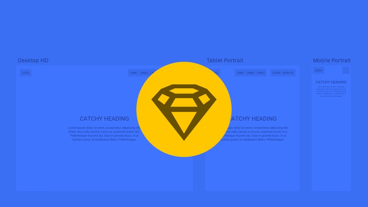
Press A for Artboard, then select the “Desktop HD” Artboard from the Inspector.
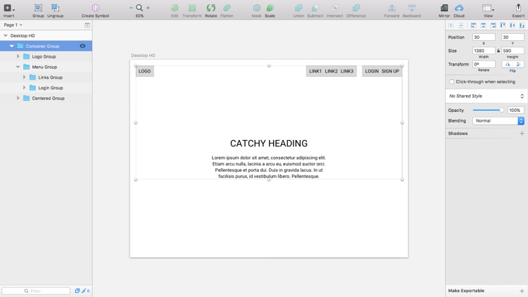
Design a logotype in the top-left corner of the Artboard using a vague combination of text and shapes, as you would do creating a simple wireframe. Repeat these steps with a top-right menu and a centred heading+text combination (nothing fancy, we’re only experimenting with an idea here). After that, Group all of the logotype layers together, then all of the menu layers, then all of the centred content layers, and then finally all of the Groups together into a single Group.
For quick reference:
- Rectangle: R
- Oval: 0
- Text: T
- Group: Command+G
Step 2: Putting Resizing Rules in Place
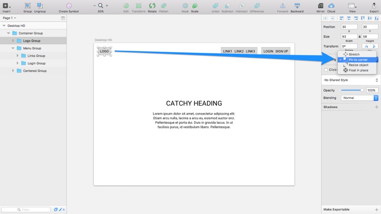
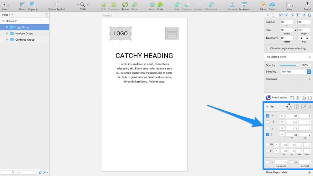
Pin and Stretch
Now this is where we define the positioning of our canvas objects. Naturally, the logo needs to remain in the top-left corner, so choose “Pin to corner” from the “Resizing” select box in the Inspector, where the relevant corner is whichever corner the layer is closest too (you probably noticed that the first option was “Stretch” ⏤ this is the default behavior when resizing Groups, the behaviour that you’ve been familiar with all this time).
Repeat this step for the top-right corner menu.
Resize Object
It took me a while to realise how “Resize object” works. It doesn’t scale the layer relatively, it scales the layer by the same amount that you’re scaling the Group that contains it.
This is…unconventional, but, fortunately, we won’t need it for this tutorial.
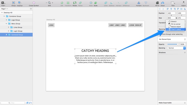
Float in Place
“Float in Place” does exactly what you think it does. It keeps layers aligned when resizing, however, it’s especially useful for centring layers either horizontally or vertically, so let's do that with our centred content to keep it horizontally aligned.
In the next step, we’ll resize our Group to test it for responsiveness, and use that information to determine where the responsive breakpoints should be; these breakpoints determine which screen size a design needs to be adapted for a better user experience.
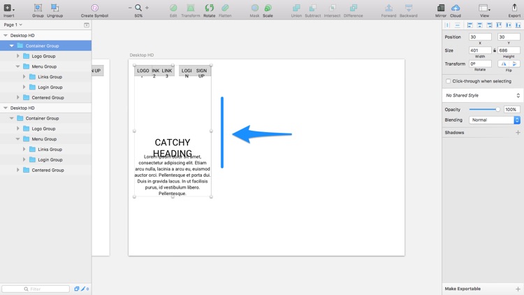
Duplicate your Artboard and start to resize the Group.
Step 3: Resizing Groups for Responsive Testing
After resizing the Group, there comes a moment when the design simply doesn’t make sense anymore. In this case, the logo and the menu start to overlap, and the centred content feels too large for such a small screen ⏤ this means that we’ve reached a breakpoint and we now need to adapt our layout.
Select the Artboard from the Layer List and click the “Resize to Fit” button in the Inspector, then scale up the Artboard to the next common screen size, which is Responsive Web Design → Tablet Portrait).
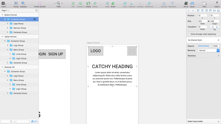
You can then take this one step further and test on a mobile device, or alternatively, you can reverse these steps for a mobile-first approach (recommended). As you can see, the design needs restructuring on a mobile device to offer a better user experience, hence the conversion of the menu to a nav icon.
However, since Group Resizing has kept the layout aligned for us, all that’s left to do is wireframe the navigation icon and change the font-size of the centred elements. So easy!
Adapting the layout to fit mobile screens
Group Resizing vs. Auto Layout Plugin
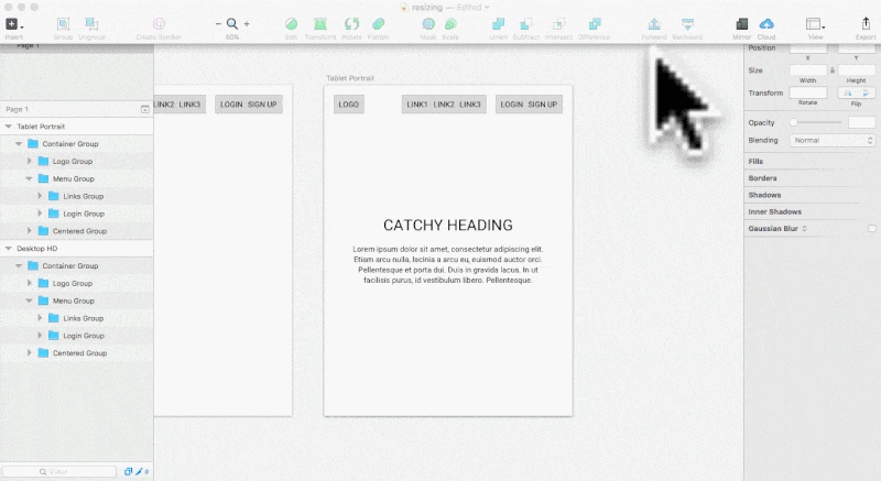
So how does Auto Layout differ from Group Resizing? First of all, Auto Layout resides in a cute little box in the Inspector, which is what makes Auto Layout feel like a native feature. Secondly, if you select the “Pin” dropdown, you’ll see all of the features that you’re already familiar with from using Group Resizing. From here you can pin an element to a corner, align an element vertically, or specify the width of an element in percentages. Pretty standard stuff, not much different from Group Resizing so far.
Orientation and Artboard Size
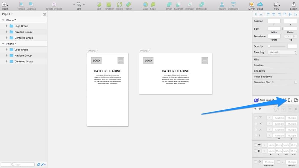
Let’s take a look at where Auto Layout really shines. Click the device orientation icon to rapidly toggle between “Portrait” and “Landscape” mode ⏤ while Group Resizing does let us create fluid designs, as does Auto Layout, Auto Layout lets us switch orientation with a simple click.
Here, I’ve duplicated the Artboard so that you can see the two orientations side-by-side.
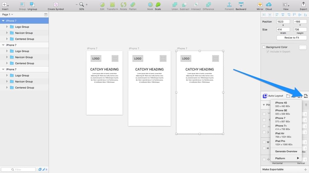
Next, lets convert our Artboard from iPhone 7 to iPhone 7+ and iPhone SE. Again, I’ve duplicated the Artboard so that you can see the comparison side-by-side.
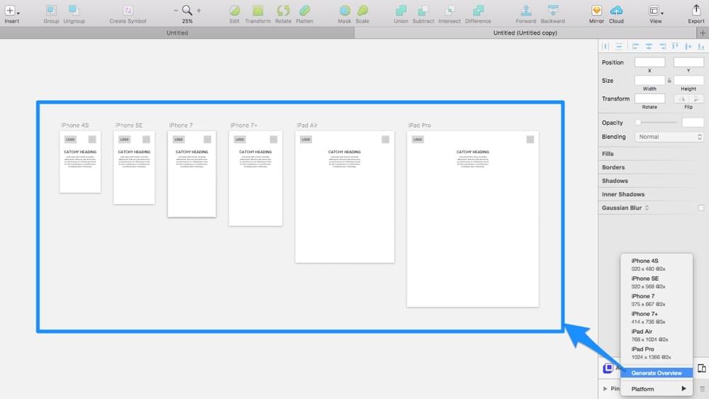
Generating an Overview of All Screen Sizes
In reality, you would work with the same Artboard throughout, converting the same Artboard back-and-forth as you test your fluid settings in different device sizes. That being said, should you need to see your design in all device sizes at once (maybe you’d like to export the Artboards to demonstrate to your team how the design would look on all screen sizes), simply select the “Generate Overview” option.
Conclusion
I used the Group Resizing feature only for a short while before I understood how useful it was for creating and testing fluid layouts, and I still use it to this day for rapidly visualising a responsive concept. For more in-depth mockups that need to be tested in a variety of devices, Auto Layout can help you switch up your Artboard sizes (and orientations) for rapid testing in mere seconds. Plus, when combined with the Slinky Sketch Plugin, you can also create (and export) responsive emails as HTML!