5 Web Design Trends to Watch in 2023

A new year is typically a time for new ideas, approaches, or ways to make life a little better or more enjoyable. For web designers and users, improved ways to design websites is always high on the list.
In the following post we’ll be addressing 5 new web design trends that address issues like accessibility, UX, and responsiveness as well as 10 pre-built websites from BeTheme that show how to effectively use them.
With 268,000+ sales and a 4.83/5 star rating, BeTheme is one of the world’s most popular and highly-rated WordPress Themes.
5 web design trends to look out for in 2023
In order to improve something, you first have to have an understanding about the things that can impact it, both positively and negatively. For web designers, that “something” is a user’s digital experience and how 5 design trends that can positively impact a digital experience could best be implemented.
1. Hoverable iconography
A top web design priority is how to go about creating interfaces that require minimal effort on the part of the user to interact with them, i.e., they are as intuitive as possible. Shortcuts that make things easy for the designer can, however, have the opposite effect on the user – especially when it comes to iconography.
Some icons, especially those used in headers, are so commonplace that any user can interpret their meanings and use them appropriately.
As an example, the BeBiker 4 website features three icons on the left for 1) Shopping Bag/Cart, 2) Search, 3) Account.
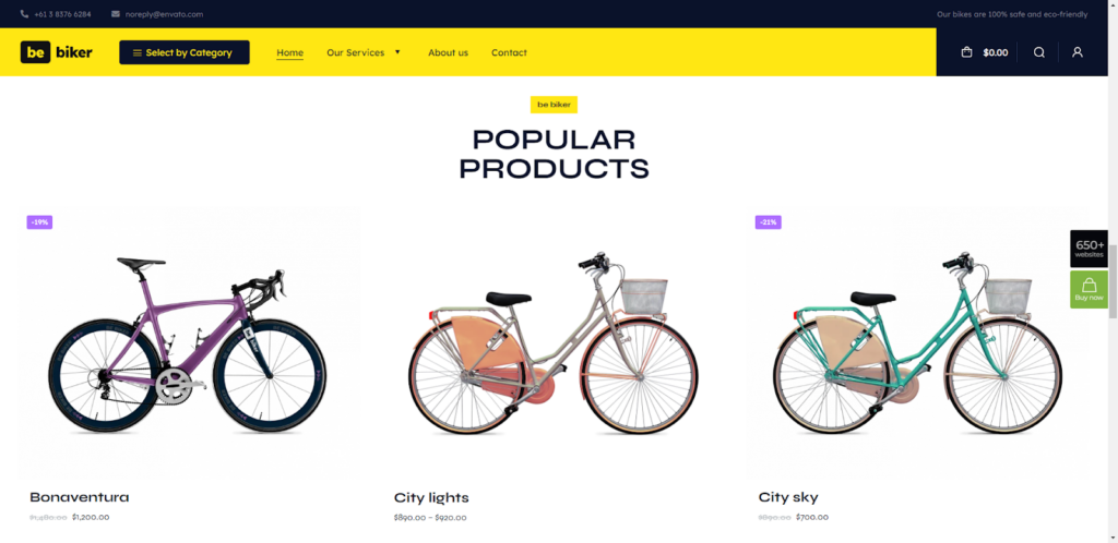
The same iconography used from site to site becomes so familiar that users know immediately how to use the icons.
The challenge for the designer is how to address less frequently used icons. Here, users need help in interpreting them. Giving each icon a brief description might help but would at the same time add clutter to a design.
Using a hover-triggered helper text serves users’ needs while avoiding clutter.
The BeJeweler 2 site offers an excellent example of this trend:
Helper text has other uses as well. In addition to its use when hovering over a product icon, it can also be used when hovering over variant swatches. It offers plenty of information without cluttering, and it ensures that a user can confidently interact with the site’s offerings going forward.
2. More social proof
Trust is an all-important factor in building both personal and professional relationships. This applies for relationships between brands and customers as well. In 2023, well-informed web designers will use social proof and trust marks to bring about that trust.
There are several approaches to using these trust builders on websites, one of them is to include a page and a home page section dedicated to real testimonials or reviews.
The BeDoctor site uses social proof to do this:
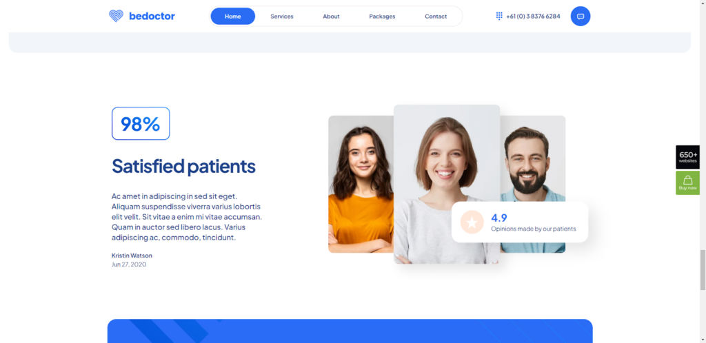
BeDoctor uses three different types of potential trust-building content:
• A rating of customer satisfaction;
• a client feedback.
• an average customer rating.
The latter can link to a ratings platform like Google or Yelp.
New businesses may not have generated enough social proof to use for trust-building purposes and may need to rely on trust marks instead.
An icon placed next to a “Checkout” button would be an example.
Another approach would be to add context to website claims like BeMarketing 2 has done:
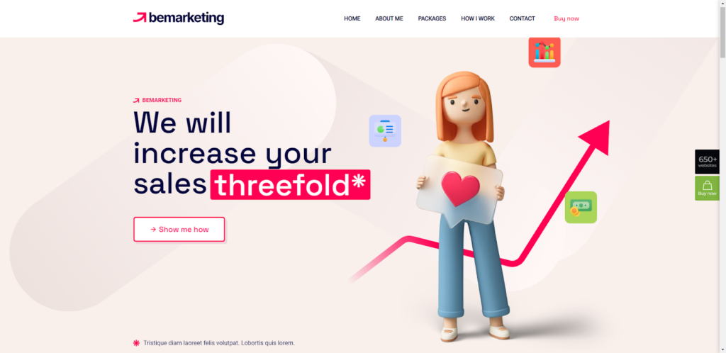
The asterisk next to “threefold” is expanded below. The explanation could be a brief textual statement or a link to a page where proof of the claim is documented.
3. Mobile-specific features
Thanks to easy-to-follow rules that are well-known to many web designers, responsive design has become easier over the years. Most WordPress themes on the market today are built to be responsive, making this mobile- and device-specific requirement even easier to satisfy.
When web designers find themselves in a comfort zone, stagnation sometimes sets in, and any desire to do even better can go out the window.
Greater attention is going to be paid to mobile-specific features in 2023, with greater attention being directed toward overcoming certain frictions and obstacles.
The BeLanguage 4 pre-built website address this in its navigation design:
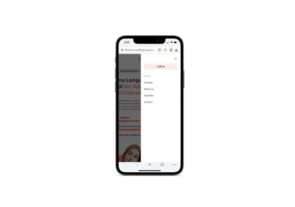
While all of the non-mobile page links are intact, the “Call Us” button appears at the top of the list of links rather than at the bottom – a little but significant navigational divergence.
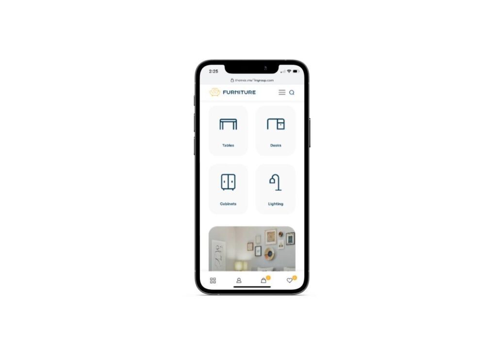
BeFurnitureStore has done this by placing what would normally appear at the top on desktop (account, cart, favorites) on a sticky bottom banner.
Web designers who work at revolutionizing the mobile web experience can be counted on to give stronger solutions in the years to come.
4. Shape texturization
Once upon a time when skeuomorphism was the rage, we witnessed all different kinds of real world textures on our desktop and phone screens. Over time, this “cutting-edge” trend began to be regarded more and more as an extraneous distraction.
That does not mean that digital texturization is a bad thing. As you will see in 2023, web designers will begin using organic shapes to add small, strategic textures to their designs. The BeRenovate 5 website is an example of this:
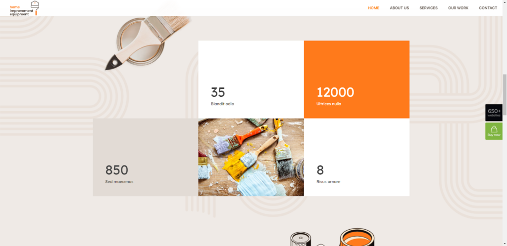
Note how the rounded shapes and lines used in the background throughout the site soften the overall imagery, while at the same time making it visually more interesting.
BeCoaching 3 is an excellent illustration of how digital texturization can be strategically employed to draw attention to certain areas of a page.
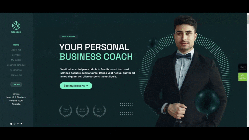
Two shapes used throughout this one page website make it easier to direct visitor’s eyes to where you want them to go. These shapes also tend to be used nearer to the page’s right margin. Since users’ eyes commonly focus initially on the left of a page, the shapes help assure that those visitors will see and interact with as much of the content as possible.
5. Supplemental video
Users have various tastes with respect to what they look for online. Some prefer reading blogs, others prefer to watch or listen along to something, such as a video post or vlog.
A website designer or owner can’t be expected to try to satisfy both worlds. Trying to deliver personalized content in both text and video will only tend to downgrade loading speeds.
What you can do however, is include a supplemental video or video alternative when it most seems to matter
BeBusiness 6 takes this approach halfway down its home page with a full-width video section that is impossible to miss:

This video segment might be useful to summarize the preceding content, to show a video testimonial, or for a variety of other purposes.
Supplemental video doesn’t have be full width either. The BePregnancy hero section for example utilizes a small cutout to house the video:
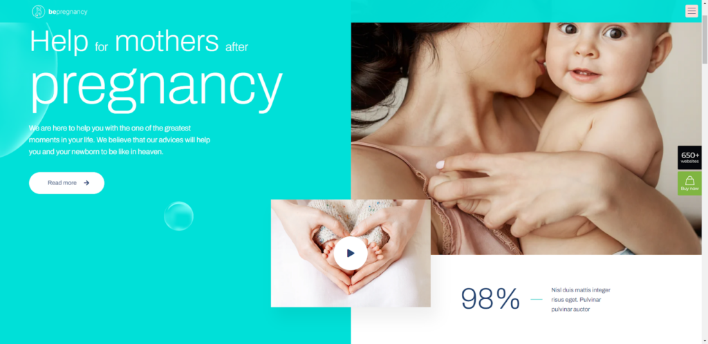
The “Play” button is instantly recognizable and gives the visitor a choice as whether or not to watch the video (given the subject matter in this case, the choice would probably be to watch).
Using videos sparingly and strategically and moving away from using autoplay videos makes it much easier for a web designer to maintain acceptable page loading speeds.
What are your thoughts on these website design trends?
More often than not, website trends tend to cover superficial changes to website content with such things as interesting color trends, typographical experimentation, special effects, etc.
While there is nothing wrong with any of the above, the 2023 web design trends represent a sea change of sorts by focusing on things like accessibility, trust building and responsiveness.
When you use BeTheme to create a website, much if not all of the work necessary to incorporate these new trends has already been accomplished in many of the WordPress theme’s 650+ pre-built sites. Check it out.


