Twelve Terrific Typographic Logos
The use of typographic logos is becoming a very popular concept, because it gives designers the flexibility to be creative without overcompensating with ostentatious graphics and loud colors. Typographic designs are generally creative and interesting manipulations of letters and numbers in different fonts. Some of them are funny, some of them are conceptual, and others are very inventive. Regardless of the designer’s approach, typographic logos create a clean, compact design that is great for all business types and is easily transferable to all sorts of paper and pixelated media forms.
Below, you will find twelve of the most creative typographic logos that are already being used by various companies.
Darkbird
The Darkbird logo displays a light and a dark contrast with the typographic bird representation at the top.
ZIGZAG
I really appreciate this zigzag logo, because you can clearly tell what the logo is saying, and it is further reinforced with the zigzag cut of letters to bring the point home. I am still not sure why the dot for the “I” is sitting over the “Z” though.
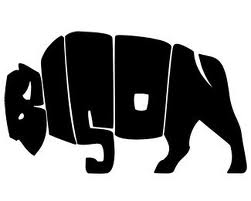
BISON
This is one of my favorites, as it utilizes the word bison to actually display the animal’s shape. I think this is one of the most creative typographic logos I have ever seen. I like logos that do not need the name to be written beneath the logo because it is already so clearly displayed within the image.
DAVID
This is typography meeting abstract art. I love how the “A” and “V” in David share a common wall.
BEE
I like the reinforcement in BEE. They could have left it at the letter “B”, but instead they chose to show their creative side by adding the two E’s within it .
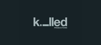
killed
This is a very simple but artistic logo, where the name is made even more obvious by actually killing one of the letters. It would imply that the letter “I” lies dead within the logo.
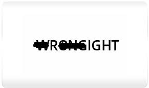
WRONG RIGHT
This is very innovative with such a simple design. It is as simple as writing the word “wrong,” marking it out, and writing the word “right.” Yet, wrong can still be seen and the same “R” is being used for both words. This logo allows you to see the full name of the logo, and the concept is not lost.
FLAT LAND
Flat Land could have been a simple and unimpressive design, but the creative use of the “LAND” shadow made all the difference. This concept was so well done that you probably do not stop to consider that “FLAT” could never cast a “LAND” shadow. The vague light in the background also brings the shadow concept home, and you can tell that this design was created by someone with a good understanding of graphical concepts.
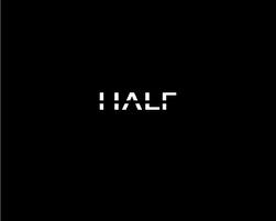
HALF
This is a very simply, interesting, and straightforward concept…the word half with its letters cut in half.
Mouse Universe
The first thing I noticed when I looked at this typographic logo was the computer mouse. It was not until the second glance that I realized the mouse was made up of the letters “M” and “U”. This is very original and inventive.
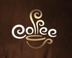
Coffee
This typographic logo is one of the most effective logos that I have seen. It not only spells coffee, but it makes you see and almost smell the coffee with the use of the F’s in the word to simulate steam.
SEO Solution
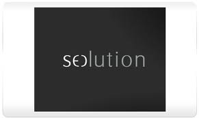
Those who are not familiar with SEO may not have realized the creativity in this logo right away. But, for those of us who are indeed familiar with the term, will note the SEO at the beginning of the word which also forms the “S” and “O” for the word “Solution.”
Are there other typographic logos on the web that are worthy of mention?
