Make Your Own Responsive SVG Graphs & Infographics

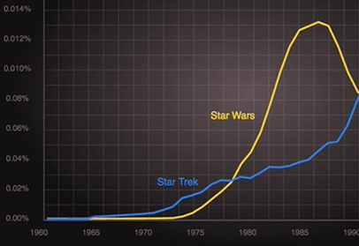
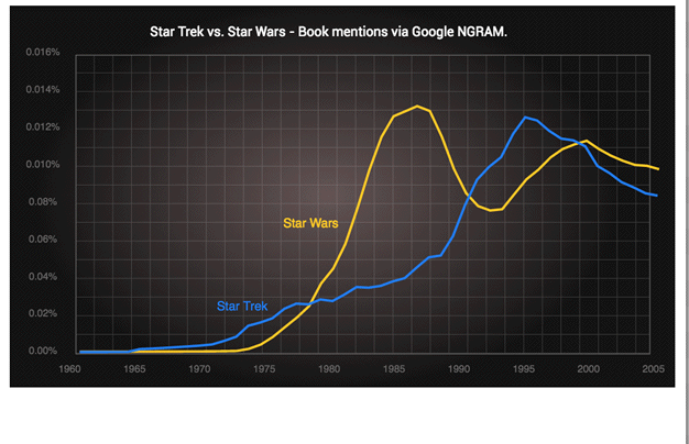
A few weeks ago I talked about making this Star Trek vs. Star Wars chart in SVG using the free Boxy SVG vector editor.

We also talked about the power of clean, well-written SVG. I want to take that idea a step further today. I know this is the design and UX channel, but sometimes to design something better, we need to take ‘code-level’ control. We’re going to poke around in the SVG markup but there will be a worthwhile design payoff.
One of the best ways I’ve found to experiment with SVG is to:
- Draw something simple in Boxy SVG and save it,
- Open that SVG file in your favorite text editor (Brackets, Atom, Sublime, whatever)
- Copy and paste that SVG code directly into the HTML panel at Codepen.io. It should render in the results panel.
From there you can start making changes and see what happens. Here’s my original Star Trek vs. Star Wars chart pasted into Codepen.
Tidy SVGs are Happy SVGs
Switching back to the code editor for a second, let’s look at the basic structure of our SVG chart. At the top, you’ll see a set of <defs> tags that contain reusable resources we call on later in this document – specifically you’ll see:
- a gray background gradient ‘glow’, and
- the grid pattern we use in the back
Beneath the <defs>, the rest of the document is fairly easy to follow.
- A background rectangle (
<rect>) with glow makes a backing canvas - The chart body with the grid pattern (
<rect>) - The chart title (
<text>) - The ‘Star Wars’ yellow chart line (
<path>) - The ‘Star Trek’ blue chart line (
<path>) - 2 x labels for the chart lines (
<text>) - A group (
<g>) containing the y-axis number markers (<text>) - A group (
<g>) containing the x-axis number markers (<text>)
There’s not a lot to it, right?
But if you look closely at those two groups of axis numbers, you’re probably seeing a lot of repetition.
<text y="430" x="40" style="text-anchor: middle; fill: rgb(103, 102, 102); font-size: 12px;">1960</text>
<text y="430" x="118" style="text-anchor: middle; fill: rgb(103, 102, 102); font-size: 12px;">1965</text>
<text y="430" x="196" style="text-anchor: middle; fill: rgb(103, 102, 102); font-size: 12px;">1970</text>
If this was HTML we wouldn’t stand for this many repeated inline properties – we’d strip them out into the CSS and replace them with a class. There’s no reason not to do exactly the same in SVG.
In <defs> section at the top of we already have <style> block. We can add a new CSS rule to that block like this:
.y-axis text {
    text-anchor: middle;
    fill: rgb(103, 102, 102);
    font-size: 12px;
    }
And that allows us to strip those text nodes down to something much more compact like this:
<text y="430" x="40">1960</text>
<text y="430" x="118">1965</text>
<text y="430" x="196">1970</text>
Not only is this code MUCH easier to read and navigate through but it also makes the file smaller while allowing us to change the color of all the y-axis numbers from a single point. Win:win:win.
With the help of your code editor’s find-and-replace, you should be able to tidy up your file nicely. We can put the chart line label styling into the <style> too. We’ll create new CSS class and add it to the label text.
.label-starwars {
    white-space: pre;
    font-size: 15px;
    fill: rgb(253, 200, 39);
    word-spacing: 0px;
  }
Be aware that you can’t move the ‘x’ and ‘y’ values of an SVG element into the CSS. But all other properties can be transferred to a class even including properties that aren’t in the CSS spec such as ‘fill’ or ‘stroke’ (as shown above).
Here’s that same SVG file tidied up with some new CSS classes.
But this article isn’t just about cleaning – let’s do something cooler and more useful with our chart.
Making Smarter SVGs
If there’s one benefit of SVG that is trumpeted the most, surely it is ‘scalability‘? After all, that IS what the ‘S‘ in ‘SVG’ stands for. We can effortlessly scale an icon from 40px to 400px and expect it to stay laser-sharp and crisp.
But this has its limitations.
It doesn’t matter how sharp text is if it’s too small to read.
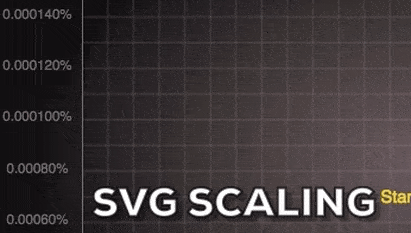
Just because I can scale down our chart to fit onto a smaller screen, doesn’t mean that it’s of any practical use at that size. It doesn’t matter how laser-sharp our labels are if they’re simply too small to read.
As you can see above, the text quickly becomes illegible when we scale our chart below about 500 pixels wide.
Can we fix it? Responsive SVG can!
In HTML and CSS, we would tackle this kind of problem with CSS media queries – which is exactly what we’ll do in our SVG. We spent time CSS-ifying our SVG and now we reap the benefits.
Back in our <style> block we can add a CSS media query that dials up the font-size of our text when our chart has less than 500px to work with. Something like this:
@media (max-width: 500px) {
      .label-startrek, .label-starwars{
          font-size: 170%;
      }
     .y-axis text {
         font-size: 130%;
     }
     .x-axis text {
         font-size: 130%;
     }
   }
Which gives us a result like this:
Our axis labels up-size themselves when the graphic breaks 500px – but it’s a bit ugly.
Great! So, now the numbers on our axis are more readable at smaller scales – but they are also a little crowded and ugly too.
What if we hid every second label to improve the readability of the remaining ones? Surely that would be a better UX for users on smaller devices?
Let’s create a new CSS class called ‘hide-on-small’ and add it to our media query:
.hide-on-small{
    display: none;
    }
… and apply that class to every second number.
<text y="430" x="40">1960</text>
<text y="430" x="118" class="hide-on-small">1965</text>
<text y="430" x="196">1970</text>...
Update: May 28th 2016
As Amelia noted in the comments below, there’s a much more elegant way to target every second number on each axis – CSS nth-of-type. This is all we need.
.x-axis text:nth-of-type(2n),
.y-axis text:nth-of-type(2n) {
   transition: opacity 1s ease-in-out;
   opacity: 0;
   }
That said, having a class called ‘.hide-on-small’ available may well still come in useful when creating these kinds of adaptive creations.
Here’s how it looks in practice.
Hiding SVG elements below certain breakpoints
See the Pen Star Trek Vs. Star Wars NGRAM (Responsive) by SitePoint (@SitePoint) on CodePen.
Final Word
This is a fairly unpolished demo but I think it shows some of the potential in responsive SVG – particularly when used to improve the utility of graphs, charts and infographics.
I find it fun to use Codepen to experiment with media queries inside SVG. Watching your work develop live as you type is a rewarding way to work.
As you may have already worked out, you’re also free to write your CSS straight into Codepen CSS window. This is a neat way to work and allows you to incorporate the magic powers of Sass, Less or Stylus in your SVG if you want to.
However, I would recommend moving your finished static CSS into your SVG <style> block when you’re finished. That way your SVG is a self-contained unit and won’t break if it gets separated from the CSS file.
The other nifty benefit of creating responsive SVG is they aren’t just sensitive to the device they are in – they also react to where they are placed in the layout. In other words, they can be set to expand to fill the available space and adjust their display accordingly.
This means the graph above could become its own thumbnail when it’s used in a list view of articles (it’s only 5k after all). Maybe we could strip away all text and only leave the chart lines when rendered at under 150px?
See the Pen Grid – Responsive Graphs by SitePoint (@SitePoint) on CodePen.
Elsewhere, that very same SVG might present differently in a ‘control panel view’ showing multiple charts like the Codepen above. Hovering over any chart simultaneously expands it into focus while bringing in more fine-grained detail.
Warning: I dialed up the CSS transitions on this demo to emphasize the changes but I might have overdone it a touch – it makes me feel kinda drunk. Still, it shows the basic principle.
The possibilities are endless but you’ll need to hand-code them – there’s no tool that does this well.
We’ll look at some other more sophisticated ways of using media queries in SVG in the weeks to come.