How to Boost UX with Analytics and Customer Journey Mapping

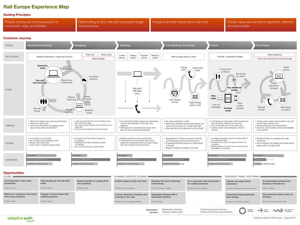
A customer journey map is a deliverable created by UX designers (or with the input of UX designers) as a way of helping businesses better understand their users’ needs. By mapping the user journey of a product or service across all their touchpoints, we can learn not only where our UX is falling short, but how we can optimize these journeys for more conversions (usually by removing friction).
Sometimes, the customers’ journey will go beyond their interactions on your website. For example, when creating a journey map relating to users purchasing items from an online store, one touchpoint might be the call the user makes to customer support when their order arrives with the incorrect item(s). You might consider this unimportant information as a UX designer, but it tells us that our online offering might be seriously lacking.
A customer journey map doesn’t start and end when the user enters and exits your website. Where the user came from tells us about the user intent, and our engagements with users outside the website can tell us about the experiences they’ve had online. In this article, however, we’ll be focusing on the customer journey through our website.
An illustration of a customer journey through a website (source)
Why Customer Journey Maps?
Customer journey maps can be long and complex, or they can be short and simple. This will depend on the nature of the business, although if we want to be converting visitors into customers, removing friction should be a #1 priority, even if the customer journey is somewhat short.
By creating a customer journey map, we’ll be able to visualize these high-friction areas more easily. There’s certainly no “one correct way” to go about doing this, but generally, you should be using your analytics data and insights derived from that data to analyze the customer journeys your users are taking — possibly broken down into different segments depending on the user intents. (Different users will have different user intents, and may possibly encounter entirely different issues as well.)
You can also interview your users or create customer surveys, but analytics is less intrusive (since user behavior is tracked behind-the-scenes with analytics), and getting users to fill out customer surveys is a struggle.
Customer Journey Mapping with Google Analytics
As discussed in Google Analytics: How to Perform User Research, Google Analytics is a fantastic tool for identifying areas of your website that are giving users the most trouble. It doesn’t always state the objective truth (often enough, usability testing can offer more clarity), but it’s a free tool, and for most businesses, it’s a no-brainer. While useful for tracking metrics such as bounce rates and conversions, it’s also useful for user research and customer journey mapping.
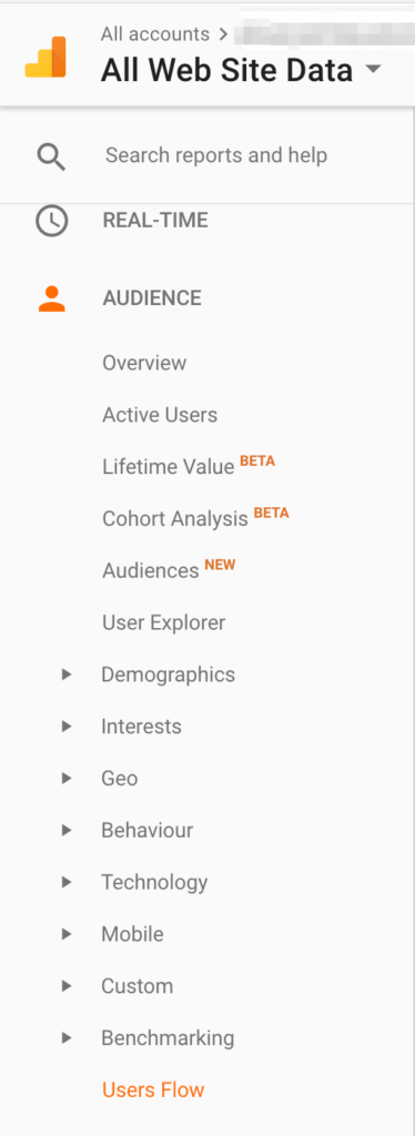
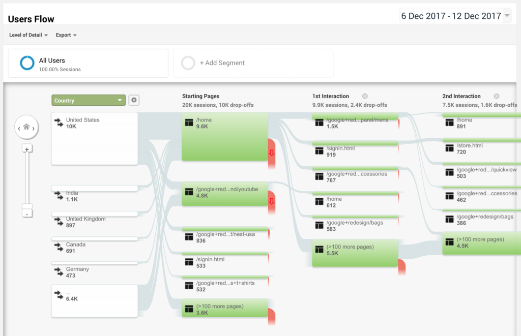
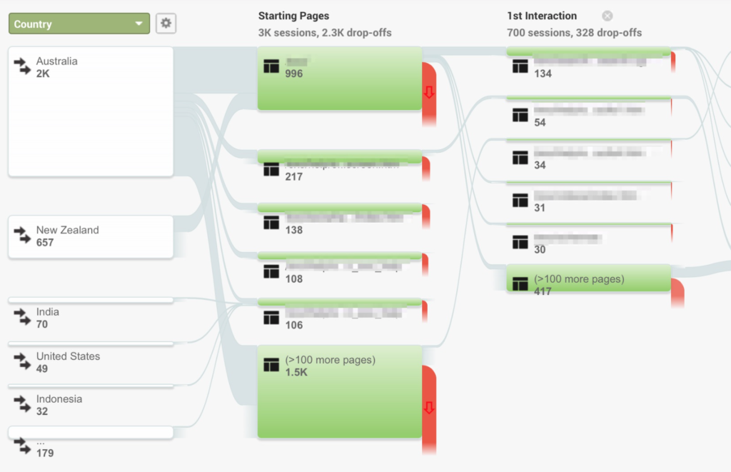
With Google Analytics, there are two reports that can grace us with insights about the customer journey, the first being the Users Flow report (which can be found under Audience in the menu on the left-hand side.
Users Flow shows you where your traffic is coming from, broken down by dimension (Country by default), and then shows you what the users’ 1st/2nd/3rd… interactions were after that.
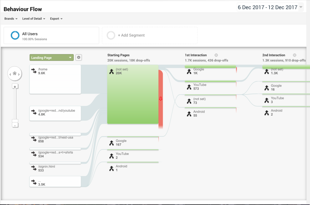
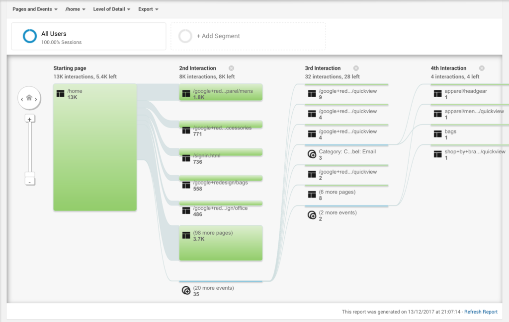
Behavior → Behavior Flow is the 2nd report, and looks very similar to Users Flow, but it allows you to track the flow of users through your website with more granular tracking on individual events and web pages.
You can use this data to kickstart your investigation. If you’ve noticed that users are dropping off on a specific web page, you can then make use of user testing to try to identify why (or even ask users directly with surveys).
Should you make changes to your website later, based on the outcome of your customer journey map, you can then use these Google Analytics reports to compare drop-offs before and after, to measure the effectiveness of those changes.
Segmenting User Groups in Google Analytics
Google Analytics offers excellent segmenting tools as well, enabling you to drill into different contexts — such as mobile vs desktop — or see how different landings affect conversions on an ecommerce website (which can be a low-cost way of using A/B testing to compare solutions).
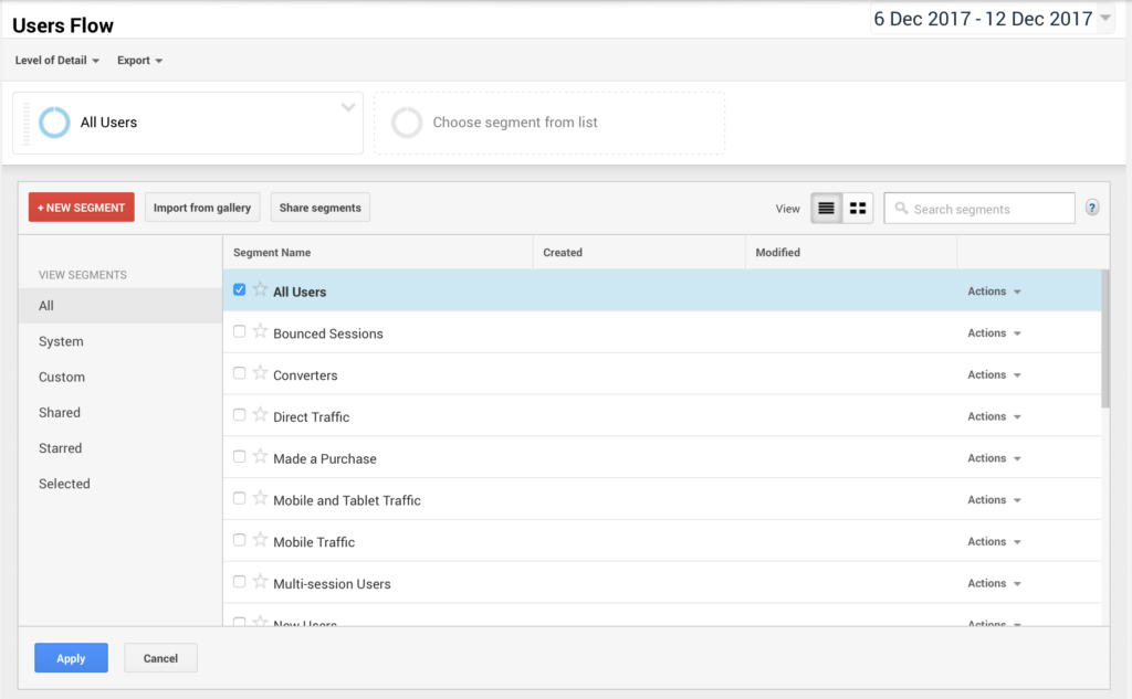
By clicking the + Add Segment button at the top, the above options are revealed. Many of the ready-made segments are useful (such as mobile traffic), but you can easily create your own by clicking on the + Add Segment button.
Tracking Conversion Flows
Regardless of what you use your website for, there will always be conversions you’ll want to track, such as sales, signups and subscribers.
In the Users Flow and Behavior Flow reports, Events are marked in blue. Events are conversions that are tracked via JavaScript. (That is, the interaction tracks an event happening, not a web page.)
Goals, on the other hand, track web pages. For example, one Goal you could set up would be to track how many users reach the checkout confirmation page. “How to Track Ecommerce Transactions with Google Analytics” provides an example of tracking ecommerce transactions with Google Analytics.
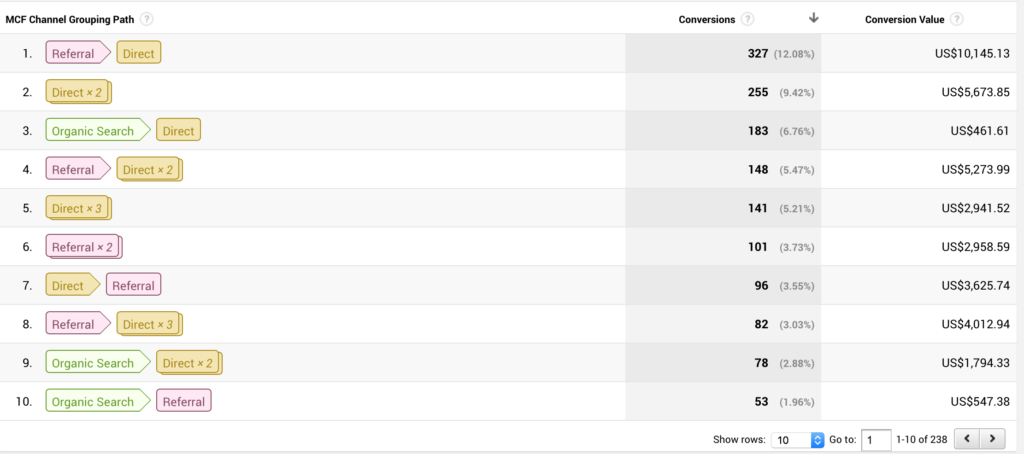
With ecommerce conversion funnels turned on, you can find out not only what journey the user took to reach their conversion, but the number of users that did so and the total conversion value. This way, you can start to figure out which journeys you should focus your attention on.
At this stage, it might be worth gathering up your insights and sketching out your key journey maps. Remember, these Google Analytics reports offer insights into what your customer journeys might be. Not all of them will be relevant. Think about what your conversions are, isolate the key journeys based on that, and then isolate the journeys that have a worrisome number of drop-offs.
These are the user journeys you’ll want to investigate.
Figuring Out the “Why” with Hotjar
So far, we’ve looked at customer journey maps, how to find and analyze them using Google Analytics, and how to isolate causes for concern. Now let’s take a look at how usability testing can help us find out why those drop-offs are happening.
While there are plenty of usability testing tools out there, Hotjar is one of the tools leading the charge. In a nutshell, think heatmaps, user recordings and surveys.
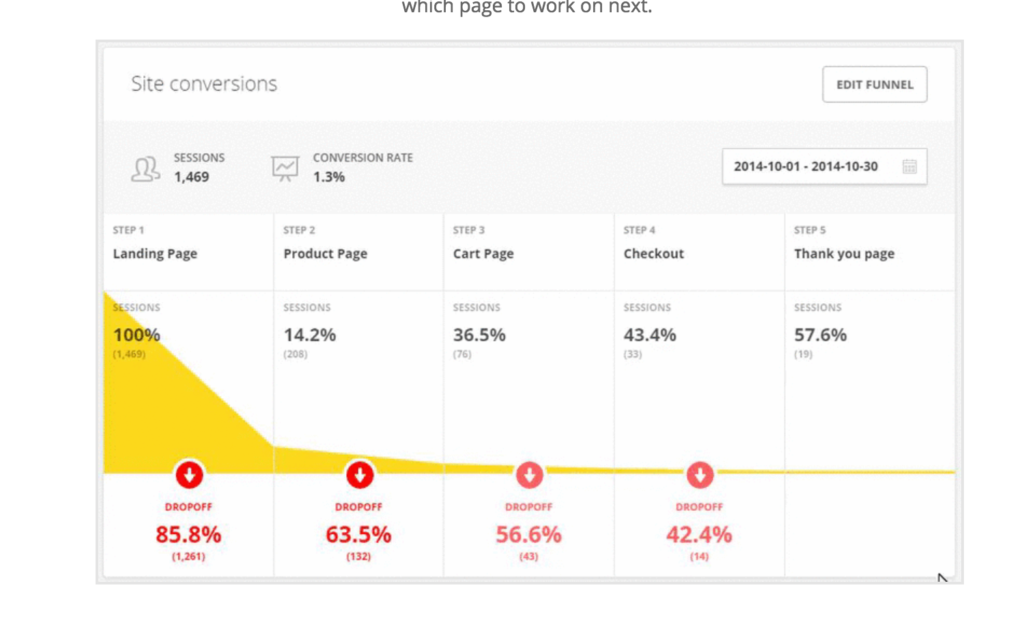
Hotjar has a number of useful tools. Site conversions (see above) is one of them, which is very similar to those Google Analytics flows. Hotjar does require you to define these maps yourself though, so you may want to use this as a way to refine the customer journeys that you analyzed in Google Analytics. (Hopefully you sketched them out!)
Once you’ve inserted the Hotjar tracking code on your website, you can then tell Hotjar what these customer journeys are. These journeys will be the baseline of your usability testing.
Once you know the where, you can then begin to find out the why, and for this we can use Hotjar’s user recording features. With the tracking code mentioned above, you’ll have access to heatmaps and screen recordings, where you can then watch your users travel through your website.
In these recordings, you’ll find out why they dropped off.
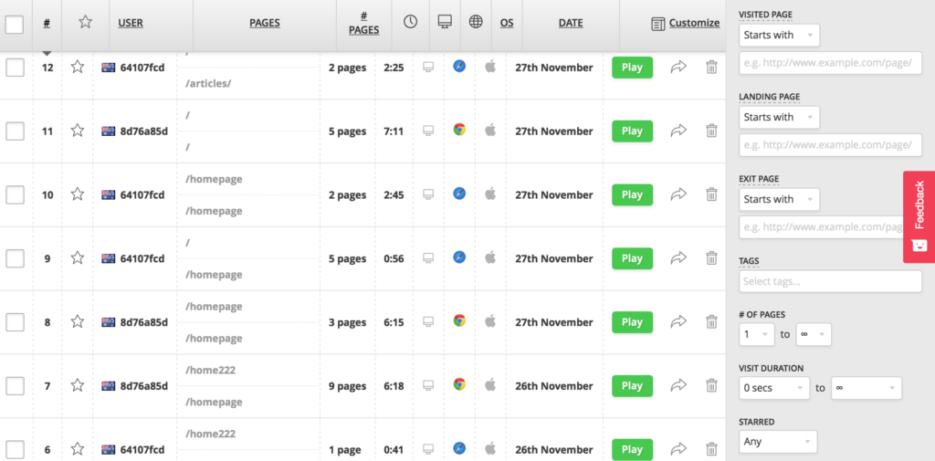
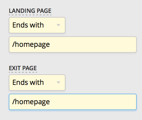
It’s really easy to use filters to dive into the sessions that are relevant to the areas you’re investigating. As shown above, these filters are on the right-hand side. This allows you to actually watch users navigate through your website and see where and why they left it.
Maybe your users are completely missing your call to action? Maybe they’re distracted by an ugly advert? The reasons for losing out on a conversion are endless, and at the very least, Hotjar narrows those reasons down.
You won’t know what’s happening for sure until you’ve started observing your users via recording sessions.
Bonus: Customer Surveys
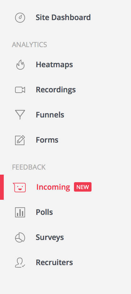
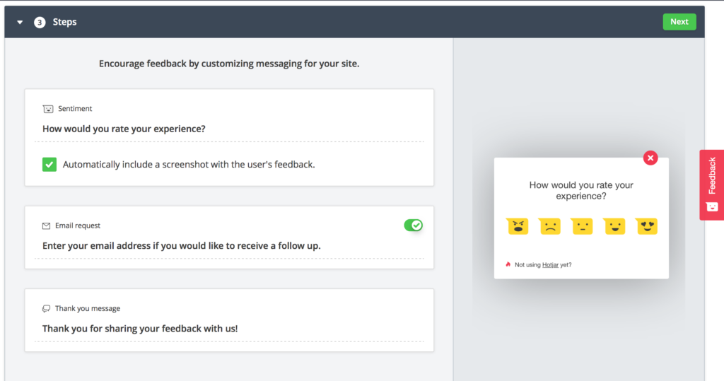
Another useful Hotjar feature is the Feedback tool. This is called Incoming, and you’ll see it on the left-hand side.
With Incoming and a few details about when and where, you can insert a request for customer feedback on your website. This comes in handy when even usability testing doesn’t seem to be showing the issue and/or solution.
A sensible, non-invasive moment to ask for feedback is at the end of the customer journey you’re measuring (i.e. after a conversion), or during the moment where most of your drop-offs happen (so we can find out why). The comments that come through will be a great support to the quantitative data you’ve collected in Google Analytics.
Summary
Make sure you’re not using tools like Google Analytics and Hotjar in isolation. Customer journey maps are a great way to build empathy with users, and they serve as an insightful document that can help teams become more knowledgeable about their users. It incorporates various user touchpoints and is backed by data. With tools like Google Analytics and Hotjar, you can gain an understanding of the key journeys on your website, and start measuring (and then optimizing) how users are navigating from A to B (and even from B to C and beyond).
Remember to expand your maps by figuring out the user intent (referral metrics can help with this), and figuring out what the user does next after they leave your website.
You can check out all the articles in our UX Analytics series here. To learn in-depth about UX Analytics, check out SitePoint’s book Researching UX: Analytics.


