Web Typography: Establishing a Strong Typographic System

Setting up the typography for any new project is always a complex task. There are literally hundreds of tweakable variables, and it’s very easy to spend endless hours adjusting sizing, line heights, margins, and weights. The best way to save your sanity is to have a design system that can generate quick answers to most of the little questions—which lets you concentrate on the “big picture” decisions.
As readers will consume more body text than any other text size, often our first critical typography decision is to set the body font size for our default layout (let’s put responsive design to the side for now). For many years, 16 pixels was considered the default body size of the Web.
However, with today’s larger screens, text-heavy sites such as blogs and news services are generally choosing 18-pixel to 21-pixel body font sizes. Social media and ecommerce apps that use busier, more modular UI units have tended towards 14px to 16-pixel body fonts. Obviously, these are broad trends, and not hard and fast rules, but you can see these general trends in the list below.
Typical body font sizes for well-known sites
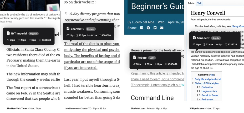
- Medium.com:
21px - NYTimes.com:
18px - CNN.com:
18px - Airbnb.com:
18px - SitePoint.com:
18px - BBC.co.uk:
16px - Developer.mozilla.org:
16px - Twitter.com:
15px - Etsy.com:
14px - Wikipedia.com:
14px - Facebook.com:
14px
Remember that these big internet properties do a lot of user testing, so put some thought into where your application fits in relation to this list. When you’ve settled on your base text sizes, eye-test them on real screens, tablets, and phones until you’re happy with them as a starting point.
Scaling Your Type
So, now you’ve set your body font size. How do you decide on the sizing of your titles, section headings, subheaders, lists and blockquotes?
For me, the answer used to be, “Umm … tweak it till it looks … kinda right?” I’d scale up a heading, bump the weight a little, jog it a pixel up, … push it back down, … and back up again. Frankly, it was exhausting, because there were so many finicky little decisions and very few totally wrong answers.
Type scaling —sometimes called modular scaling – lets you use simple math to give you simple typographic answers. It allows us to set a single scaling ratio to generate all our font sizes while keeping them in harmony. It’s like a musical scale for type sizing.
Type Scaling in Practice
Let’s start with a body font size of 18px. That makes our default paragraph size 1em (or 18px):
body{font-size: 18px;}
p   {font-size: 1em; /* (or 18px) */ }
I’m going to set a type scale of 1.25. To calculate my h5 font size, I simply multiply my paragraph font size by 1.25. That that’s 1em * 1.25, or 1.25em:
h5 = p * 1.25 = 1.25em
Our h4 headings would be the h5 size multiplied by 1.25 (1.25em * 1.25) or 1.563em. Continuing the process gives us something like this:
/* Using a type scale of 1.25 */
h5 {font-size: 1.25em;}  /* 22.50px */
h4 {font-size: 1.563em;} /* 28.13px */
h3 {font-size: 1.953em;} /* 35.16px */
h2 {font-size: 2.441em;} /* 43.95px */
h1 {font-size: 3.052em;} /* 54.93px */
If I decided that my h1 headings felt a little oversized at that scale, I could bump my type scale down to 1.2 to get this result:
h5 {font-size: 1.2em;}   /* 21.60px */
h4 {font-size: 1.44em;}  /* 25.92px */
h3 {font-size: 1.728em;} /* 31.10px */
h2 {font-size: 2.074em;} /* 37.32px */
h1 {font-size: 2.488em;} /* 44.79px */
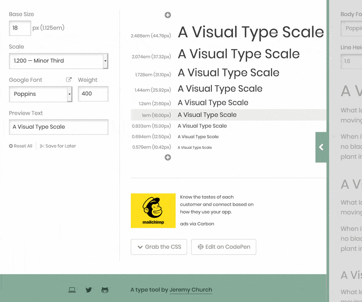
Okay, so I need a pocket calculator to size my text? Happily, no. There are some great tools that let you tweak and test type scales in generated CSS in real time. My favorite is Jeremy Church’s Type-scale.com (below), a tool that lets you quickly test different type scales and generate working CSS. There’s even a dummy layout on the right panel to eye-test your work and a CodePen export option. This is a great foundation for your typography CSS.
Does a single type scale ratio work for all device sizes?
The answer is, no, often it doesn’t. We can learn from traditional print formats here. If you compare the typography of a typical newspaper to that of a classic paperback novel (below), you’ll notice some interesting differences beyond the obvious paper sizes.
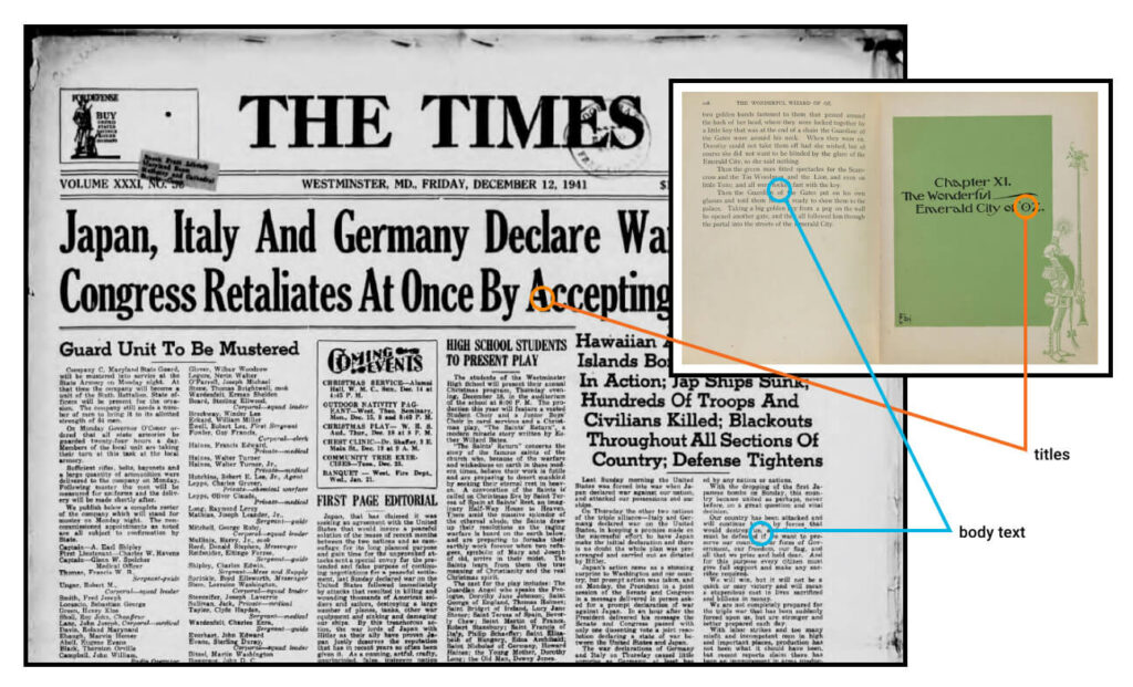
While their body font sizes may be quite similar, there’s much great variation in heading sizes in the newspaper. Common sense tells you those headlines in The Times simply aren’t going to fit as chapter titles for The Wizard of Oz. As a general rule, smaller formats (such as phones and novels) are going to need shallower type scales.
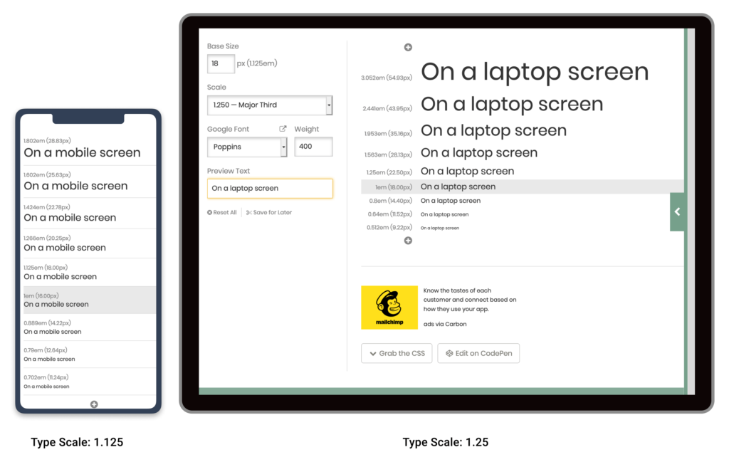
Note that this difference in type scales doesn’t need to be large. As the image above shows, a small increase in type scale—from 1.125 up to 1.25 —ripples through the scale to generate a much larger top-level heading. While that h1 title looks fine on a laptop, it would chew up far too much real estate on a mobile device.
In short, it’s wise to use CSS @media queries to serve two type scales – a steeper type scale for large screens, and a more compressed type scale for smaller screens. We’ll tackle this later in the project.
So, now that we have a reliable, repeatable process to scale the type in our designs, let’s look at the spaces in between that type.
What is a Vertical Baseline Rhythm?
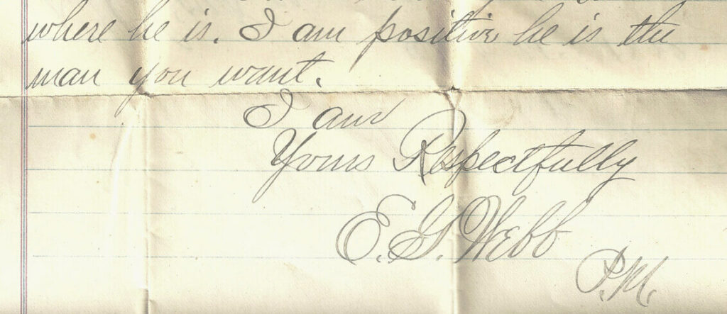
Vertical baseline rhythm — sometimes referred to as the vertical measure — is a grid of horizontal lines that you can use to ‘hang your typography from’. It’s not unlike the blue-lined, school workbooks many of us learned to write in.
The trick is getting your larger type units to fit into the same grid as your body text. In a simple handwritten letter (below), E.G. Webb is allowing an extra row for his signature. He’s probably using a baseline rhythm without even knowing what it’s called.
In The Elements of Typographic Style Applied to the Web, Richard Rutter describes baseline rhythm like this:
Headings, subheads, block quotations, footnotes, illustrations, captions and other intrusions into the text create syncopations and variations against the base rhythm of regularly leaded lines. These variations can and should add life to the page, but the main text should also return after each variation precisely on beat and in phase.
How does that work on the web? Let’s look at a real-world example. The excellent Colossal magazine uses a very open, airy layout, yet it still somehow manages to feel strong and structural. How does it do that? It turns out that if we superimpose a 21px vertical grid over the whole layout (see below), we see a previously hidden structure emerge. For this example, I’m going to call one row of this grid a “unit”.
You’ll notice that:
- the site branding fits nicely into a box five units high
- the main navigation is three units high
- article titles are two units high
- secondary navigation and social links are one unit high
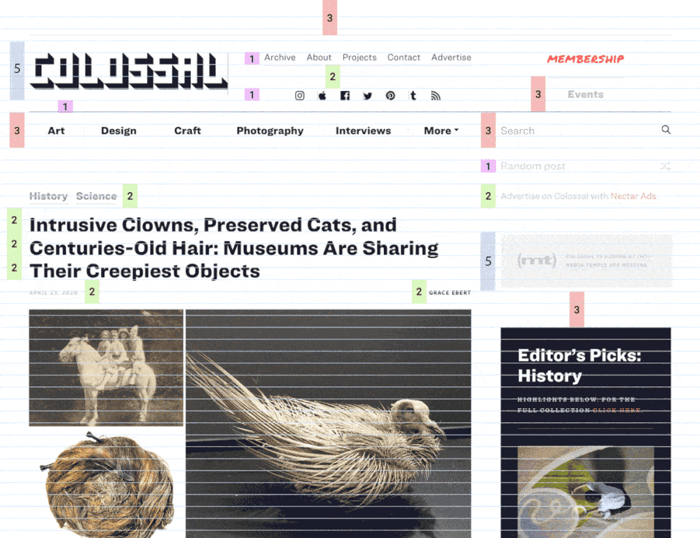
In fact, most UI elements “hang” on this underlying grid like socks pinned on an invisible clothesline. Even though we can’t see the underlying grid, we’re aware of it through a feeling of balance and harmony. It just feels right.
Note that we’re not talking about just font size, but instead the whole space the text occupies —including the line height and margins. So in the Colossal example, the article title would have a line height of 42px, or two units for each line.
However, you’ll notice that not every element is locked to this grid. The designers have chosen to offset elements like the photos from the grid. That’s fine too. The grid is a great starting point, not martial law.
Using Layout Grids in your UI designs
Most modern graphic layout tools (such as Sketch, Figma or Adobe XD) make it easy to add a vertical baseline to any canvas/frame. In this Figma example (see below), I selected the document frame and used the + button to add separate rows and columns in the Layout Grid panel.
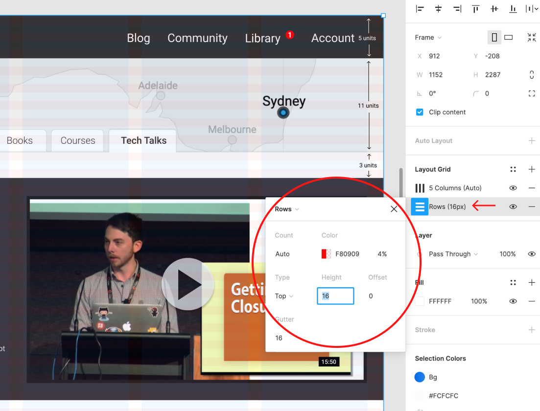
These grid layers can be switched on and off using the eye icon. I find that, with a grid in place and “snap-to-grid” switched on, it simply becomes easier to size items with the grid than without it. And that makes your life easier.
There’s even a tool to help you work out the CSS. Gridlover.net (below) is an excellent, free tool that lets you experiment with different base font sizes, line-heights and type scalings—all locked to a vertical baseline. If you try adjusting any of the line heights or margins on the right CSS panel, you’ll notice the number only changes by a full “grid unit” each time.
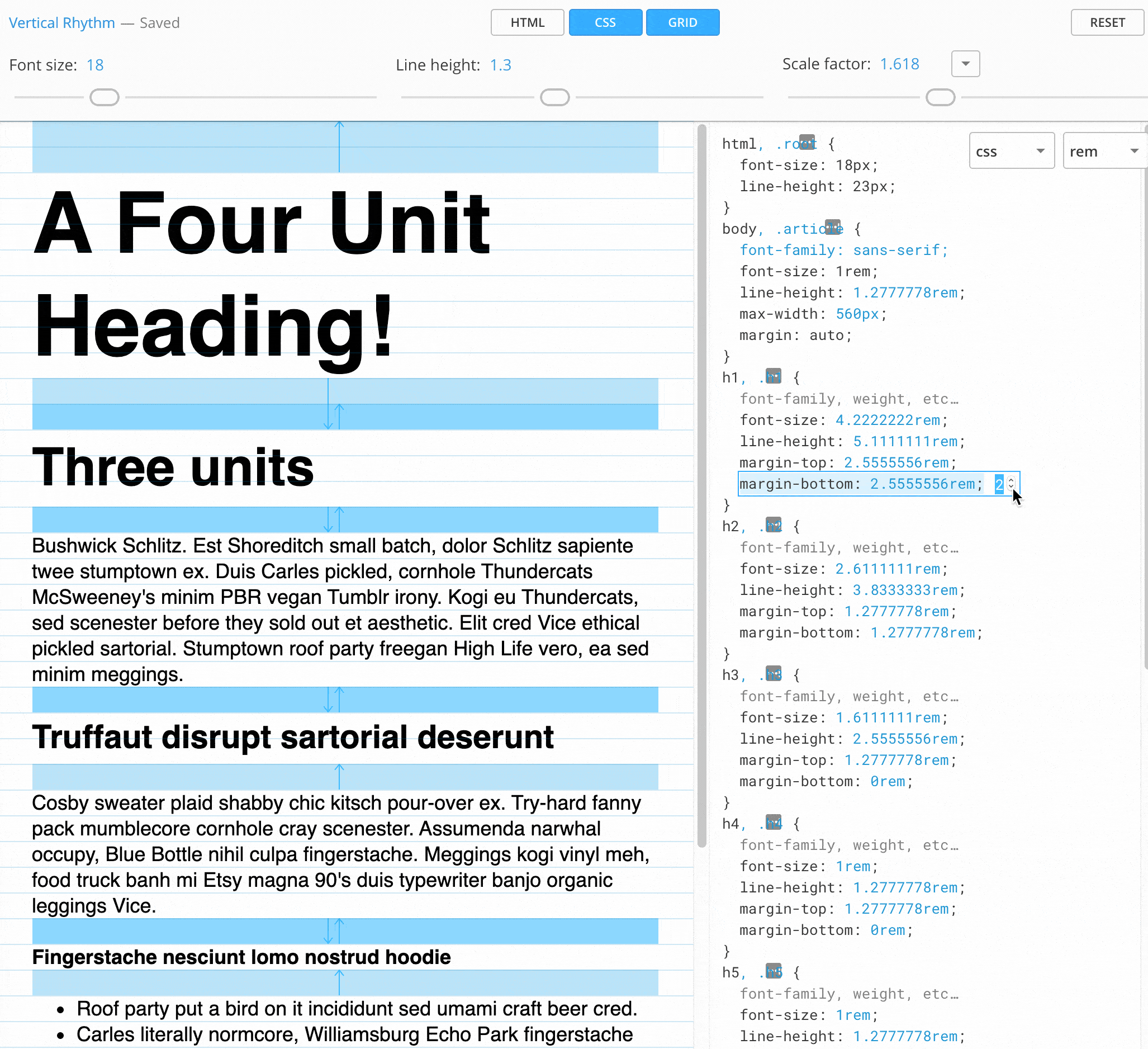
You might also notice that the tool avoids using CSS padding in its typography. I’ve found this to be a generally good policy when working with a vertical baseline system. Use padding freely on your container units, but never on typography. Even text buttons can be given height with a line-height setting rather than CSS height or padding.
Gridlover not only writes useful CSS, but it really helped me get my head around how vertical baseline and type scaling can work in the real world. I believe this is a great place to start your CSS typography.
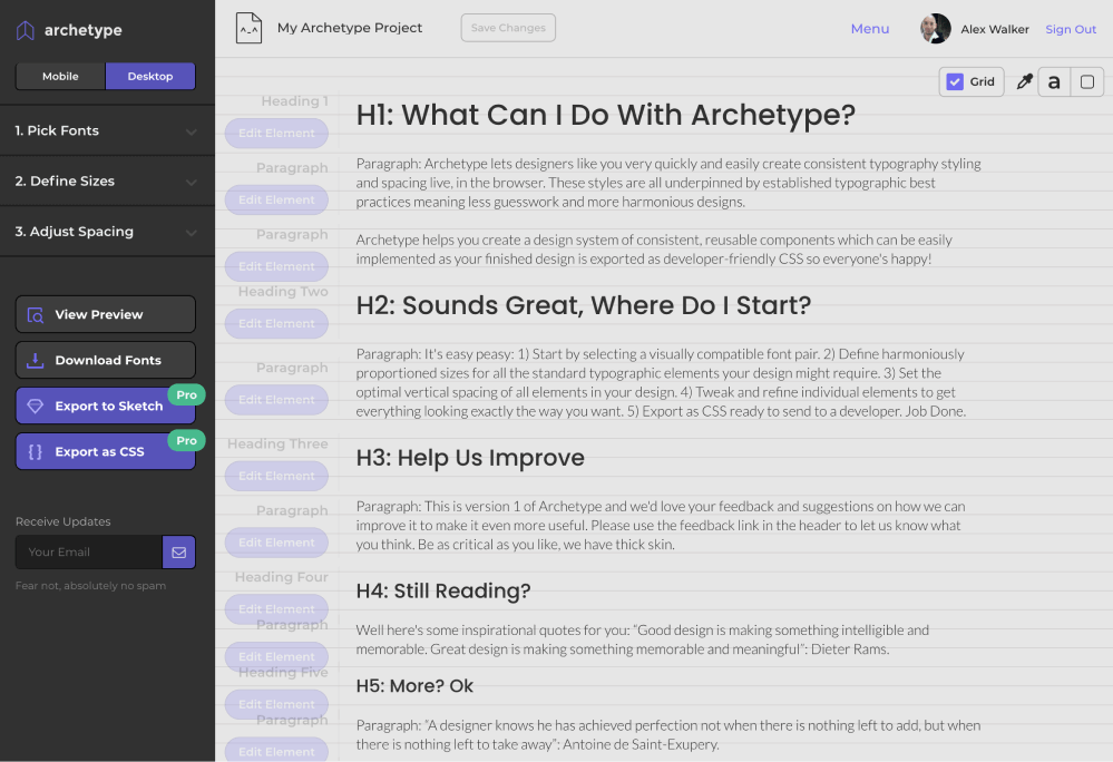
Archetype is another tool designed to help you create well-planned, integrated type systems. It offers controls for both type scale and baseline rhythm in one very thoughtfully conceived UI. It even encourages you to set different type scales for mobile and desktop out of the box. I believe this is the most sophisticated tool in this area.
The only caveat to Archetype is that it currently costs $59 per year to unlock the “Export as CSS” option. Clearly that’s a bigger outlay than Gridlover (free), but if you spend a lot of time crafting type systems, it could save you a lot of time (and money). Archetype is very good.
Vertical Baseline Rhythm is a Tool – Not a Religion
Vertical baselines are a very useful tool, but they shouldn’t become the end goal of your design. I have to admit, there was a time when I spent too much sweat trying to bend every page element to obey my mighty grid rules. I was arm-wrestling typographic percentages and margins, and “hitting the grid” became a goal in itself, rather than just a tool to help me design better.
That’s neither fun nor useful.
Today, I think it’s better to look at vertical baselines as a strong bass drum in a band—a regular beat that helps to measure out the space for the rest of the band to play in. Set up a nice backbeat that everyone can feel, but don’t be afraid of dropping little off-beat flourishes. Often they can add energy and flavor to a composition (visual or musical).
Personally, I like to start with a strong grid. If there’s whitespace between headings or paragraphs, it might as well be one, two, or three whole “vertical units”, rather than 1.3 or 2.75 units. And that invariably feels balanced and harmonious immediately.
Likewise, your hero image might as well be exactly 12 units tall, rather than 11.8 or 12.3, as now the bottom edge of the image is more likely to nicely line up with the bottom edge of any text flowing alongside it. It’s “self-tidying”.
But if, on the other hand, the caption on your images just looks too spacey when it’s spread over 25-pixel line-heights, that’s fine. Forget the grid there. Just make it look good.
The Takeaway
Ultimately, most design work is just a long, long list answers to “why” questions.
- Why did you make that major heading 49 pixels high?
- Why is that bottom margin 17 pixels?
- Why does the
h3have a line-height of1.7778?
And so on.
There are potentially hundreds of these little questions in even a small project. And you probably have enough natural “designer gut instinct” to answer them all-eventually. The problem is, it’s exhausting.
However, if you can come up with a repeatable system that delivers viable answers to most of the boring, little questions, you can save your designer gut instinct for the bigger, more important questions.
Which is usually the fun part anyway.
Related articles
- Typography Cheat Sheet: The 6 Big Mistakes to Avoid
- Taking the Guesswork out of Typography on the Web
- Choosing the Best Typography for Your UI
Extract from: The Principles of Beautiful Web Design:4th Edition