5 Tips for Writing Better Microcopy

When you see an application for the first time, the microcopy can give away many clues about the app’s purpose, how the app can help us, and how we can interact with the app. Still, many organizations develop great applications but don’t write an effective microcopy.
“Microcopy” refers to the small bits of text that guide your users to their goal, instruct them, and alleviate their concerns. Microcopy includes all information bits we communicate to users.
For example, a search bar contains text to hint at how to use the search bar, or at what information you can look up. It alleviates users’ concern about what information they can find using the search bar.
Therefore, it’s a crucial part of user experience (UX) to help users quickly understand the purpose of an individual element and the whole application. Effective microcopy accelerates the user’s learning process.
Imagine using Uber Eats for the first time. When you visit their website, we may have no idea about the website’s purpose. However, microcopy makes the purpose of the website immediately clear. We can use Uber Eats to deliver food right at our doorstep.
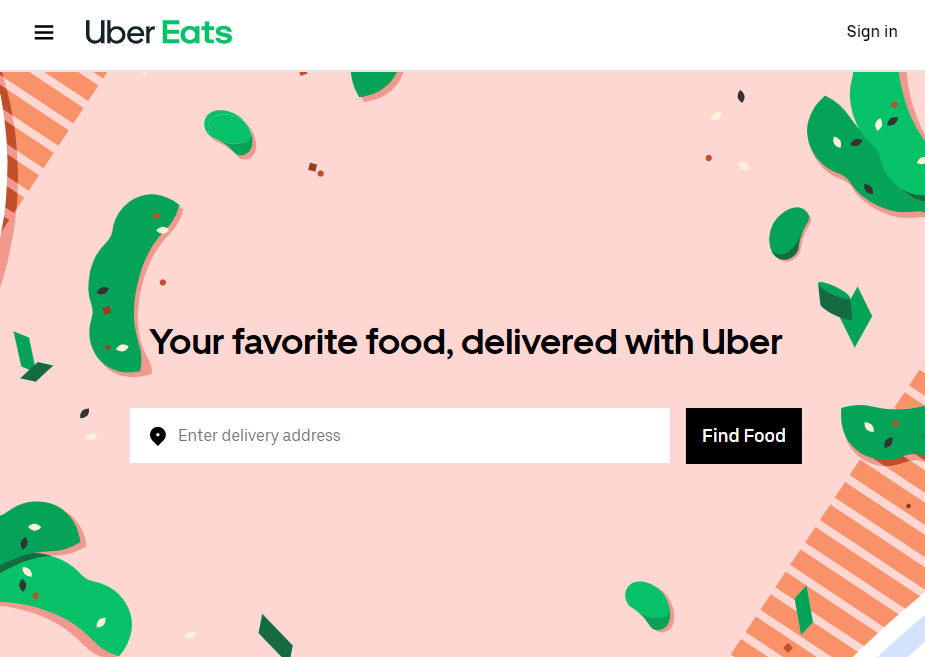
The website first displays a short slogan, which is also part of the microcopy. “Your favorite food, delivered with Uber.” The keyword food immediately pops up. To strengthen this slogan, they’ve paired “food” with the adjective “favorite”.
More importantly, we find a search bar directly below the slogan. This search bar asks us to enter our delivery address. Next, there’s a clear button that encourages us to search for food. In other words, they instruct us on how to use the application by following the textual clues.
It’s amazing how just 11 words can immediately clarify the meaning and purpose of an application. To repeat, Uber Eats is about finding food you like and delivering it right at your doorstep. Who doesn’t like a delicious pizza without having to leave the comfort of your home?
Let’s take a look at five tips to writing microcopy that will accelerate a user’s learning process.
1. Consider the Order of Microcopy Elements
The order of elements matters when creating microcopy. A user will most likely read elements top down and left to right. Therefore, structure information top down and left to right in order of importance. Avoid placing information a user needs below a particular element while needing it to complete the last element.
Let’s take a look at an example to clarify this order. Mailchimp’s sign-up form has switched the order of elements. They’ve added the password requirements below the password input field.
It might happen a user fills in their default password when first seeing the password field. This reaction is normal when we read a form top down. Next, the user notices that their password doesn’t meet the password requirements. In this case, they have to create a new password. It might sound like a small UX issue, but they can add up.
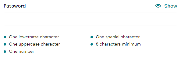
We don’t want to completely diss Mailchimp’s password field, as they do a great job listing the password requirements. And you could argue that placing the requirements between the password label and the password field would take up too much space, making it hard to see the link between the label and the field.
In short, when designing input elements, stick to the following order to comply with the top-down, left-to-right order:
- Label
- Instruction or hint
- Input field
2. Be Transparent, Add Meta Info
Nowadays, users are more conscious of their data and who can access it. Therefore, when you want to store users’ data, sign them up for a newsletter, or lead them to a product page, tell the user what will happen. We refer to this type of information as “meta-information”.
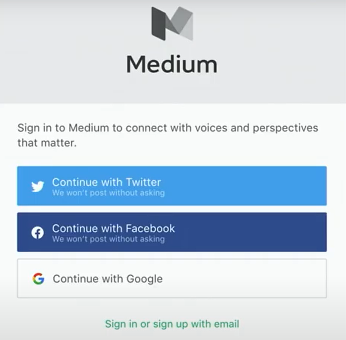
Here’s a great example of the (old) Medium sign-up form telling us how Medium uses our data.
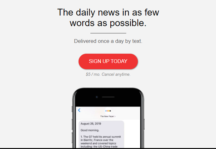
Below, we see an example of a paid newsletter by The New Paper. They do a great job at creating transparency by providing meta-information. They provide news once a day, using a concise format.
Furthermore, they add some microcopy to the sign-up button declaring the cost and cancellation policy. It’s important to declare this type of meta-information, as you don’t want to disappoint your user with the impression the newsletter is free to read after clicking the sign-up button.
Being transparent allows you to build trust but also tells something about your brand’s values. It’s a bonus when users perceive a brand as honest and transparent.
3. Use a Consistent Tone
Tone refers to how you speak and approach your user. There are different possibilities for your text’s tone of voice. Your text may be exciting, direct, friendly, or sorry. It represents your attitude as a company.
It’s vital to maintain the same tone across your microcopy messaging. This form of consistency helps users learn your interface faster and learn about your company’s values.
Let’s compare two flight booking apps, Ryanair and Skyscanner. Ryanair serves a broad audience of both younger and older people looking for cheap flights. Skyscanner focuses on the same cheap or last-minute flights, aimed at a younger audience that wants to explore the world on a budget.
While the goal of offering cheap flights might be the same, their audiences differ. Both companies express this difference in the tone of voice. Let’s compare the call to action to search for flights for their mobile apps.
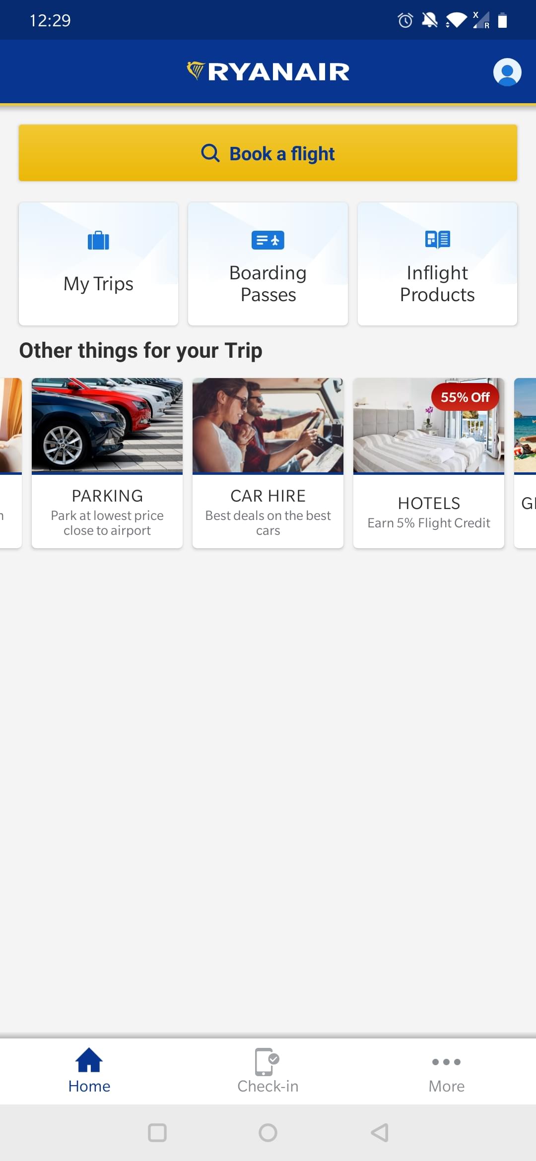
Firstly, Ryanair opts for a direct or formal tone by labeling the button with the action.
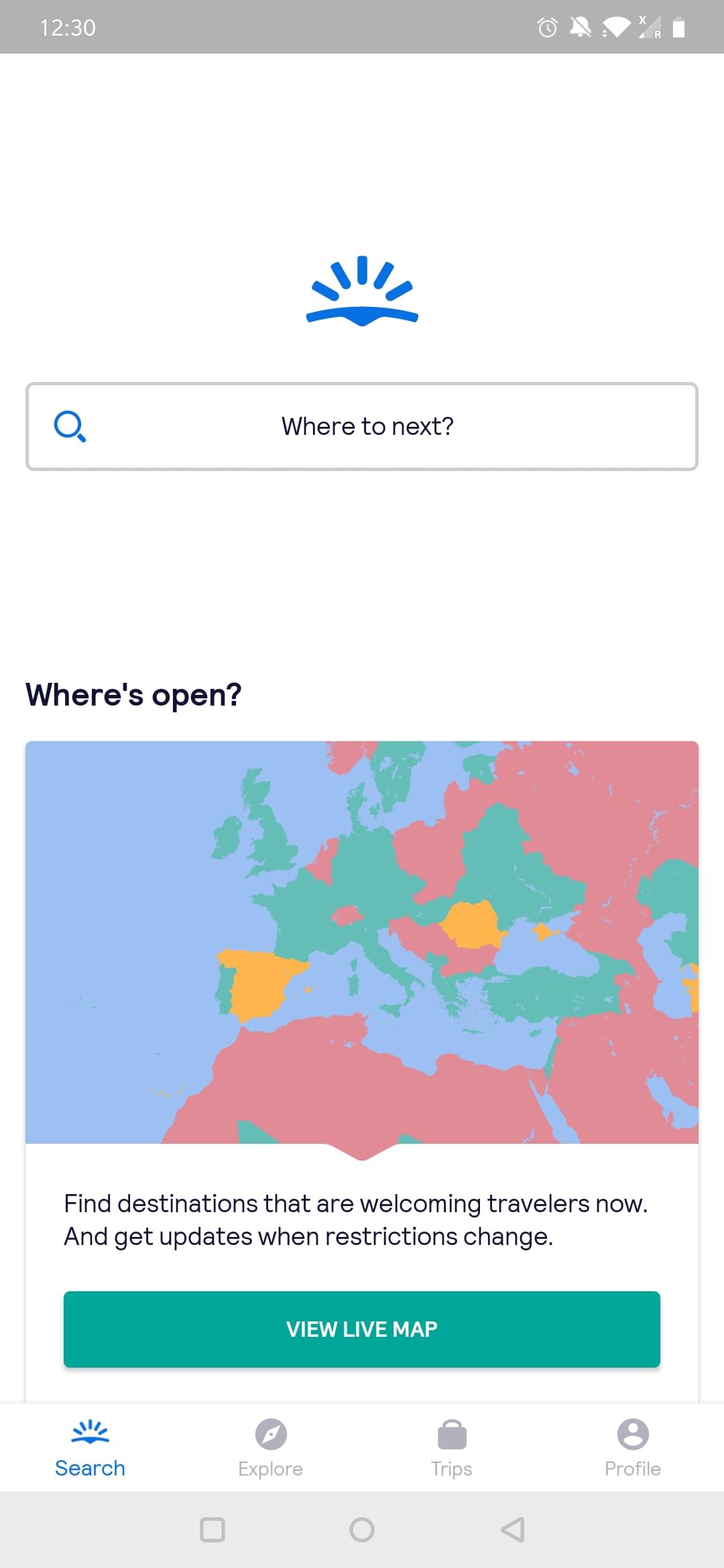
Instead, Skyscanner opts for a more informal or playful tone by asking where you want to go next. Notice that they don’t even mention the keywords “flight” or “book[ing]”. It shows the apparent difference in messaging between both companies.
4. Use Active Voice Over Passive Voice
One of the favorite tips for writing more effective microcopy is using active voice over passive voice.
Most importantly, using active voice adds more power to your message, and it’s easier for users to understand than a passive sentence. By using an active voice, you put the subject first and tell the user what has happened.
Often, a sentence that uses passive voices reverses this order. Take a look at the example below.
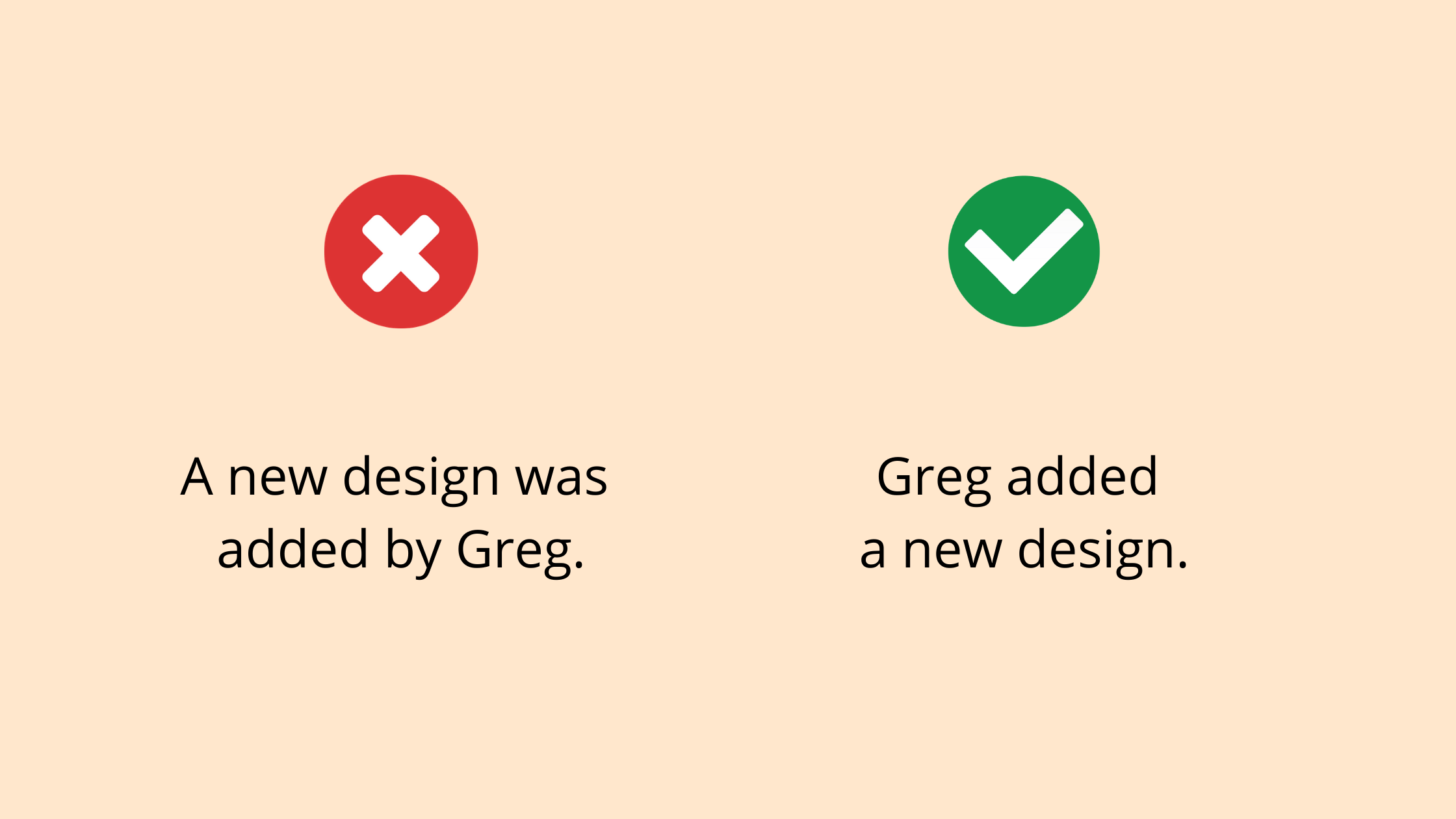
The active statement “Greg added a new design” is much clearer and more direct than the passive “A new design was added by Greg”.
5. Use the [Slogan-]Info-Action Format
Copywriters often use the “info-action” format for a call to action (CTA). Instead of adding a button that says “Start your trial”, add additional information that explains why they should sign up for your trial.

The Slack home page
A variant to this CTA is the “slogan-info-action” format. We often find this format on product pages or landing pages to provide some extra context. A slogan allows you to clarify your brand’s values and express its tone of voice.
The Slack team’s slogan explains what you can achieve with their messaging tool, while the info section focuses on the benefits. Lastly, they ask you to complete an action:
- Learn how to use Slack’s functionality
- Upgrade your plan (because I am logged in to Slack when taking this screenshot)
Keep It Simple!
A note to every microcopy writer: keep it simple! As every designer knows, less is more. Apply this rule to your microcopy strategy. Overcommunication can confuse users.
We’ve covered how you can build transparency using meta-information, how to create better microcopy by paying attention to the order of web elements, and how a consistent voice represents your brand’s values.
If you want to learn more about UX writing, I recommend reading the following blog posts:
- “Content as UX: Building a More Human Web”, by Georgina Laidlaw
- “How to Create Unforgettable Interface Copy”, by Jerry Cao.


