Learnability in Web Design: 5 Best Practices

Have you ever considered improving the learnability of your product or website? Perhaps it’s your first time reading about the concept of learnability. It’s not an easy task to build a learnable website, as it requires some experimentation and A/B testing.
Learnability’s goal is to design a clear interface that users can quickly pick up and understand. Ideally, there’s no need for documentation to educate your users on how to use your product.
Luckily, many techniques exist to create a learnable interface. This article shows you five best practices you can use to provide a more learnable interface to your users.
- consistency
- feedback
- sticking to known UI elements
- familiarity
- storification
But first, let’s make the point clear why learnability matters.

Why Does Learnability Matter?
Now, why does learnability matter? There are various reasons why you should consider providing a more learnable user interface.
First of all, users can adopt a new interface much quicker. Therefore, they can accomplish their goal using your tool much quicker. In other words, they can receive more value from your tool. Moreover, there’s little need for documentation or an extensive support center. Your goal is to reduce the number of support requests by providing a clear interface.
That’s not all! Think about customer experience. A user who can quickly learn your tool will have a better experience. In the end, the user wants to receive value within the least amount of time possible. They don’t want to spend a lot of time learning a new tool.
Lastly, learnability matters for your retention rate. A complex interface will scare users. Often, they’ll look for easier alternatives that provide them with the same value.
Now that we understand the importance of learnability, let’s explore five best practices to enhance learnability.
1. Consistency
First, let’s discuss the importance of consistency. Google has nailed consistency through its Material Design to give all of its products a similar look. Therefore, when users switch between Google’s products, it’s much easier to understand how the new product works.
Why? Users have seen this design before and know how to interact with it. Let’s compare the interface of both Google Drive and Gmail. Note the similarities in the positioning of elements such as the search bar, menu, and action button.
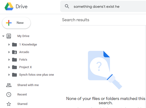
For example, Google Drive has a big call to action button with the text “New” to create a new file or folder. If we compare this with Gmail, we find the same call to action button “Compose” to create a new email. This allows a user who’s new to Gmail but frequently uses Google Drive to quickly understand the purpose of this large button.

In short, consistent interfaces are predictable interfaces. This predictability leads to learnable patterns. This applies to everything, ranging from sidebar menus to icon usage, or even link color.
2. Feedback
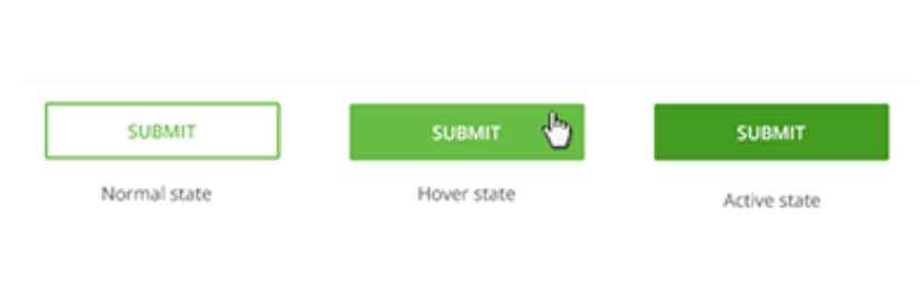
Feedback is one of those keywords you find in every UI design book. One of the most rudimental forms of feedback is hyperlink feedback.
A hyperlink can have three different states. First of all, a hyperlink sits in its normal state. When the user hovers the hyperlink with its cursor, the link color changes or the user sees a small transition animation. This small feedback moment tells the user that the element is clickable. Once the hyperlink has been clicked, you’ll see its active state. Again, this is a form of feedback to tell the user that the click request has been received and is being processed.
Feedback can be very subtle. We refer to this as micro-interactions. Micro-interactions can take the shape of:
- animations or transition effects
- color changes
- a checkbox being checked
These micro-interactions are crucial, as a user needs evidence that what they’ve done affected the page. Imagine you click a button to submit a form and the button doesn’t provide any sort of feedback. In other words, the page remains static. I bet you’ll hit the submit button a second time because you didn’t receive any evidence of your actions.
Therefore, be kind, and provide feedback to your users. It will make their experience so much nicer and less confusing.
3. Don’t Reinvent the Wheel
Rather than reinventing the wheel, make use of already existing design solutions to add familiarity to your design. For example, the hamburger menu is one of the best solutions for hiding a menu on a mobile device. However, there’s no need to design an alternative to hamburger menus, as everyone knows how they work and what their purpose is.
Let’s take a look at the design by Rifayet Uday (pictured below). While the different hamburger designs look esthetically nice and don’t add much of a variation to the original design, it’s still better to stick to the original hamburger menu design. You want to avoid confusing your users.

Therefore, stick to industry best practices. The same applies to website layouts. Stick with what works and what has been used over and over. For example, a shopping cart resides on the top right of your website. Don’t get funky and place your shopping cart at the left bottom. This will only confuse users.
It’s important to understand that when users don’t understand your interface design, they’ll often abandon your website or look for an alternative website that provides them with a better user experience.
4. Familiarity
Familiarity allows a user to learn new interfaces quicker based on previous knowledge. In other words, familiarity makes use of mental models. A user can transfer their mental model of one product to a new product. This means they can use pre-existing knowledge of similar interfaces to adopt a new interface quicker.
A mental model represents a person’s thought process for how something works. Mental models are based on incomplete facts, past experiences, and even intuitive perceptions. They help shape actions and behavior, influence what people pay attention to in complicated situations and define how people approach and solve new problems or interfaces. — Susan Carey, 1986 article from “Cognitive science and science education” journal
Moreover, familiarity creates reliability and helps users to feel confident when exploring and using an unfamiliar interface. For example, if you apply Google’s Material Design language to your website, users can recognize elements and know how to interact with them. Therefore, they’re not afraid to click a particular button as they know what action to expect. Reliability is key for a user to remove any fears to explore a new tool.
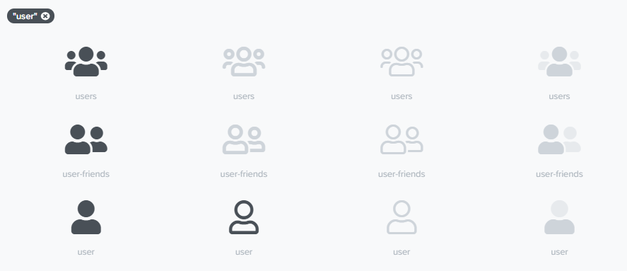
Tip: use a common set of icons such as Font Awesome to add familiarity to your interface.
5. Storification
Sometimes you want to launch a totally new product that requires a disruptive user interface. Here, we can’t just rely on the previous tips to speed up the learning process.
In this case, you can speed up the process through storytelling. Storytelling enables you to make the information you share easier to understand but also to remember. Preferably, you should use visual storytelling over text-based storytelling. Users don’t want to read big chunks of text to learn about an interface.
What works best here? Design an interactive visual story that guides the user through all the important elements of your interface. Try to keep your story short and focus only on the beginner elements the user needs to get started. There’s no need to explain advanced use cases. These kinds of topics can be covered in additional guides. We don’t want to overwhelm the user with new information as this has opposite effects on the learning process.
Note: you can learn more about stories and storytelling in design.
Conclusion: Learnability and Pattern Recognition
Many tips exist to boost learnability for your user interface. However, it’s important to know that all of the above best practices rely on pattern recognition. Therefore, aim to design interfaces where you exploit users’ previous knowledge so they can detect patterns in your interface. Allowing users to detect these patterns helps them to learn an unfamiliar interface quickly.
I hope you’ve learned there’s real value to be gained from implementing learnability. Personally, the most important aspect of paying attention to learnability is improving the user experience. Products nowadays are developed with the user in mind. So, why would you develop a product that doesn’t take into account the learnability factor of your interface? You can have an amazing product but have a complex user interface.
Therefore, invest some time in improving the learnability of your user interface. You might be surprised by the positive effects on user experience.


