How to Animate CSS Box Shadows and Optimize Performance

In this article, you’ll learn how to animate CSS box shadows without reducing browser performance.
In CSS, the box-shadow property is used to add shadows to web elements, and these shadows can be animated. However, shadow animations can affect the performance of the browser, causing lagging when rendering the page.
This guide is intended for frontend developers with a working knowledge of HTML, and CSS animation.
Why This Matters
A web page has to have a very short load time, ideally under five seconds. Research indicates speedy page loading gives a huge boost to conversion rates. Further research indicates that 70% of users say a website’s speed impacts their willingness to buy from an online store. Basically, fast sites equal happy users.
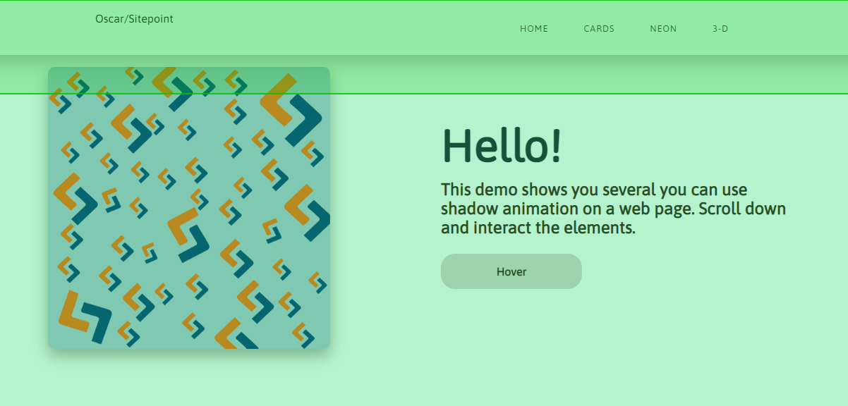
Before we go further, here’s a demo of how box-shadow animations can function on a web page. You can scroll through and interact with the web elements.
See the Pen
Web elements with shadow animation by SitePoint (@SitePoint)
on CodePen.
Three Main CSS Box Shadow Animation Events
Because of what’s happening behind the scenes, CSS box-shadow animation can be resource heavy. There are three main processes, or events, that are triggered during box shadow animation (or any form of animation, for that matter). These events are painting, layout, and compositing.
-
Painting. In painting, the browser fills in the pixels with color, and
box-shadowis one of the CSS properties that triggers this event. Basically, it creates a new shadow at every frame of the animation. According to Mozilla, the ideal CSS animation should run at 60fps. -
Layout. Some animations change the structure of a page, which can lead to many style recalculations. A good example would be a sidebar pushing other elements out of the way when expanding. The CSS properties that cause this include
padding,margin,border.Simply put, if the animated property affects other elements, it will change the layout of the page, causing recalculations — which uses a lot of system resources.
-
Compositing. In compositing, only parts of the page change. CSS properties like
opacityandtransformaffect just the element they’re applied to. This will mean fewer style recalculations, and smoother animations. Compositing is the least tasking process out of all three.
With your browser’s inspector tool, you can observe this process in real time. First, open up the inspector tool (Chrome is pictured below), and click on the three dots on the top right corner of the tab. Check More tools and select Rendering.
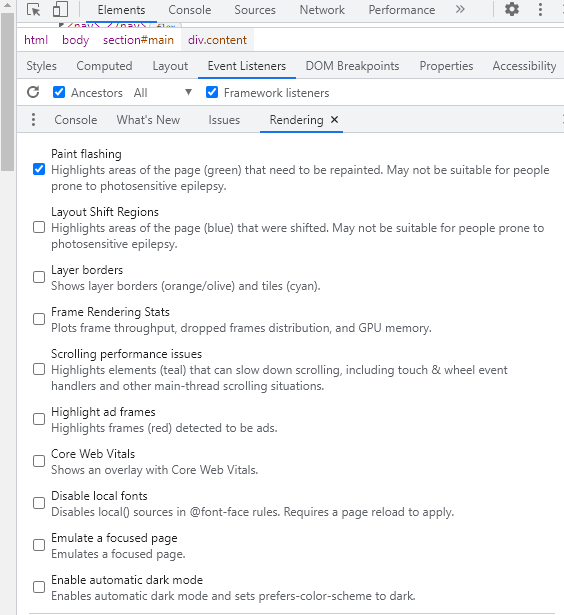
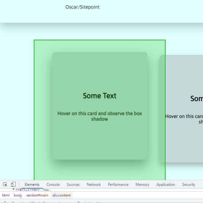
For this example, Paint flashing is selected. Every time there’s a painting event, the screen will flash green:
- The navbar:
- The text cards:
- The nav links:
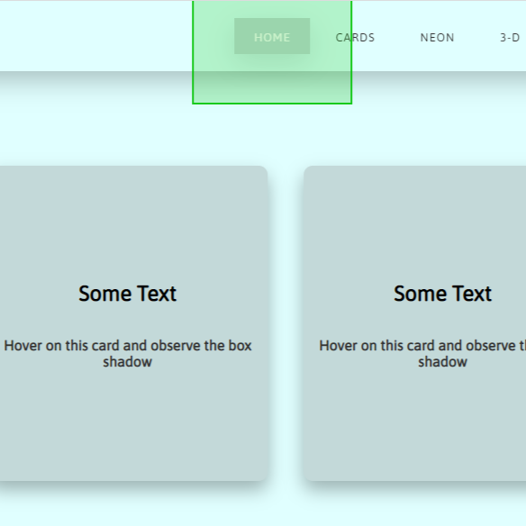
You’ll find that every element with a shadow flashes green when you hover over it, or when you refresh the page. You can also do the same experiment with layout: just uncheck Paint flashing and select Layout Shift Regions.
Please note that paint flashing may not work in CodePen demos, so you’ll want to try this with a live preview from a text editor. The video below shows what you should see.
The goal is to minimize painting and layout changes, because they use more system resources.
Checking Performance
As a developer, you may not have any issue running shadow animations because you have a fast computer. But you have to consider users with slower PCs and unreliable internet connections. Just because it looks good on your computer doesn’t mean it’s the same everywhere else.
A box-shadow has four values and a color. These four values are the shadow’s horizontal position (x-offset), vertical position (y-offset), spread, and blur radius respectively. A typical shadow animation will involve a change in one or more of these values:
box-shadow: <x-offset> <y-offset> <spread> <blur> <color>;
Let’s create a simple box-shadow animation, starting with some HTML:
<body>
  <div class="box"></div>
</body>
And here’s some CSS for the initial and the final shadow:
.box {
  box-shadow: 0px 5px 10px 0px rgba(0, 0, 0, 0.5);
  transition: transform ease 0.5s, box-shadow ease 0.5s;
}
.box:hover {
  transform: translateY(-5px);
  box-shadow: 0px 10px 20px 2px rgba(0, 0, 0, 0.25);
}
Here’s the result:
See the Pen
Animated box-shadow by SitePoint (@SitePoint)
on CodePen.
For the animation, we’re changing the values of the y-offset, blur and spread. We’re also going with a more transparent final shadow.
Now let’s take a look at what’s going on behind the scenes as we run this 0.5s animation. On your browser, open up the developer tools by right clicking and selecting Inspect. Once the tools are open, head over to the Performance tab. You can record the shadow animation; just a few seconds is enough to see what’s happening.
The screenshot below shows what you’ll find from Chrome’s devtools.
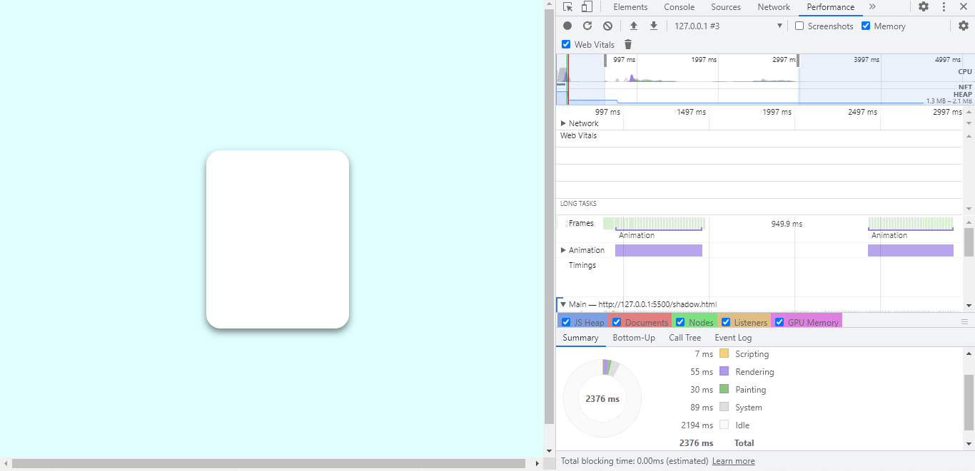
The shadow’s animation period, hover up and down, is highlighted at the top, and a breakdown of the processes that takes place is displayed at the bottom. The breakdown shows that scripting takes 7ms, rendering takes 55ms, and painting lasts for 30ms.
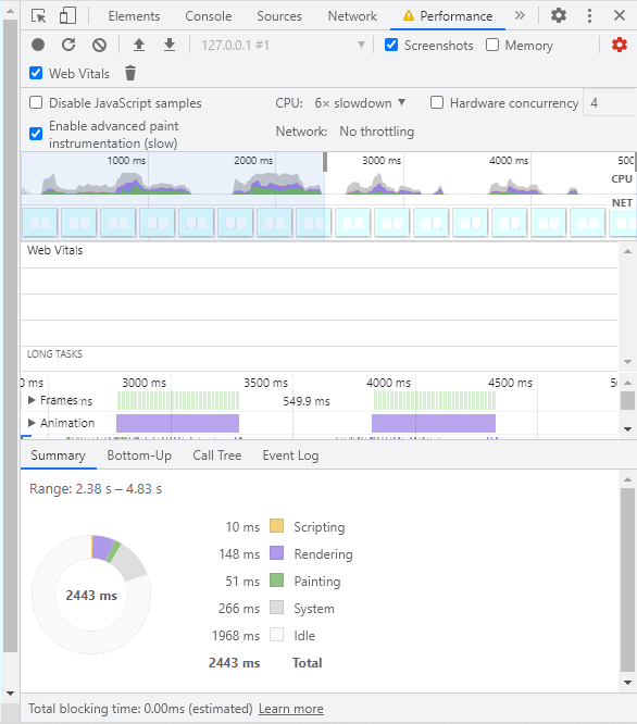
Now, those numbers seem okay, but what happens when the CPU is four times slower? You can throttle your CPU speed from the performance tab.
The following image shows what happens when you run the same animation with a slower CPU.
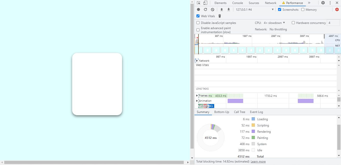
In this new process, loading takes 6ms. Scripting is up to 52ms, rendering has more than doubled to 117ms, and painting is now 72ms.
You can also throttle network speed, and make the CPU even slower. Shadow animations use a lot of system resources, and we’ll look to take away some of the load.
It’s important to note that the transform property plays a part in how the CPU performs. More on this later.
How to Maintain Optimal Performance
If you must animate shadows on a web page, it’s worth making them more performant. In this section, you’ll learn various ways shadow animations can be tweaked so the performance hit is reduced.
We’ll cover the following:
- animating opacity
- having multiple
box-shadowlayers - animating a pseudo element
- using the
transformproperty
Animating opacity
When using rgba colors, the alpha channel controls opacity. Changing only the alpha channel when animating shadows won’t be as hard on the CPU as changing the shadow’s offset and spread values.
.box {
  box-shadow: 0px 10px 20px 0px rgba(0, 0, 0, 0.5);
  transition: box-shadow ease 0.5s;
}
.box:hover {
  box-shadow: 0px 10px 20px 0px rgba(0, 0, 0, 0.25);
}
.box-2 {
  box-shadow: 0px 10px 20px 0px rgba(0, 0, 0, 0.5);
  transition: box-shadow ease 0.5s;
}
.box-2:hover {
  box-shadow: 0px 20px 40px 0px rgba(0, 0, 0, 0.25);
}
In the first animation, only the shadow’s opacity is changing, while in the second, the y-offset is changing from 10px to 20px, and the spread is changing from 20px to 40px.
And here’s how they perform, at 6x slowdown (so you can see the performance graphs clearly), starting with the animation where only the opacity is changing:
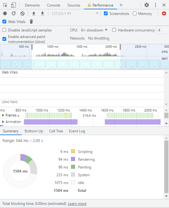
It takes approximately two seconds to hover on and off the box. Now compare this to the second shadow animation.
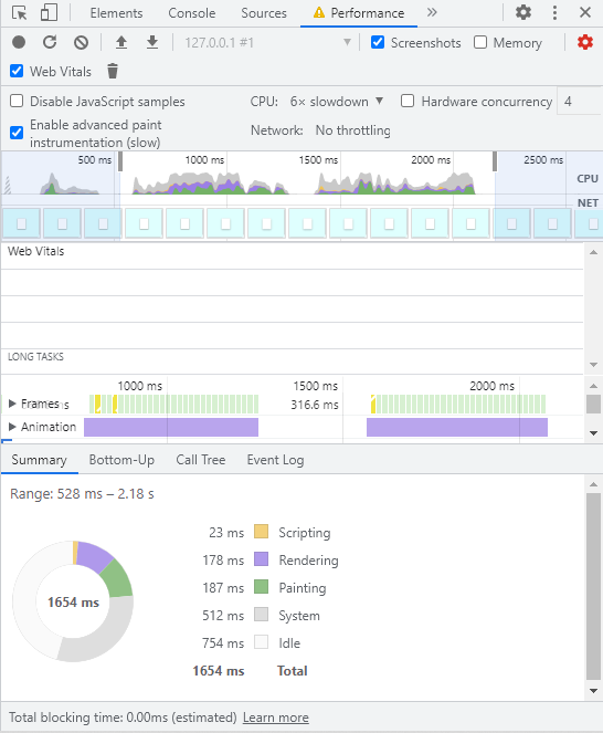
Again, two seconds on and off, and there’s a noticeable increase in the time for for all the events. Painting was 96ms before, and it’s now doubled to 187ms. Rendering, which is part of compositing, is also up from 97ms to 178ms.
So, changing only the opacity of the shadow produces a more performant animation.
Here’s a live demo of these two animations.
See the Pen
Animated opacity vs animated offsets by SitePoint (@SitePoint)
on CodePen.
Layered shadows
If you observe the shadows around a table, or lift an object above it, you’ll notice that its darkest shadow region is closest to the object, and it becomes increasingly lighter as it spreads outwards.
Replicating this effect isn’t easy with one box-shadow. Layered shadows look much better. They also produce more performant animations, even with the added shadow layer.
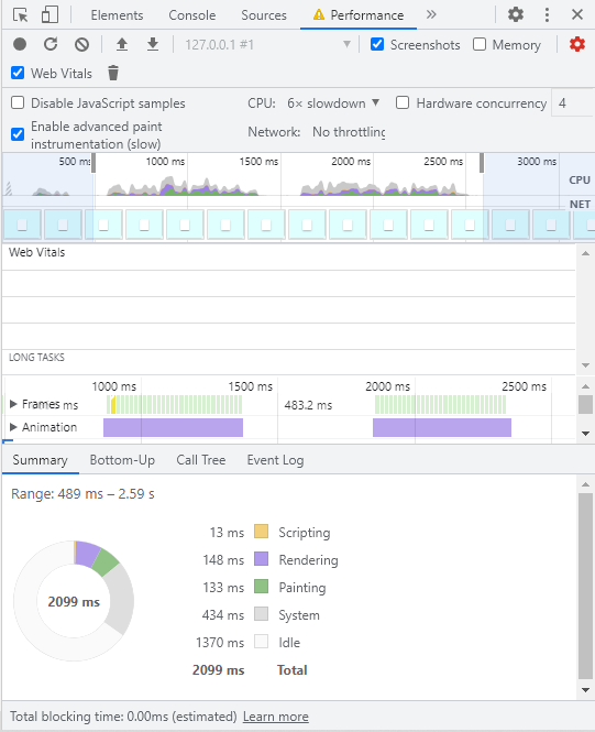
Let’s compare the performance of a single box-shadow and a multi-layer shadow:
.box {
  box-shadow: 0px 10px 20px 0px rgba(0, 0, 0, 0.5);
  transition: box-shadow ease 0.5s;
}
.box:hover {
  box-shadow: 0px 20px 40px 0px rgba(0, 0, 0, 0.25);
}
This animation has 148ms of rendering, and 133ms of painting.
Now let’s have a shadow animation with two box-shadow layers:
.box-2 {
  box-shadow: 0px 5px 10px 0px rgba(0, 0, 0, 0.25),
              0px 10px 20px 0px rgba(0, 0, 0, 0.5);
  transition: box-shadow ease 0.5s;
}
.box-2:hover {
  box-shadow: 0px 10px 20px 0px rgba(0, 0, 0, 0.25),
              0px 20px 40px 0px rgba(0,0,0,0.15);
}
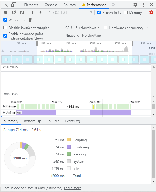
The difference is clear. Not only do layered shadows produce better-looking shadow effects, they surprisingly perform better when animated. Rendering has been reduced from 148ms to 74ms, and painting is also down from 133ms to 74ms.
Here’s a live demo of the two compared.
See the Pen
Single shadow vs layered shadow animation by SitePoint (@SitePoint)
on CodePen.
Now, let’s try something different, adding the second shadow during animation:
.box-2 {
  box-shadow: 0px 10px 20px 0px rgba(0, 0, 0, 0.5);
  transition: box-shadow ease 0.5s;
}
.box-2:hover {
  box-shadow: 0px 10px 20px 0px rgba(0, 0, 0, 0.25),
              0px 20px 40px 0px rgba(0,0,0,0.15);
}
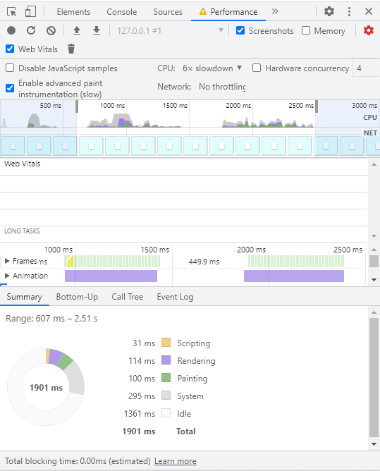
Adding a second shadow layer during animation isn’t as performant as having two layers from the start, but it still has 100ms of painting compared to 133ms with the single box-shadow animation, which is an improvement.
Ultimately, it’s up to you to decide how your shadow looks, and what method you’ll use to create it.
Animating a Pseudo Element
This time, we’re going to replicate the shadow animation without changing the box-shadow property. From the previous demos, we can see that there’s still a lot of repainting going on during shadow animation. If you’re changing the box-shadow values, you can’t avoid this process.
You’ll see at the end of this section that painting will be almost completely eliminated. It will involve more lines of code, but we’ll achieve more performant shadow animations.
So, after the basic styling for the box, create an :after pseudo element and give it a box-shadow, which will be the final state of the shadow after animation:
.pseudo {
  position: relative;
  transition: box-shadow ease 0.5s, transform ease 0.5s;
  box-shadow: 0px 5px 10px 0px rgba(0, 0, 0, 0.5)/*Initial shadow*/
}
.pseudo::after{
  content: "";
  position: absolute;
  border-radius: 20px;
  top: 0;
  left: 0;
  width: 100%;
  height: 100%;
  opacity: 0;
  box-shadow: 0px 10px 20px 2px rgba(0, 0, 0, 0.25);/*final shadow*/
  transition: opacity ease 0.5s;
}
Now, all you have to do is change the opacity of the pseudo element on :hover:
.pseudo:hover{
  transform: translateY(-10px);
}
.pseudo:hover::after{
  opacity: 1;
}
Let’s look at it alongside a regular shadow animation.
See the Pen
Psuedo Shadow by SitePoint (@SitePoint)
on CodePen.
There’s not much to go on visually here. The real difference is in their performance. The results for the the regular box-shadow animation are shown below.
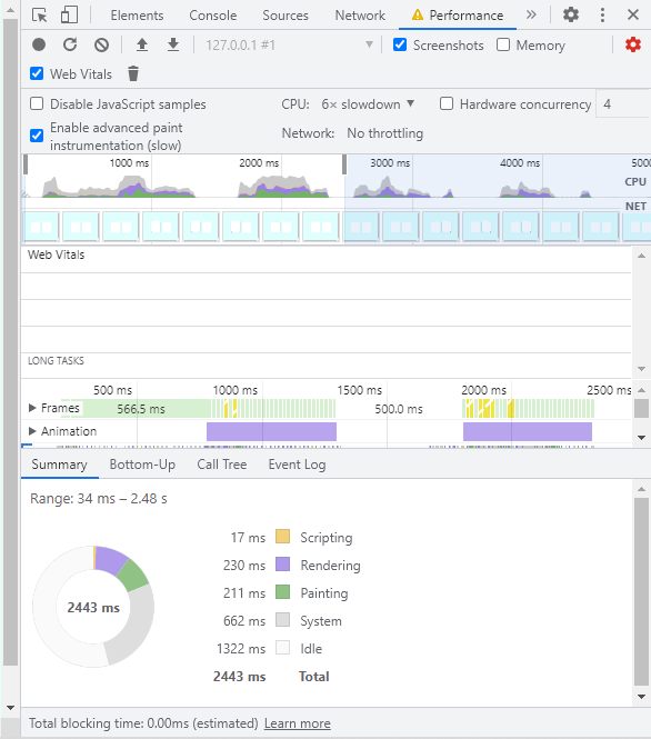
It has 230ms of rendering time, and 211ms for painting. Now the pseudo shadow animation.
This time, we have 148ms of rendering, and only 51ms of painting. There’s more code, but the result is worth the hassle.
Using the transform property
This mostly applies to the main element, the box, that will have the shadow. Using the transform property, instead of layout changing properties like margin, will reduce the amount of style recalculations.
This property can be used with the translate or scale properties to simulate lifting an element off the page, creating the illusion of depth.
Some Useful Tips
It’s already established that any animation that involves the box-shadow property will affect performance. So, if you must have CSS box shadow animation, here are some useful tips to keep in mind.
First, keep them minimal. Don’t throw shadows on every element for the sake of it. Secondly, only animate the interactive elements. There’s no need to animate anything that has no function. This will reduce the workload of the CPU and greatly improve performance.
Conclusion
Shadows can enhance your site visually, but they also affect performance — especially when it comes to animation. In this article, we’ve tested various methods on animating shadows and compared their performance. Animating shadows triggers three events — painting, layout changes, and compositing — with the first being the most tasking.
The ideal solution would be to not animate shadows at all (since they look fine as they are!). If you really want to animate the box-shadow property, changing just the opacity as opposed to changing the offset values will reduce repainting. The catch is you’ll loose that illusion of depth that shadows are meant to provide. Another approach is to animate two box-shadow layers. This solution is visually pleasing, and performant, even with the extra shadow.
The last option is to animate not the box-shadow but a pseudo element that provides a shadow. This drastically reduces the amount of repainting and the overall work the CPU does in running the animation. You’ll write more code, but it’s your best bet in ensuring good performance.
Related content: