Using SVG with Media Queries

In HTML documents, we can show, hide, or rearrange parts of the page based on the conditions of the viewport. If the browser window is 480 pixels wide, for example, we might shift our navigation from a horizontal one to a vertical, collapsible list. We can do something similar when using SVG with media queries.
This article is an extract from Tiffany’s book CSS Master, 3rd Edition. Check it out if you’d like to master other advanced CSS3 features like Flexbox and Grid!
* * *
As well as using CSS with HTML, we can also use CSS with SVG, or Scalable Vector Graphics. SVG is a markup format for describing flat, two-dimensional images. Because it’s a markup language, it has a Document Object Model, and can be used with CSS.
By using CSS with SVG, we can change the appearance of SVG based on user interaction. Or we can use the same SVG document in multiple places, and show or hide portions of it based on the width of the viewport.
All major browser engines support the SVG 1.1 specification, and they have done for years. Support for features of SVG 2, on the other hand, is still a work in progress. Some of what we’ll discuss here has limited browser support at the time of writing. That may have changed by the time you’re reading this. Keep an eye on the Chromium meta issue — Implement SVG2 features — to track development progress in Chromium-based browsers. Watch the Support SVG 2 features meta issue to follow Firefox’s implementation work, and WebKit’s Implement SVG 2 meta issue for Safari. Issue trackers can be unpleasant to navigate, but for now they’re the best way to track SVG 2 support.
Before we go any further, however, let’s talk about what SVG is and why you should use it.
Vector Images versus Raster Images
Most of the images currently used on the Web are raster images, also known as bitmap images. Raster images are made up of pixels on a fixed grid, with a set number of pixels per inch. JPEG, WebP, GIF, and PNG are all examples of raster image formats.
Raster images are resolution dependent. A 144 PPI (pixels-per-inch) PNG image looks great on a device with a 144 PPI display resolution. When viewed on a higher resolution, 400 PPI display, however, that same image can look fuzzy. Raster images also have fixed dimensions and look best at their original size. Scaling a 150 by 150 pixel image up to 300 by 300 pixels distorts it.
Instead of using pixels on a grid, vector image formats describe the primitive shapes — circles, rectangles, lines, or paths — that make up an image, and their placement within the document’s coordinate system. As a result, vector images are resolution independent, and retain their quality regardless of display resolution or display dimensions.
Resolution independence is the biggest advantage of SVG. We can scale images up or down with no loss of quality. The same image looks great on both high and low PPI devices. That said, SVG is poorly suited to the amount of color data required for photographs. It’s best for drawings and shapes. Use it in place of PNG and GIF images, and as a more flexible replacement for icon fonts.
Another advantage of SVG is that it was designed to be used with other web languages. We can create, modify, and manipulate SVG images with JavaScript. Or, as we’ll see below, we can style and animate SVG using CSS.
Associating CSS with SVG Documents
Using CSS with SVG is a lot like using it with HTML. We can apply CSS using the style attribute of an SVG element, group CSS within a document using the <style> element, or link to an external stylesheet. The pros and cons of each method are the same as when using CSS with HTML.
Using the style Attribute
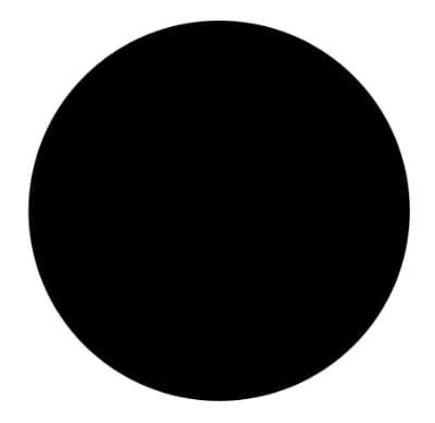
Here’s a simple SVG document where the code creates a black circle:
<svg version="1.1" xmlns="http://www.w3.org/2000/svg" viewBox="0 0 200 200"
➥enable-background="new 0 0 200 200">
    <circle cx="101.3" cy="96.8" r="79.6" />
</svg>
The image below shows how that code renders in a browser.
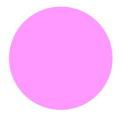
Let’s give our circle a pink fill using CSS and the style attribute:
<svg version="1.1" xmlns="http://www.w3.org/2000/svg" viewBox="0 0 200 200"
➥enable-background="new 0 0 200 200">
    <circle cx="101.3" cy="96.8" r="79.6" style="fill: #f9f" />
</svg>
The effect of this is shown below.
Here’s one difference between using CSS with HTML and using it with SVG: property names. Many of the CSS properties that we use with HTML documents aren’t compatible with SVG, and vice versa. We’ll come back to this point later in the chapter.
Using the style attribute isn’t the best way to use CSS, of course. Doing so limits the ability to reuse those styles across multiple elements or documents. Instead, we should use inline or linked CSS.
Embedding CSS in SVG Documents
Instead of using the style attribute, we can use the <style> element:
<svg version="1.1" xmlns="http://www.w3.org/2000/svg" viewBox="0 0
➥ 200 200" enable-background="new 0 0 200 200">
    <style type="text/css">
        circle {
            fill: #0c0;
        }
    </style>
    <circle cx="101.3" cy="96.8" r="79.6" />
</svg>
Embedding CSS in an SVG document lets us reuse those styles for multiple elements within the same document, but it prevents that CSS from being shared across multiple documents. That’s fine for logos and icons. But if you’re creating something like a library of chart styles, an external CSS file is a better bet.
Using a standard text editor, you can also add CSS to SVG images created with software such as Sketch, Inkscape, or Illustrator. Doing so won’t affect your ability to edit the image with the drawing application, but if you edit the file using image software, the application may rewrite or remove your CSS.
Linking from SVG to an External CSS File
As with HTML, linking to an external CSS file makes it possible to share styles across several SVG documents. To link an external CSS file, add <? xml-stylesheet ?> to the beginning of your SVG file:
<?xml version="1.0" encoding="utf-8"?>
<?xml-stylesheet href="style.css" type="text/css"?>
<svg version="1.1" xmlns="http://www.w3.org/2000/svg" viewBox="0 0
➥ 200 200" enable-background="new 0 0 200 200">
    <circle cx="101.3" cy="96.8" r="79.6" />
</svg>
Using the <link> Element
Alternatively, use the HTML <link> element. If you do use this method, you’ll need to include the xmlns namespace attribute, as shown below:
<link href="style.css" type="text/css" rel="stylesheet"
    ➥ xmlns="http://www.w3.org/1999/xhtml" />
Note: some older browsers need the <link> element to be enclosed by <defs> or <g> tags.
The <link> element isn’t an SVG element. It belongs to HTML and XHTML. XHTML is a variant of HTML that’s parsed according to the rules of XML markup. According to the rules of XML, we can borrow elements and their behavior from other XML dialects, such as XHTML. To do so, however, we need to tell the browser which namespace the element belongs to using the xmlns attribute.
Using @import
We can also link to an external stylesheet by using @import inside <style> and </style> tags:
<style type="text/css">
@import('style.css');
</style>
This method functions similarly to the <link> method.
SVG and the <img> Element: Limitations
Linking from SVG files to external assets, including CSS files, doesn’t work with the <img> element. This is a security limitation of the <img> element that’s baked into browsers.
If you’d like to use linked CSS with your SVG images, you’ll need to do either of these two things:
- use the
<style>element in your SVG document to place your CSS inline - use an
<iframe>or<object>element (see note below)
Note: Craig Buckler’s tutorial “How to Add Scalable Vector Graphics to Your Web Page” discusses using <iframe> and <object> in detail.
In general, you should use <iframe> over <object>. However, the <object> element can be the child of an <a> element, while <iframe> can’t. Using <iframe> or <object> also makes the SVG document tree available to the parent document’s document tree. This means that we can use JavaScript to interact with it (for example, with document.querySelector('iframe').contentDocument).
Inline SVG and External Assets
When adding SVG to HTML, the browser won’t load external assets referenced by the SVG document. We can, however, link to CSS for our SVG document from the <head> of our HTML document:
<head>
    ⋮
    <link href="svg.css" type="text/css" rel="stylesheet" />
</head>
SVG elements within HTML documents also become part of the HTML document tree. If you’re using inline SVG, it’s perfectly fine to combine your HTML-related and SVG-related CSS in the same stylesheet.
Differences between SVG and HTML
While SVG and HTML are both markup languages, there are two significant differences between them that affect how they work with CSS:
- SVG doesn’t adhere to the CSS box model
- SVG lacks a positioning scheme
SVG Doesn’t Adhere to the CSS Box Model
When used with HTML, CSS layout follows the rules of the CSS box model. SVG, on the other hand, uses coordinates for layout. It adheres to what may be best understood as a “shape model”.
SVG shapes aren’t limited to rectangular boxes. As a result, most box-model–related properties don’t apply to SVG elements. You can’t, for instance, change the padding or margin of an SVG element. Nor can you use the box-sizing, box-shadow, outline, or border-* properties. Grid layout, floats, and Flexbox also don’t work.
You can, however, use CSS to set or change a range of SVG properties and attribute values. The full list is outlined in the SVG 2 specification, although support in most browsers is incomplete. Some CSS properties, such as filter, can be used with SVG or HTML. We’ll discuss a few of them in this chapter, within the context of specific techniques.
SVG Lacks a Positioning Scheme
When CSS is used with HTML, element boxes can:
- exist within a normal flow
- be removed from normal flow with the
floatproperty - be removed from normal flow with the
positionproperty
The CSS specification refers to these as positioning schemes. Positioning schemes don’t exist in SVG. The position property has no effect on SVG elements. Neither do properties such as top, left and bottom, which depend on elements being positioned. You also can’t float elements within an SVG document.
Instead, SVG uses a coordinate system for element placement. To create a <circle>, for example, you need to set its center point coordinates using the cx and cy attributes, and set a radius length using the r attribute. A polygon consists of a series of point coordinates and line segments drawn between them. In other words, you can define where an element will be drawn to the SVG canvas, but you can’t “position” them in the CSS sense of the word.
Related to positioning schemes, SVG also lacks the idea of z-index and stacking contexts.
Note: the SVG 2 specification does define behavior for z-index and stacking contexts in SVG documents, but most browsers don’t yet support it.
SVG elements are instead stacked according to their source order. Those that appear later in the document sit towards the top of the stack. If you want to change the stacking order of SVG elements, you’ll need to move them around in the source or use JavaScript to reorder them in the DOM tree.
In fact, most CSS 2.1 properties don’t apply to SVG documents. Exceptions include animations and transforms, display, overflow, visibility, filter, and a few font and text-related properties. Instead, you’ll have to use SVG-specific styling properties with SVG documents. Most of these properties can also be expressed as SVG element attributes.
Styling SVG Elements
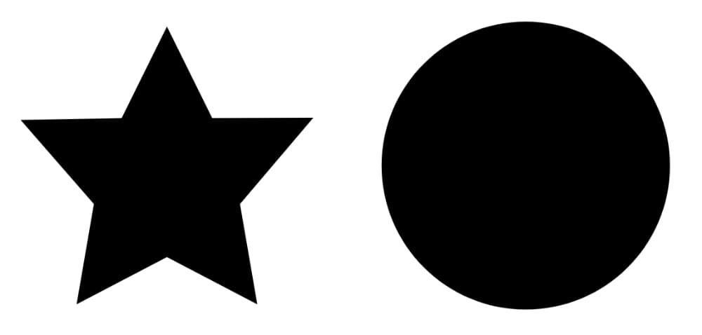
Here’s a simple example of how to style SVG elements using CSS. First our SVG document, which is a stand-alone file:
<?xml version="1.0" encoding="utf-8"?>
<?xml-stylesheet href="styles.css" type="text/css" ?>
<svg version="1.1" xmlns="http://www.w3.org/2000/svg" xmlns:xlink=
➥"http://www.w3.org/1999/xlink" x="0px" y="0px" viewBox="0 0 497
➥ 184" enable-background="new 0 0 497 184" xml:space="preserve">
    <polygon id="star" points="77,23.7 98.2,66.6 145.5,66.5 111.2,
➥106.9,119.3,154 77,131.8 34.7,154 42.8,106.9 8.5,67.5 55.8,
➥66.6 "/>
    <circle id="circle" cx="245" cy="88.9" r="67.5"/>
</svg>
This markup creates the image shown below.
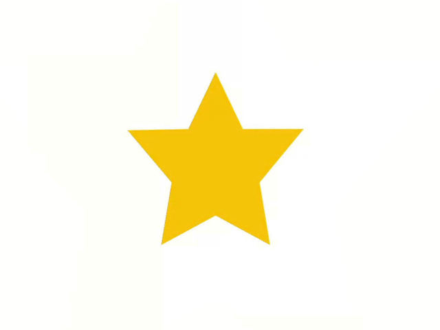
Although we can’t use most CSS properties with SVG documents, we can use CSS to change an element’s color. Let’s make our star yellow:
#star {
    fill: hsl( 44, 100%, 50% );
}
You’ll often see the fill attribute used with SVG tags — for example, <circle fill="rgb( 255, 185, 0 )" cx="3" cy="10" r="100"> — but it’s also a property that can be used with CSS.
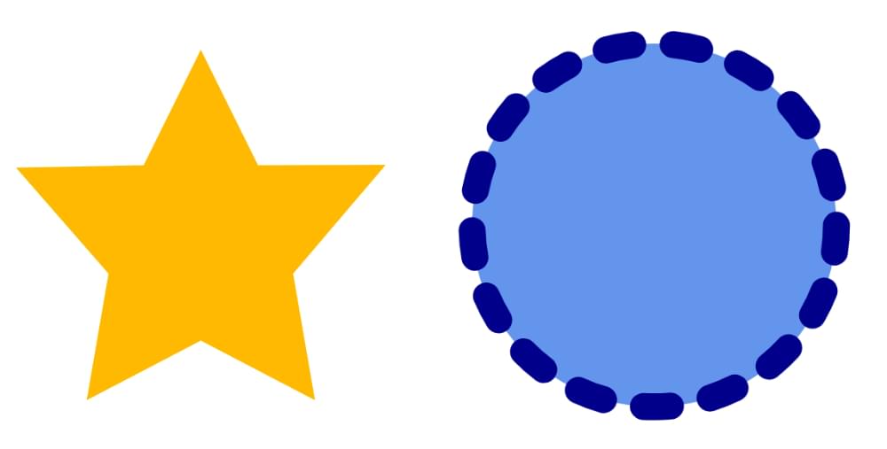
We can also use CSS to adjust an element’s stroke, which is the outline of an SVG shape. A shape’s stroke exists, even if no stroke properties are set. Let’s give our circle a dark blue, dashed border that’s ten pixels wide. We’ll also set its fill property to cornflowerblue:
circle {
    fill: cornflowerblue;
    stroke: darkblue;
    stroke-width: 10;
    stroke-dasharray: 10, 15;
    stroke-linecap: round;
}
Together this gives us the result below.
Using SVG Attributes as CSS Properties
We can also use CSS to set the coordinate values of some shape elements: <rect>, <circle>, and <ellipse>. Typically, we’d use SVG attributes for these elements:
<svg viewBox="0 0 400 400" xmlns="http://www.w3.org/2000/svg">
    <rect x="20" y="200" width="300" height="300" fill="#f60" />
</svg>
However, SVG 2 redefined some SVG attributes as geometry properties. This means we can use CSS to set their values:
<svg viewBox="0 0 400 400" xmlns="http://www.w3.org/2000/svg">
    <style type="text/css">
      rect {
          x: 20px;
          y: 50px;
          width:  300px;
          height: 300px;
          fill: #f60;
      }
    </style>
    <rect />
</svg>
Coordinate properties (x and y), center coordinate properties (cx and cy), and radius properties (rx, ry, and r), can be set using CSS. So can width and height. Units are optional for SVG attributes. CSS values, on the other hand, require units. Both lengths and percentages are valid for the properties mentioned here, but be aware that lengths work a bit differently with SVG documents. Remember that the S in SVG stands for scalable. The computed size of an SVG element also depends on:
- the computed
widthandheightof the root SVG element - the value of the root element’s
viewBoxattribute - any scaling transforms applied to the element or its ancestors
In other words, the corners of our <rect> element are (20, 50), (20, 320), (350, 320), and (20, 350) within the SVG coordinate system. However, the actual dimensions may be larger or smaller, depending on the factors above.
Not every SVG attribute is available via CSS — at least not in every browser. For example, Chrome and Edge support using the CSS path() function to set path data, or the d attribute:
path {
    d: path("M 454.45223,559.21474 -304.96705,163.45948 417.4767,-296.33928 Z");
}
As of this writing, they are the only browsers that do. Work to add support in Firefox and WebKit has not yet begun.
For other shape elements, the SVG 2 specification is downright inconsistent. To date, you must use element attributes to set the properties of <line>, <polyline>, and <polygon> elements.
That said, we aren’t limited to using type (or element) selectors to set properties. We could, for instance, define small, medium, and large circles using class selectors:
<svg viewBox="0 0 400 400" xmlns="http://www.w3.org/2000/svg">
    <style type="text/css">

    .small {
        cx: 20px;
        cy: 20px;
        r:  20px;
        fill:  #0c0;
      }

      .medium {
        cx: 80px;
        cy: 80px;
        r:  60px;
        fill:  #fc0;
      }

      .large {
        cx: 220px;
        cy: 220px;
        r:  120px;
        fill: #00f;
      }

    </style>

    <circle class="small" />
    <circle class="medium" />
    <circle class="large" />
</svg>
Regardless of the selector, using CSS syntax to specify properties also makes it easy to animate them. We’ll take a look at how to do this in the next section.
Animating and Transitioning SVG CSS Properties
Using CSS with SVG becomes more interesting when we add transitions and animations to the mix. The process is just like animating HTML elements with CSS, but with SVG-specific properties. Let’s create a twinkling star effect using the following SVG document:
<svg version="1.1" xmlns="http://www.w3.org/2000/svg" x="0px"
➥ y="0px" viewBox="0 0 497 184" xml:space="preserve">
    <defs>
        <link href="twinkle.css" type="text/css" rel="stylesheet"
➥ xmlns="http://www.w3.org/1999/xhtml"/>
    </defs>
    <polygon class="star" points="77,23.7 98.2,66.6 145.5,66.5 111.2
➥,106.9 119.3,154 77,131.8 34.7,154 42.8,106.9 8.5,67.5
➥ 55.8,66.6 "/>
    <polygon class="star twinkle" points="77,23.7 98.2,66.6 145.5,
➥66.5 111.2,106.9 119.3,154 77,131.8 34.7,154 42.8,106.9
➥ 8.5,67.5 55.8,66.6 "/>
</svg>
Our document contains two star-shaped polygon elements, each with a class name of star. To create the twinkling effect, we’ll animate the first one. Here’s our CSS:
@keyframes twinkle {
    from {
        fill-opacity: .4;
    }
    to {
        fill-opacity: 0;
        transform: scale( 2 );
    }
}
.star {
    fill: rgb( 255,195,0 );
    transform-origin: 50% 50%;
}
.twinkle {
    animation: twinkle 1.5s infinite forwards ease-in;
}
Here we’ve used the SVG-specific property fill-opacity. As with CSS, if we can interpolate the value of an SVG styling property, we can animate or transition it. You can see two different points of the animation in the image below.
Let’s look at another example. This time we’ll create a drawing effect by transitioning the stroke-dasharray property. Here’s our SVG document:
<svg version="1.1" xmlns="http://www.w3.org/2000/svg"
➥xmlns:xlink="http://www.w3.org/1999/xlink" x="0px" y="0px"
        viewBox="0 0 200 200" enable-background="new 0 0 200 200">
    <circle fill="transparent" stroke-width="16" cx="101.3"
➥ cy="96.8" r="79.6"/>
</svg>
The stroke-dasharray property accepts a comma-separated list of length or percentage values that create a dashed pattern. Odd-numbered values determine the dash length. Even-numbered values determine the gap length. A stroke-dasharray value of 5, 10 means that the stroke will be 5px long with a gap of 10px between each dash. A value of 5, 5, 10 alternates 5px and 10px dash lengths with 5px gaps in between.
We can use stroke-dasharray to create a drawing effect by starting with a zero dash length and a large gap, and ending with a large dash length and a dash gap of zero. Then we’ll transition between the two. Here’s what our CSS looks like:
circle {
    transition: stroke-dasharray 1s ease-in;
    fill: transparent;
    stroke-dasharray: 0, 500;
}
.animate {
    stroke-dasharray: 500, 0;
}
At the beginning of the transition, our stroke is invisible because the dash length is 0 and our gap is 500. But when we add the animate class to our circle, we shift the dash length to 500 and eliminate the gap. The effect is a bit like drawing a circle with a pair of compasses. Why 500? It’s the smallest value that worked to create this particular effect.
An Animated Path Future
Remember our example of defining a path via CSS from the previous section? Someday, we may be able to animate paths in every browser, using CSS:
path {
    d: path("M357.5 451L506.889 192.25H208.111L357.5 451Z");
    transition: d 1s ease-in-out;
}
.straighten {
    d: path("M357.5 8871L406 -10113.75H208.111L357.5 351Z");
}
To date, however, only Chromium-based browsers such as Google Chrome and Microsoft Edge support animating path definitions in this way. To make this work in other browsers, use a JavaScript library such as GreenSock and its MorphSVGPlugin. In addition to its cross-browser compatibility, GreenSock and the MorphSVGPlugin also make it much easier to morph between two shapes regardless of the number of points in each.
Using SVG with Media Queries
With HTML documents, we might show, hide, or rearrange parts of the page based on the conditions of the viewport. If the browser window is 480 pixels wide, for example, we might shift our navigation from a horizontal one to a vertical, collapsible list. We can do something similar with media queries and SVG documents. Consider a logo, such as that of the fictitious Hexagon Web Design & Development pictured below.

Without media queries, this SVG logo would simply stretch or shrink to fit the viewport or its container. But with media queries, we can do more clever things.
Let’s distinguish between the HTML document viewport and the SVG document viewport. When SVG is inline, the HTML viewport and the SVG viewport are one and the same. The SVG document behaves like any other HTML element. On the other hand, when an SVG document is linked — as with the <iframe>, <object> or <img> elements — we’re dealing with the SVG document viewport.
Media queries work in both cases, but when the SVG document is linked, its viewport is independent of its HTML document. In that case, the size of the browser window doesn’t determine the size of the SVG viewport. Instead, the viewport size is determined by the dimensions of the <object>, <iframe>, or <img> element. Take the (abridged) SVG document that follows as an example:
<svg version="1.1" id="HexagonLogo" xmlns="http://www.w3.org/2000/
➥svg" xmlns:xlink="http://www.w3.org/1999/xlink" x="0px" y="0px"
➥ viewBox="0 0 555 174" xml:space="preserve">
    <defs>
        <style type="text/css">
        /* CSS goes here */
        </style>
    </defs>
    <g id="hex">
        <polygon id="hexagonbg" points="55.2,162 10,86.5 55.2,11
➥ 145.5,11 190.7,86.5 145.5,162  "/>
        <path id="letterH" fill="#FFFFFF" d="M58,35.5h33v35.2h18.
➥4V35.5 h33.2v103.4h-33.2v-38.3H91v38.3H58V35.5z M77.5,126.5V87.
➥3h45.6v39.2h4V47.9h-4v35.6H77.5V47.9h-4v78.6H77.5z"/>
    </g>

    <g id="word-mark">
        <g id="hexagon-word">
            ...
        </g>
        <g id="web-design-and-dev">
            ...
        </g>
    </g>
</svg>
Note: a full demonstration of this technique, including the complete source of this SVG document, is available in the code archive.
In smaller viewports, let’s show just the H in a hexagon symbol:
@media (max-width: 320px) {
    [id=word-mark] {
        display: none;
    }
}
Now, whenever our SVG’s container is less than or equal to 20em, only the symbol portion of our logo will be visible.
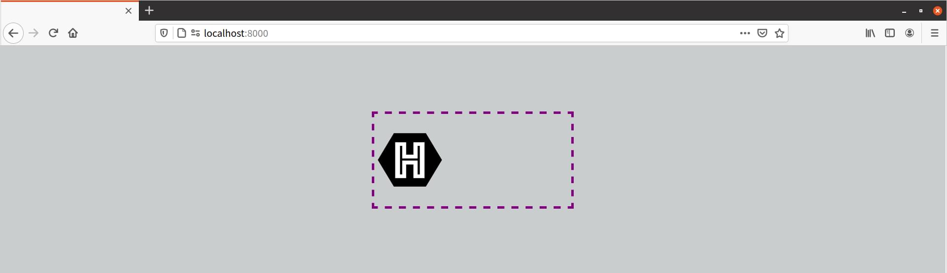
To trigger this view from the HTML document, set the width of the SVG container:
<iframe src="hexlogo.svg" style="width: 320px; border:0"></iframe>
As you may have noticed from looking at the image above, our SVG image retains its intrinsic dimensions even though part of it has been hidden. This, unfortunately, is a limitation of SVG. To fix it, we need to change the viewBox attribute of the SVG document, but only when the viewport is below a certain size. This is a great use case for matchMedia (which is discussed in Chapter 10, “Applying CSS Conditionally”).
The viewBox attribute, as its name suggests, determines the viewable area of an SVG element. By adjusting it, we can determine which part of an SVG image fills the viewport. What follows is an example using matchMedia and a media query to update the viewBox attribute:
<script type="text/javascript">
const svg = document.querySelector( 'svg' );

/* Store the original value in a variable */
const originalViewBox = svg.getAttribute( 'viewBox' );

/* Define our media query and media query object */
const mq = matchMedia( '( max-width: 320px )' );

/* Define the handler */
const updateViewBox = () => {
    if (mq.matches) {
        /* Change the viewBox dimensions to show the hexagon */
        svg.setAttribute( 'viewBox', '0 0 200 174' );
    } else {
        svg.setAttribute( 'viewBox', originalViewBox );
    }
}

svg.addEventListener( 'SVGLoad', updateViewBox );

/* Fire if the media condition changes */
mq.addEventListener( 'change', updateViewBox );
</script>
Now, whenever the SVG container is 320 pixels or less, the value of viewBox will be "0 0 200 174". When it exceeds 320 pixels, viewBox gets restored to its initial value.

Since this technique uses either the onload event attribute or the SVGLoad event, it’s a good idea to embed our CSS and JavaScript within the SVG file. When CSS is external, the SVGLoad event may fire before its associated CSS finishes loading.
Using Media Queries with background-size
SVG documents and media queries aren’t limited to foreground images. We can also resize the SVG viewport using the CSS background-size property.
We’ll start with this SVG document:
<?xml version="1.0" encoding="utf-8"?>
<svg version="1.1" xmlns="http://www.w3.org/2000/svg"
➥ xmlns:xlink="http://www.w3.org/1999/xlink" x="0px" y="0px"
➥ viewBox="-20 -20 250 250" xml:space="preserve">
    <style type="text/css">
        circle {
            stroke: #000;
            stroke-width: 30;
            fill: #009688;
        }
        @media ( width: 100px ) {
            circle {
                fill: #673ab7;
            }
        }
        @media ( width: 300px ) {
            circle {
                fill: #ffc107;
            }
        }
    </style>
    </defs>
    <circle cx="100" cy="100" r="100" />
    <circle cx="100" cy="100" r="50" />
</svg>
This is a simple case. Our <circle> elements get a new fill color at specific viewport widths. When the viewport is 20 pixels wide, the fill value is teal. When it’s 300 pixels wide, it’s yellow.
To make this work, we have to use our SVG image as a background image and set the selector’s background-size property. In this case, we’ll use our image as a background for the <body> element and for <li> elements:
body, li  {
    background: url(circles.svg);
}
body  {
    background-color: #9c27b0;
    background-size: 300px auto;
}
li {
    background-position: left center;
    background-repeat: no-repeat;
    background-size: 1em auto;
    padding-left: 40px;
    font-size: 24px;
    margin: 1rem 0;
}
The result is pictured below.
Conclusion
Using SVG with CSS gives us more possibilities for flexible and adaptive documents. You should now know how to:
- use CSS to style SVG elements
- animate SVG properties
- employ CSS media queries and the
matchMediaAPI to show and hide portions of an SVG document
* * *
This article is an extract from Tiffany’s book CSS Master, 3rd Edition. Check it out if you’d like to master other advanced CSS3 features like Flexbox and Grid!