Flexbox or CSS Grid? How to Make Layout Decisions that Make Sense

Following the widespread implementation of CSS Grid Layout, one question became prominent in front-end web development circles: Is there still any use for Flexbox?
Grid is now supported by all major browsers as much as Flexbox is. But the answer to the question is that yes, Flexbox is still an important part of CSS.
In this article, I’m going to suggest a few ways to help you decide when to use Flexbox and when to use Grid as you tackle your web development projects.

To master Flexbox, Grid, and many other advanced CSS3 features, check out CSS Master, 3rd Edition.
What Is Flexbox?
CSS Flexible Box Layout, or Flexbox for short, started to appear in browsers around 2012. Having binged on floats and third-party layout libraries for years, web designers and developers welcomed this new CSS module with enthusiasm, although it took a little while to get used to its alien syntax and acquire full command of its inner workings.
A flex container can be defined in a CSS document like so: .container { display: flex; }. Then, as the W3C Specification says, its children —
can be laid out in any direction, and can “flex” their sizes, either growing to fill unused space or shrinking to avoid overflowing the parent. Both horizontal and vertical alignment of the children can be easily manipulated. Nesting of these boxes (horizontal inside vertical, or vertical inside horizontal) can be used to build layouts in two dimensions.
Since the introduction of Flexbox, things like creating equal-length columns irrespective of their amount of content, centering elements both horizontally and vertically, lining up and spacing navigation links along a horizontal line and more, has become much easier.
Wrapping columns inside a flex container is enough to achieve equal-length columns. Check it out!
See the Pen
Flexbox-Equal-Columns by SitePoint (@SitePoint)
on CodePen.
As for centering content both horizontally and vertically, it’s a matter of adding the following lines of code to a flex container:
.hero {
  display: flex;
  flex-direction: column;
  /* centers vertically */
  justify-content: center;
  /* centers horizontally */
  align-items: center;
}
Here’s a demo:
See the Pen
centering-flexbox by SitePoint (@SitePoint)
on CodePen.
Finally, lining up a bunch of links has never been so painless:
.links-container {
  display: flex;
  /*  shortcut to specify direction (horizontal) and wrapping behavior */
  flex-flow: row wrap;
  gap: 1rem;
}
You can see a demo of this on CodePen.
To familiarize yourself with how Flexbox works, and as a quick reference to its properties and values, have a look at the links below:
- A Friendly Introduction to Flexbox for Beginners on SitePoint
- Mozilla’s Flexbox introduction
- The Flexbox cheat sheet by CSS-Tricks
- The What the Flexbox?! video series by Wes Bos
So that’s Flexbox in a nutshell. Let’s now move on and look at Grid.
What Is CSS Grid?
In March 2017, CSS Grid Layout started to receive widespread browser support. According to the Grid specification, Grid layout is —
a new layout model for CSS that has powerful abilities to control the sizing and positioning of boxes and their contents.
With Grid, the power to build all kinds of robust layouts on the Web has grown immensely, so much so that Jen Simmons, CSS expert and renowned Grid advocate, has been encouraging web designers and developers to be adventurous in their layouts and break out of overly used common patterns. (See her YouTube video Modern Layouts: Getting Out of Our Ruts.)
Thanks to Grid, it’s easy to create a complex layout that doesn’t use much code at all, needs no floats or other hacks, and that causes zero headaches.
Here’s a CodePen demo. (Note that Grid only kicks in on wider screen sizes.)
See the Pen
grid-layout by SitePoint (@SitePoint)
on CodePen.
In that demo, to create the basic grid for the entire page at full size, I turned my container div into a grid container and then divided it up into columns and rows:
.container {
  display: grid;
  grid-template-columns: 1fr 1.2fr 1.5fr;
  grid-template-rows:  1fr 4fr 3fr 2fr;
}
The fr unit is a new flexible unit of measurement introduced with CSS Grid Layout. The fr part is short for fractional, as it represents a fraction of the available space in the grid container. Using fr rather than a fixed unit like px, means letting the browser work out the math needed to create the layout, which I think is preferable in most cases.
Once the grid is ready, it’s time to go ahead and place the child elements inside it. There are a few different ways to do this. In the demo above, I used grid line numbers and the grid-area property, which does the job in one line of code. For example, here’s the code to lay out my main content:
.main {
  /* row start, row end, col start col end */
  grid-area: 1 / 1 / 3 / 3;
}
Once all the sections are in place within the grid, here’s what it looks like:
For more details and handy cheat sheets, check out the links below:
- SitePoint’s “Introducing the CSS Grid Layout” and “Creating Layouts with CSS Grid” tutorials
- Rachel Andrew’s Grid by Example
- Jen Simmons’ s Experimental Layout Lab
- CSS-Tricks’s “A Complete Guide to Grid”
- the MDN CSS Grid Layout Guide
- Wes Bos’s CSS Grid course
- How to Center a Div Using CSS Grid
Grid or Flexbox: Which One Should I Go For?
Having had a taste of what both Grid and Flexbox are capable of, it’s time to go back to the original question. When is one preferable to the other?
Here’s a Twitter thread Chris Coyier launched a couple of years ago basically asking this same question:
For y'all that have an understand of both CSS grid and flexbox, what's your favorite way of explaining the difference?
— Chris Coyier (@chriscoyier) January 25, 2019
For y’all that have an understand of both CSS grid and flexbox, what’s your favorite way of explaining the difference?
As you can expect, a number of interesting answers did crop up, most of which I’ve sorted out under the headings below.
Grid for page layout and Flexbox for components
“Grid for page layout and Flexbox for components” is perhaps the most intuitive answer one could give to this question. In fact, I wouldn’t have any doubts as to which technology I’d use when coding up a whole page layout. You can do page layouts with Flexbox — and indeed, that’s what most of us did before Grid entered the scene. But creating a grid with flexbox has never felt really “flexy” and has never come without a few headaches. Grid, on the other hand, was simply born for this. However, the question remains: was it born just for this?
It turns out that Grid is also great when creating components to be placed inside the macro, page-level sections. For example, in the demo below, the form is a grid container and its elements have been laid out using CSS Grid properties.
See the Pen
form-with-css-grid by SitePoint (@SitePoint)
on CodePen.
Despite the fact that the Email and the Password labels are of different lengths, the form fields line up perfectly, both horizontally and vertically. And this is the magic of Grid: it lays out web element both horizontally and vertically, by default, be it page-level elements or component-level elements. This specificity that Grid possesses is a powerful factor in deciding when to use Flexbox or Grid.
Two-dimensional versus one-dimensional layout
As Rachel Andrew makes clear in the above referenced Twitter thread:
Flexbox is for one dimensional layout. A row OR a column. Grid is for two dimensional layout. Rows AND columns.
Page-level layouts, as well as inner components, might need a grid-like structure. This is important to the extent that it points to a fundamental rule of thumb that comes into play when deciding which one to use when. If your design needs items in the grid to line up in columns and rows, not only is Grid perfect for the job, it’s the only tool that does so by default. On the other hand, if you want items to just stack up so that each line is independent of the others in terms of length and alignment, then Flexbox is your best friend, simply because that’s what it does by default.
As Jen Simmons makes clear in the same Twitter thread:
Grid makes actual columns and rows. Content will line up from one to the other, as you ask it to. Flexbox doesn’t. Not only in the second dimension (which is easiest to talk about), but also in the first dimension.
As you shrink your browser window, check out the difference between the Flexbox-based and the Grid-based layouts below:
See the Pen
1d-v-2d-flexbox-grid by SitePoint (@SitePoint)
on CodePen.
As the container shrinks, the grid items remain perfectly aligned, while the Flexbox items flex their dimensions and alignment with respect to each other on the basis of the available space.
However, it doesn’t mean that you can’t build a grid using Flexbox or that you can’t get your Grid items to be of different lengths. What it means is that you’ll have to write some extra code to get Flexbox to behave like a grid and you’ll have to span each of the Grid items individually to achieve the kind of flexi-looking layout that you see above. That said, doing so would only give you the appearance of a Flexbox kind of layout, but certainly not its intrinsic behavior.
To conclude, if you don’t want rows to line up, definitely go with Flexbox.
But does it follow that Grid is only good at building 2D layouts? Not necessarily. Chris Coyier points this out in his contribution to his own Twitter thread:
I’m not the world’s biggest fan of the 1D vs 2D differentiation of grid vs flexbox, only because I find most of my day-to-day usage of grid is 1D and it’s great for that.
Perhaps, an alternative way to articulate a rule of thumb that could be helpful in the choice between Flexbox and Grid would be to say that Flexbox works from the content out, while Grid works from the layout in. Let’s look at this idea a bit closer.
Content out or layout in
The W3C specs for Flexbox and Grid could be helpful in clarifying the expressions “from the content out” and “from the layout in”.
Regarding Flexbox, the spec points out that it offers —
simple and powerful tools for distributing space and aligning content in ways that web apps and complex web pages often need.
In other words, what Flexbox tells the browser is: Here’s my content, just work out the best way to distribute it horizontally (or vertically, if that’s what’s required) in the nicest way possible on the basis of the given space.
In the case of Grid, the Grid spec clarifies that it —
provides a mechanism for authors to divide available space for layout into columns and rows using a set of predictable sizing behaviors. Authors can then precisely position and size the building block elements of their application into the grid areas defined by the intersections of these columns and rows.
In the case of Grid, the point of departure is a structure of columns and rows, which Grid creates explicitly or implicitly. The code says to the browser: These are my content blocks; now place them exactly within the grid structure in the specified locations.
As compelling as this way of approaching the present discussion is, I think it still leaves something out.Consider using this code in a grid container:
grid-template-columns: repeat(auto-fit, minmax(minimum width, 1fr));
This lets the browser, not the developer, work out how many columns and rows are needed for the content according to the available space, as well as whether a specific piece of content gets placed into column or row one, two, etc. — a bit like Flexbox, but with perfect alignment. (See the Grid demo with the apple icons in the previous section.)
So, although I like this third option quite a bit, something still tells me that Grid is capable of much more.
What Rule of Thumb Do I Follow?
Grid can do most of the things that Flexbox can do and much more, with the exception of a limited number of use cases. Consequently, I tend to follow Chris Coyier’s stance in his Twitter thread, which is also similar to the approach of Wes Bos on this issue. It goes as follows: Unless I’m tackling just those few cases which would be better handled by Flexbox, I mostly go for Grid .
Use Cases for Flexbox
As pointed out above, one thing that Flexbox does by nature, as it were, is to wrap elements along different lines, each only caring about distributing its items in the available space given their different widths, without any relation to the lines above or below. So, if I’m not after the grid-like appearance of perfectly aligned rows and columns, I’ll reach out for Flexbox.
See the Pen
flexbox-tags by SitePoint (@SitePoint)
on CodePen.
Another situation where I’d consider using Flexbox over Grid is if I’m after a straightforward, one-dimensional layout of elements that I would need to easily flip around and/or animate.
Flexbox lets you reverse the order of the elements with just one rule on the flex container: flex-direction: row-reverse/column-reverse. You can’t do this with Grid, unless you adjust the order property manually for each child element, which might be tedious. However, be mindful of the accessibility implications of doing so, whether in Flexbox or Grid.
In addition, Flexbox lets you animate the size of its child elements effortlessly, which is also something that you can’t achieve cross-browser with Grid.
Here’s a demo of how Flexbox handles both requirements.
See the Pen
flexbox-scroller by SitePoint (@SitePoint)
on CodePen.
The last use case where I’d rather go with Flexbox over Grid is if I wanted to create a design where two or more elements were horizontally aligned with just one of them stretching all the way along the available space while the other(s) keep to their natural width. In other words, something that looks a bit like CodePen’s search bar section on the Your Work page.

I think the desired flexibility required by this component is better served using Flexbox, although the same design can be easily achieved using Grid.
Here’s a live demo using Flexbox, and here’s one using Grid.
The reason why I’d consider Flexbox as being the better option here is that, if you later decide to add more elements to the left of the stretched search bar, you won’t need to go back to the CSS document and change anything, because the design will still look nice.
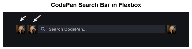
On the other hand, while adding extra elements to the right of the search bar will still look fine in the Grid-based version, adding them to its left would mess up the design, meaning you’d have to adjust the CSS too.
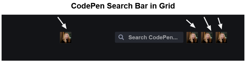
The image below shows the CodePen search bar redesign in Grid with extra elements added to its right.
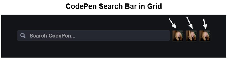
The next image shows the CodePen search bar redesign in Grid with extra elements added both to its left and its right.
At the end of the day, it’s just a tiny adjustment, so I’m leaving the matter with you and your personal preference as to which one to go for.
Grid for everything else
For everything else, I’d go with Grid. Obviously, I haven’t come across all the designs that are possible on the Web, but for the most part, I can’t see anything being more powerful than Grid.
There are jobs that Grid can do as well as Flexbox. Here are a couple of examples.
Centering elements, which has been done with Flexbox since it was first implemented in browsers, can as quickly be done with Grid. Here’s the same design that appears in the section above on Flexbox, but this time realized using CSS Grid:
See the Pen
centering-css-grid by SitePoint (@SitePoint)
on CodePen.
The magic is all in these three lines:
.hero {
  display: grid;
  /* centers vertically */
  align-items: center;
  /* centers horizontally */
  justify-items: center;
}
Another case which is perfect for Flexbox but also doable in Grid is aligning small elements. In “How to Align Things in CSS”, Rachel Andrew points out —
One of the things I think is often overlooked is how useful Flexbox is for doing tiny layout jobs, where you might think that using
vertical-alignis the way to go. I often use Flexbox to get neat alignment of small patterns; for example, aligning an icon next to text …
Here’s Rachel’s demo that illustrates her point:
See the Pen
inline-flex by SitePoint (@SitePoint)
on CodePen.
And here’s my fork which replicates the same design using Grid:
See the Pen
inline-grid by SitePoint (@SitePoint)
on CodePen.
Instead of using inline-flex, like Rachel did in her demo, I’m using inline-grid:
span {
  display: inline-grid;
  align-items: center;
  grid-auto-flow: column;
}
You can even add more icons after the text and it still lines up, just as with Flexbox.
Also, one thing Flexbox can’t do but Grid can do extremely well is overlapping elements without the woes that come when using absolute positioning. Have a look at this demo by Jen Simmons to see how it works.
And I haven’t even mentioned what’s coming in the future with CSS Grid Level 2. I can’t wait for subgrid to be widely implemented in browsers. At that point, aligning elements that are not direct children of the grid container without the need for a nested grid container will be as straightforward as adding the value subgrid to grid-template-columns and grid-template-rows. Check out Rachel Andrew’s CSS Grid Level 2: Here Comes Subgrid for a deep dive.
Finally, there’s even a CSS Grid Layout Module Level 3 specification, which might include the possibility of building masonry layouts using the value masonry for grid-template-columns/grid-template-rows. Once again, Rachel Andrew provides detailed info about this in her article “Native CSS Masonry Layout in CSS Grid”.
Conclusion
In this article, I’ve discussed a few ways in which you can approach the choice between using Flexbox or Grid for your layouts.
There’s nothing prescriptive about the rules of thumb presented above, and I think no single one of them is absolutely better than the others. I’d even go so far as to say that each one of them complements the others and, therefore, that no one is exhaustive when considered in isolation.
One last approach I’d like to suggest is the following: create lots of layouts using both technologies until you develop a feel for which one works best for you.
Happy building!
To master Flexbox, Grid, and many other advanced CSS3 features, check out CSS Master, 3rd Edition.